Architecture has often provided typographical inspiration. For our special Brazil issue, Wallpaper* turned to the admirably internationally staffed but London-based studio of Julia to create a bespoke typeface for the magazine.
Julia was founded by Italian Valerio Di Lucente, Frenchman Erwan Lhuissier and the Brazilian Hugo Timm, all of whom met at the Royal College of Art in London. Blending their professional experience, their studio has worked in print and on the web. With a handful of other elegant typefaces already on their desktops – including Herman, Modo, and Riso – Di Lucente, Lhuissier and Timm turned their eyes to Brazil, working in close collaboration with Wallpaper's design team.
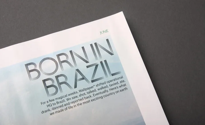
The result is 'Copan', a geometrically precise but fittingly fluid title font in two sizes. 'Initially we only knew what we didn't want it to look like - there are good cliches and bad cliches about Brazil,' says Timm. 'one of the prominent characteristics of Brazilian typography – as opposed to work from the UK or France – is that it's quite informal and vernacular.'
Instead, the Julia studio immersed itself in the country's culture, collecting imagery from every source. While not directly inspired by the fluid concrete facades of Oscar Niemeyer's classic Edificio Copan apartments, the resulting font shares certain characteristics – 'a happy coincidence,' according to Timm.
The repeated lines (four strokes for the large size, three for the small), the architectural rigour of the curves and the moiré pattern the font creates all give a nod to Niemeyer's 1966 creation. 'I don't want to suggest that the font could have been used for the building's original identity,' Timm admits, 'we originally wanted to represent Brazil but feel that we have evoked its spirit instead.'

Wallpaper* 135: Editor’s letter

Wallpaper* 135: the cover

Wallpaper* 135: the cover

Wallpaper* 135: page 180

Wallpaper* 135: page 191

Wallpaper* 135: page 101

Wallpaper* 135: page 174

Wallpaper* 135: page 168

Wallpaper* 135: page 89

Wallpaper* 135: page 53

Wallpaper* 135: page 54

Wallpaper* 135: page 67

Wallpaper* 135: page 125

Wallpaper* 135: page 122

Wallpaper* 135: Editor’s letter

Wallpaper* 135: page 37