
Receive our daily digest of inspiration, escapism and design stories from around the world direct to your inbox.
You are now subscribed
Your newsletter sign-up was successful
Want to add more newsletters?
Milton Glaser, the American doyen of graphic design who created some of the 20th century’s most influential visual identities, and a leading proponent of design as an instrument of social change, died in Manhattan on Friday, 26 June 2020, on his 91st birthday.
Born in The Bronx in 1929, Glaser was educated at the Cooper Union Art School in New York, and the Academy of Fine Arts in Bologna, where he was a Fulbright Scholar and studied under Giorgio Morandi. Along with Seymour Chwast, Reynold Ruffins and Edward Sorel, Glaser co-founded the graphic design and illustration practice Push Pin Studios in 1954, which triggered commercial art’s shift from the rigidity of late Modernism to a more expressive, colourful design language. Glaser worked with journalist Clay Felker to launch New York magazine in 1968, ushering visual journalism into a new era. He served as its president and design director until 1977.
He had his breakout moment in 1966 with a poster of Bob Dylan, commissioned by CBS records for the singer-songwriter’s Greatest Hits album. Inspired by Marcel Duchamp’s 1957 Self-Portrait in Profile, Glaser depicted Dylan’s silhouette in black, and then rendered his abundant curly hair in kaleidoscopic colours to evoke the psychedelic drugs that defined 1960s counterculture. With print runs exceeding six million, the poster is one of the most widely circulated of all time, and has entered MoMA’s permanent collection.
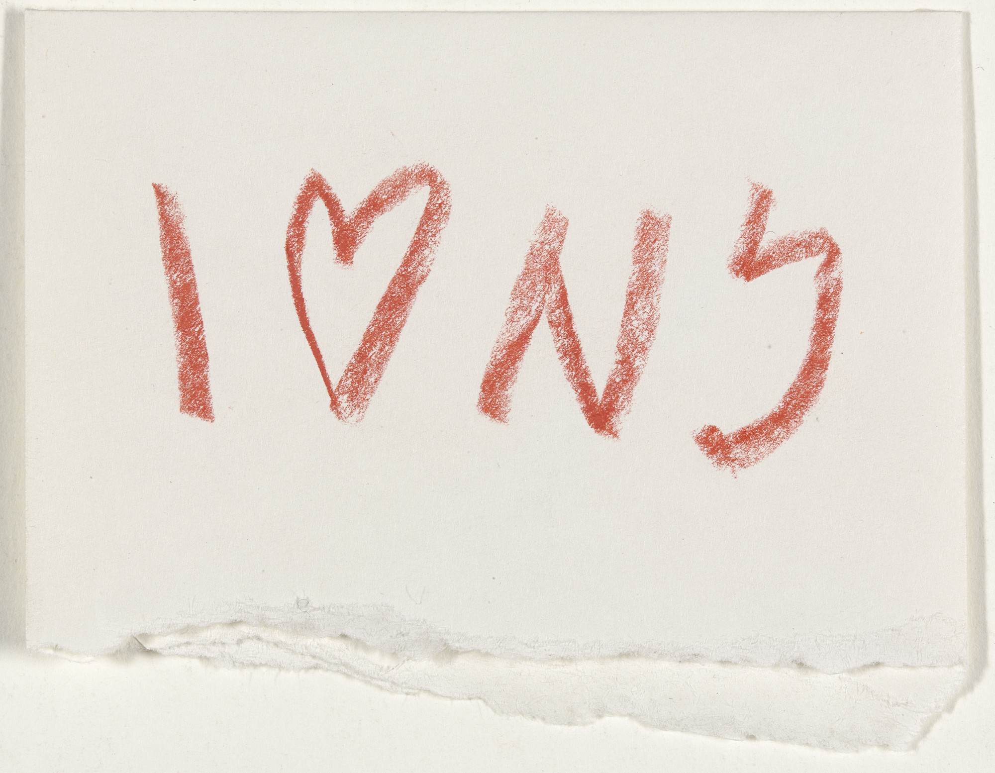
Created in a Manhattan taxi in 1976, Glaser's concept sketch for the 'I ❤️ NY' logo is now in MoMA's permanent collection.
The ‘I ❤️ NY’ logo, created in 1977 for the New York State Department of Commerce, became his magnum opus. The brief was to create an uplifting symbol for a state that was grappling with soaring crime rates and economic decline. While in a Manhattan taxi, Glaser pulled a red crayon from his pocket to sketch on the back of an envelope, doodling the three letters and red heart that became an instant icon. ‘My design had a sense of inevitability. The form and the content were united in a way that could not be taken apart,’ he recalled in a 2011 interview. The eventual stacked form of the logo seemed to pay homage to Robert Indiana’s LOVE sculpture, first shown seven years earlier, while the serif typeface – an evolved version of American Typewriter – added to its popular appeal. ‘I ❤️ NY’ is said to have compelled typographers to include a heart in every typeface developed since. More than four decades on, it still appears on all manner of memorabilia and seems as popular as it was on day one.
Glaser’s logo may have played a pivotal role in reversing New York’s fortunes, but he never charged a fee for the project, and instead believed that he was fulfilling a civic duty. After the Twin Towers fell in 2001, he would rework the logo into a poster that read ‘I ❤️ NY More Than Ever’, with the red heart slightly singed on the side. He also added a line of smaller text at the bottom: ‘Be generous. Your city needs you. This poster is not for sale.’
Ever a believer in the power of design to inspire civic engagement, Glaser threw his creative muscle behind many social causes. In 1987 he designed the symbol and poster for the World Health Organization Special Programme on AIDS, intersecting two red hearts and turning the overlapping area in the skull to draw attention to the many lives that had been tragically lost. Accompanied by the words ‘AIDS: Worldwide effort will stop it’, Glaser’s design helped usher in a moment of global reckoning. For the 2005 UN World Summit on Poverty, he came up with a memorable image of a black hand with fingers in five different skin tones, captioned ‘We Are All African’ and calling for an end to political and social indifference towards human suffering in developing nations.
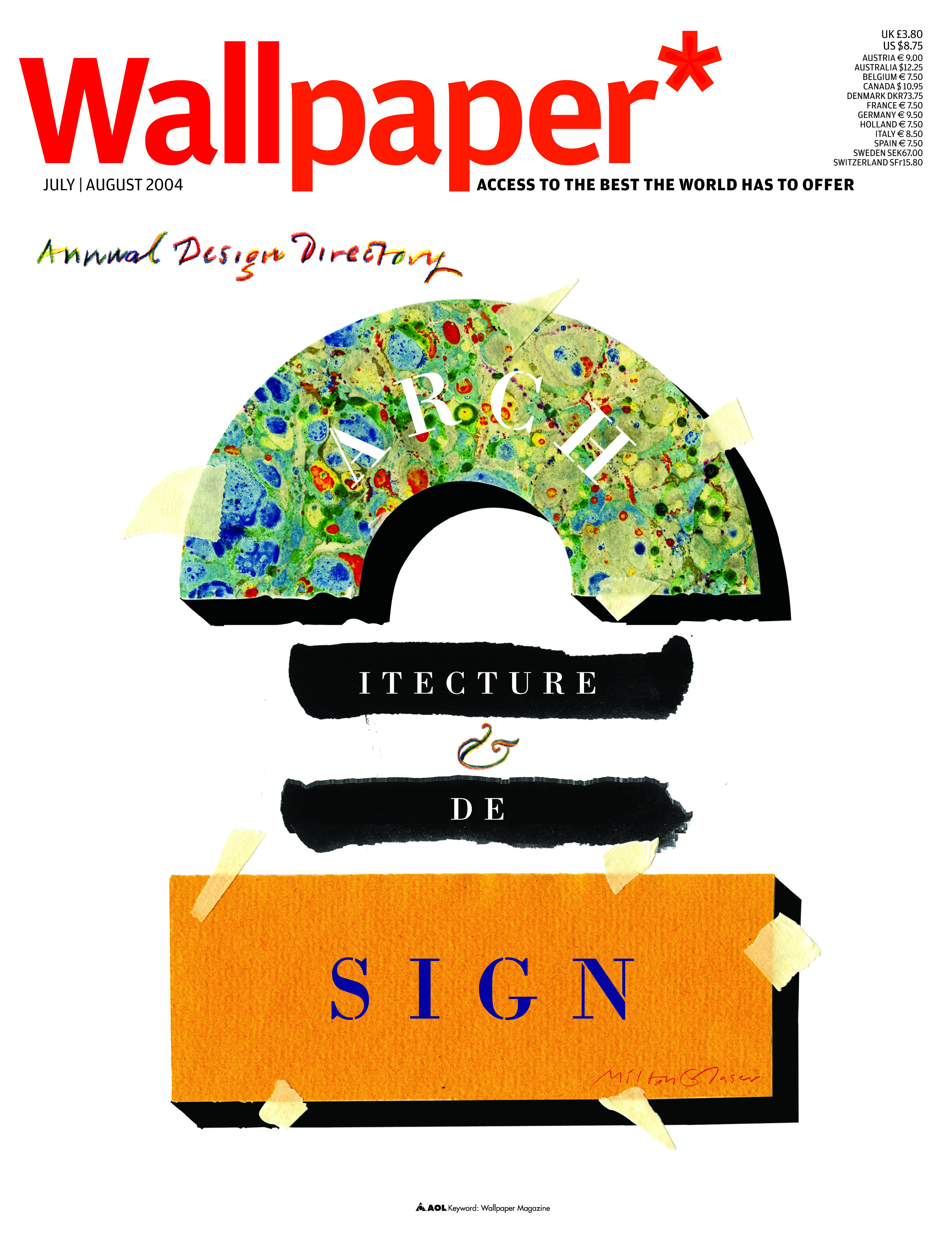
Glaser designed the cover for the July/August 2004 issue of Wallpaper*, transforming the coverline ‘Architecture & Design’ into a physical collage of textured and marbled paper and brush strokes
In 2014 he turned his efforts to fighting climate change. With a simple green circle overwhelmed by a black gradient, and the slogan ‘It’s not warming // it’s dying’, Glaser’s campaign moved away from benign language, and positioned environmentalism as an urgent struggle for planetary survival.
Receive our daily digest of inspiration, escapism and design stories from around the world direct to your inbox.
‘The role of the graphic artist today is the role of a good citizen, which is that you participate in the life of your times and try to improve the existing condition,’ he commented in a 2015 interview.
Glaser remained engaged in the world of editorial design, creating memorable covers for the likes of Time, Life and Fortune. We commissioned him for the July/August 2004 Design Directory issue of Wallpaper* (W*70), for which he transformed the coverline ‘Architecture & Design’ into a physical collage of textured and marbled paper and brush strokes, highlighting the continued relevance of analogue methods in disciplines that were rapidly embracing digital technologies.
His creative talents extended to other design disciplines: he was a regular collaborator of the New York restaurateur Joe Baum, redesigning The Rainbow Room at Rockefeller Center, and creating The Aurora on 49th Street. He also redesigned American supermarket chain, The Grand Union Company, and did the interiors and concept of the 1987-88 Triennale di Milano international exhibition.
Glaser was given a lifetime achievement award by the Cooper-Hewitt, Smithsonian Design Museum in 2004. In 2009 he was awarded the National Medal of Arts by US President Barack Obama, becoming the first graphic designer to be accorded this honour. ‘He re-defined the way people communicate through innovative graphic design, creating memorable visual artifacts that challenge contemporary artists and delight all Americans,’ read the award citation.
His passion for work was undimmed as he entered his tenth decade. ‘Retirement fit in with the nature of industrial work, but that’s not true of artists and painters,’ he said when he turned 90. ‘I’m still working on a daily basis and nothing could please me more.’
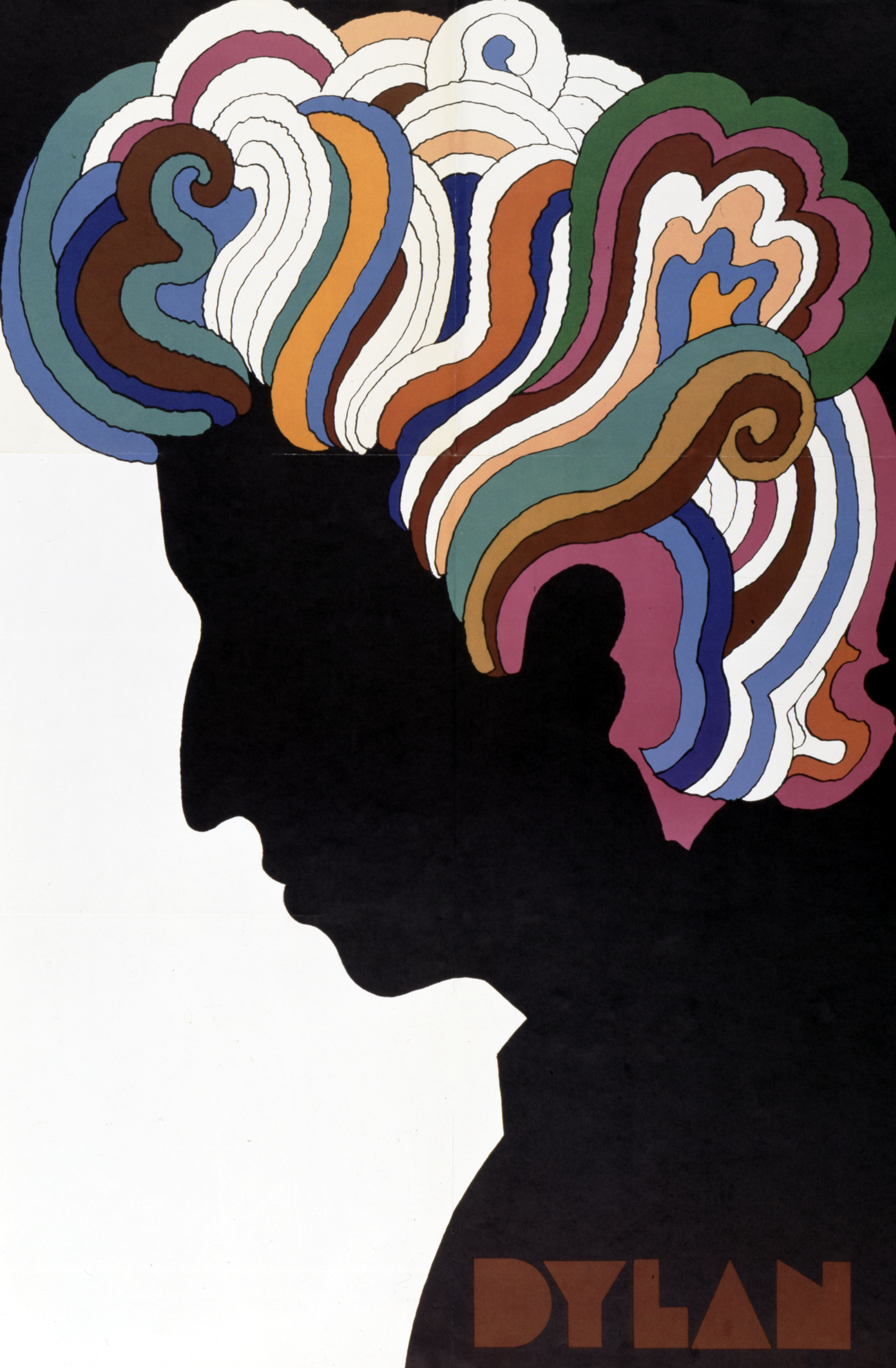
Glaser's poster of Bob Dylan, designed as an insert to the singer-songwriter's Greatest Hits album in 1967. Glaser and Dylan were both awarded the National Medal of Arts in 2009.
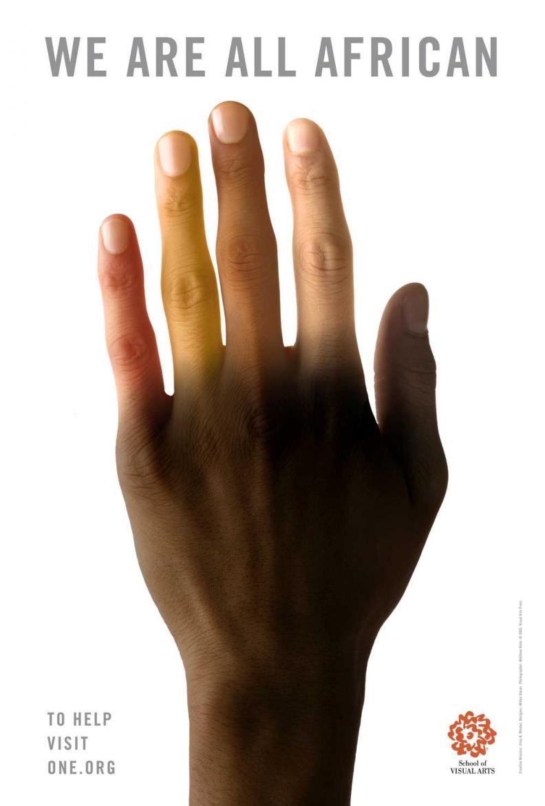
Glaser's 'We Are All African' poster, a call for solidarity created for the UN World Summit on Poverty in 2005

The 'It's not warming' campaign, launched by Glaser in 2014, took a blunt approach in emphasising the need for urgent action against climate change
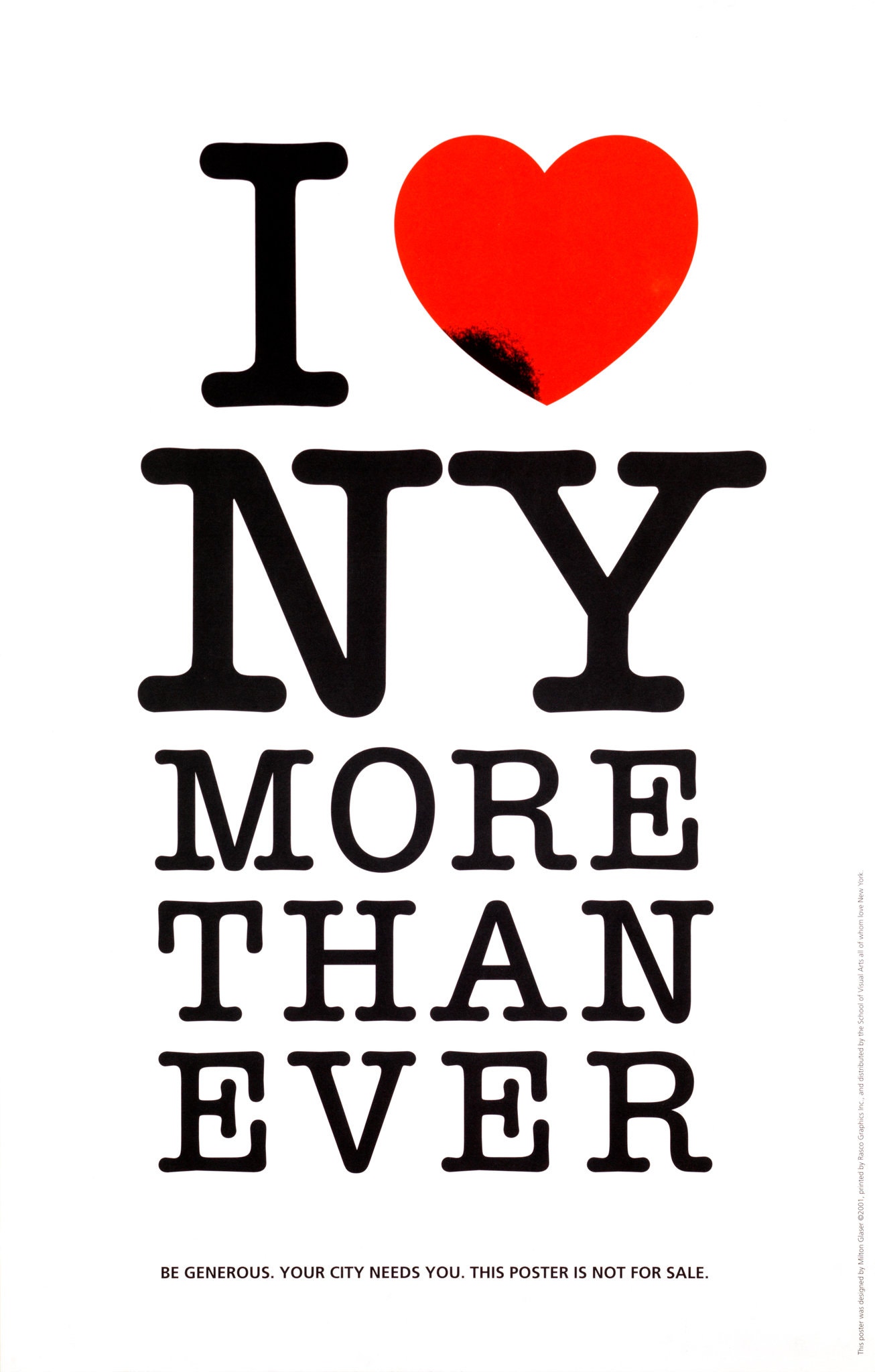
After 9/11, Glaser updated his iconic 'I ❤️ NY' logo to read 'I ❤️ New York More Than Ever', the design was distributed as a poster and reproduced on the front and back pages of The Daily News
INFORMATION
TF Chan is a former editor of Wallpaper* (2020-23), where he was responsible for the monthly print magazine, planning, commissioning, editing and writing long-lead content across all pillars. He also played a leading role in multi-channel editorial franchises, such as Wallpaper’s annual Design Awards, Guest Editor takeovers and Next Generation series. He aims to create world-class, visually-driven content while championing diversity, international representation and social impact. TF joined Wallpaper* as an intern in January 2013, and served as its commissioning editor from 2017-20, winning a 30 under 30 New Talent Award from the Professional Publishers’ Association. Born and raised in Hong Kong, he holds an undergraduate degree in history from Princeton University.