Bill Gold was a rare star name in a mostly anonymous field, a prolific designer of posters for classic films by legendary directors including Alfred Hitchcock, Federico Fellini, Vincente Minnelli, John Ford, Martin Scorsese, Sam Peckinpah, Stanley Kubrick, Robert Altman, Milos Forman, Ridley Scott and Clint Eastwood. In some cases, his striking graphic images have become more enduring and beloved artworks than the movies they promoted.
Gold, who has just died at the age of 97, enjoyed a long and rich career which spanned seven decades and included creating designs for six Best Picture Oscar-winners. A key signature of his vast body of work is that there is no signature. His versatile style was constantly evolving as he moved from an age of free-hand illustration to our current era of slick digital photomontage. ‘I can’t discern a Bill Gold style, which is a compliment,’ the veteran film critic Leonard Maltin once wrote. ‘Rather than trying to shoehorn a disparate array of movies into one way of thinking visually, he adapted himself to such a wide variety.’

My Fair Lady, 1964, winner of the Best Picture award at the 1964 Academy Awards
At 21, Brooklyn-born Gold went straight from art college to work as an in-house illustrator at the Warner Brothers branch office in New York. His second ever poster assignment was for the Humphrey Bogart classic Casablanca (1942), a beautifully rendered character montage framed by its elegantly swooping hand-lettered title. Warners requested just one minor tweak to amplify the sense of drama. ‘The client loved it but said there was no excitement, so I put a gun in Bogart’s hand,’ Gold later admitted.
From these traditional artisan beginnings, Gold’s style grew more daring and dynamic. Unimpressed with the lazy Hollywood studio formula of clustering three main character faces onto a flat portrait design, he began to experiment with typographic fonts, saturated colours and asymmetrical framing on iconic posters such as Hitchcock’s Strangers on a Train (1951) and Dial M For Murder (1954), Elia Kazan’s A Streetcar Named Desire (1951) and George Cukor’s My Fair Lady (1964), the latter an effusive hot-pink collaboration with illustrator Bill Peak.
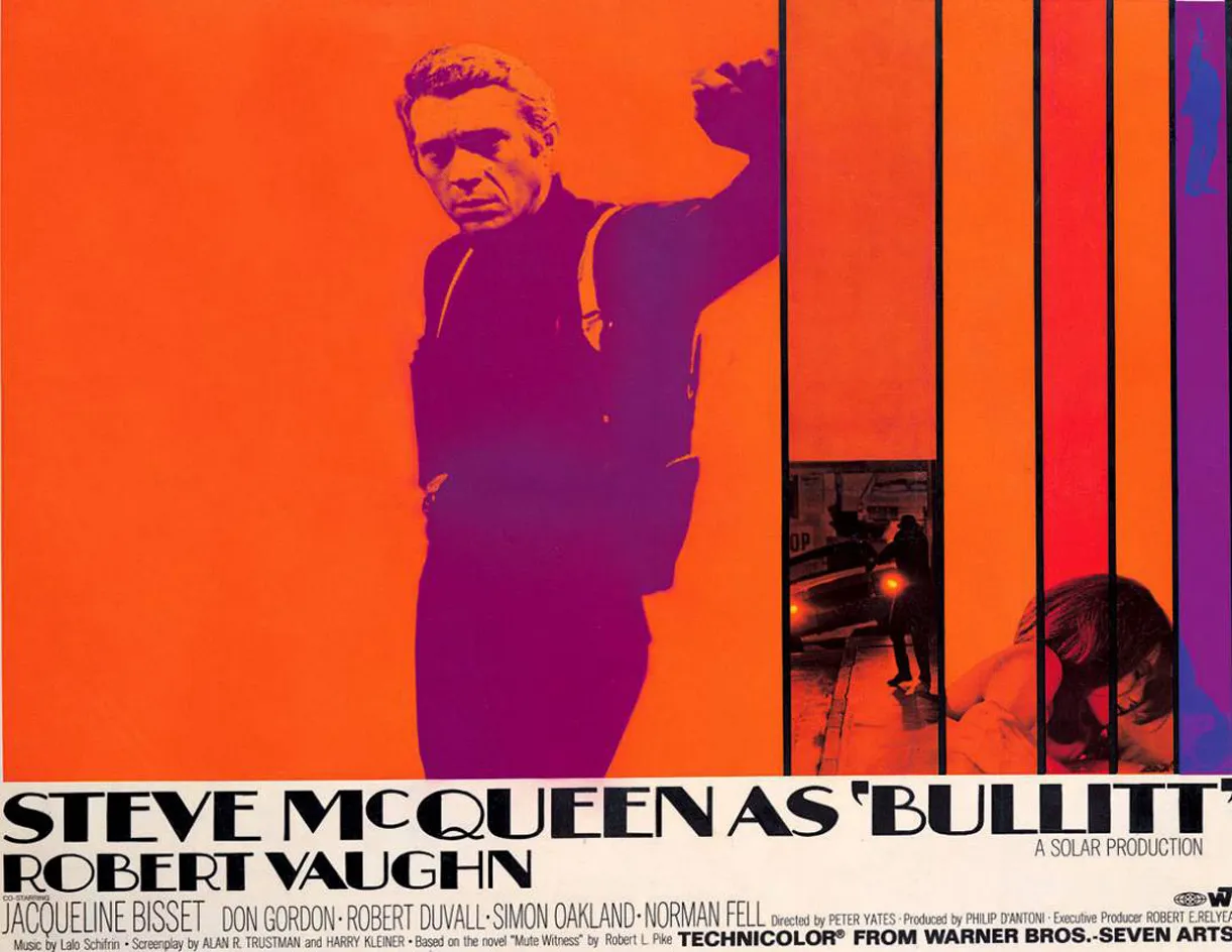
Gold hit his richest seam in the late 1960s and early 1970s, his increasingly stylised graphics reflecting a splashy new era of explicit sex, gritty violence and mainstream horror. His posters for Stuart Rosenberg’s prison drama Cool Hand Luke (1967), Roger Vadim’s comic-book space romp Barbarella (1968) and Peter Yates’ rubber-burning crime thriller Bullitt (1968) are Pop Art masterpieces, all jazzy custom fonts and vibrant blocks of psychedelic colour. Arresting designs like those for Stanley Kubrick’s A Clockwork Orange (1971) and John Boorman’s Deliverance (1973) appeared to burst through the poster’s flat frame and menace the viewer with knives, guns and even the three-dimensional prow of a canoe.

Barbarella, 1968
But Gold was also a master of understatement, and pointedly avoided pictorial plot spoilers. ‘We try to tell a minimum amount of a story,’ he told CBS News in March this year, ‘because anything more than that is confusing.’ His stark monochrome image for William Freidkin’s The Exorcist (1973), a lonely figure silhouetted in a blinding shaft of light, came about because the studio forbade any religious references or shots of the demonically possessed heroine. Likewise his cryptic teaser poster for Ridley Scott’s seminal sci-fi thriller Alien (1979), an egg cracking open and oozing sickly green light, reveals almost nothing about the story. Both ended up as design classics in their own right, spellbinding exercises in pure suspense.
Gold forged his longest and most fruitful collaboration with Clint Eastwood, starting on Dirty Harry (1971) and ended with a one-off post-retirement poster for J Edgar (2011). While Eastwood favoured a more literal and functional graphic style than some of Gold’s more feted work, their shared chemistry still produced several superlative designs including Pale Rider (1985), Unforgiven (1992) and Mystic River (2003). As Eastwood wrote in 2010, ‘the first image you have of many of your favourite films is probably a Bill Gold creation.’ A gracious epitaph for an unrivalled body of work.

A Streetcar Named Desire, 1951

A Clockwork Orange, 1971

Deliverance, 1972

The Exorcist, 1973

The Sting, 1973
INFORMATION
For more information, visit the Bill Gold website