In summer this year, Barbara Kruger mounted an exhibition at the Guild Hall museum in East Hampton, New York, that seemed to take direct aim at the denizens of this summertime Shangri-La of merchant kings and dowager socialites on the shores of the Atlantic. The show, titled ‘Plenty’, confronted visitors with graphic jolts of Kruger commentary emblazoned on the walls, floors and ceiling. One message proclaimed: ‘You want it/You need it/You buy it/You forget it’. Another goosed the audience with the observation: ‘Money makes money and a rich man’s jokes are always funny’. In a smaller side gallery, a video installation projected images of people talking on mobile phones accompanied with the words ‘Moisturizers, sneakers, cellphones, lipstick, computers, cars, sex, sunglasses, smaller noses, bigger breasts, fuller lips, abs, pets, houses and art’. It read like the table of contents at Wallpaper*.
Some critics complained that Kruger was shooting fish in a barrel – that one fashionable art event is the same as any other in the Hamptons’ crucible of fantasy and fortune. They missed the point. For more than three decades, the artist has injected her work in the most likely of places, decrying consumerism on the sides of shopping malls and questioning institutional authority on the walls of the very museums bolstering her career. Her cultural critique has been disseminated via countless posters, T-shirts, mugs and kitchen magnets. Her trademark text bars in Futura Bold Oblique type have become as recognisable as a Warhol silkscreen. But far from blunting her barbs, ubiquity and familiarity have made the frisson of recognition all the more strange and pointed.

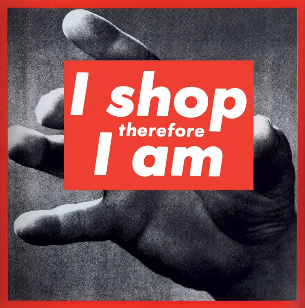
Recycling the text from a 1987 silkscreen collage, Kruger’s limited-edition cover for Wallpaper’s December 2010 Entertaining issue
‘I don’t pretend that my work somehow transcends the marketplace. There is nothing outside the market,’ Kruger says. ‘The art world works the way most markets work. I look at art culture in an anthropological way – my place in it, the highs and lows, rumour, innuendo, speculation.’
By all traditional market indicators, Kruger’s career – which has not flagged since she first captured the attention of the mainstream art world in the late 1970s – is enjoying a particularly vital moment. She has spent the last four months criss-crossing between the US and Europe, overseeing a series of exhibitions at the Stedelijk in Amsterdam, the Whitney Museum’s construction site in downtown Manhattan, and Berlin’s Sprüth Magers Gallery, where she showed her multi-channel video installation, The Globe Shrinks. Magazine covers and a hefty new monograph published by Rizzoli have further spread the gospel according to Barbara.
‘The concept for the Wallpaper* cover came easily,’ says Kruger, referring to this month’s limited-edition cover. ‘I was thinking about pleasure. The design market works the same way as art. I’m fascinated by what is fetishised and what is valueless’.

Kruger’s 2009 Desire Exists Where Pleasure is Absent continues the collage approach, combining found photographs and pity slogans, that made her name.
On the site of the Whitney Museum’s future Renzo Piano-designed outpost in Manhattan’s Meatpacking district, Kruger sheathed construction fences and trailers with meditations on the shifting identity of the neighbourhood and her personal history as a downtown demi-mondaine in the 1970s, when the now-trendy area was inhabited by abattoirs, drug dealers, transsexual prostitutes and gay S&M clubs. One of the most poignant messages read: ‘From blood to meat, to leather, to flesh, to silk’.
‘These are just observations. I am totally un-nostalgic. I don’t care about rich people with trust funds remembering their picaresque adventures in poverty in the 1970s,’ she says. On the subject of New York art culture in that era, Kruger is equally unsentimental. ‘When I was coming up, the art world was 12 white guys. There are different colours now, difficult sexual persuasions. Gender and race have become real issues.’
Graphic design has always been essential to Kruger’s practice. In 1965, she enrolled in Parsons School of Design in New York, where she studied with photographer Diane Arbus and artist Marvin Israel, a lesser-known but influential figure who taught graphics and photography in addition to his own work as a painter and editorial art director. Kruger dropped out of Parsons after her first year and landed a job at Condé Nast Publications as an assistant to the art director of Mademoiselle. She was quickly promoted to head designer. Ever restless, she left Mademoiselle in 1968 and spent the next decade working as a freelance picture editor and graphic designer at House & Garden and other magazines while she cultivated her evolving sensibility as an artist.

n the late 1970, Kruger began making collages using black-and-white images appropriated from midcentury newspapers and magazines superimposed with text printed in her signature typeface. Utilising stratagems of advertising and editorial design, she created agitprop commentaries on gender, race, consumerism, identity, power, corporate greed and the construction of history. Her technique coalesced in defining works of the 1980s such as Untitled (Your Gaze Hits the Side of My Face) and her calling card, as it were, Untitled (I Shop Therefore I Am).
In the 1990s, Kruger began experimenting with sculpture, video installations and large-scale immersive environments that jacked up the volume of her message-making. ‘Architecture was my first love. I used to draw houses when I was a child. Architecture and the built environment colour our days and nights. The idea of adding a spatial dimension to my work came naturally,’ she explains.
‘I discovered Twitter during the bombings in India. It’s an incredibly powerful tool, but for most people it’s about telling the world, “I just had a cupcake”.’
Although Kruger has not strayed far from the themes of her early collages, the convulsive social media changes wrought by 21st-century media have provided a rich vein of new material to mine. ‘Think about Facebook and reality TV. It’s hard for people to see the world unless it’s through a lens, or to see themselves unless someone is looking at them through a lens. It’s all lenses and screens,’ she says. ‘I discovered Twitter during the bombings in India. It’s an incredibly powerful tool, but for most people it’s about telling the world, “I just had a cupcake”.’
Still, Kruger insists she has no longing for the past. Her work remains grounded not in condemnation but in observation, conjuring moments of recognition and connection – sometimes jarring, sometimes subtle – with an economy of words and imagery. ‘There’s always a need to create commentary. That’s what art is. That spark exists whether there’s a market for your work or not,’ she says. ‘I’m lucky. I never thought anyone would know my name. I never thought I’d have a pot to piss in. All of this is cake.
As originally featured in the December 2010 issue of Wallpaper* (W*141)