Receive our daily digest of inspiration, escapism and design stories from around the world direct to your inbox.
You are now subscribed
Your newsletter sign-up was successful
Want to add more newsletters?
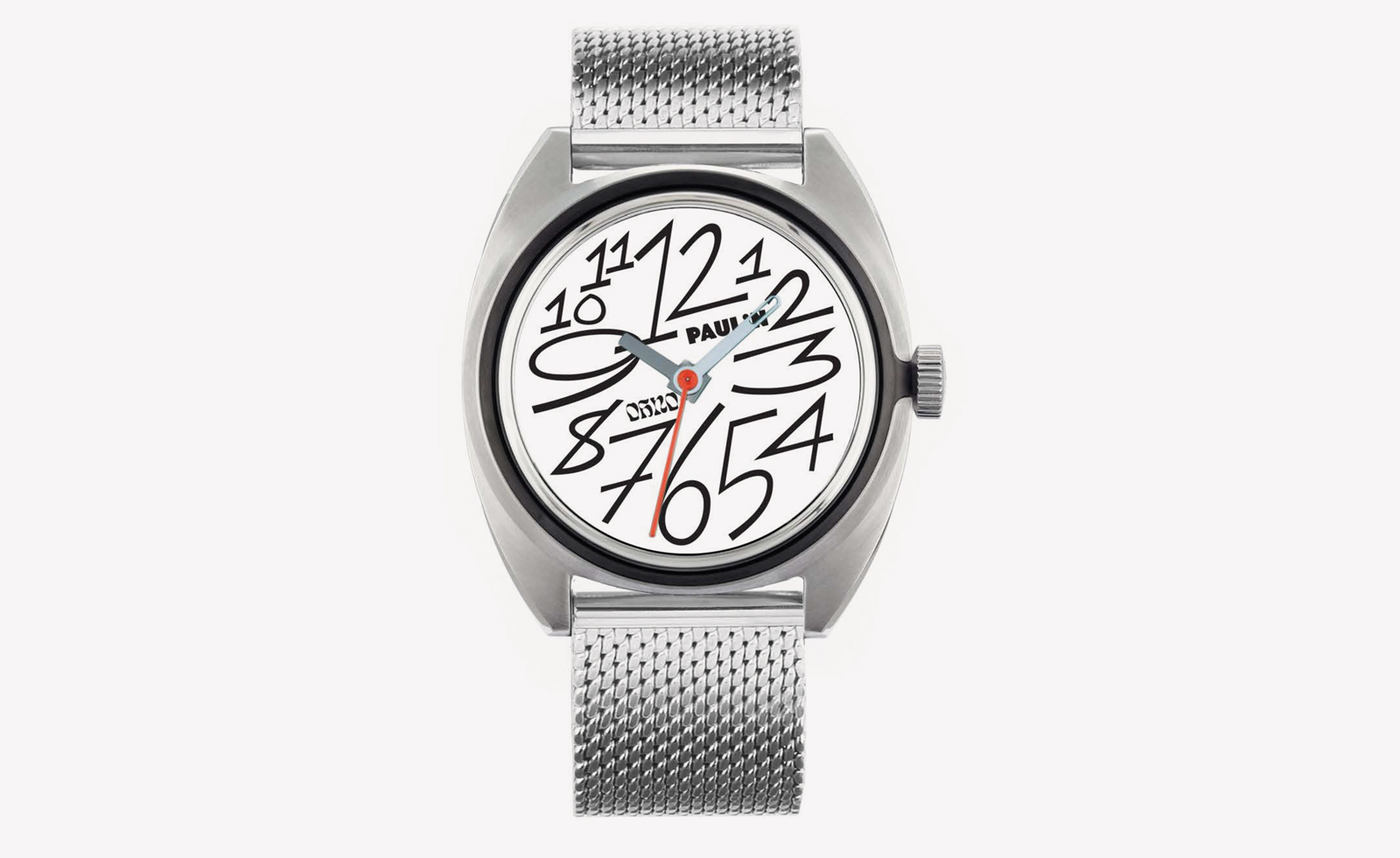
When the British watch brand Paulin launched its OH No model last year - with free-form bespoke numerals designed by with the San Jose type foundry of the same name - it was not expected that it would become a best-seller.
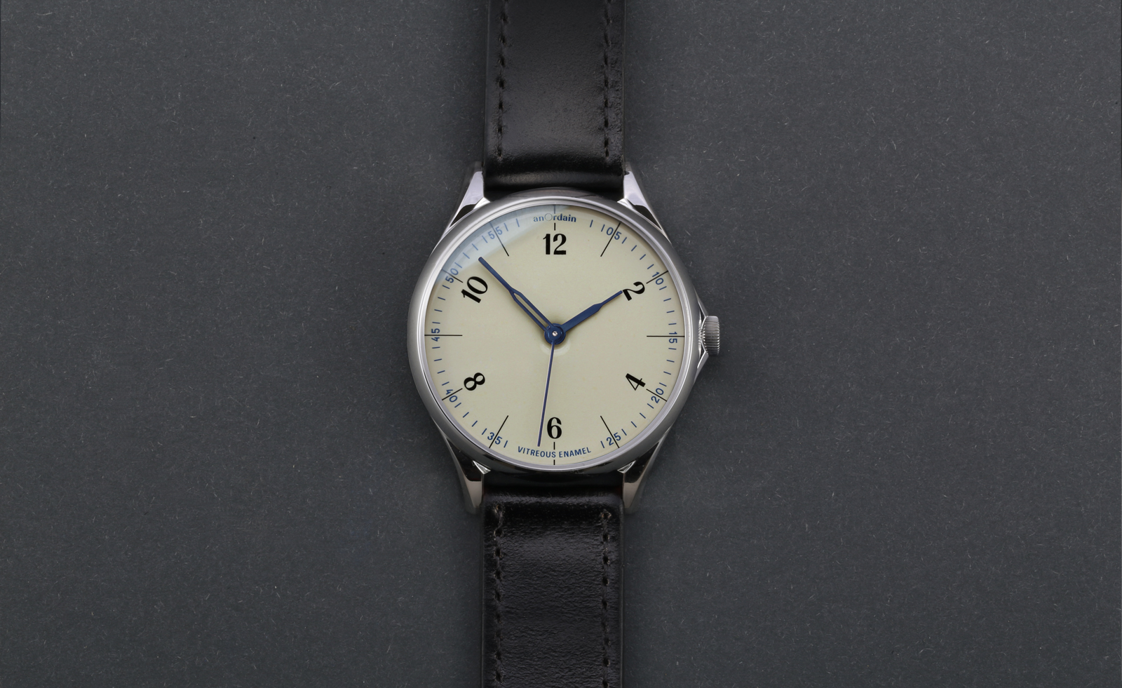
“That it has suggests typography on a watch dial matters more that the watch industry perhaps allows for, especially given that otherwise a watch can just be a circle with 12 dots on it,” says Lewis Heath, the founder of Paulin and AnOrdain watch brands. “I think typography is likely under explored as a point of distinction on ‘proper’ watches, and this is something new smaller brands [arguably less weighed down by heritage or convention] are tuning in to. And I think watch consumers are really starting to paying attention to typography now”.
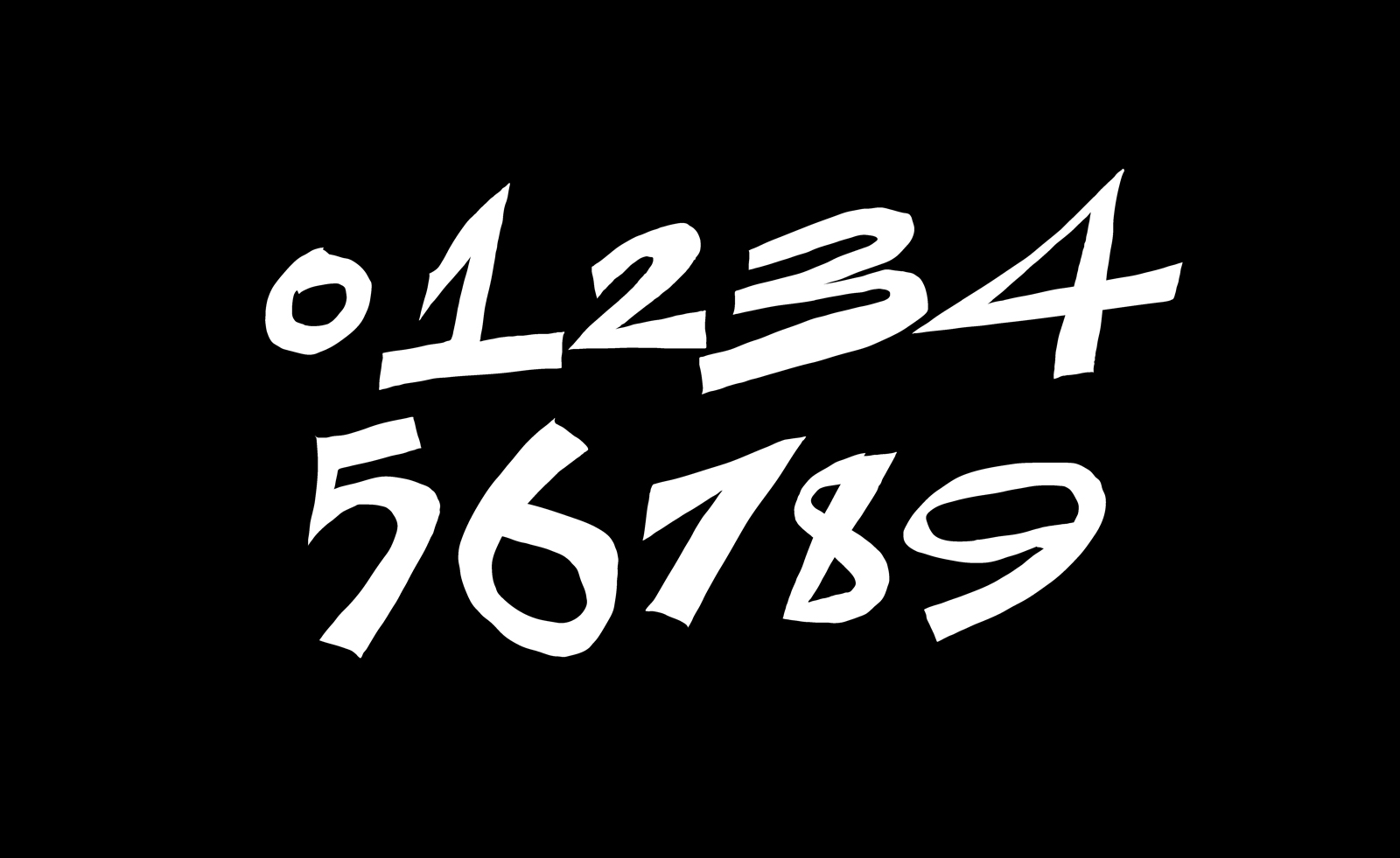
The company worked previously with in-house typographer Imogen Ayres on its Neo watch, and is now collaborating with Kia Tasbihgou - whose clients include the likes of Nike, Greenpeace and Salomon - on a gently italicised, geometric hand-drawn type for a model due out next summer. Neither designers have a background in designing for watch dials.

Anordain watch
“When type is being drawn for such a small surface as a watch face usability has to be the most important thing, but once it’s useable it has to be beautiful, because that’s what lends character to any individual piece,” reckons Tasbihgou. “[Right now] there’s a sense that too much watch typography borrows from each other for that”.
Paulin/Anordain is not the only watchmaker looking to external expertise when it comes to type design. Arguably Hermes set that idea running with its 2012 Slim d’Hermes, with its Philippe Apeloig-designed stencil-like number form. Nomos Glashutte too has worked with an agency to create the ever-so-slightly seriffed forms that very subtly cut against its otherwise strictly Bauhausian rigour. Other brands have cornered the use of a certain font - Mondaine with Helvetica, for example, or Junghans with its Max Bill-designed font - or, like Ressence, designed their own from scratch.
But while Christian Knoop, creative director of IWC, reckons that typography accounts for some 80% of a watch’s visual appeal, it remains the norm that many other major and even esteemed brands use off-the-shelf fonts - fonts often designed for very different media - and hope for the best. That can lead to some discordance: Patel Philippe using a florid Chancery font for city names next to hours in plain Arial on its 5131 world time watch, for example, or Grand Seiko’s use of four different fonts on its SBGR077.

Paulin's OH No watch
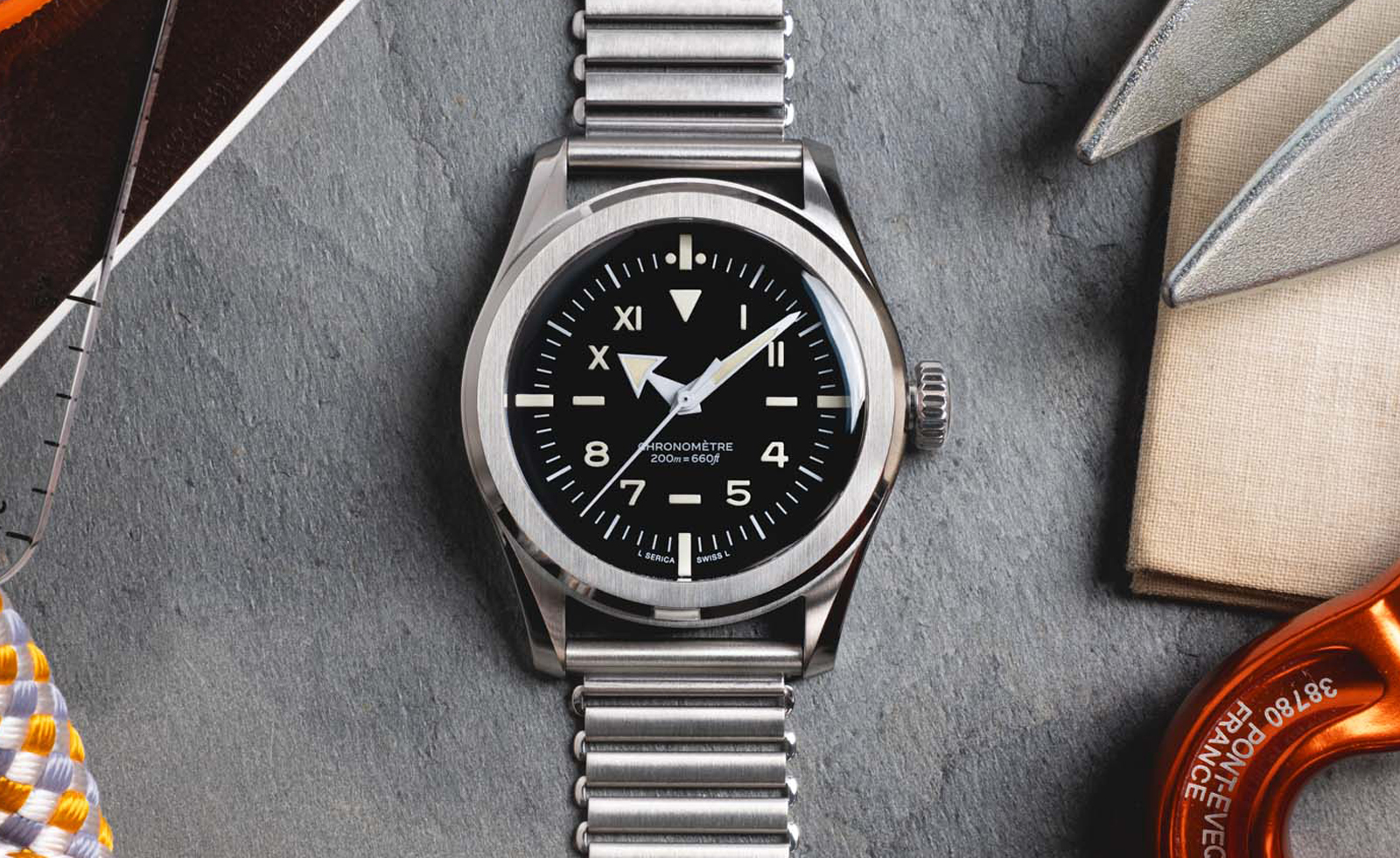
Of course, there are technical demands unique to some watch designs - the printing of convex dials using the tampography process, for example, is much more complex than printing on flat paper. But, according to Jerome Burgert, founder of French watch brand Serica, the digitisation of design - which has made tweaking letterforms that much easier - has also engendered, by turns, a homogeneity and a recklessness in watch typography. And this despite the fact that, given that small canvas, the look, size, weight and positioning of letterforms become all the more impactful in giving a dial personality.
Receive our daily digest of inspiration, escapism and design stories from around the world direct to your inbox.
But, he stresses, type isn’t everything. With the Parade, Serica’s latest model, an oval dress watch, there’s almost none at all, with even the brand name tucked away in a tiny font size along the minute track.
“With tool watches especially typography is used to convey information about their capability but the dress watch is an example of how it’s possible for a watch’s design to be strong enough to express brand identity without the reliance on typography,” Burgert says. “I like clean lines and the fact is that too many watches put typography all over the place”.

Paulin's watch typography
Josh Sims is a journalist contributing to the likes of The Times, Esquire and the BBC. He's the author of many books on style, including Retro Watches (Thames & Hudson).