Seldom do we drop in on a company just for a butcher’s at its reception, but we’ve made an exception with Virgin Atlantic.
The airline’s global HQ at Gatwick is home to 1000 staff. It has two identical entrances – north and south – and since February, visitors and employees to each have found themselves doing a double take in a 3-D, experiential spot-the-difference, because not only has UK design agency Checkland Kindleysides jazzed up both reception areas, it has added some quirky distinguishing features to boot.
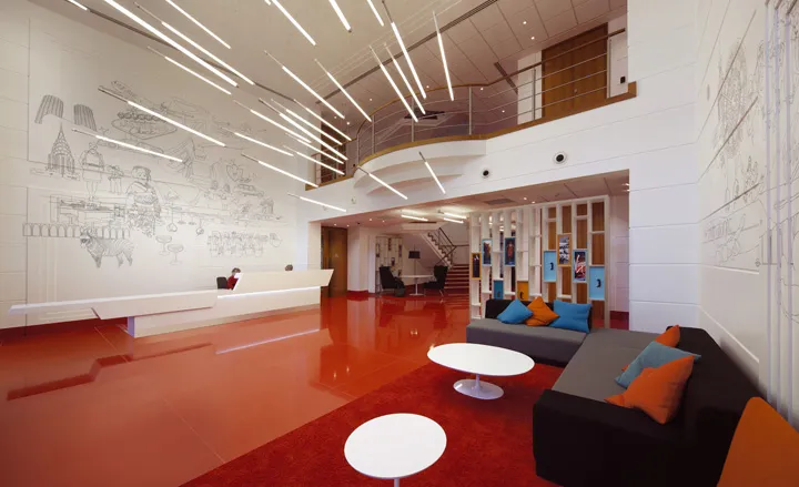
Both spaces have been administered a hefty dose of the Virgin colour palette, with a super-shiny ceramic tile floor in bright red, and a sleek white reception desk of curvy Corian. The aviation references include some fluorescent tube strip lighting, whose reflection bounces off the floor tiles, doing a convincing impersonation of an aircraft’s landing lights. Meanwhile a pigeonhole shelving unit behind the waiting area is home to a collection of suitcases lacquered in various hues.
The designers have made good use of the double-height space, by commissioning one of their own, Joe Keating, to pen some Sergeant Pepper-like illustrations. They’re a jolly melange of the airline’s destinations, a few key Virgin characters, and some images of Britain. So Richard Branson himself rubs shoulders with Big Ben, a Japanese festival and a cup of tea.
The illustrations are applied in vinyl – the same stuff that’s used for the aircrafts’ wing graphics. But here’s the clever bit: the pictures appear in gold in the north reception and in silver in the south. And that’s not the only way to tell the two spaces apart. The north’s seating comes in purple, gold and maroon, while visitors to the southern entrance can enjoy orange, green and turquoise furniture – all courtesy of Modus. It just shows what can be done when the right mix of theming and fun are applied to a space.

Both identical spaces have been administered a hefty dose of the Virgin colour palette, with a super-shiny ceramic tile floor in bright red, and a sleek white Corian reception desk

The aviation references include some fluorescent tube strip lighting, whose reflection bounces off the floor tiles, doing a convincing impersonation of an aircraft’s landing lights

A pigeonhole shelving unit behind the waiting area is home to a collection of suitcases lacquered in various hues

The designers commissioned one of their own, Joe Keating, to pen some Sergeant Pepper-like illustrations for the walls

They’re a jolly melange of the airline’s destinations, a few key Virgin characters, and some images of Britain. So Richard Branson himself rubs shoulders with Big Ben, a Japanese festival and a cup of tea

The illustrations are applied in vinyl – the same stuff that’s used for the aircrafts’ wing graphics - and appear in gold in the north reception and in silver in the south