Bright side: Prismologie applies ’colour psychology’ to skincare
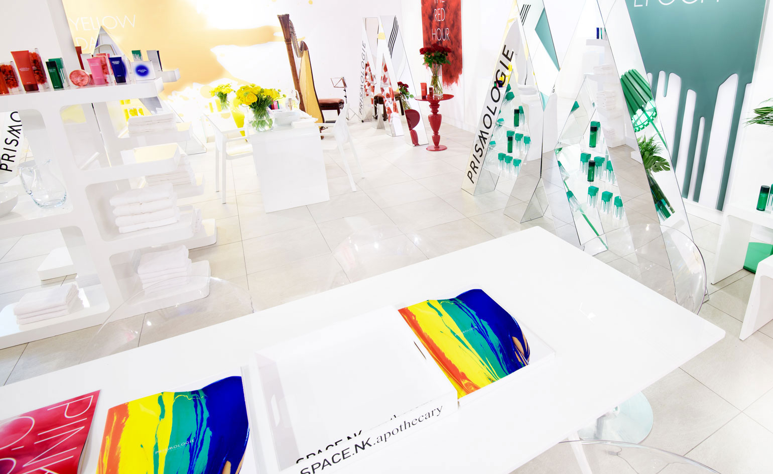
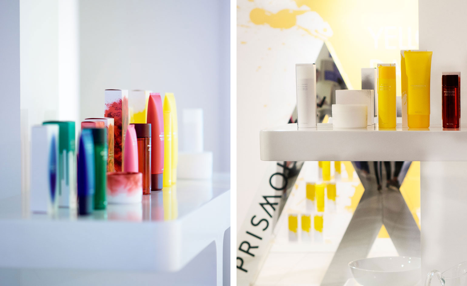
Vibrant new body and bath brand Prismologie embrace an ethos drenched in colour. Their range is divided into collections where ingredients are chosen for their shade as well as their skincare properties.

Receive our daily digest of inspiration, escapism and design stories from around the world direct to your inbox.
You are now subscribed
Your newsletter sign-up was successful
Want to add more newsletters?
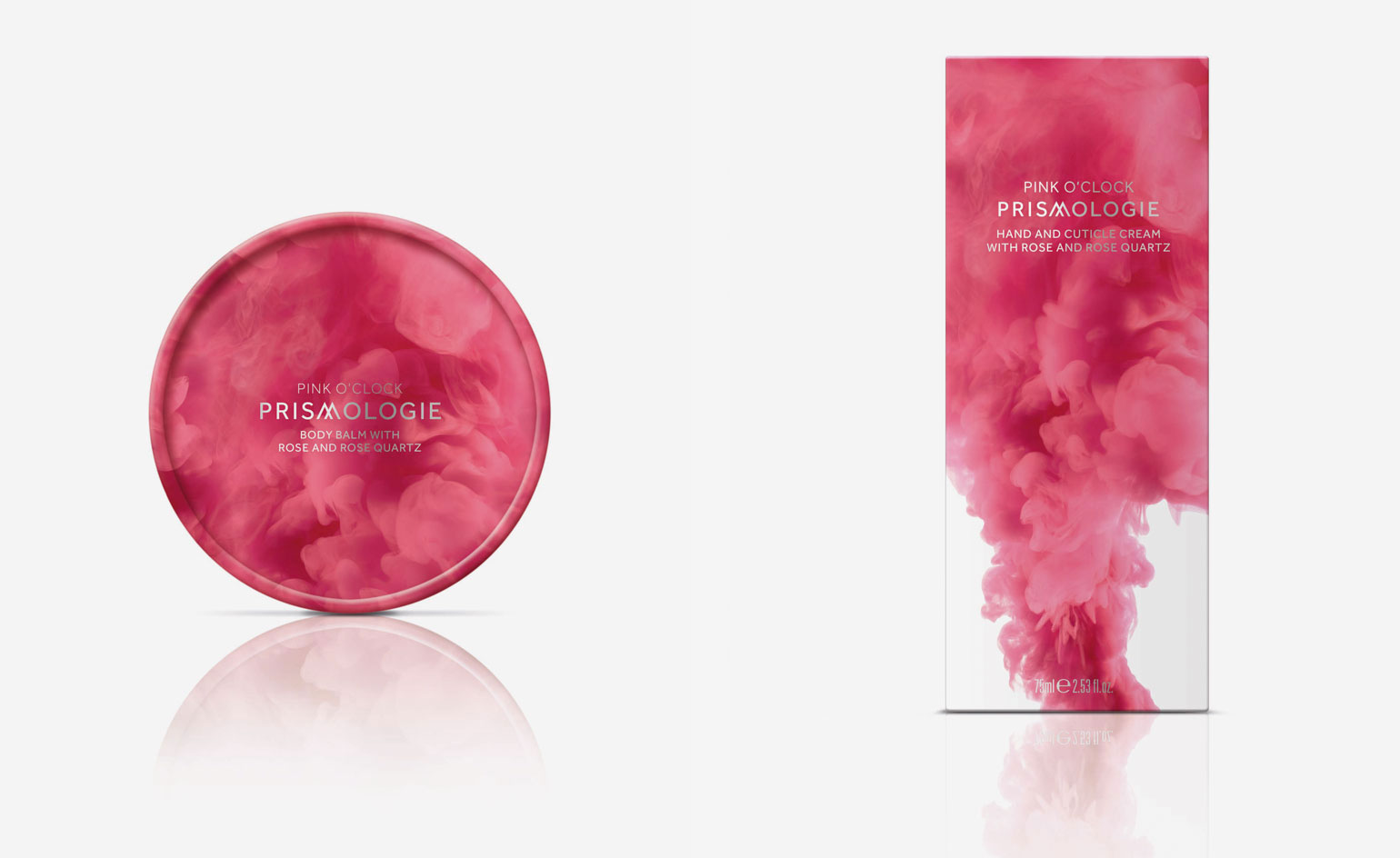
Vibrant new body and bath brand Prismologie embrace an ethos drenched in colour. Their range is divided into collections where ingredients are chosen for their shade as well as their skincare properties. Floral rose is combined with rose quartz micro-crystals for the 'Pink O'Clock' range; while cedarwood and ruby make up the 'red' in 'The Red Hour'. Aromatics and gemstones, such as the diamond micro-crystals in 'White Beginning', are utilised as mood enhancers – fleshing out the notion of an active 'colour psychology'.
Prismologie heralds the emotive power of colour, and the restorative effect that choosing a colourful product may have – be it optimism, courage or just a pervading sense of brightness.
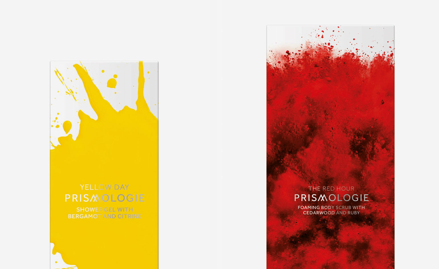
The most striking element of the product, though, is its packaging. The simple white boxes are embellished with splatters of creamy yellow, clouds of pink and detailed powder shots. The design emphasises Prismologie's mantra: that you can wear colour, without being seen to wear colour.

Each collection in the Prismologie range is based on ingredients in that colour. The natural pigmentation of these colours work together to promote subliminal emotional change

The brand prides itself on colour, but also its natural ingredients – no GMs, parabens or SLS are used

The 'Pink O'Clock' collection utilises floral rose and rose quartz micro-crystals

Yellow Day' is citrusy with a bergamot fragrance and botanical oils; 'The Red Hour' uses cedarwood and ruby
INFORMATION
For more information visit Space NK, where the collection is stocked
Receive our daily digest of inspiration, escapism and design stories from around the world direct to your inbox.