Screen stars: the best Oscar-winning film posters of all time

In anticipation of this year’s Academy Awards we’ve taken a look back at the film posters promoting each winner of the Best Picture category in the award’s 90-year history. Typography lovers, graphics geeks and film fans, here’s our round up of the best-designed artworks from the Saul Bass-inspired West Side Story to the photomontage style of Moonlight.
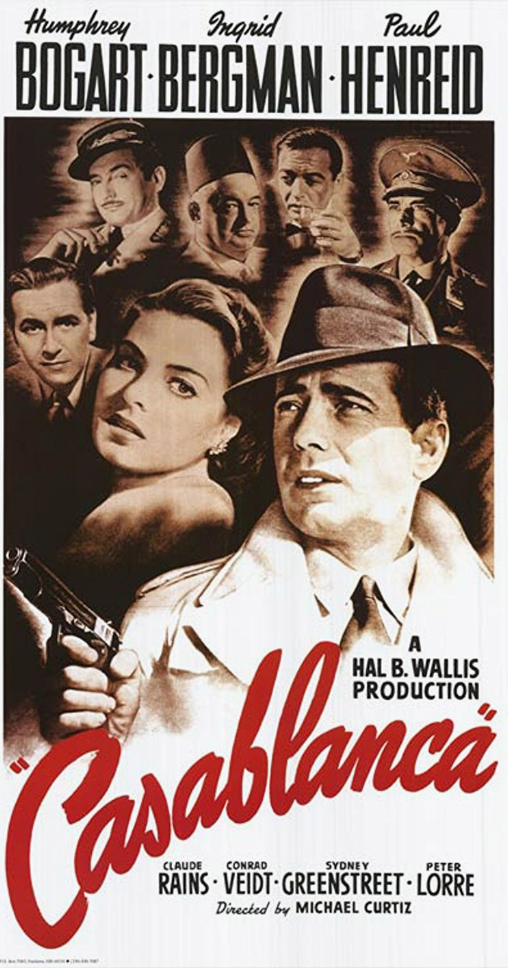
Casablanca, 1943
Directed by Michael Curtiz, Casablanca was famously just another production-line studio quickie before it struck box office gold and became an immortal, much-quoted romantic classic. Likewise 21-year-old New Yorker Bill Gold was just another in-house illustrator at Warner Brothers when he drafted the film’s poster, a superbly detailed character montage enlived by the exuberant curve of the hand-lettered title, adding an eye-catching splash of colour to help sell a monochrome film. Gold went on to enjoy a prolific seven-decade career designing all-time classic posters for the likes of Hitchcock, Kubrick, Ridley Scott and Clint Eastwood.
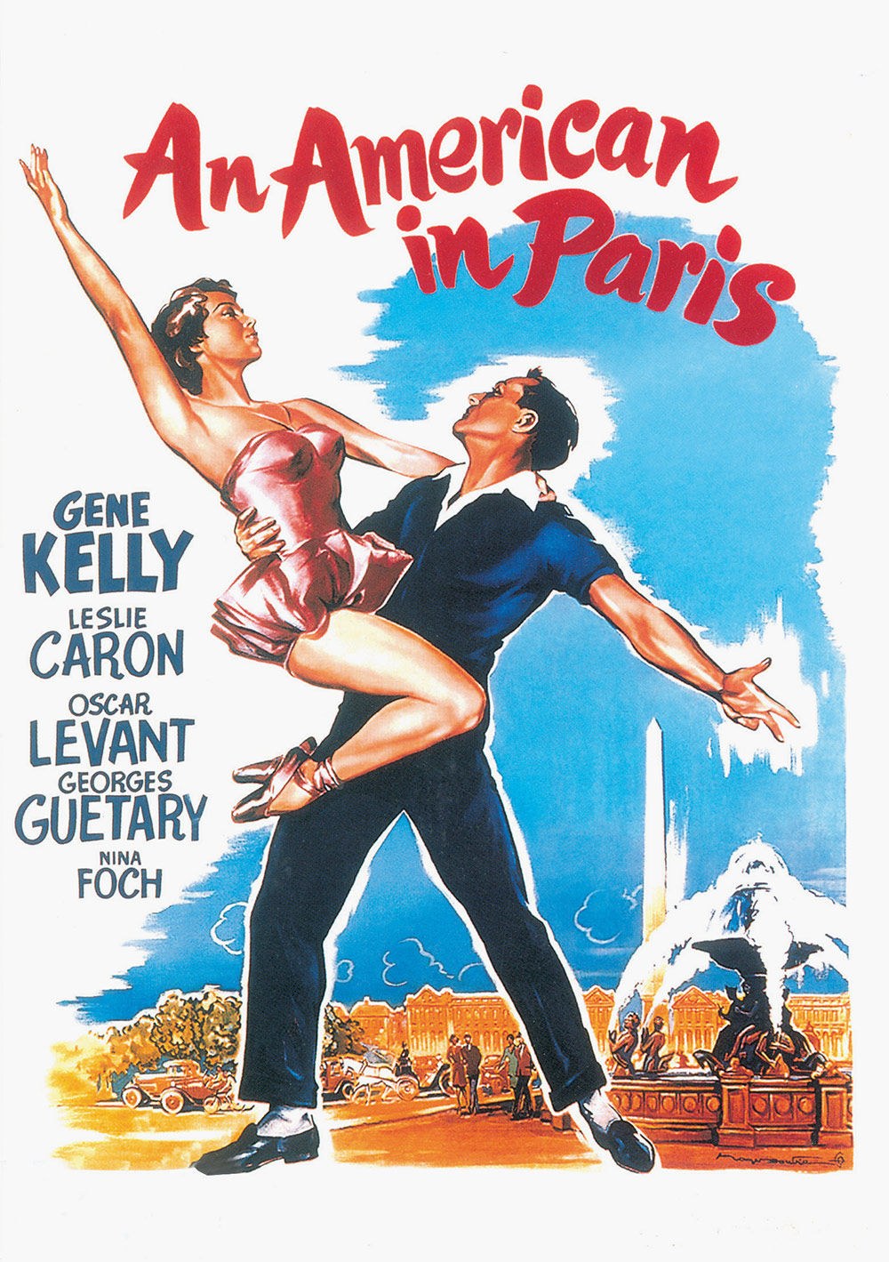
An American in Paris, 1951
On the screen, director Vicente Minnelli’s phenomenally successful six-time Oscar-winner is a triumph of splashy design with a knowingly retro artisan aesthetic throughout. The Hollywood-based sets conjure up a fantasy Paris modelled on paintings by Renoir, Van Gogh, Toulouse-Lautrec, Rousseau and others. Dating from an age when a single in-house illustrator would create an entire poster, this painted image conveys the vivacious energy of the film’s song-and-dance numbers with its hand-made lettering, vivid colour palette and kinetic composition. It still feels fresh today.
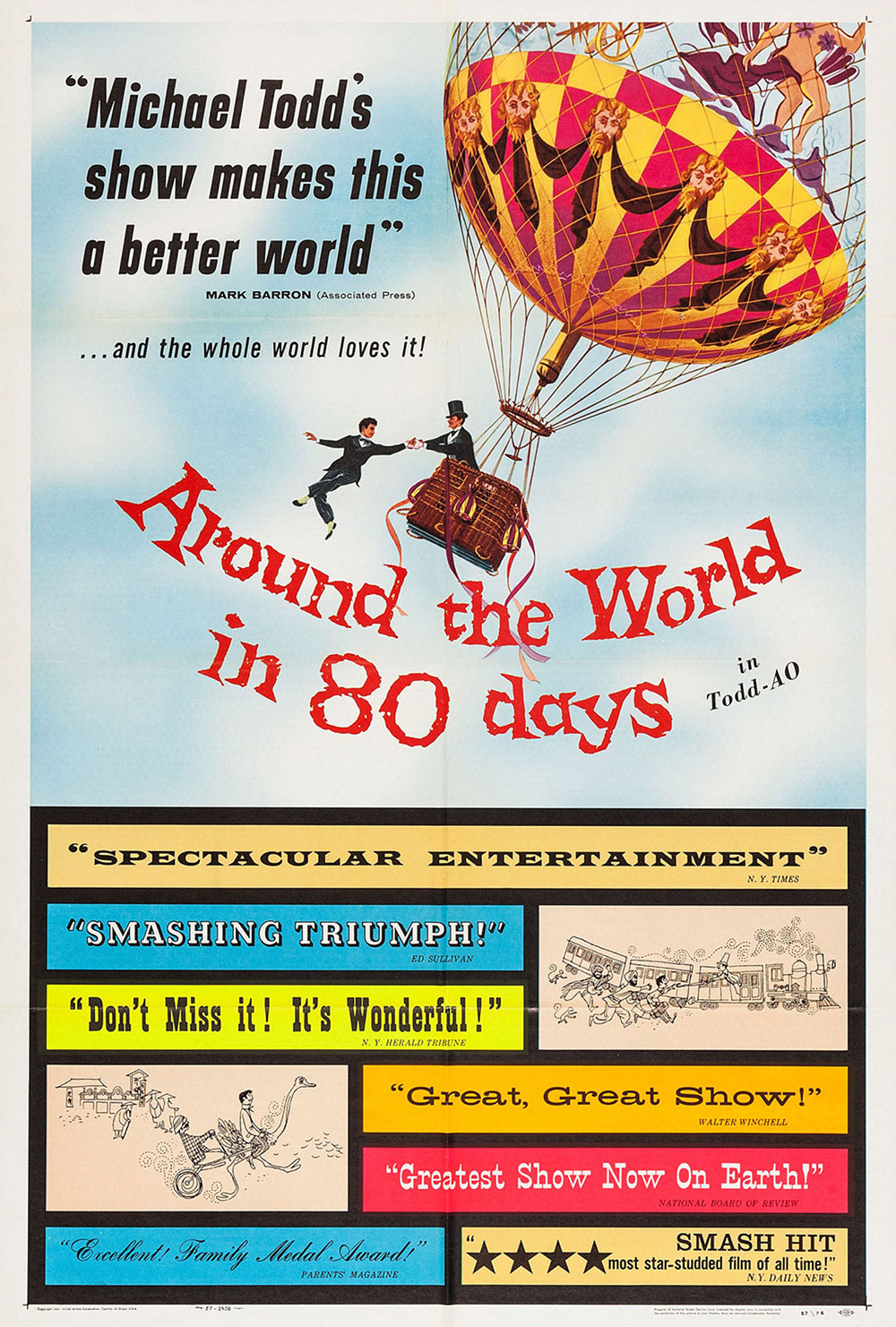
Around the World in 80 Days, 1956
Based on the classic Jules Verne adventure yarn, director Michael Anderson’s all-star Technicolor travelogue fills three hours with its globe-trotting picaresque capers. This playful illustrated poster breaks the ‘show don’t tell’ rule with its noisy cacophony of quotes, all jumbled together in a carnivalesque collage of vernacular Victorian and Edwardian decorative styles. It looks slapdash and cluttered through modern eyes, but it does at least convey some of the film’s kaleidoscopic, anarchic energy.
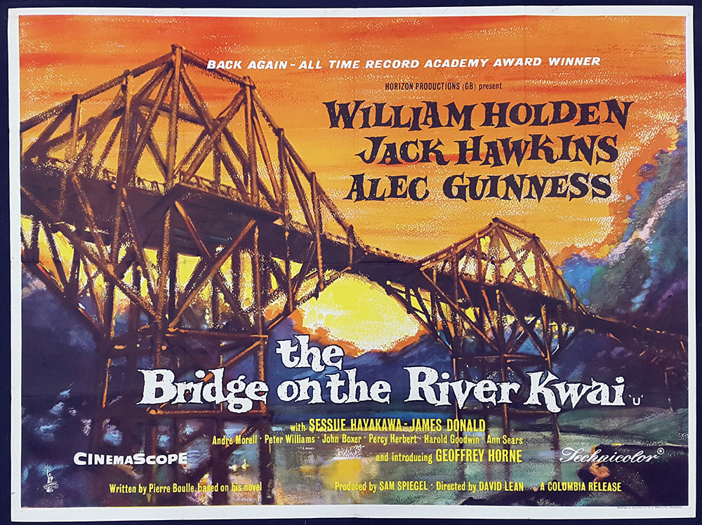
The Bridge on the River Kwai, 1957
Director David Lean’s action-heavy wartime epic won seven Oscars, but the original poster graphic tells us little about what to expect from the film. A vivid painted sunset framed with lively lettering, this handsome tableaux could just as easily be advertising a western or a tourist travelogue. Later post-Oscar variants added a more explanatory narrative image of co-star William Holden carrying a machine gun.
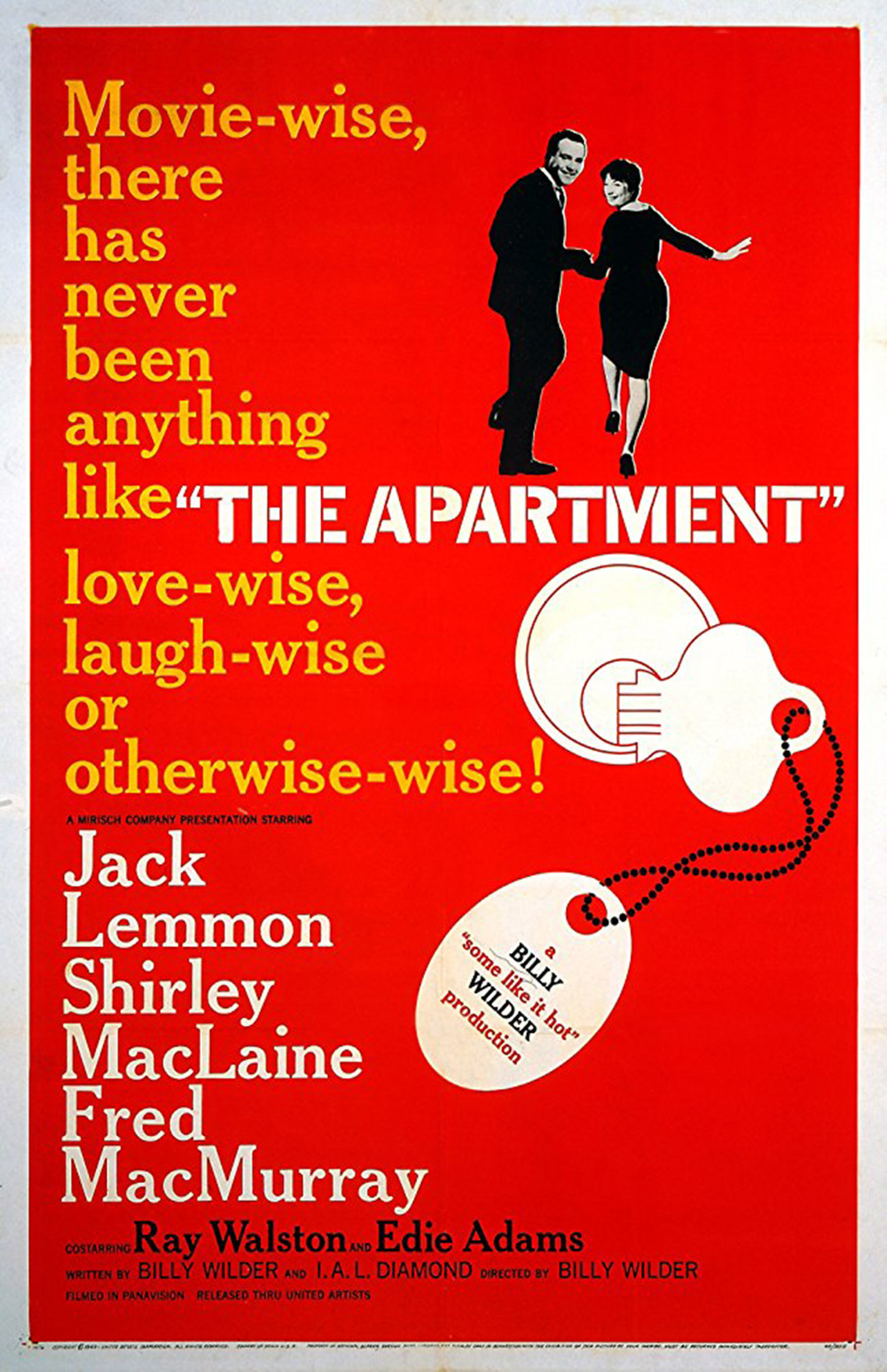
The Apartment, 1960
Emigré director Billy Wilder was a comic genius with a sharp outsider’s eye for the everyday sexual hypocrisy of American life, but his urbane European frankness was not always a gift to studio marketing bosses. Coy and unrevealing, this poster for Wilder’s fast-paced adultery drama relies too heavily on clumsily worded innuendo and a cheap-looking key-fob graphic to sell its slightly risqué story. The stencil title block in Cheltenham font tells us very little too. An oddly uninspired image that surrenders to conservative social mores instead of subverting them.
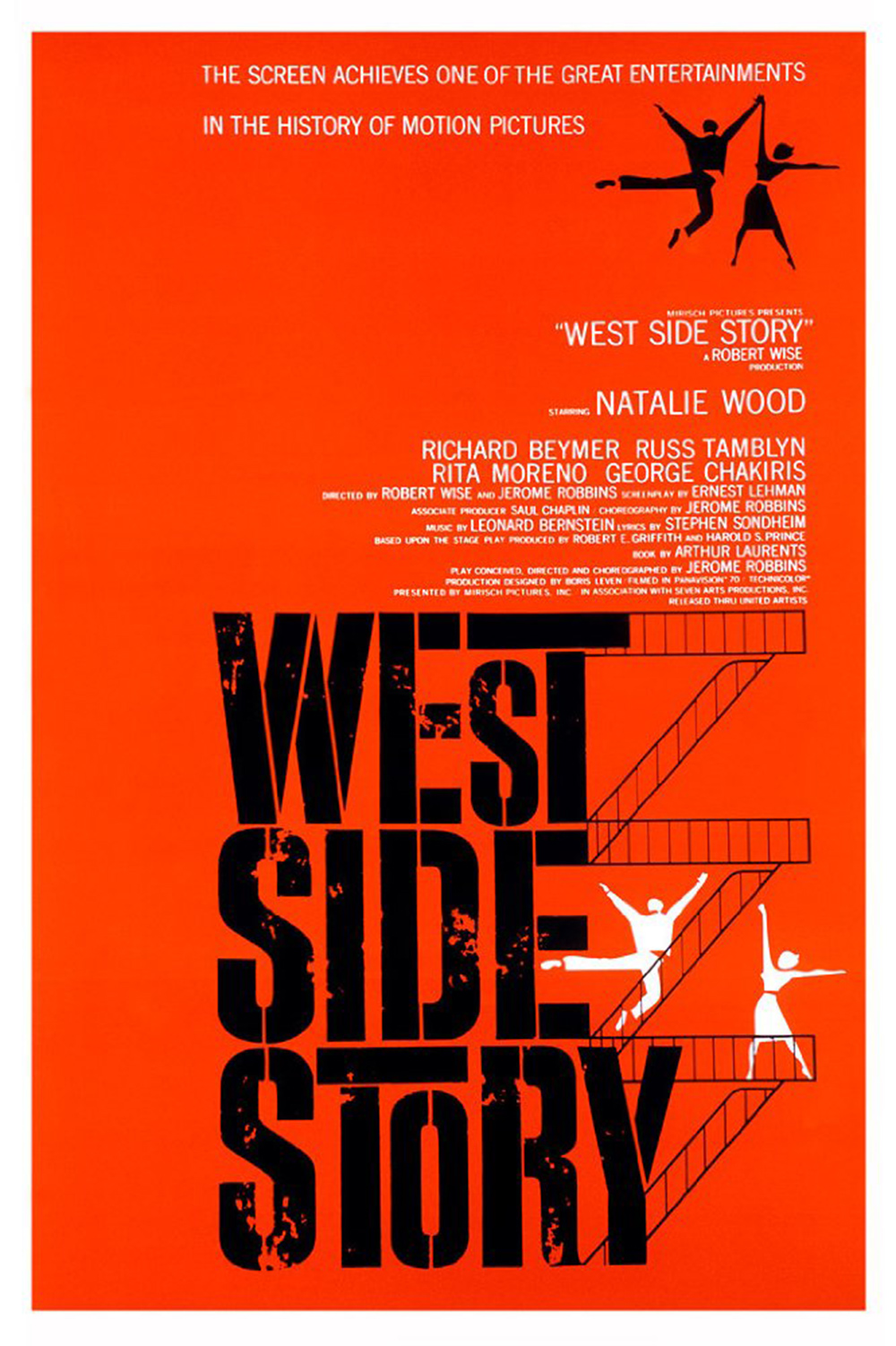
West Side Story, 1961
Feted for his work with Hitchcock and Scorsese, Saul Bass is the most revered designer of posters and title sequences in cinema history. Although Bass was closely involved with the look of Robert Wise’s multiple Oscar-winning musical West Side Story, he did not design this poster, but it is firmly rooted in his signature style with its artfully simple two-colour scheme, deliberately distressed stencil typeface and characters flattened into repeated graphic motifs. This all-time classic design has been variously credited to the equally legendary Bob Peak and to Joe Caroff, who went on to create the 007 logo.
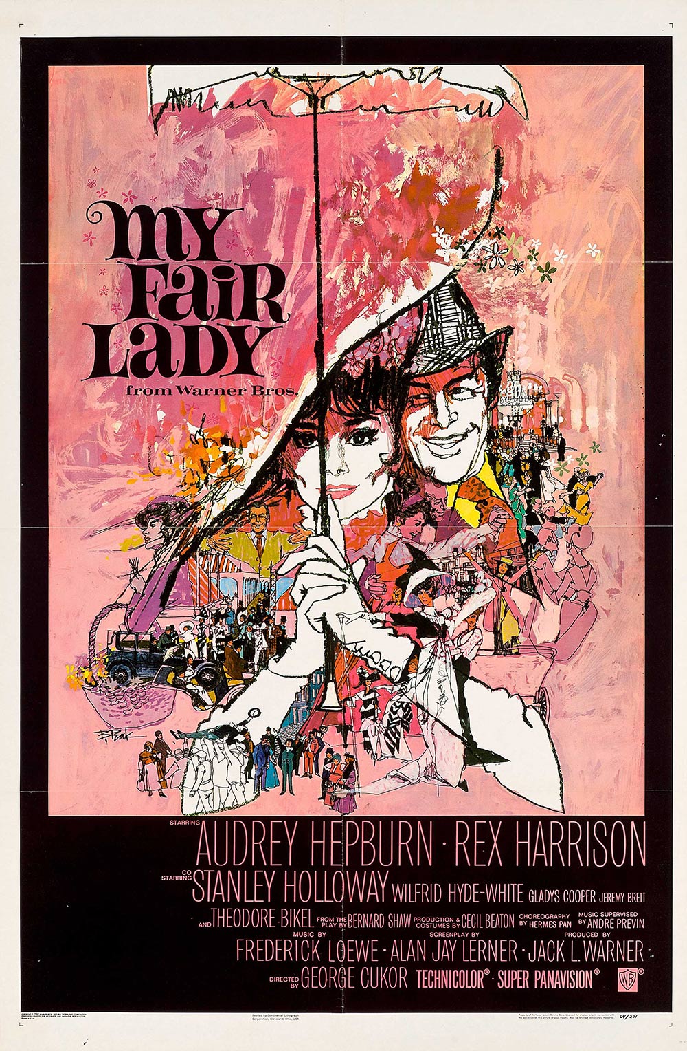
My Fair Lady, 1964
Audrey Hepburn’s vowel-mangling role as cockney flower-seller Eliza Doolittle forms the focus of Bob Peak’s gorgeous pictorial summary of George Cukor’s sumptuous classic musical. An illustration legend known for his block colours and ‘bleeding’ style, Peak worked in tandem with similarly renowned designer Bill Gold on this image, which beautifully integrates custom-font titles into a pastel paint backdrop. Moving commercial illustration forward from the Saul Bass school of semi-abstract graphic minimalism, Peak later created dozens of iconic film posters including Camelot, Apocalypse Now, The Spy Who Loved Me, Superman and the early Star Trek movies.
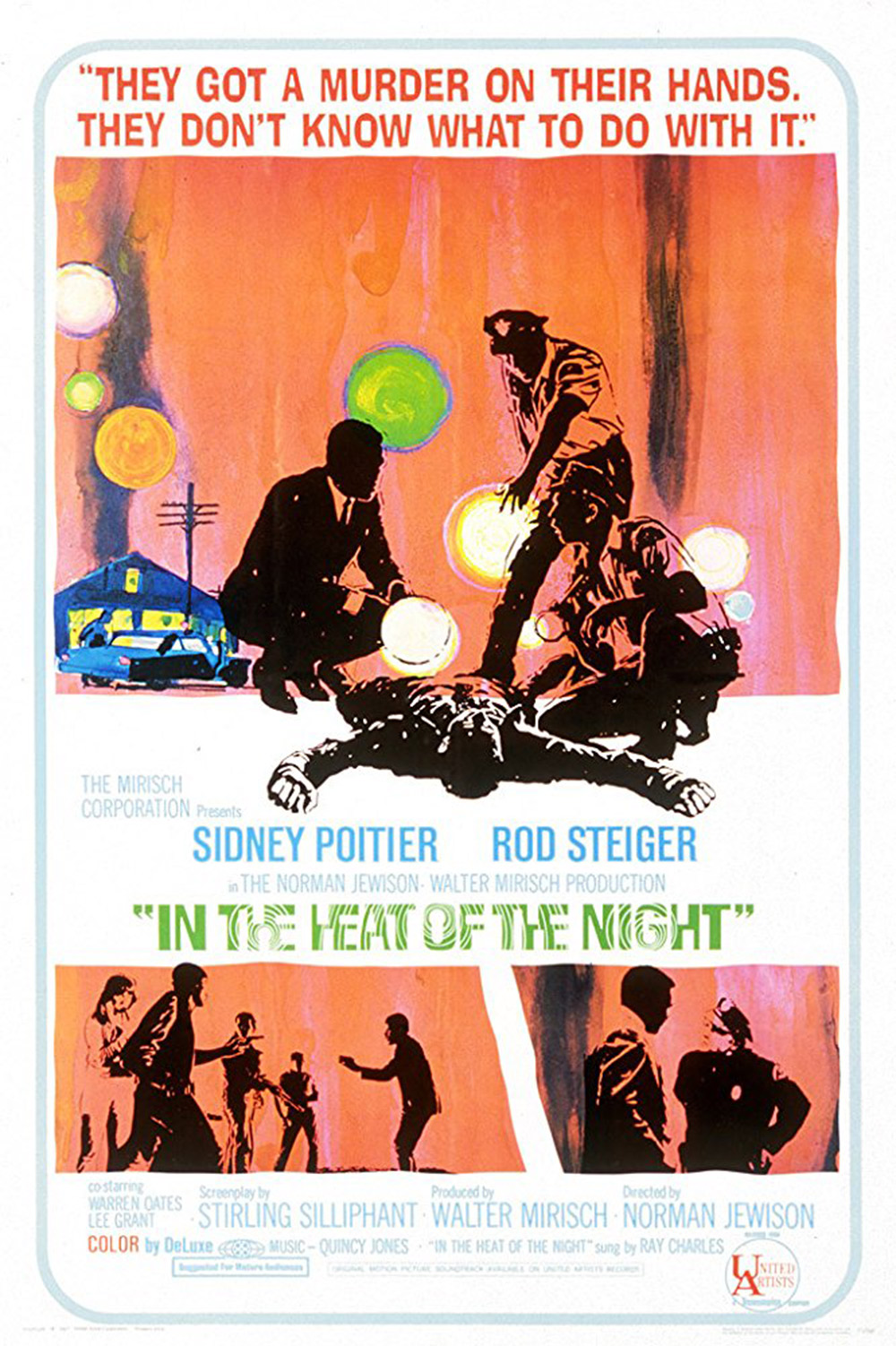
In the Heat of the Night, 1967
The jazzy hipster-friendly poster for director Norman Jewison’s racially charged Deep South murder thriller features a blazing triptych of panels with the stylised comic-book look of Pop Art and the lurid psychedelic palette of an acid-rock album sleeve. The use of semi-abstract silhouettes may have been a subtle attempt to disguise Sidney Poitier’s blackness, a shameful but common studio anxiety during the Civil Rights era and before. When United Artists initially proposed using a naked female body as the main poster image, Jewison protested ‘the film deserves a little better than this’. Correct.
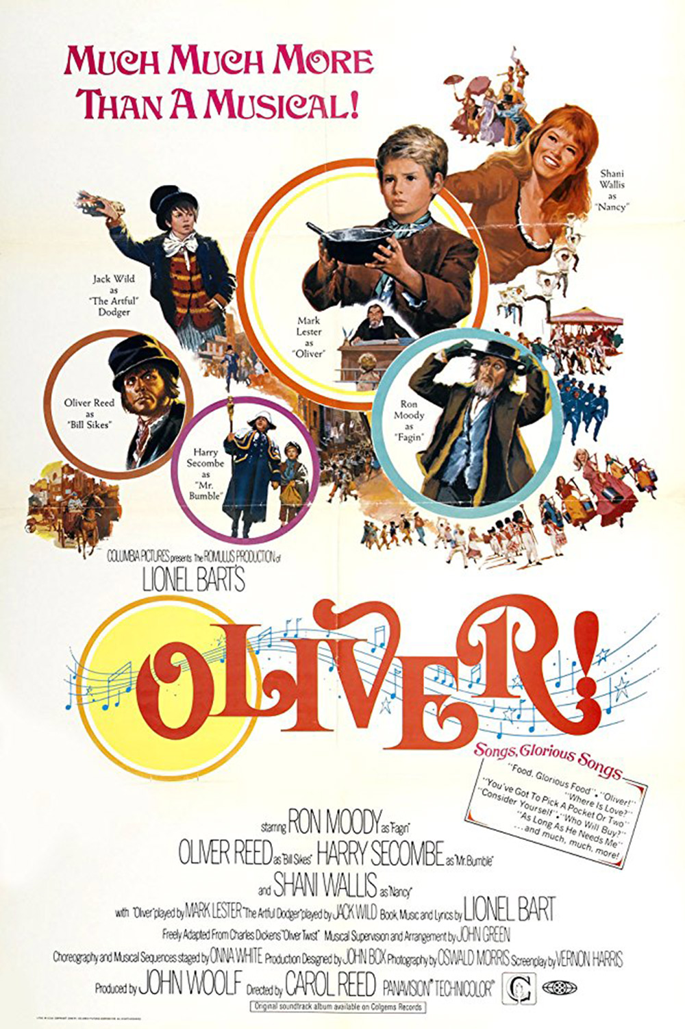
Oliver!, 1968
They liked it so much they put a ring on it. Several rings in fact. The poster for director Carol Reed’s sing-along screen adaptation of Lionel Bart’s hit Dickensian musical is a bubbly, bouncy, busy affair that taps into a late 1960s revivalist boom in Victoriana and Edwardiana. That overly literal musical notation graphic and hand-lettered tagline are unusually heavy-handed touches from Chicago-born illustrator Howard Terpning, an ex-Marine whose other poster credits include Cleopatra, The Sound of Music, Doctor Zhivago and Lawrence of Arabia.
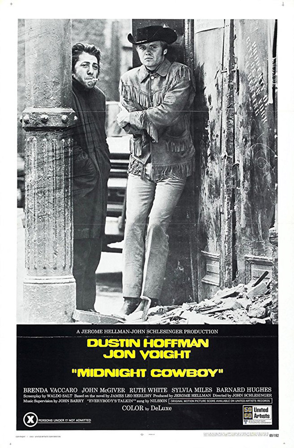
Midnight Cowboy, 1969
The first X-rated film ever to win a Best Picture Oscar, director John Schlesinger’s sleazy New York classic was also one of the first to bring openly gay themes into the mainstream. The stark, grungy, monochrome shot of Jon Voight and Dustin Hoffman, together with that acid-hued sans-serif custom typeface, are squarely pitched at the post-hippie counterculture crowd. This could almost be an album cover, which it effectively become anyway, serving as a sleeve image to John Barry’s magnificent collective soundtrack.
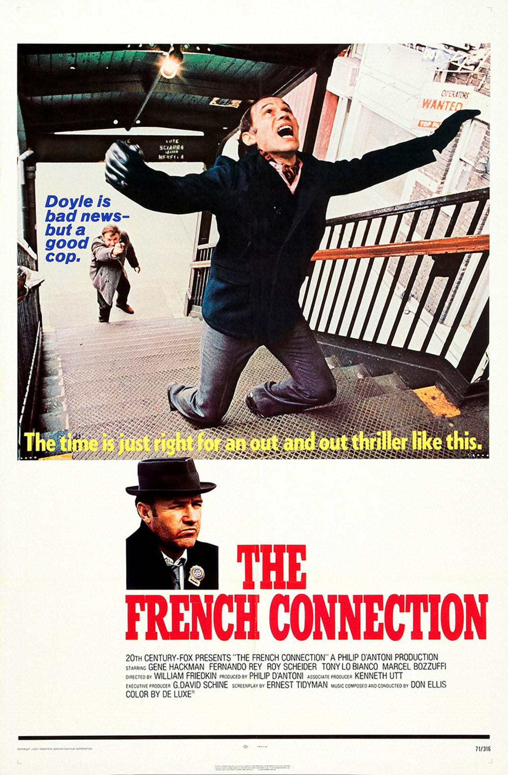
The French Connection, 1971
William Friedkin’s gritty urban crime thriller was feted for its kinetic, hard-knuckled realism, which may explain why this poster feels so brusque and unruly. Colour photo reproduction had improved enough by the late 1960s that movie stills were increasingly replacing paintings and illustrations. But that clumsy cut-out of Gene Hackman, and that jarringly asymmetrical lay-out, have not aged gracefully. It is also highly unlikely any modern police thriller would choose an image of its hero shooting a suspect in the back as a key selling point. At least the chunky titles in compressed block-serif lend this ungainly montage some pulpy tension.
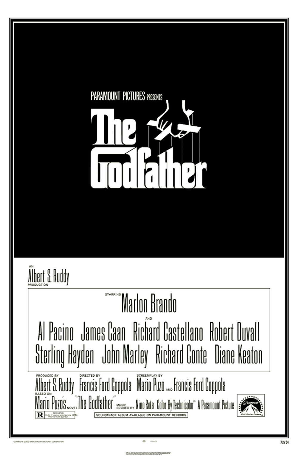
The Godfather, 1972
Director Francis Ford Coppola’s operatic gangster saga borrows its iconic puppeteer logo from author Mario Puzo’s original book cover, which was created by the legendary Japanese-American graphic designer S. Neil Fujita. The custom-designed, condensed, tightly spaced, mono-weight serif typeface forms a pure typographical ‘word picture’ that became a brilliantly simple exercise in franchise branding. Several later variants incorporated the film’s co-star Marlon Brando into the tableau.
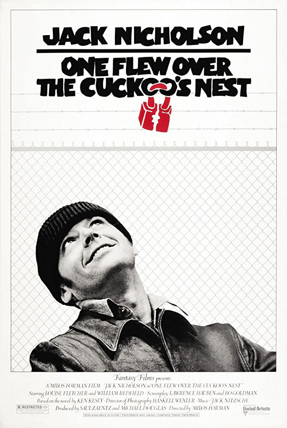
One Flew Over the Cuckoo’s Nest, 1975
Jack Nicholson’s combustible charisma is the driving force behind Milos Forman’s psych-ward drama, which became only the second film ever to win all five major Academy Awards: best picture, director, actor, actress and screenplay. A still of Nicholson’s anti-heroic character Randle McMurphy naturally dominates this stark poster, his cocked head and sly grin symbolising the theme of escape from prisons both mental and physical, hence the slightly cheap-looking wire fence graphic and metaphorical padlock added above. A simple image which conveys the spirit of the film better than the hand-lettered title.
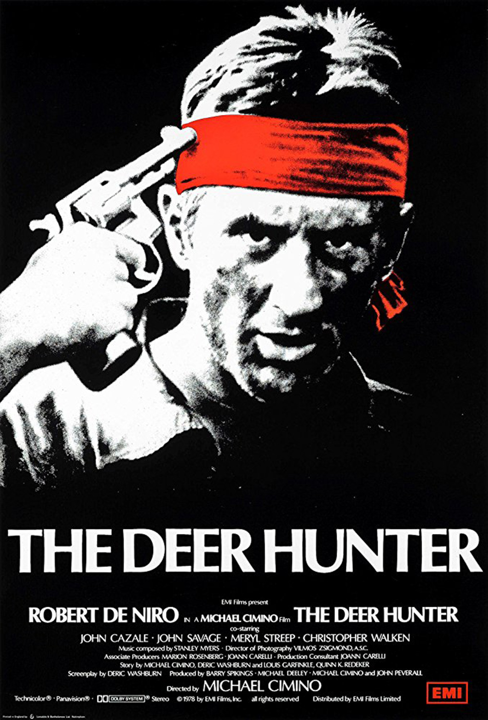
The Deer Hunter, 1978
A sprawling elegy for America’s fallen in the Vietnam war, director Michael Cimino’s epic tear-jerker is a far more lyrical prospect than this attention-grabbing posterised still of its co-star Robert De Niro might suggest. The contrast-boosted image and chunky capitalised Optima titles are not very sophisticated, but they get to the point quickly, selling an anguished art-house drama more like a testosterone-heavy action movie.
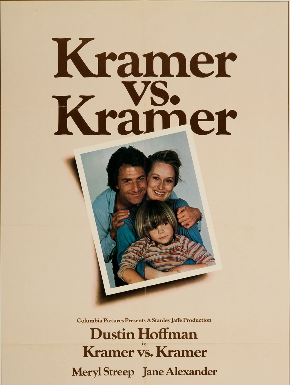
Kramer vs. Kramer, 1979
It is clear from this poster that director Robert Benton’s somber divorce drama took itself very seriously indeed back in the late 1970s, but this promotional image of co-stars Dustin Hoffman and Meryl Streep now feels stuffy and dated. The ironic smiles of the happy family snapshot, slightly subverted by the scowling child and the off-kilter angle, and the tastefully beige backdrop all draw on the mundane print advertising cliches of the period. The credits are typeset in Goudy, a vintage American font associated with the upmarket magazine Harper's, striking the right tone for this soapy middlebrow sobfest.
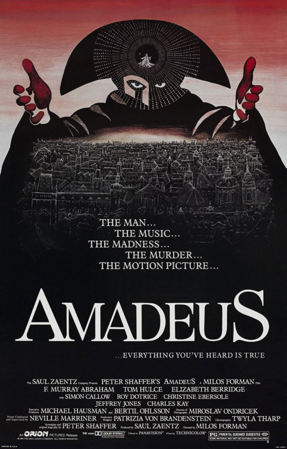
Amadeus, 1984
An appropriately classic composition for a film about classical composers, this eye-catching graphic is a fine example of old-school illustration skills standing out in an era when photography had begun to dominate film poster design. Director Milos Forman enlisted award-winning cartoonist and children’s book author Peter Sis, a fellow escapee from Communist Czechoslovakia, to create a heavily stylised rendition of Mozart’s musical rival Antonio Salieri casting dark spells across the rooftops of 18th-century Vienna. The towering figure at the top of the poster is beautifully balanced by the titles below, rendered in the venerable old European font Garamond. Even before you learn any plot details, this image draws you in with its mesmerising power.
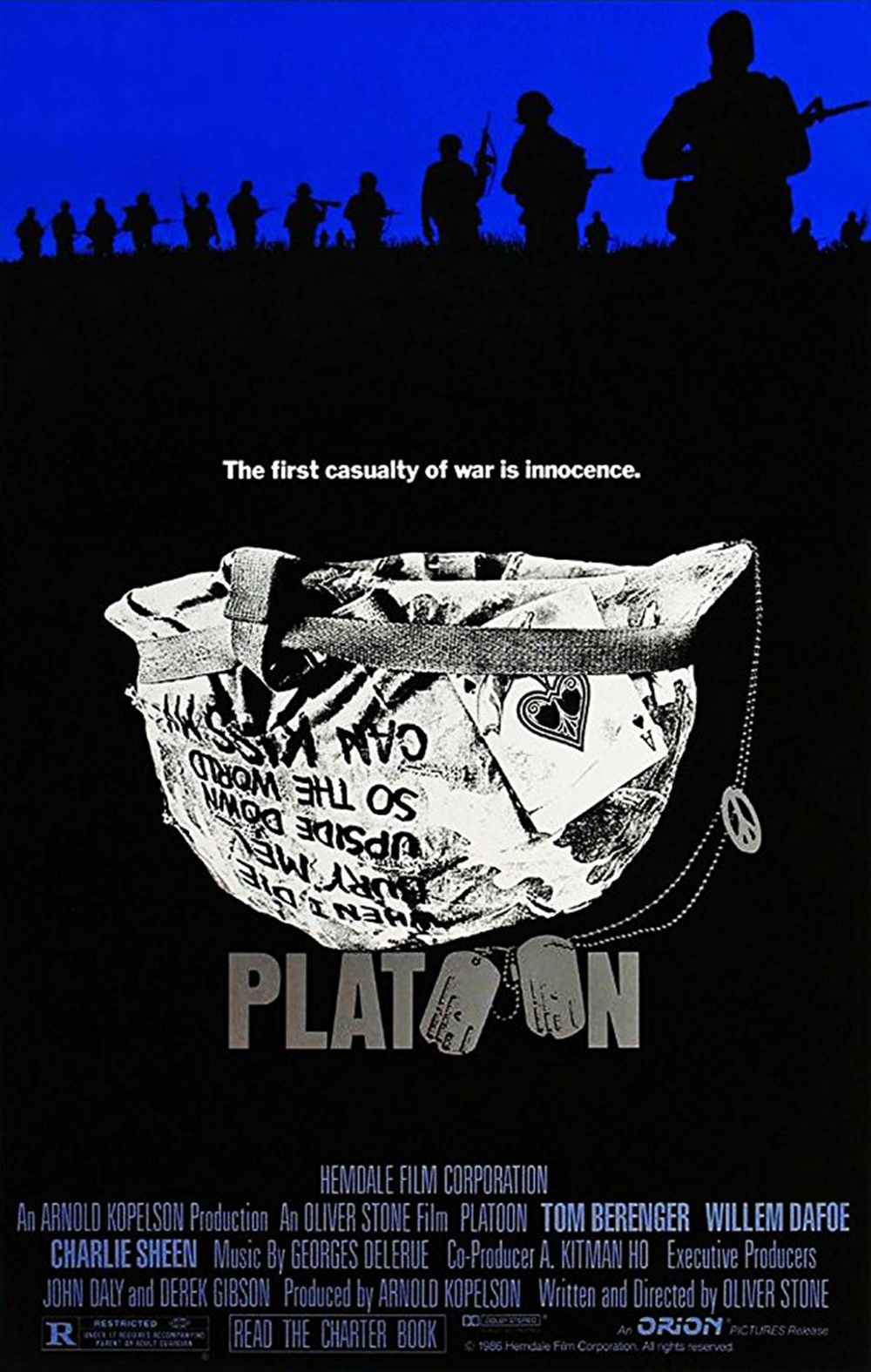
Platoon, 1986
The original theatrical poster for Oliver Stone’s semi-autobiographical Vietnam memoir is another credit for Bill Gold, the prolific designer who enjoyed a seven-decade run of Oscar-winners from Casablanca onwards. The use of military dog tags incorporated into the chunky Franklin Gothic title is very 1980s, the age of the logotype, but the upturned text-covered helmet and ironic peace symbol feel a little crowded and overly literal. Later posters replaced the helmet with Willem Dafoe’s messianic death pose from the film, a less ambivalent but more marketable image.
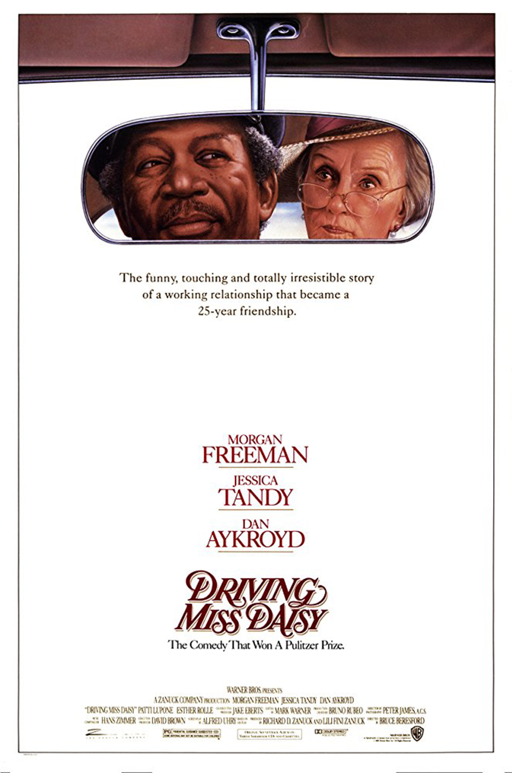
Driving Miss Daisy, 1989
Less is more in this elegant promotional poster for Bruce Beresford’s film of Alfred Uhry’s hit off-Broadway play about the changing face of racism in post-war America. Co-stars Morgan Freeman and Oscar-winner Jessica Tandy share the same rear-view mirror, a neat visual summation of both their warm friendship and close working relationship. A simple, conventional image that accurately conveys the film’s wholesome blend of old-world manners and folksy sentimentality.
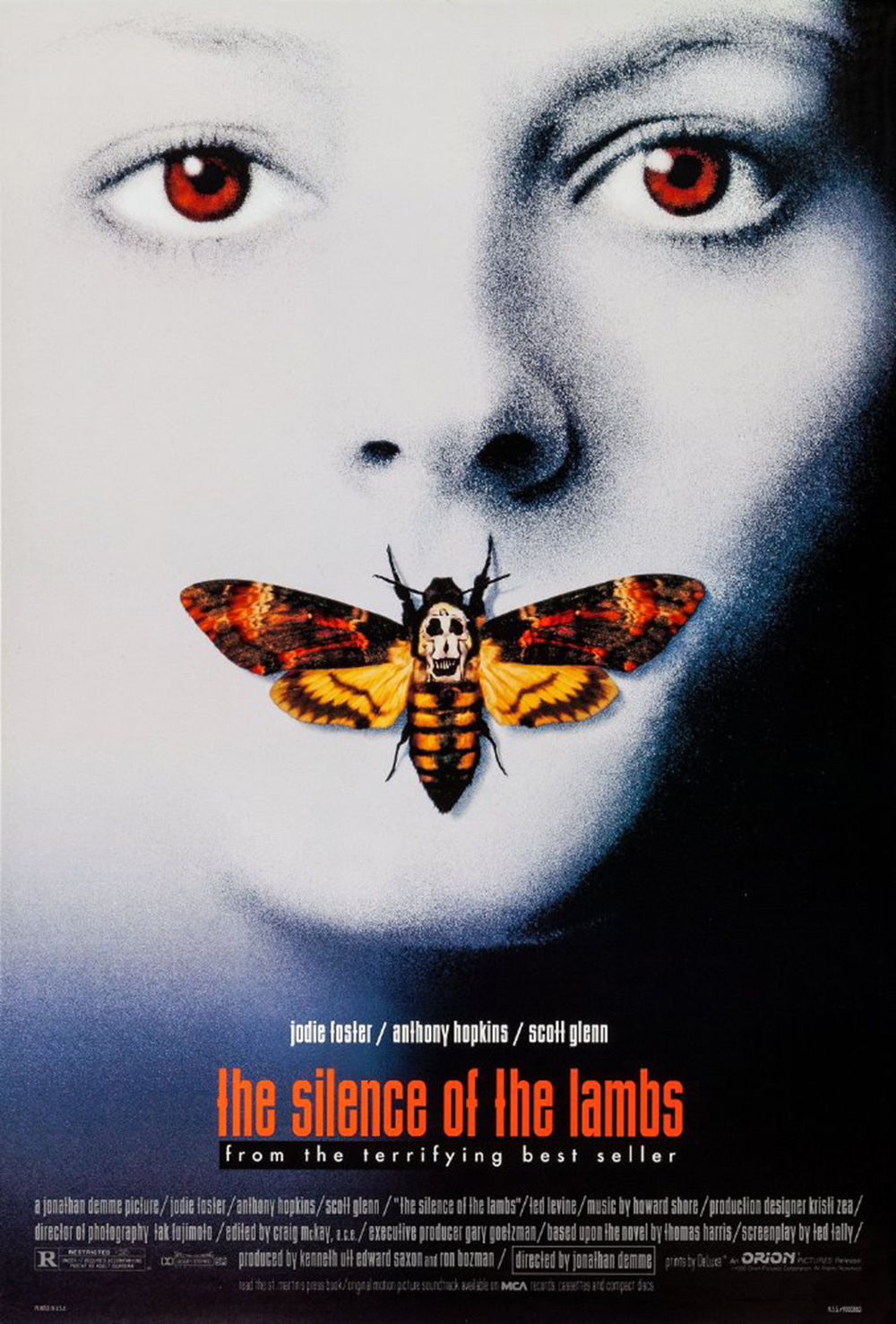
The Silence of the Lambs, 1991
Cryptic but instantly arresting, Dawn Baillie’s vivid poster collage for Jonathan Demme’s arty serial killer thriller is a design classic in its own right. It also contains an eerie ‘easter egg’ in the death’s head moth smothering Jodie Foster's mouth. The insect’s apparent skull marking is actually composed of seven naked women, mimicking Philippe Halsman’s 1951 photograph Salvador Dali In Voluptas Mors, which was itself a homage to an earlier Dali painting. Demme reportedly suggested this detail to Baillie’s agency personally. The titles are Industria, a modernist sans-serif font of 1980s vintage which also features in The X-Files credits.
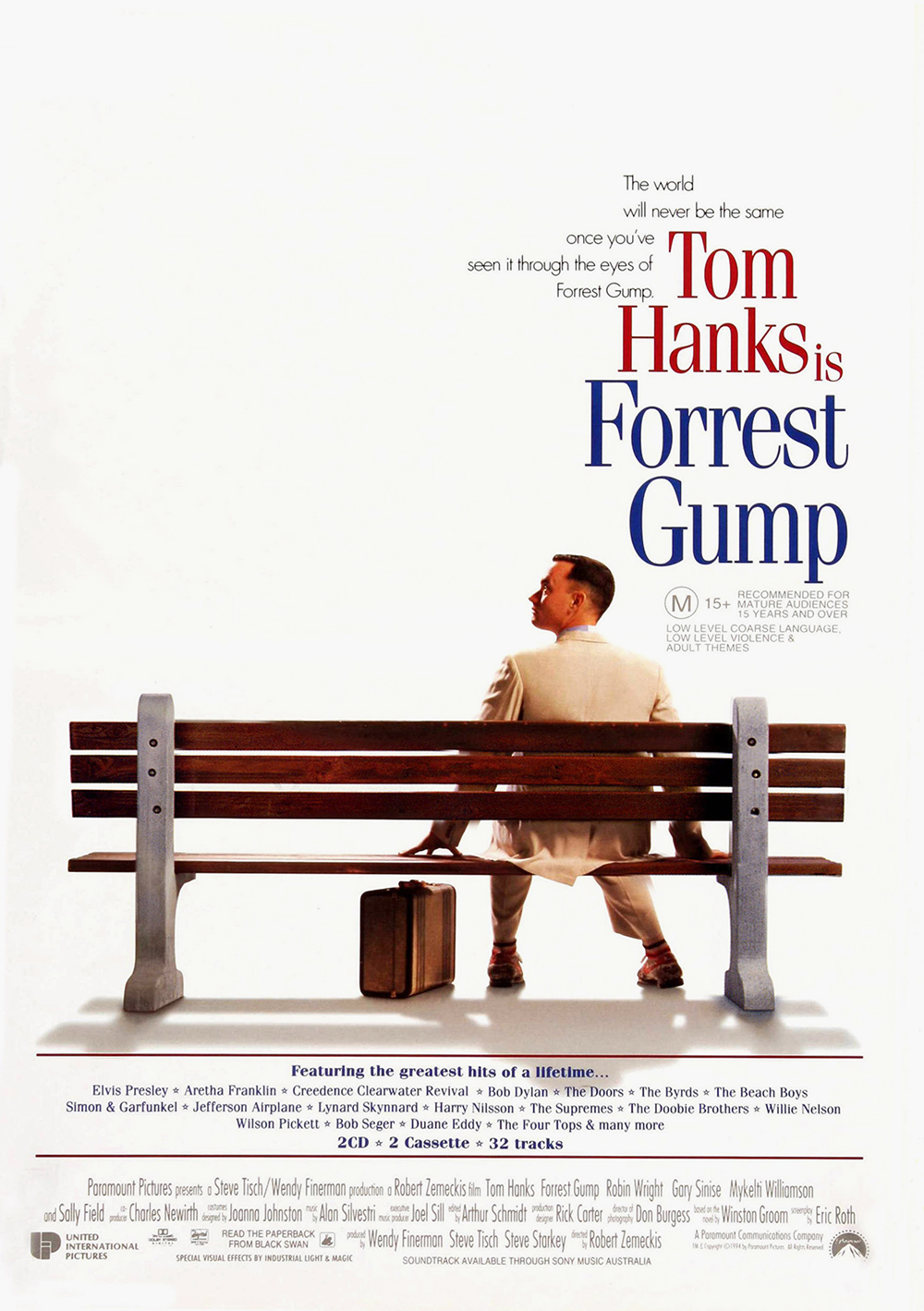
Forrest Gump, 1994
There was no chance of squeezing the overstuffed chocolate-box plot of Forrest Gump into a single poster image, so director Robert Zemeckis and his team went in the opposite direction with this playfully blank scene-setter. Meaningful emptiness, charged with anticipation and seeded with tiny clues. That off-centre rear view of star Tom Hanks and those quirky titles, in compressed Fenice font, signal an unorthodox comic adventure ahead. The red, white and blue colour scheme also strike a subtle note of flag-waving patriotism in a film that many US conservatives took to heart, despite Hanks and Zemeckis insisting the story is apolitical.
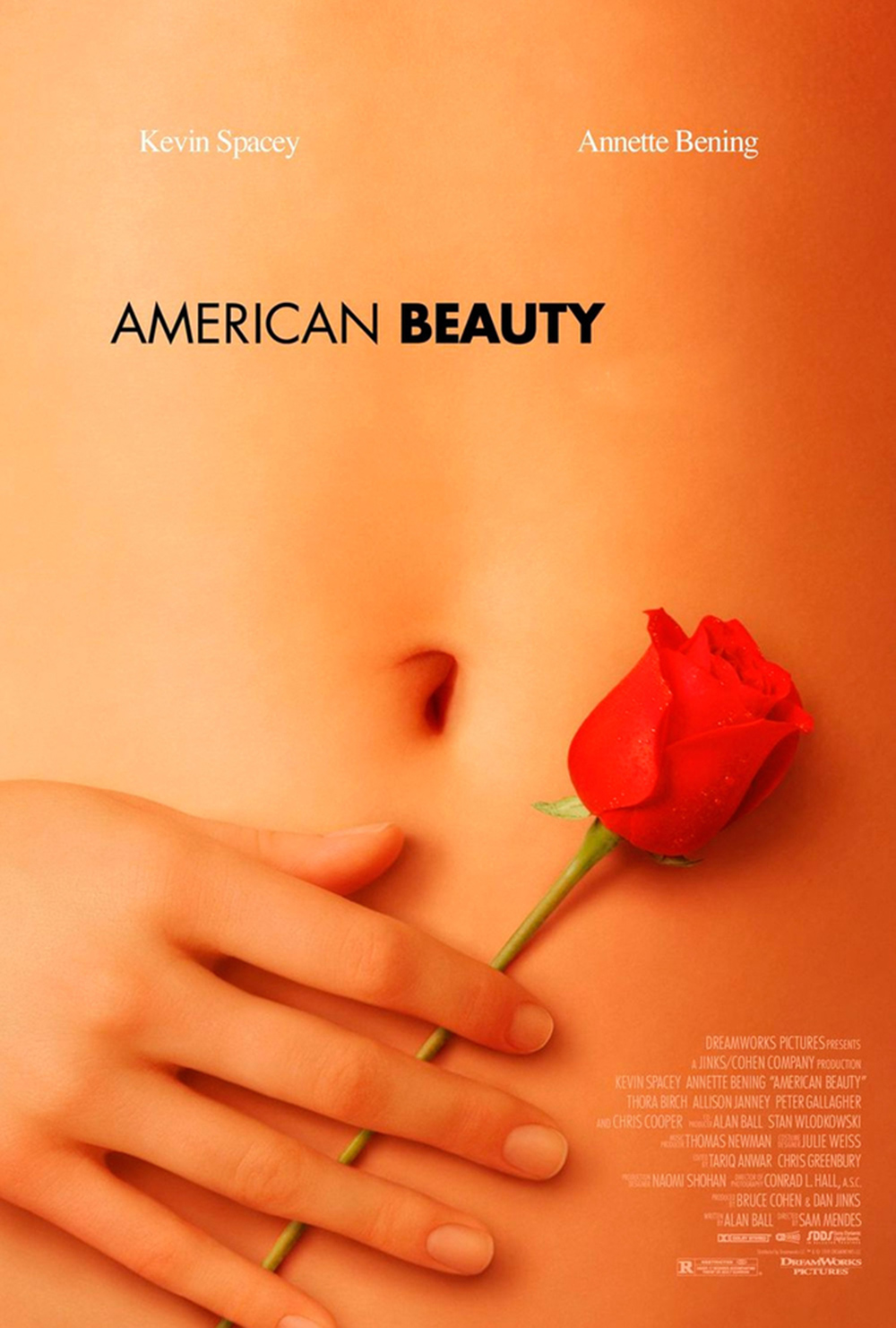
American Beauty, 1999
Seductive with a hint of creepy, this American Beauty poster by the Pulse Advertising agency subtly references the erotic rose-petal fantasy scene at the heart of director Sam Mendes’ dark comedy about sexual transgression and suburban family breakdown. The understated Futura typography and minimal tagline ‘look closer’ only deepen the sense of titillating mystery. Fun fact: that naked midriff does not belong to the film's main object of illicit desire, played by Mena Suvari, but to model-actress Chloe Hunter. Her warm skintones were possibly retouched using Photoshop, which was just becoming a standard industry tool in the late 1990s.
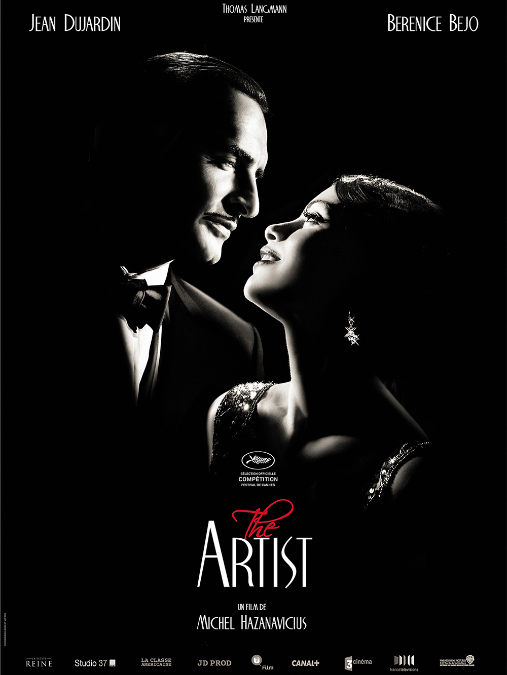
The Artist, 2011
A ravishing exercise in retro pastiche, this hit French rom-com from director Michael Hazanavicius paid witty stylistic homage to Hollywood’s silent movie era. The poster plays the same knowingly nostalgic games, framing its two stars in high-contrast chiaroscuro and swishy vintage typefaces like Onyx and Empire, invoking the art deco lettering of the 1920s and 1930s. The dainty splash of red on monochrome lends a more contemporary touch.
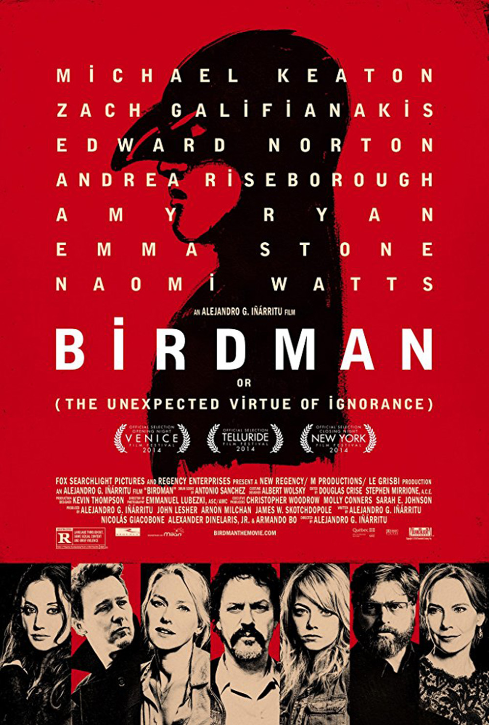
Birdman, 2014
Swept along by its ever-present jazzy score, Alejandro Iñárritu’s freewheeling backstage portrait of neurotic Broadway actors opens with a dynamic animated title sequence, the letters appearing gradually on screen in a modified upper-case version of Bell Gothic Black. The effect pays homage to cult French New Wave director Jean-Luc Godard, who used the same technique in the 1960s. This type-heavy poster uses a variation on the same graphic, relegating cast photos to secondary details below. It’s a bold piece of design signalling Iñárritu’s uncompromising auteur vision, although later promotional posters used a more conventional narrative still of the film’s headline star Michael Keaton levitating in a New York street.
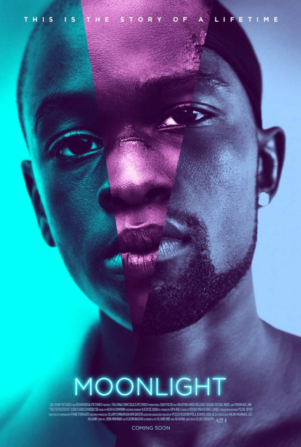
Moonlight, 2016
Based on a simple but inspired concept by Steve Reeves of Hollywood-based design agency InSync Plus, the Moonlight poster creates a single close-up photomontage head-shot from the three lead actors who play the main character at different ages. The saturated blue and purple hues invoke the ravishing visuals of Barry Jenkins’ groundbreaking exploration of gay black America while the title font is Gotham, which may have been puposely chosen for its strong association with Barack Obama’s election campaign. With its Photoshop glow and instantly recognition factor, this arresting image is tailored to a media-saturated era when thumbnail logos need to stand out across multiple digital platforms.
Receive our daily digest of inspiration, escapism and design stories from around the world direct to your inbox.