Delve into the visual world of a lost airline in this impressive chronicle of a corporate identity
'Red Square' is the story of Mary de Saulles and the 1960s BEA corporate identity, a comprehensive airline re-brand that still feels fresh today
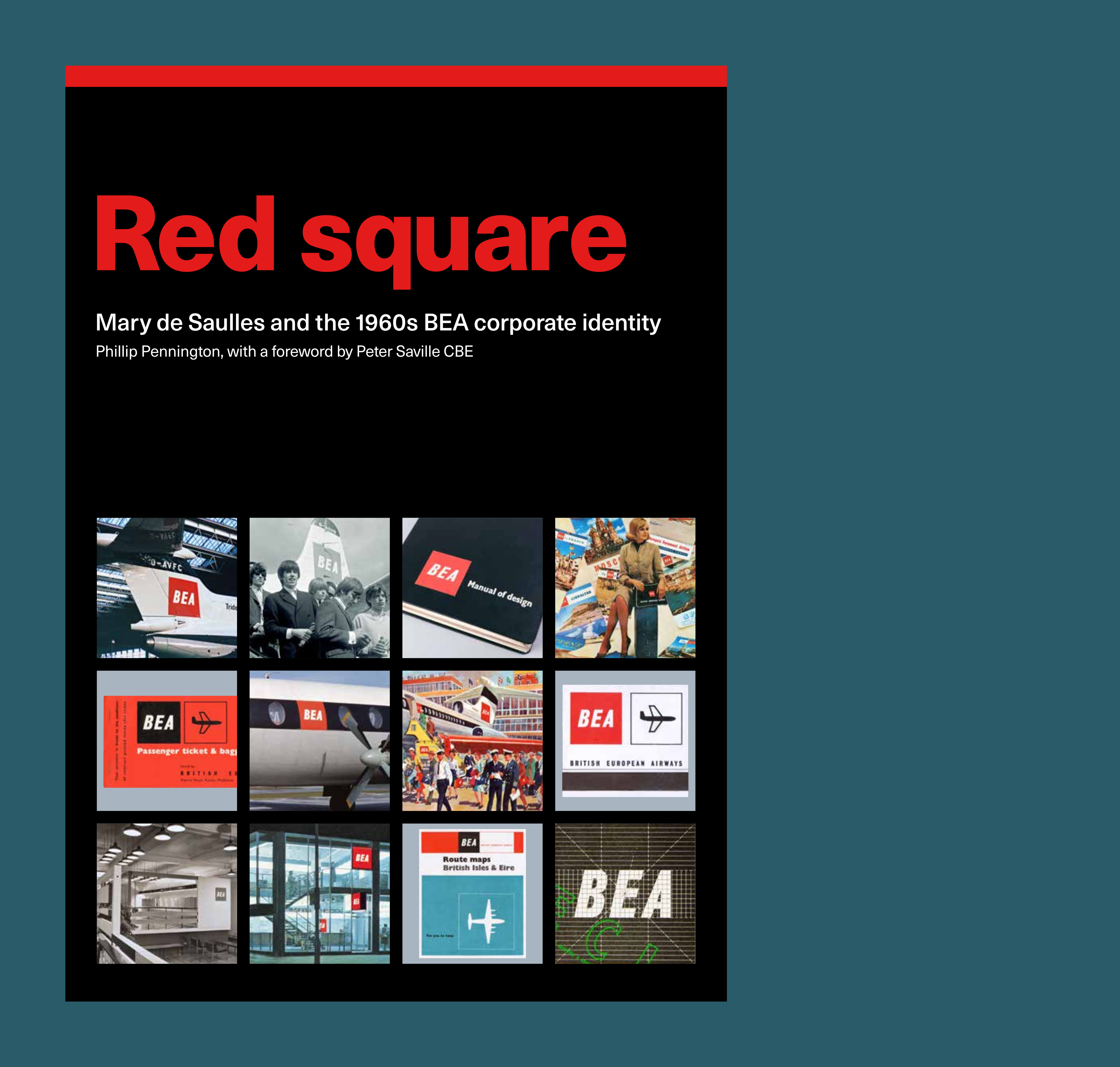
Mary de Saulles is not an especially well-known name in the annals of contemporary British graphic design. With the release of this new monograph, Red square: BEA’s Iconic 1960s Design, that will hopefully change, as it chronicles one of de Saulles’s major projects. In the 1950s, there were two national carriers in the UK, British Overseas Airways Corporation (BOAC) and British European Airways (BEA). The latter existed from 1946 through to 1974, when the two companies were merged to form British Airways.
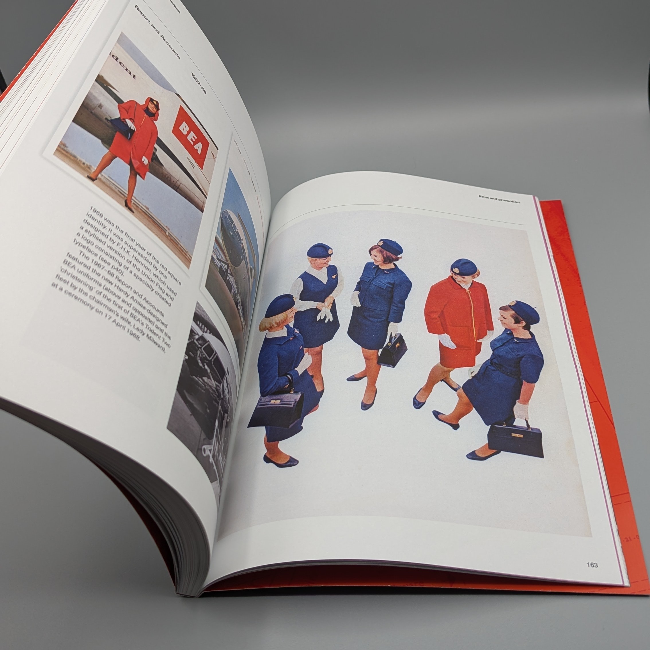
Spread from Red square
Before that, BEA was a standalone entity, with its own fleet and corporate identity. That strong graphic image, complete with bold modernist typography and striking ‘red square’ identity, was completed by the designer Mary de Saulles, in collaboration with John Lunn. Over 176 pages of his new monograph, designer and writer Phillip Pennington charts the company’s history and the arrival of the new identity.
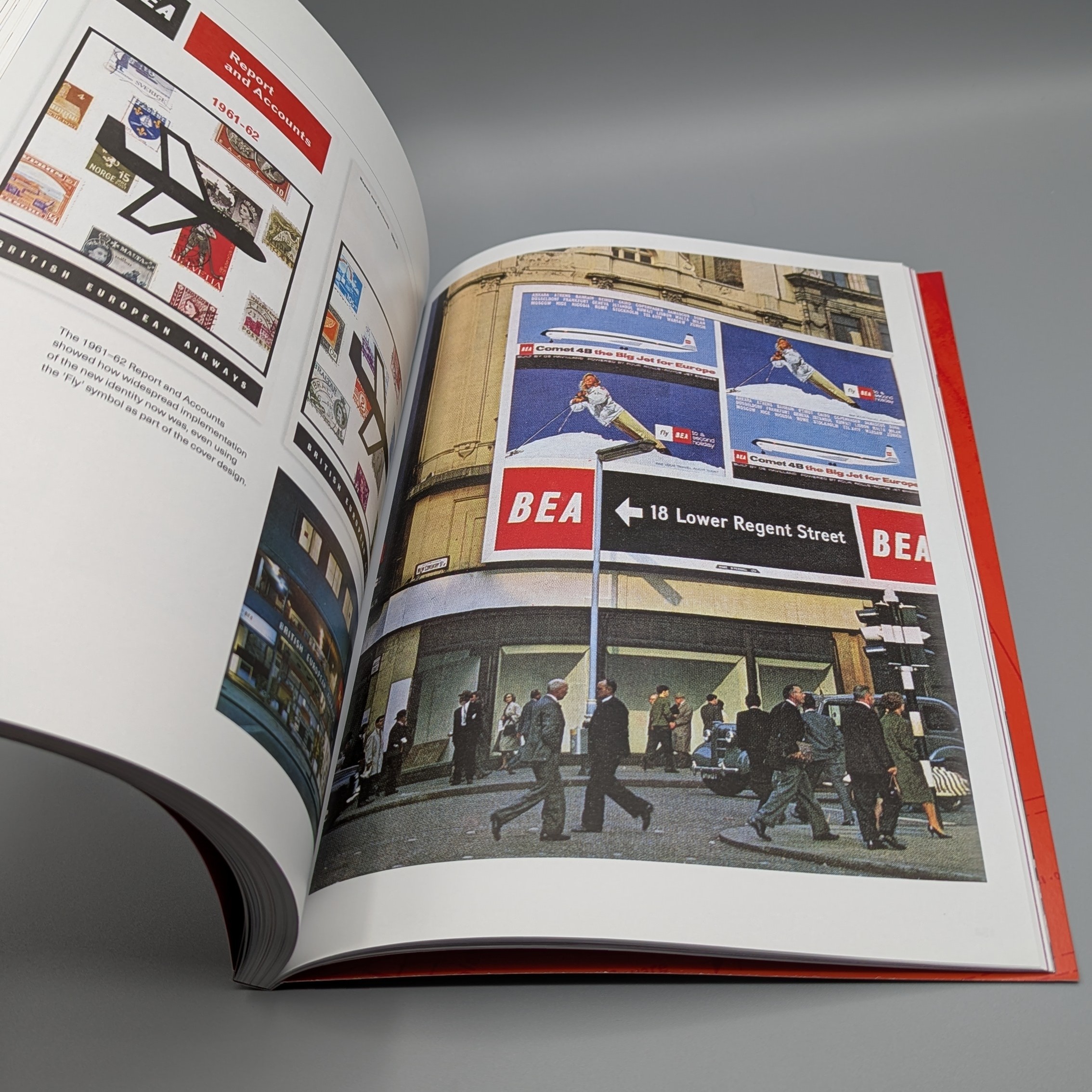
Spread from Red square
Covering everything from advertising to aircraft livery and luggage tags, the 'red square' identity is revealed here in reproduced pages from the 1959 Standards Manual. Every facet of the airline’s design and presentation was continued, right down to office furniture and even architects – Warren Chalk and Ron Herron, co-founders of Archigram, designed BEA’s Manchester office.
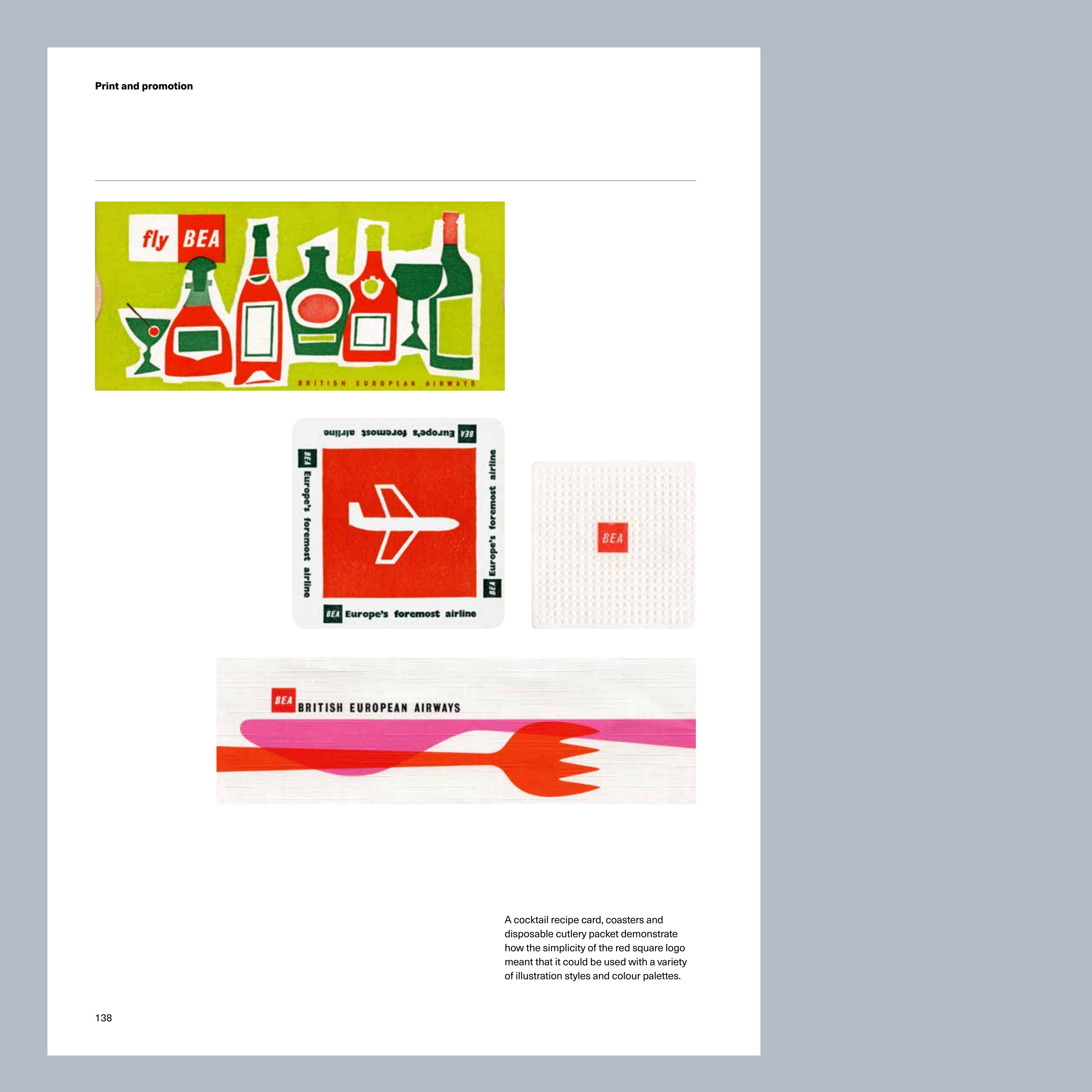
From Red square
This beautifully coherent and comprehensive work of corporate design was largely forgotten after BEA became part of the BA monolith. Pennington, a freelance designer who began his career with Peter Saville Associates, has spent over 14 years collecting and chronicling this work. Wallpaper* spoke to the newly retired author about the project.
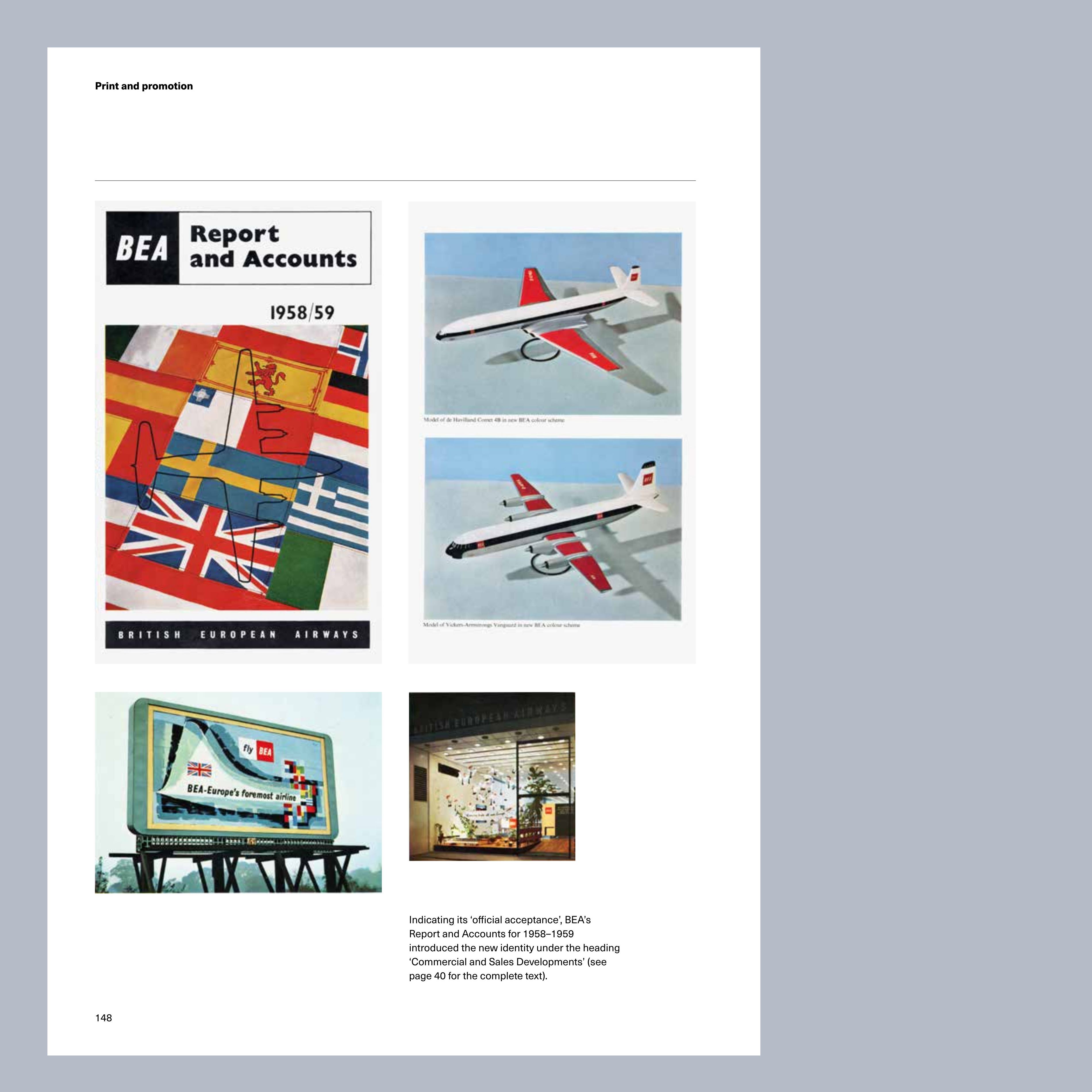
From Red square
Wallpaper*: How do you come to write the book?
Phillip Pennington: I’d been collecting various graphic ephemera for a few years, and, around 2010, started to pick up items featuring the BEA ‘red square’ logo, (I can’t honestly remember why). At some point, I wondered who had created the logo and identity. In those days I could find no information online so when I found that British Airways had a ‘Heritage centre’ I decided to get in touch with them.
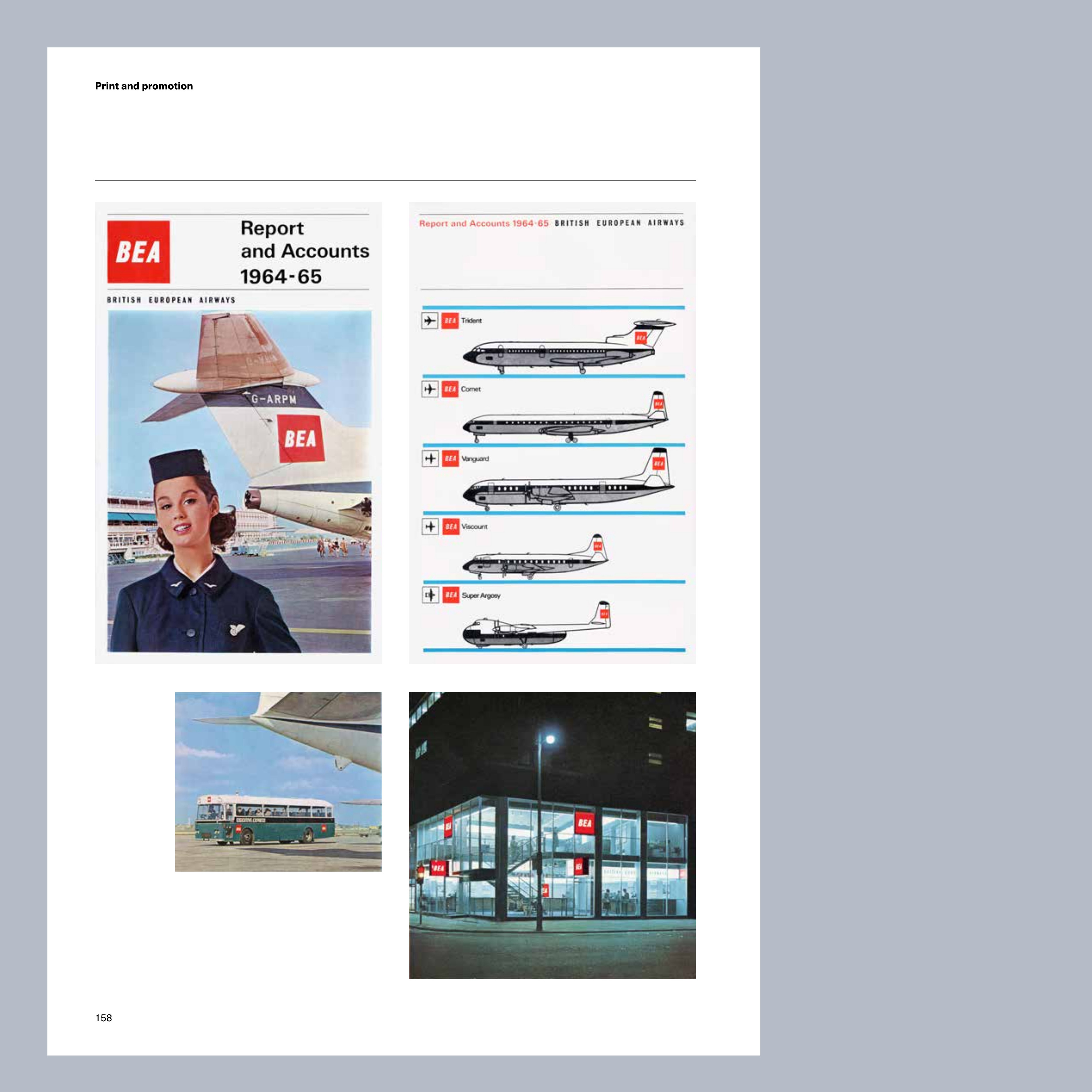
From Red square
W*: Did the archive hold much material?
Receive our daily digest of inspiration, escapism and design stories from around the world direct to your inbox.
PP: As it turned out, purely by chance, I was told that “the woman who designed the red square identity” had just donated her personal archives to them. The fact that I’d discovered who was responsible, and that she was a woman, responsible for such a large, nationally important project in the 1950s, intrigued me.
I visited the Heritage centre and was able to see the materials which Mary de Saulles had donated. The most exciting items were the ‘Manual of design’, and a very thorough record of the initial introduction of the identity, compiled into what was called the ‘Standards portfolio’.
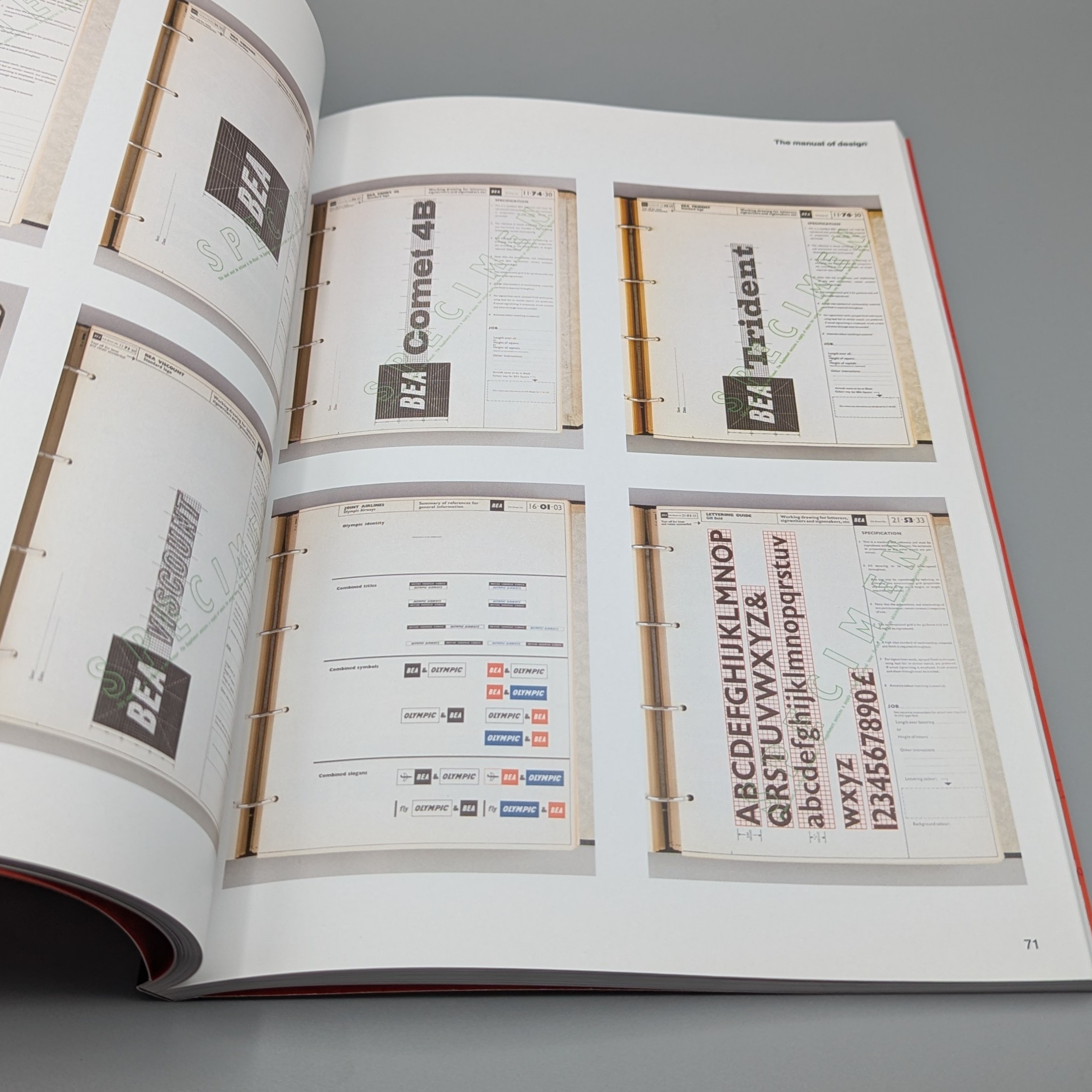
Spread from Red square showing the BEA Standards manual
W*: Is that when you decided to write the book?
PP: I felt that I’d been presented with an incredible opportunity to somehow make Mary’s achievement part of the history of design in Britain. I decided that I would attempt to put the information in book form, and, as Mary was at this point 86 years old, I should start right away. I’d never written a book before, but as I’d really enjoyed researching and writing my BA thesis in 1982 (about Peter Saville and Factory Records), I could at least have a go.
I was able to get in touch with Mary and interviewed her for the first time in April 2011, at her home and studio in Shrewsbury. I interviewed her several times over the following years and got to know her as a friend. She was one of the sharpest people I had ever met, (I would say that if my mind was the equivalent of a 4B pencil, hers was probably a 6H). It was obvious how she was able to do what she did.
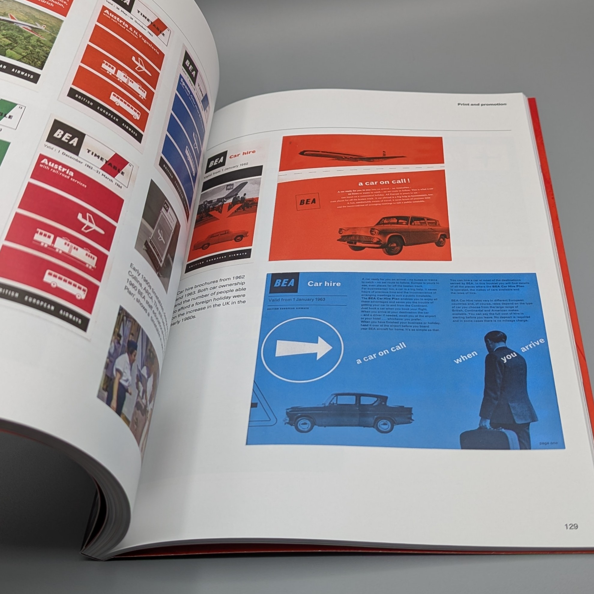
Spread from Red square
W*: How much of the archive is in the book?
PP: There’s a lot of stuff which didn’t end up in the book, I tried to select the best items and avoid making it a catalogue of my collection. The point of it was to record what Mary did, and how and when. The individual items of ephemera, original photos and transparencies are from my personal collection.
I was lucky enough to meet Mary’s son, Stephen de Saulles, who turned out to be a photographer as well as an interior/architectural designer. Stephen photographed the ‘manual of design’, the ‘standards portfolio’ and a brochure designed by BEA’s then Swiss design company.
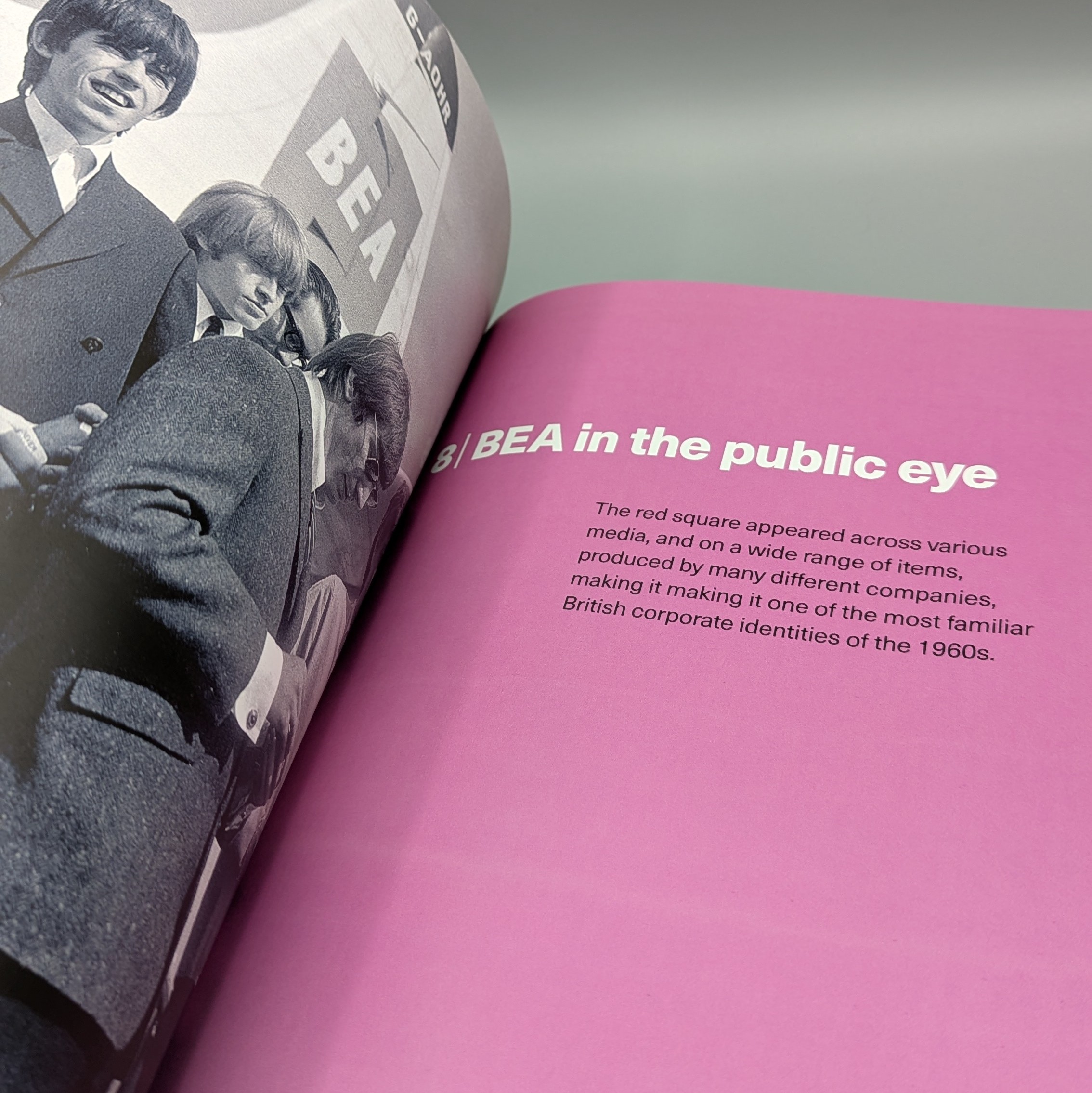
Spread from Red square
W*: How did you come to work with the modernist?
PP: As I could only work on the book in my spare time, evenings and weekends, and I wanted it to be as good as I could possibly make it, the process took a long time. I decided that I would only approach potential publishers when I had a pretty finished package, print-ready. Although it was obviously a niche book, I contacted a few publishers and got the response I had expected - I was resigned to using my savings to print and distribute it myself.
However, I’d started to follow the modernist and had a few of their publications. I emailed them after work one evening last November and got a quick, and positive response. They were interested in the project and were very happy that I could supply print-ready artwork and had covered the copyright/permissions side of things already.
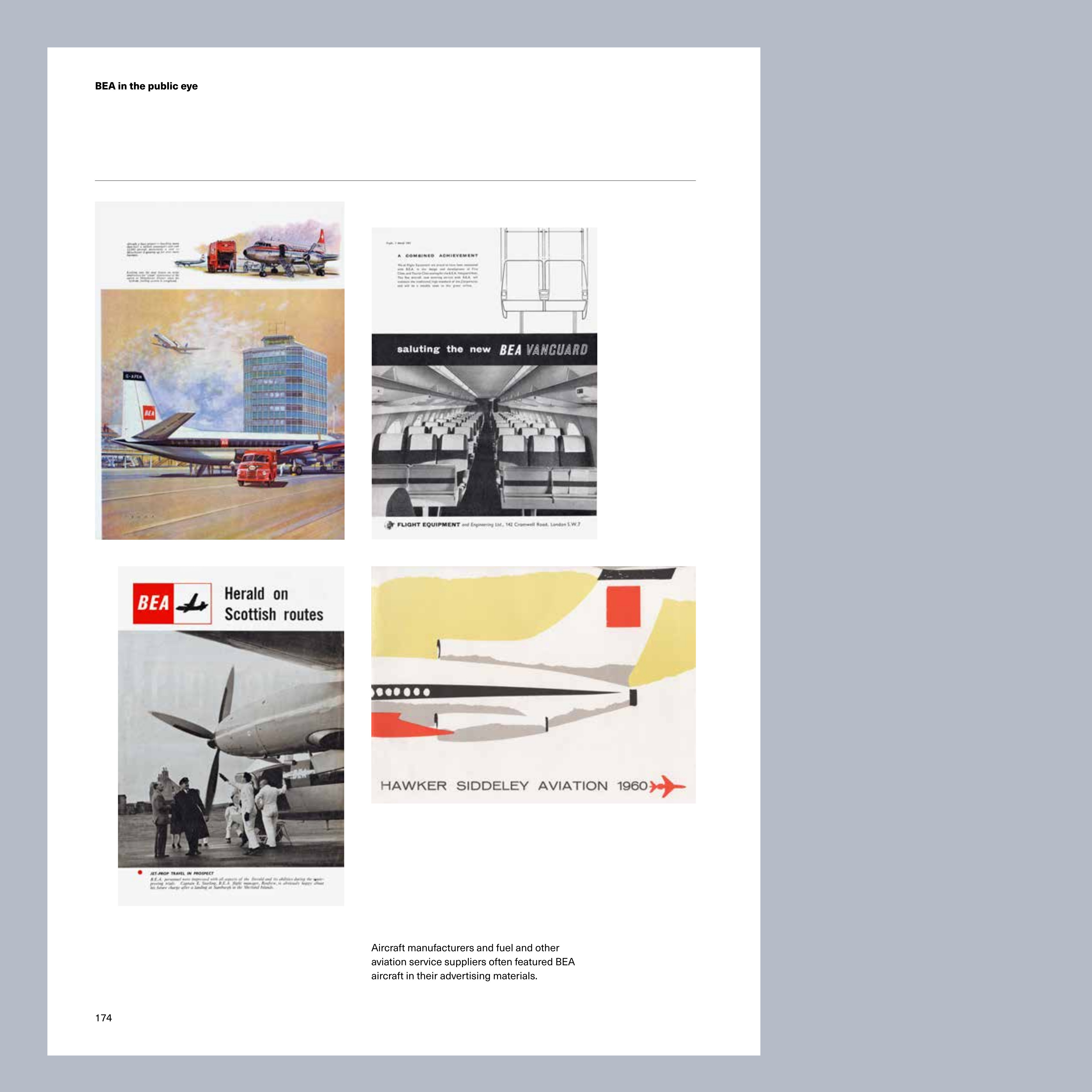
From Red square
Red Square: Mary de Saulles and the 1960s BEA corporate identity, Phillip Pennington, with a foreword by Peter Saville, £30, the-modernist.org, @themodernist
Jonathan Bell has written for Wallpaper* magazine since 1999, covering everything from architecture and transport design to books, tech and graphic design. He is now the magazine’s Transport and Technology Editor. Jonathan has written and edited 15 books, including Concept Car Design, 21st Century House, and The New Modern House. He is also the host of Wallpaper’s first podcast.