
We’re still thrilled about the celebratory cover Philippe Apeloig created for our 200th issue in October, but the designer has since been busy with an important show in Amsterdam, the city that launched his career.
The ties between the French designer and Dutch design often go unremarked, but one can see the influence of Dutch modernism in Apeloig’s work – in his precision, outlines, minimalism and grid. Apeloig first went to Amsterdam in the 1970s, while he was studying at the École Nationale Supérieure des Arts Appliqués Duperré in Paris. While there, he was offered what was to be a life-changing internship at Total Design, the firm co-founded by Dutch graphic design guru Wim Crouwel.
Carolien Glazenburg, curator of graphic design at Amsterdam’s Stedelijk Museum, has been collecting Apeloig’s works since the turn of the new millennium, notably his posters. 'Nowadays, people are not used to looking any more, but in these giant posters, the closer you look, the more you see,' she says. Apeloig donated most of the posters in the show to the museum, where they will join its permanent collection, alongside his early Dutch modernist influences, such as Mondrian.
'Posters are like paintings,' says Apeloig. 'Which makes me think of the graphic and pictorial work of the constructivists, with their palette of primary colours – which inspired me greatly.'
The main exhibition room aims to bathe viewers in type; posters are arranged by hue instead of chronologically. Take a close look at his famous institutional design for the Théâtre du Châtelet in Paris and the Fête du Livre in Aix-en-Provence, or his competition entry for Le Havre World Heritage poster design. Apeloig’s letters display a range of personalities: sometimes they stand singly, other times as part of a group; sometimes the effect is boisterous, at other times muted. In the centre of the room are four small showcases containing publication designs, including the pink and blue version of the Wallpaper* 200th issue.
Among the first designers to use computer technology in graphic design – a result of his internship with April Greiman in the USA in the 1980s – Apeloig often creates visual illusion and movement with type. The second room of the exhibition pays tribute to his animated works, which are rarely shown on the big screen, and features motion clips on smaller monitors to show his logo designs in progress. Outside the room are three iconic posters from Wim Crouwel, Wolfgang Weingart and April Greiman, which not only help the visitor to understand the source of Apeloig’s early inspirations, but are also a sentimental tribute to the designer’s mentors.

Included in the exhibition is the brand-new typeface and celebratory animation - featured here - created to mark the 200th issue of Wallpaper*

Entitled 'Philippe Apeloig – Using Type,' the installation includes the designer's posters, digital graphics, publication designs and animations.

In the museum shop, a limited number of 'Using Type' exhibition posters designed by Apeloig and the shawl that he designed for Hermès (based on the book A Lover’s Discourse: Fragments by Roland Barthes) are available

'Nowadays, people are not used to looking any more, but in these giant posters, the closer you look, the more you see' says Carolien Glazenburg, curator of graphic design at the museum.

Three iconic posters from Wim Crouwel, Wolfgang Weingart and April Greiman are also on display. Not only do they help the visitor to understand the source of Apeloig’s early inspirations, but are also a sentimental tribute to the designer’s mentors

Most of Apeloig’s poster designs are silk-screened at Brumath's Lézard Graphique in the highest quality possible for large-scale screen-prints.

Looping clips on smaller monitors show Apeloig’s logo designs in progress.

Left: Bruits du monde ('Noises of the World'), 2012. Right: Théâtre National Toulouse Midi Pyrénées saison 2012–2013, 2012

Left: TDC 54 Call for Entries, Type Directors Club, New York, 2007. Right: Vivo in Typo: Posters and the Animated Alphabet, 2008
INFORMATION
’Philippe Apeloig – Using Type’ is on view until 23 January 2016. For more information, visit the Stedelijk Museum’s website
ADDRESS
Stedelijk Museum
Museumplein 10
1071 DJ, Amsterdam
-
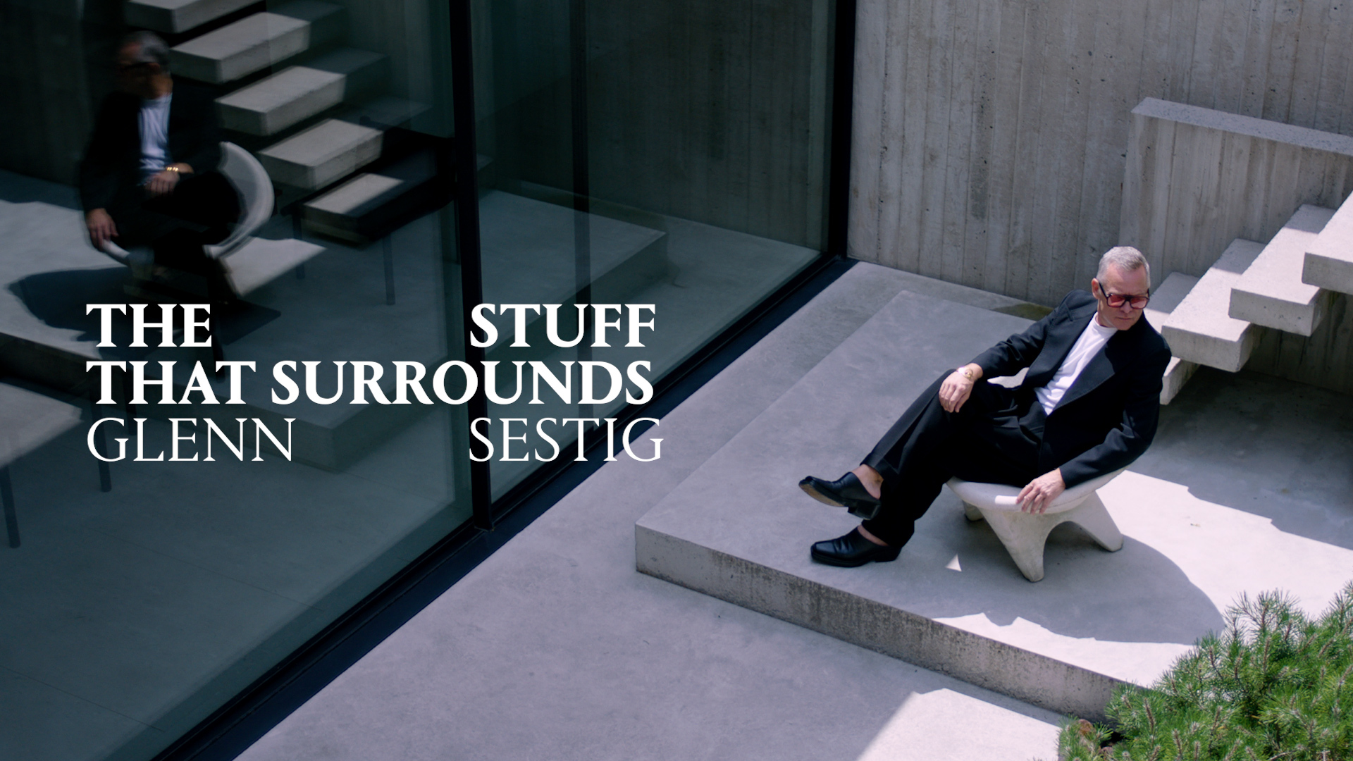 The Stuff That Surrounds, episode three: Inside the home of architect Glenn Sestig
In The Stuff That Surrounds, Wallpaper* explores a life through objects. This episode, we’re invited inside an architectural gem – just what you'd expect from one of the most distinctive voices in the field today
-
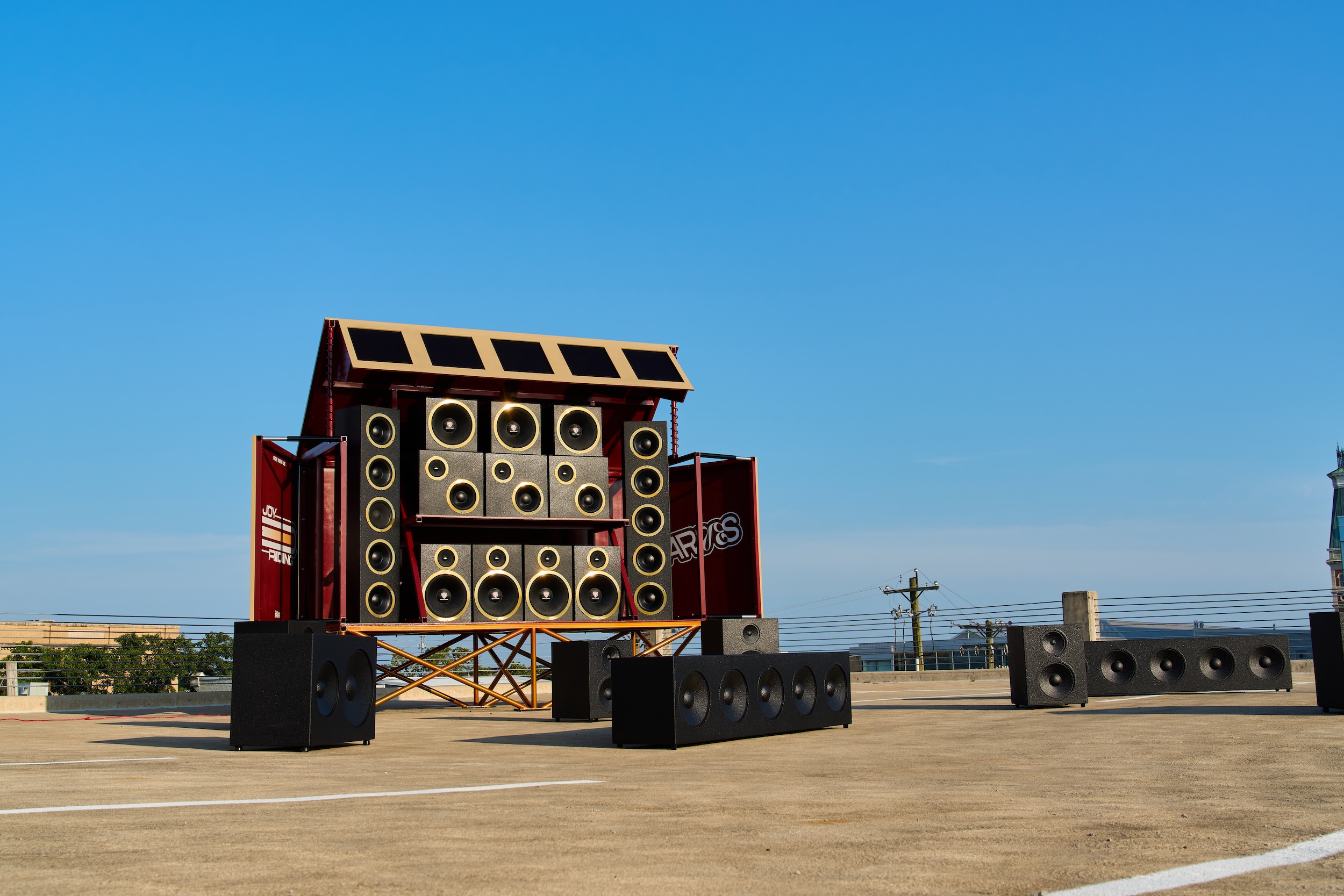 Germane Barnes just transformed a humble Indiana parking garage into an enormous sub-woofer system
With Joy Riding, the Miami-based designer’s installation at Exhibit Columbus, Barnes celebrates togetherness by evoking Black car culture
-
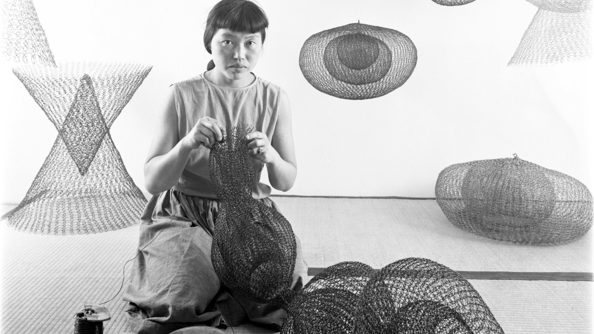 The best Ruth Asawa exhibition is actually on the streets of San Francisco
The artist, now the subject of a major retrospective at SFMOMA, designed many public sculptures scattered across the Bay Area – you just have to know where to look


-
 Saul Steinberg: behind the scenes at Triennale Design Museum
Triennale Design Museum and publishing house Electa present ‘Saul Steinberg Milano New York’, a new exhibition (until 13 March 2022) that pays homage to the American artist through 350 works. Join us for a behind-the-scenes peek at it's installation
-
 Ten years of Muller Van Severen, at Design Museum Ghent
A new exhibition by Belgian design duo Muller Van Severen (until 6 March 2022) features a retrospective of the studio’s ten years as well as a curation of pieces from the Design Museum Ghent collections
-
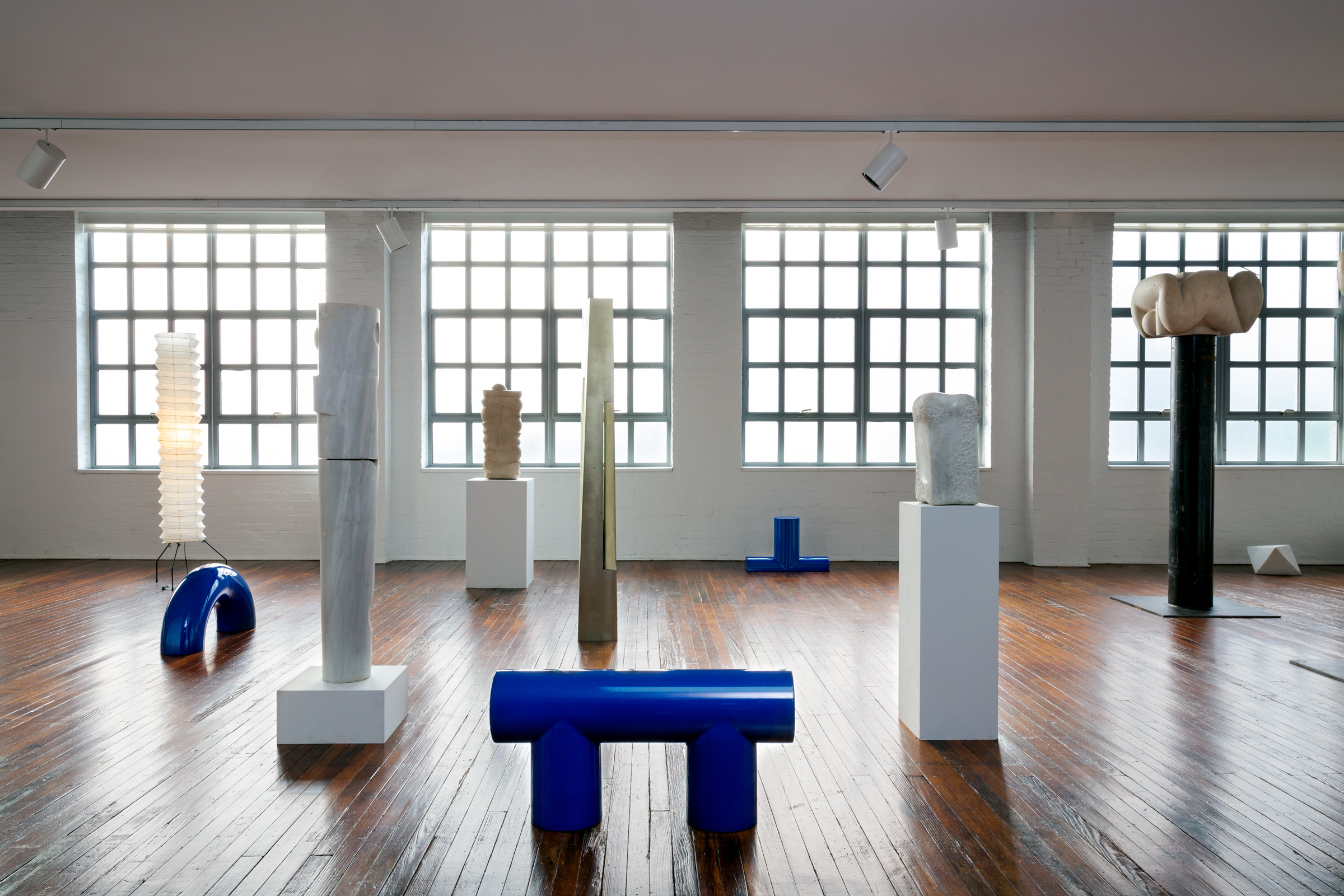 Noguchi show celebrates his reverence for Greece
Design show ‘Objects of Common Interest: Hard, Soft, and All Lit Up with Nowhere to Go’ opens in collaboration with Wallpaper* Designers of the Year, Objects of Common Interest, at the Noguchi Museum in Queens, New York (until 13 February 2022)
-
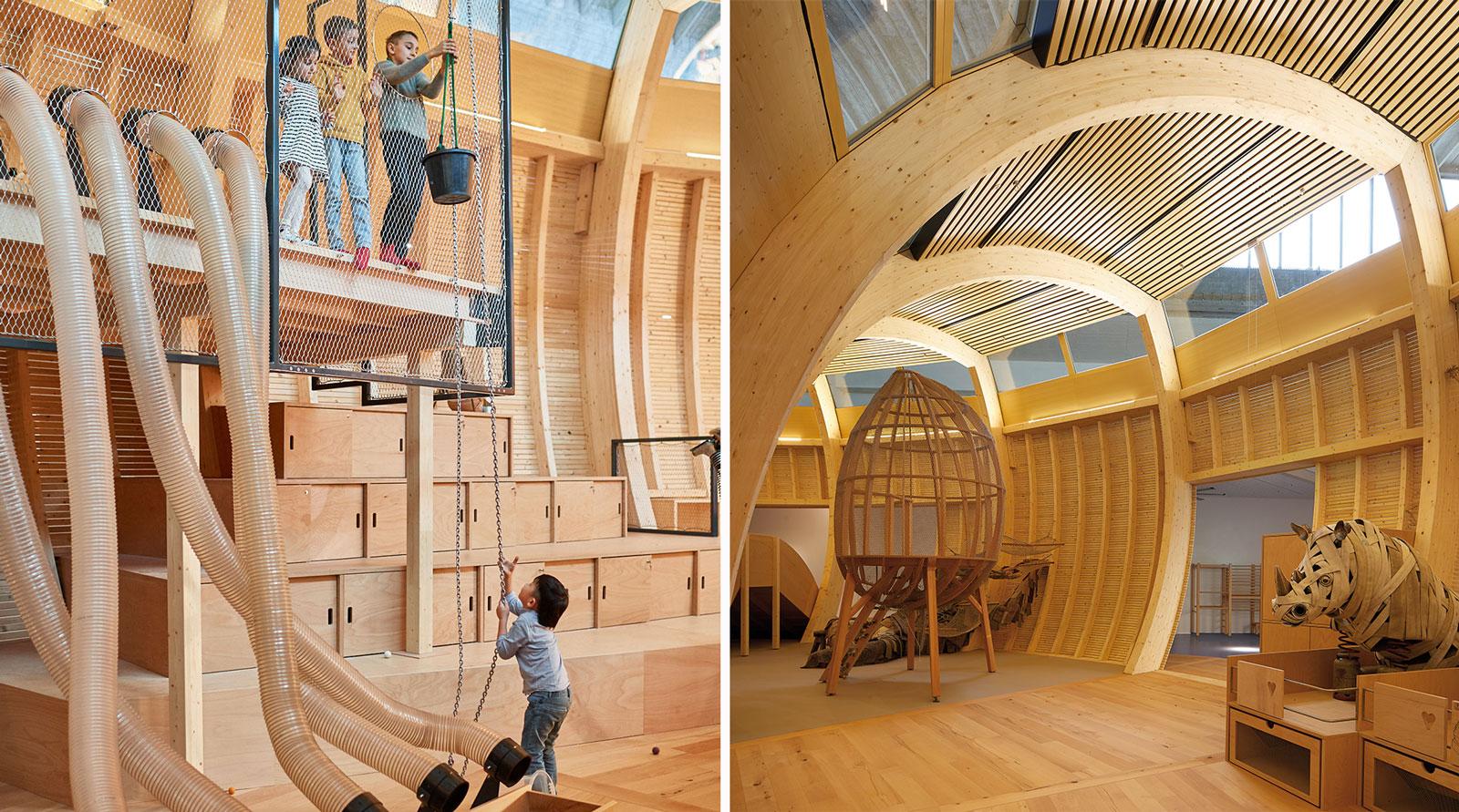 ‘Design not for children, but for everyone’: Jewish Museum Berlin’s new play space
Olson Kundig architecture and design practice brings kids’ play space ANOHA Children’s World to life inside a vast former wholesale flower market, at the Jewish Museum Berlin
-
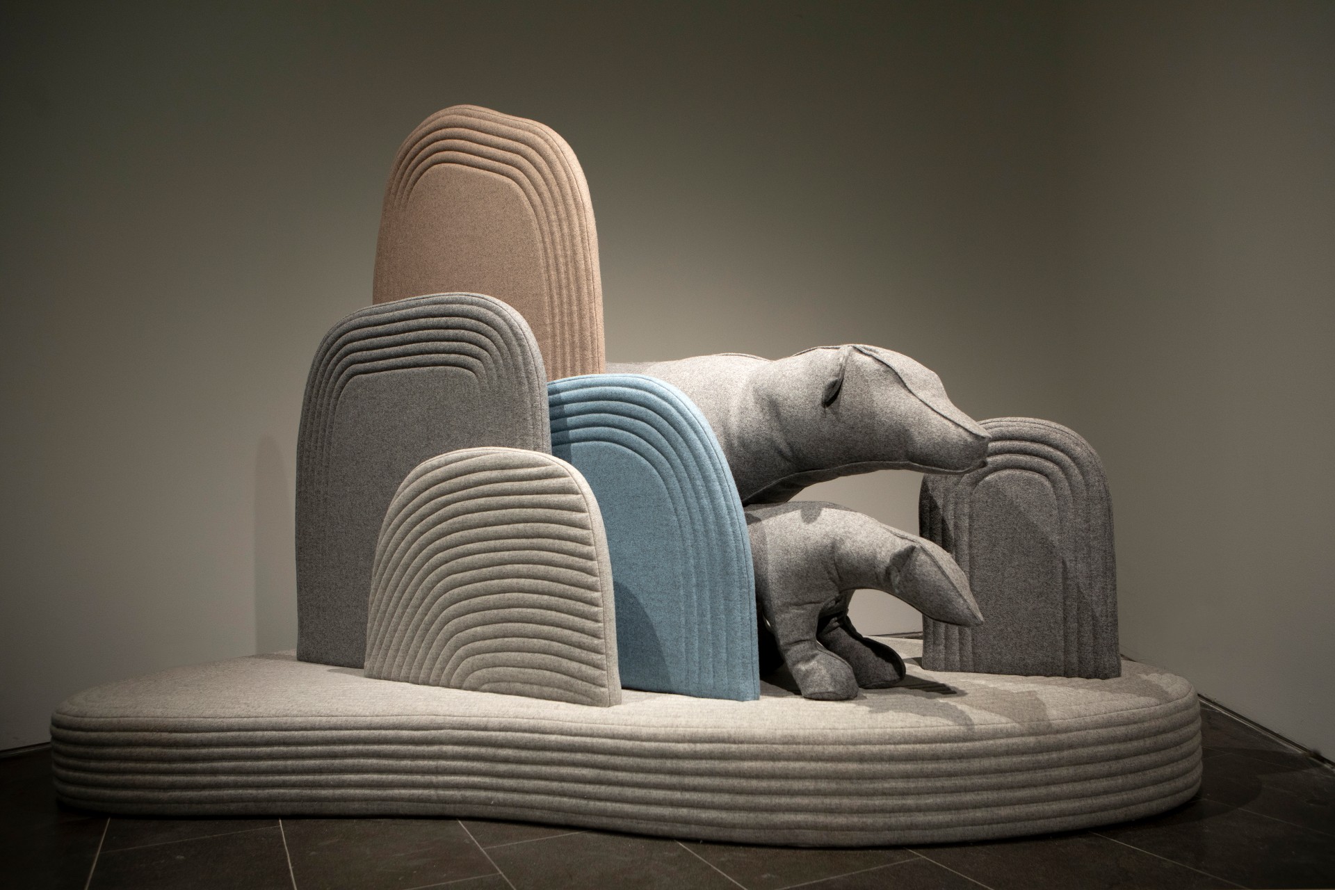 A landscape of playful animals pops up at Design Museum Holon
Child-centric designer Sarit Shani Hay presents an imaginary natural landscape that references Ron Arad's Design Museum Holon architecture and is inhabited by soft, cushioned sea lions, seals and bears
-
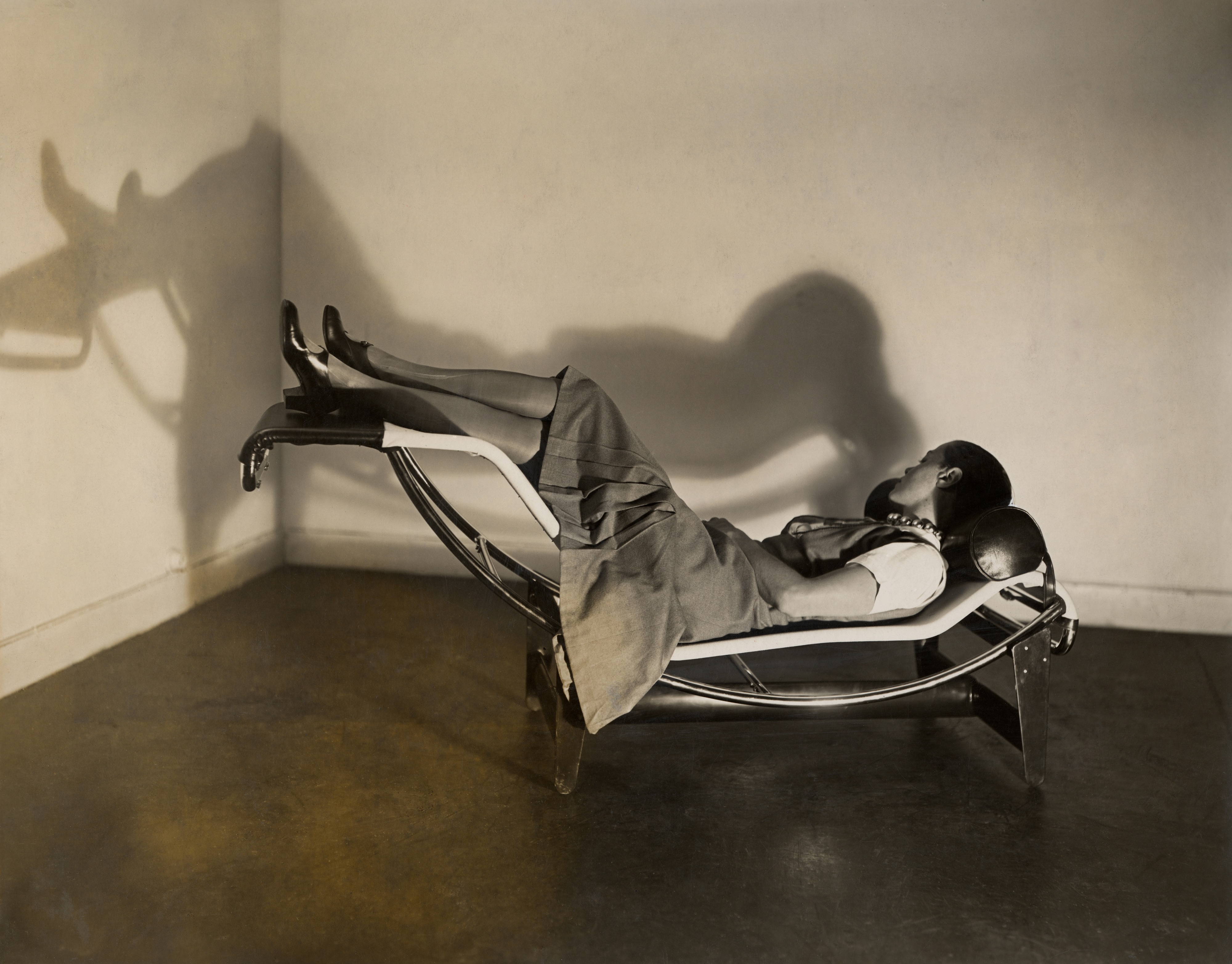 Charlotte Perriand’s life and work explored at London’s Design Museum
London’s Design Museum presents ‘Charlotte Perriand: The Modern Life’, an exhibition turned the spotlight on one of the most iconic creators of the 20th century
-
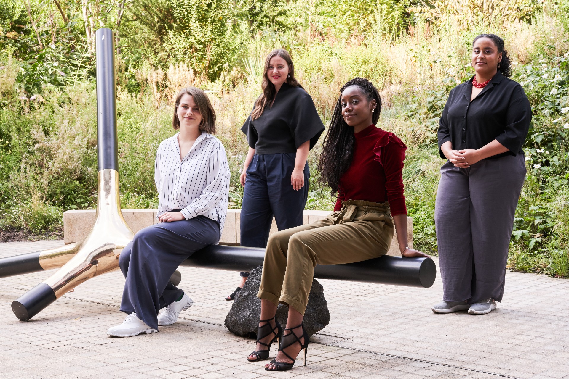 Meet the Design Museum’s all-female Designers in Residence
The multidisciplinary cohort includes Enni-Kukka Tuomala, Abiola Onabule, Cynthia Voza Lusilu and Ioana Man, who developed a series of multidisciplinary projects with the Design Museum, responding to the theme of ‘Care'
-
 Campana Brothers look back on 35 years of revolutionary design
On view at modernist Museum of Modern Art in Rio de Janeiro, ‘Campana Brothers – 35 Revolutions’ is a retrospective of the Brazilian designers’ impactful oeuvre


