The years immediately following World War II were anything but fallow. While the country struggled with rationing and rebuilding, the creative classes were gearing up to set the visual tone for the era - and the decades that followed. Spearheading the era's new aesthetic was the Design Research Unit, an austerely monickered but eccentrically staffed graphic design studio that went on to be the model of the modern design agency. Michelle Cotton's new monograph on the work of the Unit covers the three fertile decades from 1942, embracing great swathes of British visual culture.
The DRU was born out of the ashes of the Bassett Gray group, an esoteric collection of artists and writers who thrived on ceremony, fraternity and having a jolly good time. Well known for their 'bibbing ceremonies' - grand dinners with lavishly designed menus, place settings and costumes - the Bassett Grays were joined by the young Misha Black in 1932 (a few years after the convivial bibbing tradition had ceased).
Black was a stranger to English quirks, having been born Moisei Tcherny in Baku, Azerbaijan, 22 years earlier, but he quickly adapted. A self-described commercial artist, he began working on posters and trade shows in the early 1930s, trading as Studio Z from dingy digs in Covent Garden.
The artist was nothing if not well-connected, and his membership of Artists International Association saw a number of contemporary luminaries beat a path to his door for left-leaning meetings about art, unity and society. Black also founded the Society of Industrial Artists and was a member of the Modern Architecture Research Society (MARS), placing him firmly at the heart of Britain's burgeoning modernist class.
By the outbreak of war, Black was associated with, amongst others, Henry Moore, Vanessa Bell, Edward Wadsworth, Herbert Read, Wells Coates, Berthold Lubetkin, László Moholy-Nagy, Maxwell Fry, John Betjeman, Morton Shand, Eric Ravilious, Paul Nash and Eric Gill. The list goes on.
DRU itself was borne out Black's wartime secondment to the Ministry of Information, the government department that generated enormous volumes of inspirational and educational print, poster and exhibition design in order to steer the British people towards victory. It was a time of massive responsibility and opportunity. As Cotton notes, 'in 1943 [the MoI] mounted an exhibition of 150,000 items of army equipment in the ruins of the bombed John Lewis department store on Oxford Street. The exhibition received 1,300,000 visitors in three months.'
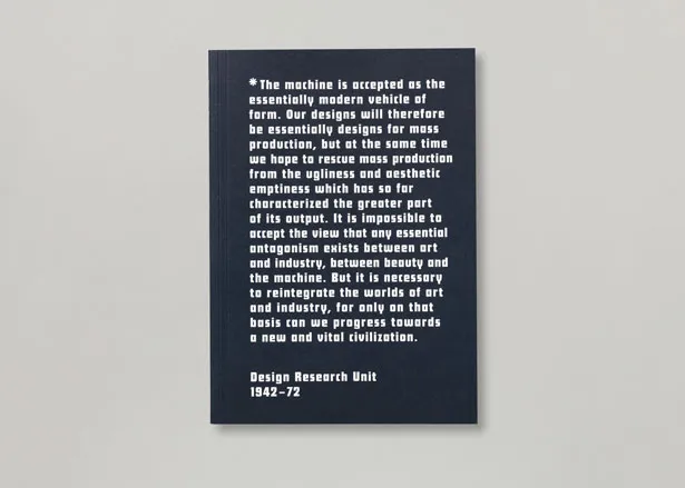
All this stood Black in good stead, and by the early 1940s the seeds of the DRU were germinating. Officially founded on 1 January 1943 by Black, Herbert Read, Marcus Brumwell and Milner Gray, its manifesto said it all: ' The machine is accepted as the essentially modern vehicle of form. Our designs will therefore be essentially designs for mass production, but at the same time we hope to rescue mass production from the ugliness and aesthetic emptiness which has so far characterised the greater part of its output ... it is necessary to reintegrate the worlds of art and industry, for only on that basis can we progress towards a new and vital civilisation.'
The Herculean energy and efforts of the era make fascinating reading. It was a time of collaboration and experimentation; Naum Gabo's experimental car design for Jowett, for example, was worked up with clay models by Bernard Leach and perspectives by Ben Nicholson. How many contemporary car companies would kill for such immersion in the pioneering arts of the era?
Cotton traces the Unit's work from the end of the war, through to its involvement with the 'Britain Can Make It' exhibition of 1946 and on to the 1951 Festival, with which the DRU and its members were intimately involved. Indeed, it was Black himself who pushed for the South Bank site, drawing up a radical masterplan as early as 1946, with swooping glass and a spiky observation tower that wouldn't look out of place in any contemporary architect's portfolio.
Following the Festival, the DRU continued to play a major role in British design culture. Together with Watneys, the Unit shaped the modern pub, with signage and design that was grudgingly dubbed 'ghastly good taste' by the Architects Journal. Perhaps most significantly of all, the DRU gave the newly nationalised British Railways its classic identity, with typography by Jock Kinneir and Margaret Calvert and the iconic two-way arrow designed by Gerald Barney. It was a colossal undertaking, from signage down to matchbooks. DRU continued to grow, with collaborators and associates including Richard and Su Rogers, who together with Renzo Piano and Jan Kaplicky, drew up an ambitious plan to extend the Unit's Marylebone offices.
The DRU still exists today as part of Scott Brownrigg Architects. Crisply designed by A Practice for Everyday Life, Design Research Unit 1942-72 deserves a place on every designer's bookshelf, not least for the immense sense of history and achievement contained within it. The 1942-72 era is also featured in a traveling exhibition of original archive material that ends its run at the Cooper Gallery in Dundee on 17 December 2011.

Published by Koenig Books, the book looks at three fertile decades of DRU's output from 1942, embracing great swathes of British visual culture

Left: an exhibition of army equipment mounted in the ruins of a bombed John Lewis by the likes of Misha Black, Kenneth Bayes, Frederick Gibberd and Bronek Katz in 1943 attracted over a million viewers
Right: DRU in 1944

Design Research Unit leaflets, c.1943

Working with Watneys for over 15 years, the Unit helped shape the modern pub. Pictured is Watneys packaging and signage

Pages from the Watney House Identification Manual, 1966; Watneys typefaces

In the early 1960s, DRU gave the newly nationalised British Railways its classic identity, with typography by Jock Kinneir and Margaret Calvert and the iconic two-way arrow designed by Gerald Barney


Corporate identity design for ICI, 1960s