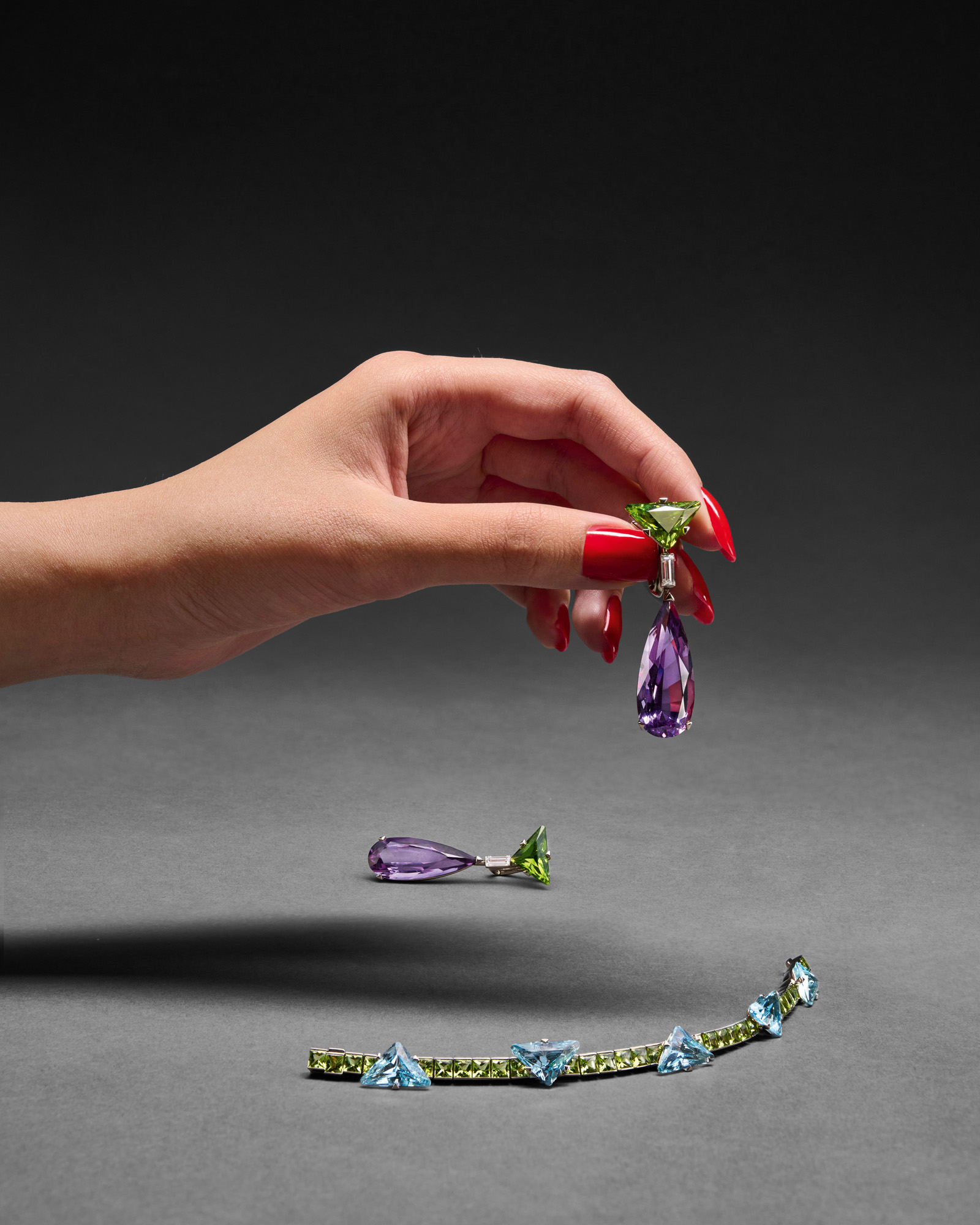
This Prada jewellery collection is a mismatch made in heaven
Prada's new fine jewellery collection unites unexpected cuts with sorbet shades


Receive our daily digest of inspiration, escapism and design stories from around the world direct to your inbox.
You are now subscribed
Your newsletter sign-up was successful
Want to add more newsletters?
Miuccia Prada and Raf Simons have zoned in on an edgy and unpredictable interpretation of fine jewellery in a new offering that celebrates contrasts. Defined by geometrical contradictions and bold strokes of colour, the Prada Fine Jewelry Couleur Vivante collection embodies a playful clash of forms.
Encompassing necklaces, bracelets, rings and earrings, the collection juxtaposes gemstones in sorbet shades for jewellery that eschews uniformity, rethinking classical line bracelets and drop earrings with sharp cuts and asymmetrical pairings.
Gemstones, including amethyst, aquamarine, madeira citrine, pink morganite and oro verde peridot, are teased into sharp angles or softly rounded orbs, cutting a very modern silhouette when studding the sensual coils of bracelets or dangling from earlobes.
This article appears in the October 2025 Issue of Wallpaper*, available in print on newsstands, on the Wallpaper* app on Apple iOS, and to subscribers of Apple News +. Subscribe to Wallpaper* today
Receive our daily digest of inspiration, escapism and design stories from around the world direct to your inbox.
Hannah Silver is a writer and editor with over 20 years of experience in journalism, spanning national newspapers and independent magazines. Currently Art, Culture, Watches & Jewellery Editor of Wallpaper*, she has overseen offbeat art trends and conducted in-depth profiles for print and digital, as well as writing and commissioning extensively across the worlds of culture and luxury since joining in 2019.