Jaeger-LeCoultre rethinks its alphabet with graphic designer Alex Trochut
To coincide with the opening of the New York Reverso 1931 Café, Jaeger-LeCoultre unveils a partnership with Brooklyn-based graphic designer Alex Trochut

Swiss watchmaker Jaeger-LeCoultre celebrates the opening of the New York iteration of its Reverso 1931 Café this month. Situated on an elegant mezzanine floor of the house’s jewel-box boutique on Madison Avenue, the art deco-inspired space is completed by an exquisite array of confections created by Parisian pastry chef Nina Métayer, each inspired by Jaeger-LeCoultre’s horological expertise, which is most recognisable in its iconic Reverso design.
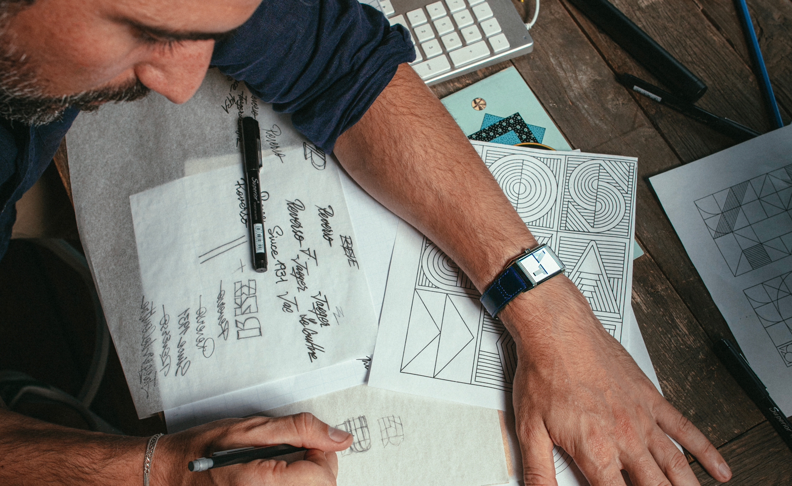
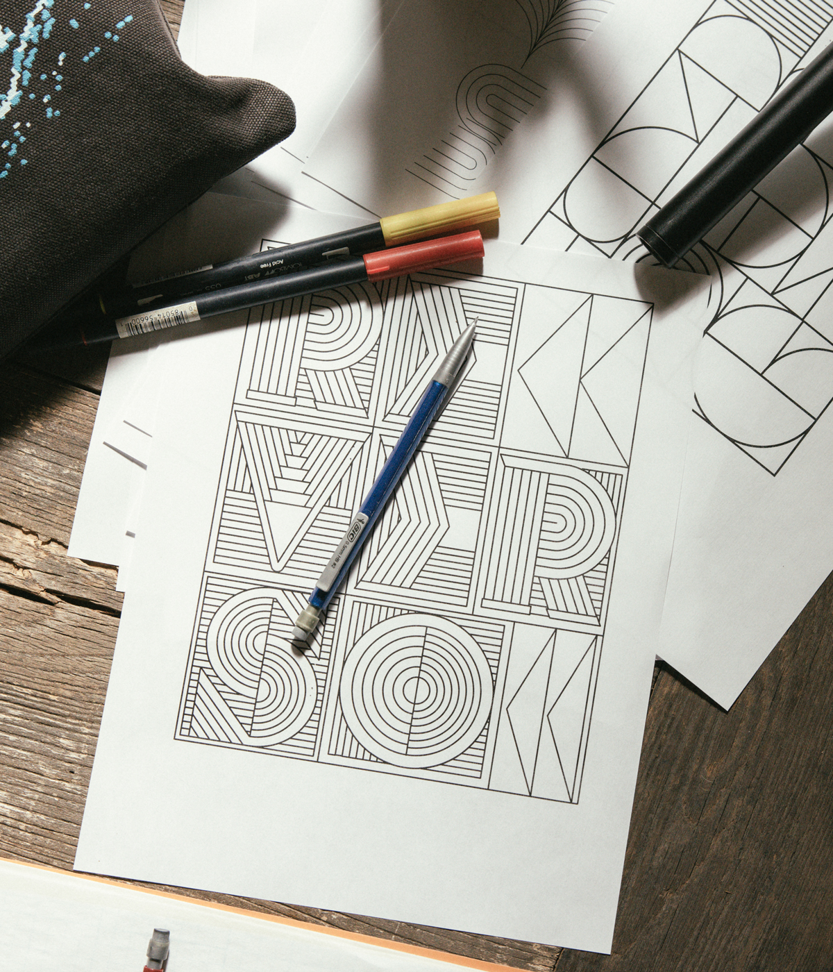
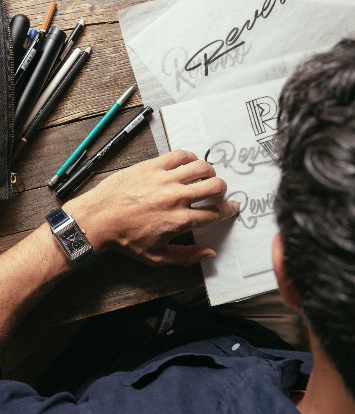
The café’s arrival in New York also coincides with the unveiling of a collaboration with the Spanish-born, Brooklyn-based graphic designer Alex Trochut. Trochut has created a new ‘1931 Alphabet’, which draws stylistically from the art deco tradition but boasts a contemporary robustness and sculptural quality that brings a fresh modernity to Jaeger-Le Coultre’s visual identity.

The house’s partnership with Trochut is the latest in its ‘Made of Makers’ programme, which CEO Catherine Rénier describes as a way of ‘looking for different perspectives on how the practices of watchmaking, art and other creative disciplines can bring value and emotion to lived experiences’, she says. ‘[The series] is a profound expression of the core principles that have always defined La Grande Maison: passion, creativity, expertise and precision, with intense respect for the person in the process – the creativity of the mind and the skill of the hand.’
Focused on international artists who share a sensibility with Jaeger-LeCoultre, the series represents an impressive variety of unexpected styles, materials and media. Rénier continues, ‘We choose to work with forward-thinking artists and highly imaginative artisans whose work challenges our senses, expands our minds and triggers strong emotions. We support them by commissioning new work and they in turn nourish the creativity and continuing evolution of our maison.’

This is particularly poignant in the lettering that Trochut created. Armed with a visual depth that conveys a sense of dynamism and movement, Trochut’s ‘1931 Alphabet’ is as expressive in the two-dimensional form as it is as a three-dimensional object.
‘As I started creating the designs, a concept emerged that would unify art deco and Jaeger-LeCoultre’s craft of watchmaking,’ he recalls. ’The letters evoked some sort of mechanism, full of different modular parts that work together to create a whole. I wanted these letters to feel physical and expose their intricate parts equally as functional and decorative, giving the sense of a moving machine.’
‘I think craft and technical skills are at the heart of both typography and watchmaking,’ he adds. ‘Letters are a mix of emotional and rational decisions, with a big internal logic that ties all the decisions into one alphabet or lettering form, like a puzzle. While I consider watchmaking to be another level of complexity, both disciplines embody a devotion to the little things, which need to work in harmony inside a system.’
Receive our daily digest of inspiration, escapism and design stories from around the world direct to your inbox.
Pei-Ru Keh is a former US Editor at Wallpaper*. Born and raised in Singapore, she has been a New Yorker since 2013. Pei-Ru held various titles at Wallpaper* between 2007 and 2023. She reports on design, tech, art, architecture, fashion, beauty and lifestyle happenings in the United States, both in print and digitally. Pei-Ru took a key role in championing diversity and representation within Wallpaper's content pillars, actively seeking out stories that reflect a wide range of perspectives. She lives in Brooklyn with her husband and two children, and is currently learning how to drive.