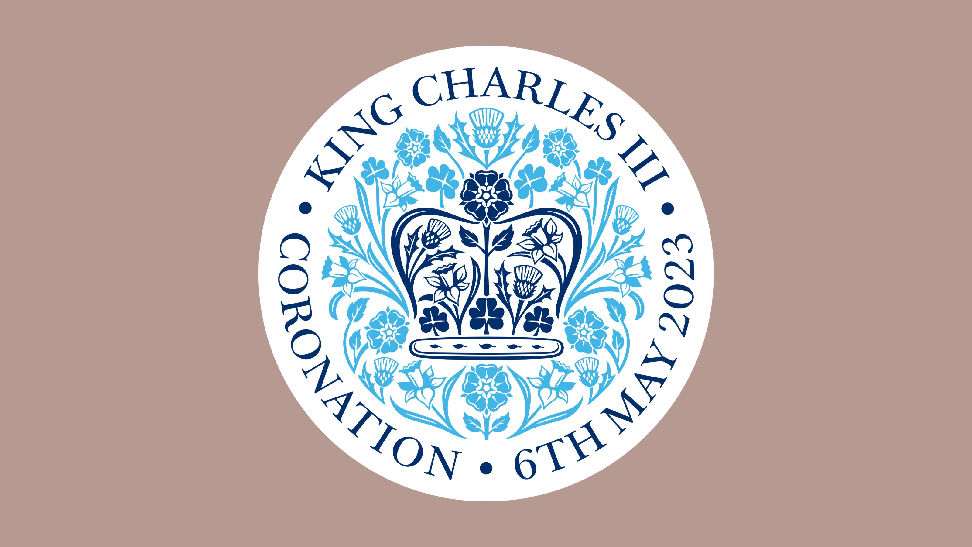
Presenting the official emblem of King Charles III’s Coronation, designed by LoveFrom
The Coronation Emblem, incorporating rich symbolism and the very first typeface from Sir Jony Ive’s LoveFrom, is designed to stand the test of time

Receive our daily digest of inspiration, escapism and design stories from around the world direct to your inbox.
You are now subscribed
Your newsletter sign-up was successful
Want to add more newsletters?
Few graphic design projects will have as much prominence over the next week as the official emblem of the Coronation of His Majesty The King and Her Majesty The Queen Consort. Unveiled in February 2023, the emblem was the work of LoveFrom, the creative collective established by Sir Jony Ive KBE.
Intended to symbolise and celebrate the historic beginning of the new reign, the emblem ‘pays tribute to the King’s love of the natural world’. Ive and his team have done this by combining the signature flora of the UK’s four nations: the rose of England, the thistle of Scotland, the daffodil of Wales and the shamrock of Northern Ireland.
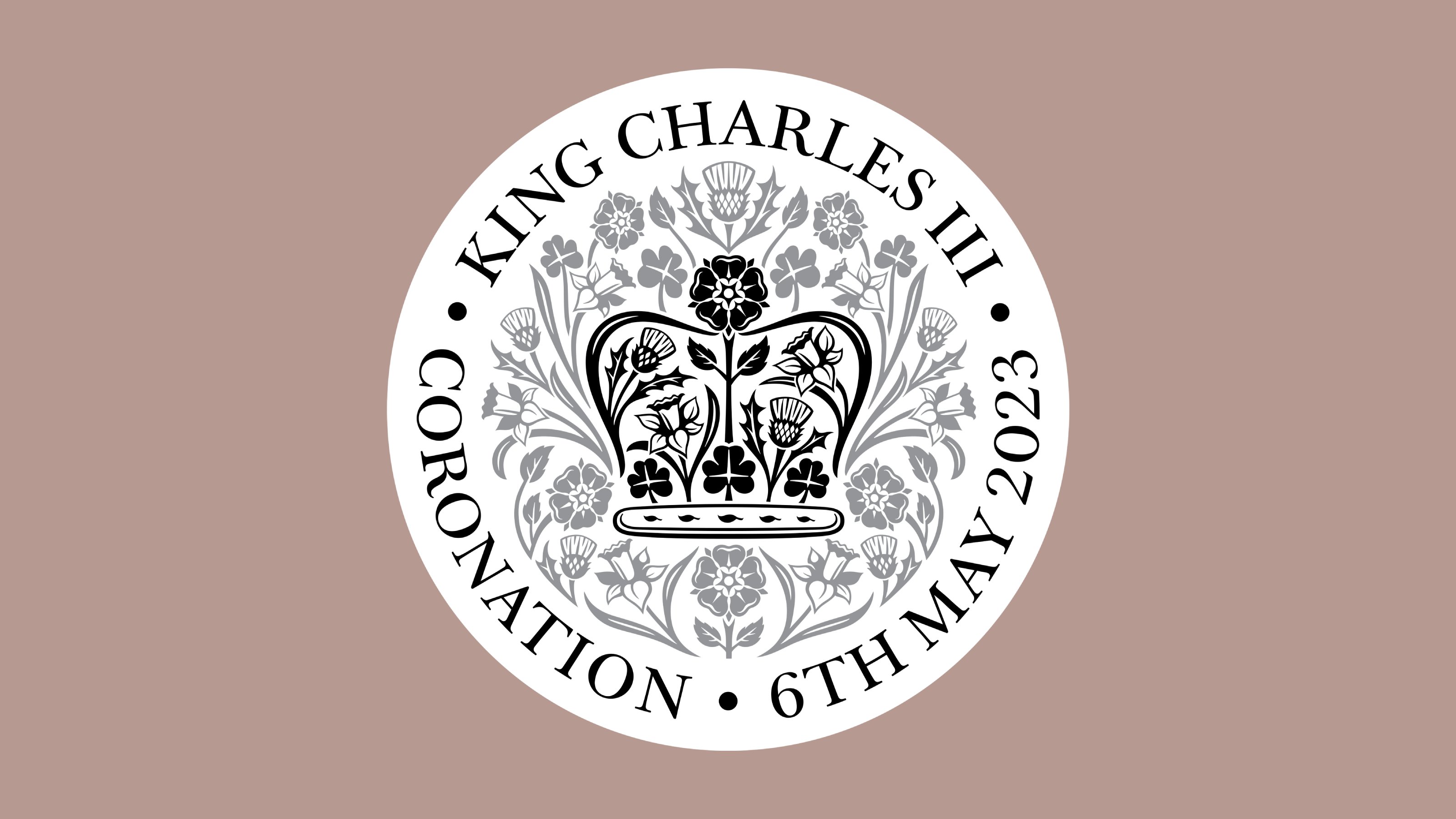
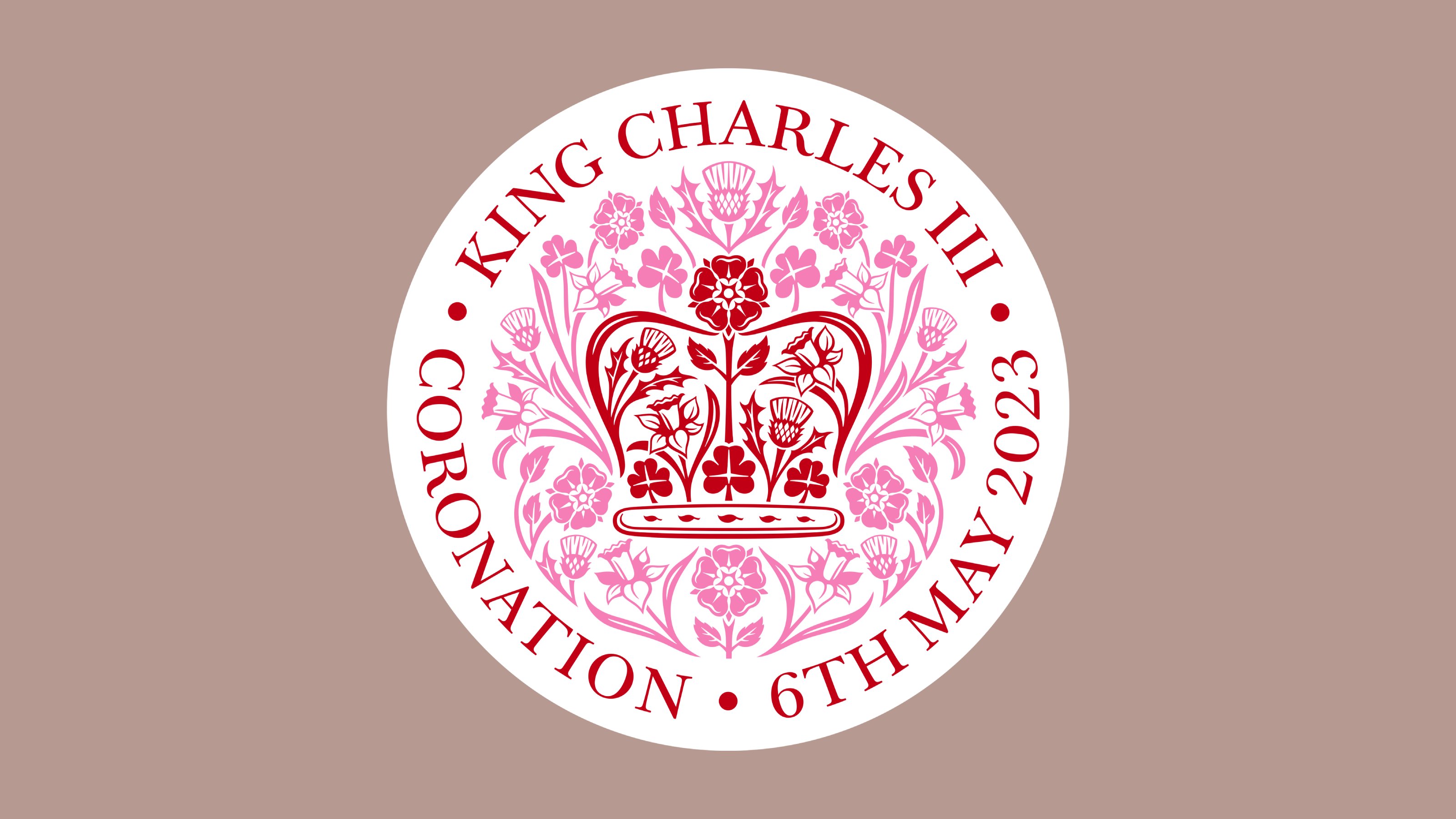
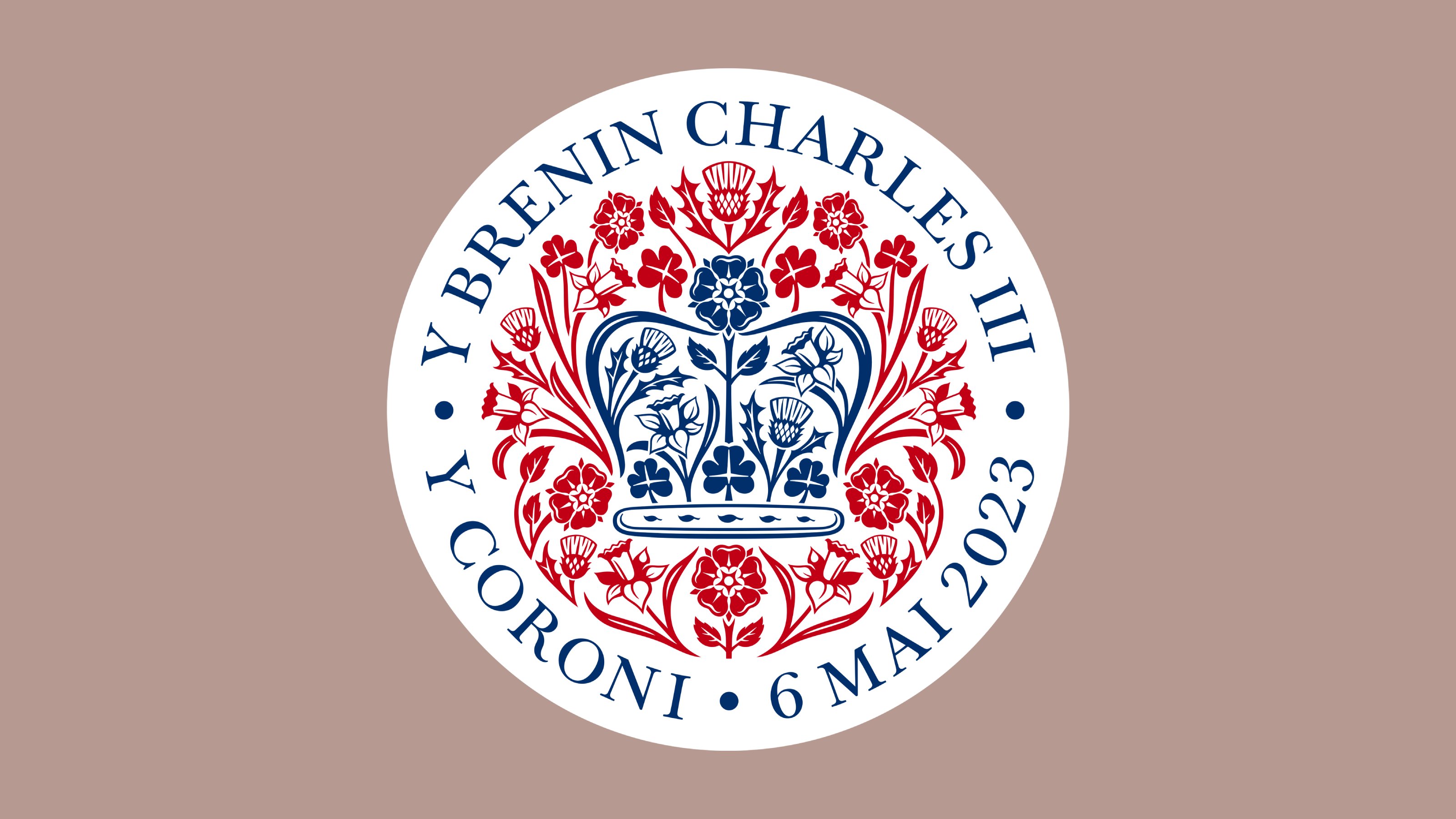
Coronation Emblem by LoveFrom

Together, the stylised flowers have been shaped to form St Edward’s Crown, originally made in 1661 for King Charles II. On Saturday 6 May 2023, His Majesty King Charles III will be crowned with this historic centrepiece of the Crown Jewel at Westminster Abbey.

Naturally, the emblem also uses the red, white and blue of the union flag. Ive said it was an honour for LoveFrom ‘to be able to contribute to this remarkable national occasion, and our team is so very proud of this work’.
‘The emblem speaks to the happy optimism of spring and celebrates the beginning of this new Carolean era for the United Kingdom,’ he continued. ‘The gentle modesty of these natural forms combines to define an emblem that acknowledges both the joyful and profound importance of this occasion.’

The emblem will, briefly, be everywhere, before it is placed in the history books as the most visible symbol of this historic day. It is also distinguished by being one of the first places the collective’s own typeface has been publicly used; the LoveFrom, Serif shows its flexibility, blending modernity, tradition and solemnity, whilst still remaining playful and fresh.
Receive our daily digest of inspiration, escapism and design stories from around the world direct to your inbox.
Jonathan Bell has written for Wallpaper* magazine since 1999, covering everything from architecture and transport design to books, tech and graphic design. He is now the magazine’s Transport and Technology Editor. Jonathan has written and edited 15 books, including Concept Car Design, 21st Century House, and The New Modern House. He is also the host of Wallpaper’s first podcast.