When worlds collide: How a skateboard deck graphic became Plastikman, a techno icon for the ages
The 1990s saw a sketch by graphic designer Ron Cameron define Richie Hawtin’s musical alias. He initially had no idea that it was happening
Receive our daily digest of inspiration, escapism and design stories from around the world direct to your inbox.
You are now subscribed
Your newsletter sign-up was successful
Want to add more newsletters?
All fluid, menacing minimalism, Plastikman has, over the past three decades, evolved into a lasting cultural symbol at the intersection of music, contemporary design and fashion. To be clear, we’re talking about the character here – not electronic pioneer Richie Hawtin’s musical alter ego; although it’s almost impossible to imagine one existing without the other.
While electronic music has a great tradition of ‘borrowing’ from other musical genres and wider popular culture, it’s perhaps somewhat fitting that the origins of Plastikman’s distinctive emblem can be traced back to an unexpected source.
Plastikman – the musical persona – has its origins in the sleepy market town of Banbury, Oxfordshire. In the late 1970s, at the age of nine, Richie Hawtin relocated with his family to LaSalle, a suburb of Windsor, Ontario, where he soon found himself a stone's throw from the heady, techno delights of Detroit. By 17, he was a fixture at the city’s music venues and as his reputation as a DJ grew, his attention turned to production, and he founded the Plus 8 record label in May 1990.
'I was always very interested in combining the visual and the auditory elements,' Hawtin muses. 'When you can fuse those together, either creating them yourself as one artist, working together with an artist that is a perfect collaboration, or you see a photo and you're like, “That image embodies the music”... You take that back to the studio with new inspiration. It's very hard to separate the two.'
By 1993, Hawtin was preparing to release the first full-length LP under his Plastikman alias. He had also been looking for a new typeface for Plus 8’s sister label, Probe Records, and had arranged a meeting with a designer. While browsing their portfolio, he was struck by an alien-like character that appeared to encapsulate the spirit of Plastikman.
'As soon as I saw it, I was like, "That's Plastikman,"' he recalls. 'The album was about this malleable, plastic, hallucinogenic, liquid type of form. It had a lot of fluidity and the titles of the songs were all done, but this little character just embodied everything that I was trying to do. And I was like, “Can I use it?” He said yes, so we just proceeded and I never thought anything of it.'
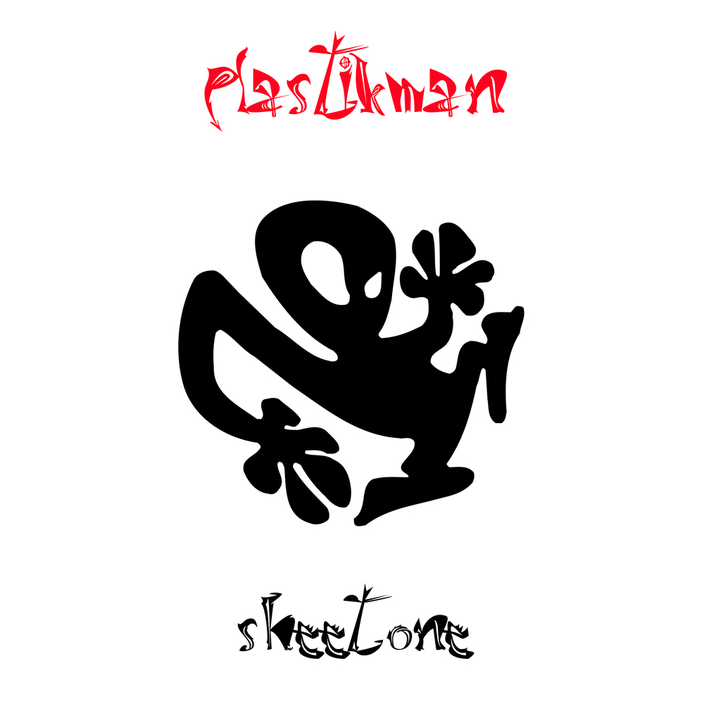
The Plastikman Sheet One album artwork
Within months, the character had dutifully embraced its role as the face of Plastikman. It adorned the sleeve of the album Sheet One, with its perforated inlay designed to resemble a wall of LSD tabs. One apocryphal tale recounts it being so realistic that a man in Texas was arrested when police spotted the CD in his car while booking him for a traffic violation.
Receive our daily digest of inspiration, escapism and design stories from around the world direct to your inbox.
'It was one of those moments where our very underground rave culture was misunderstood by someone outside of our culture,' Hawtin explains ruefully. 'That was a horrible experience to put someone through.'
Nevertheless, Sheet One and its unwitting cover star were warmly embraced by the electronic music community when the album was released in October 1993.
'The logo, the concept, the sheet of acid and the album just blew up for all those reasons connected,' Hawtin continues. 'When I saw the logo, it was just so perfect. I couldn't have imagined him if I had tried. It wasn't like I was looking for a logo or a mascot, but it was perfect… It dropped at the right time in rave culture. It dropped at the right time in my career. The music was not what people were expecting, but exactly what they needed. It was this beautiful kind of synchronicity and symphony of pieces that came together.'
There was one slight issue, however. Plastikman, the character, wasn’t quite what Hawtin had been sold. In early 1994, over 2,000 miles away in Southern California, skateboard artist and graphic designer Ron Cameron received a call from fellow designer Nate Carrico, who had spotted an album sleeve featuring a character that bore more than a striking resemblance to one of Cameron’s own designs.
'I wasn't too much into the dance culture,' Cameron recalls. 'I came more from skateboarding versus rave and stuff like that, so I didn't know that much about electronic music and I didn't know about Richie Hawtin or Plastikman, or that it had become kind of a big deal by that point.'
Eager to find out more, Cameron did what anyone would in the days before e-commerce. He headed to a record store.
'I started asking record shops around the San Francisco Bay Area that carried a lot of electronica and I noticed it was the record cover. That was the art. It was either gridded off or it was in the centre. And I'm like, ‘Oh, they're not just using it off to the side. They're using it. It's their identity.'
While the Plastikman logo was undeniably derived from his original designs, Cameron noted that the version used on Sheet One was notably inferior.
'Being a designer, you're so worried about production and if it's getting printed correctly, so I immediately saw that it was scanned and Streamlined improperly,' Cameon recalls. 'Maybe they just stuck a skateboard deck on a scanner, grabbed that and didn't know how to use the software, which kind of outlines a black and white image. It was a poorer quality than what I did.'
An early internet adoptee, much like Hawtin, Cameron reached out via email. Hawtin was understandably mortified.
'From my recollection, it wasn't a threatening letter,’ Hawtin recalls. ‘It was just like, “Hey, I'm the guy who did this and it happens to be on your album cover. What's kind of going on?”’
'He wrote back fairly quickly,' Cameron recalls. 'I showed him the skateboard deck, photos and everything. He's like, “Well, can I re-buy it from you?”... We kind of became friends because we liked creating stuff and we have similar mindsets: more underground-based, but really trying to jump into the future and do things that inspire people. So that's what the journey was, right there.'
'It's funny that it did go into Ron's world, but it doesn't surprise me,' Hawtin adds. 'Although I wouldn't necessarily call Plastikman and that album a rave album, it was definitely a psychedelic, hallucinogenic album and that was also very big on the West Coast. It made sense that it came onto his desk, so to speak.'
So how did a character on a skateboard deck become the visual signifier for an entire underground dance movement?
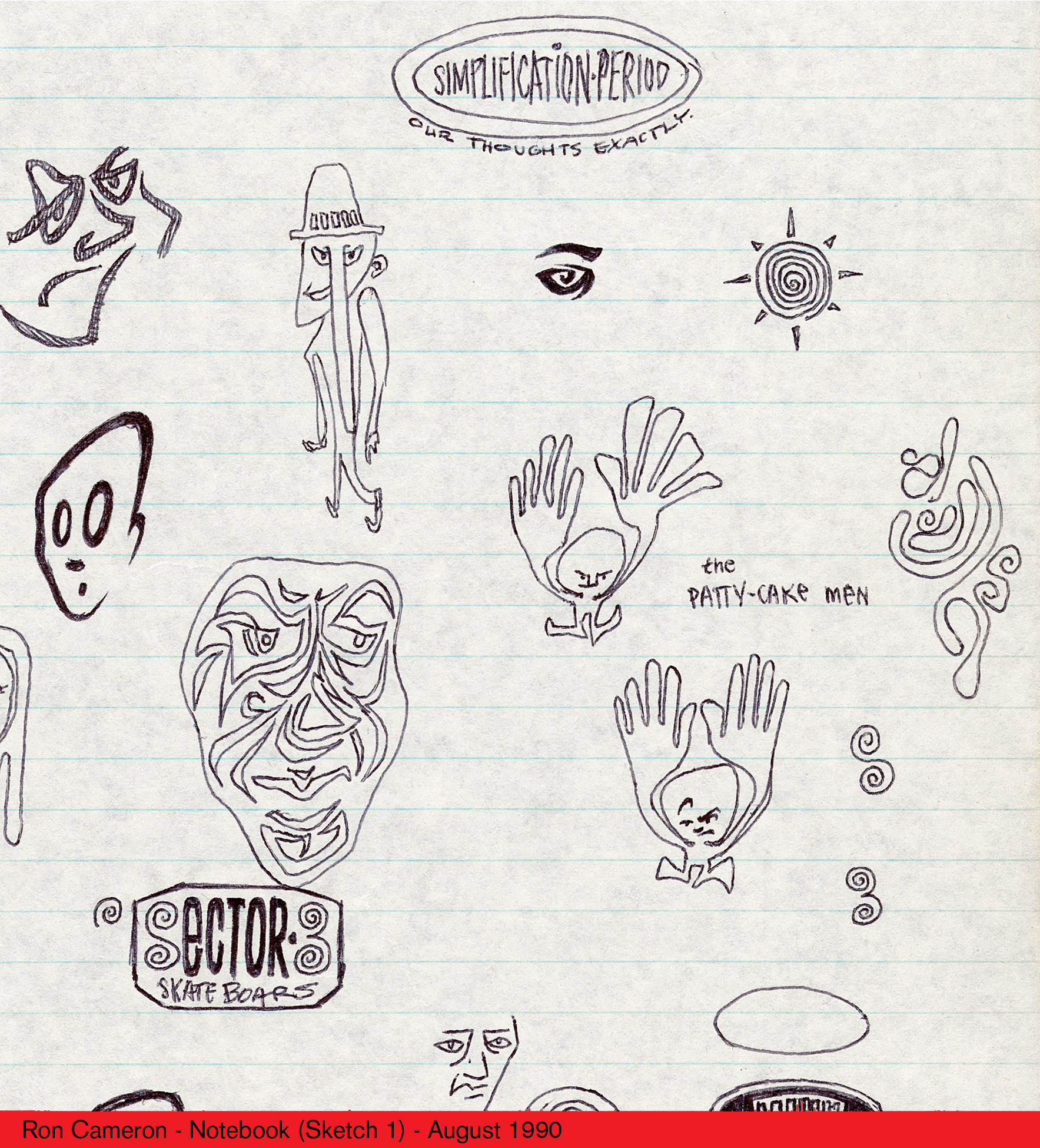
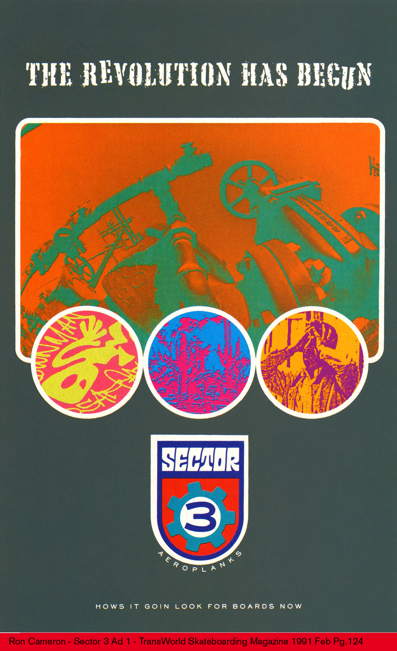
As both a street skateboarder and an established graphic designer in his own right, Cameron had already been cultivating distinctive visuals for various skate companies. The first, Blockhead Skateboards, was inspired by his love of 1960s psychedelia and pop art. When Blockhead was acquired by Tracker Trucks, publisher of the now-defunct Transworld Skateboarding magazine, Cameron relocated from Sacramento to Carlsbad, California. He later found himself at the helm of his own company, Sector 3, its name and appearance derived from the neo-psychedelic, space rock stylings of British rock band Spacemen 3.
'If I was going to remove myself from Blockhead, I couldn’t just take what I’d created there, so I had to do something new,' he muses. 'So when I went to do Sector 3, I added an industrial, 70s corporate industrial feel, and just kind of made it a little bit more refined.'
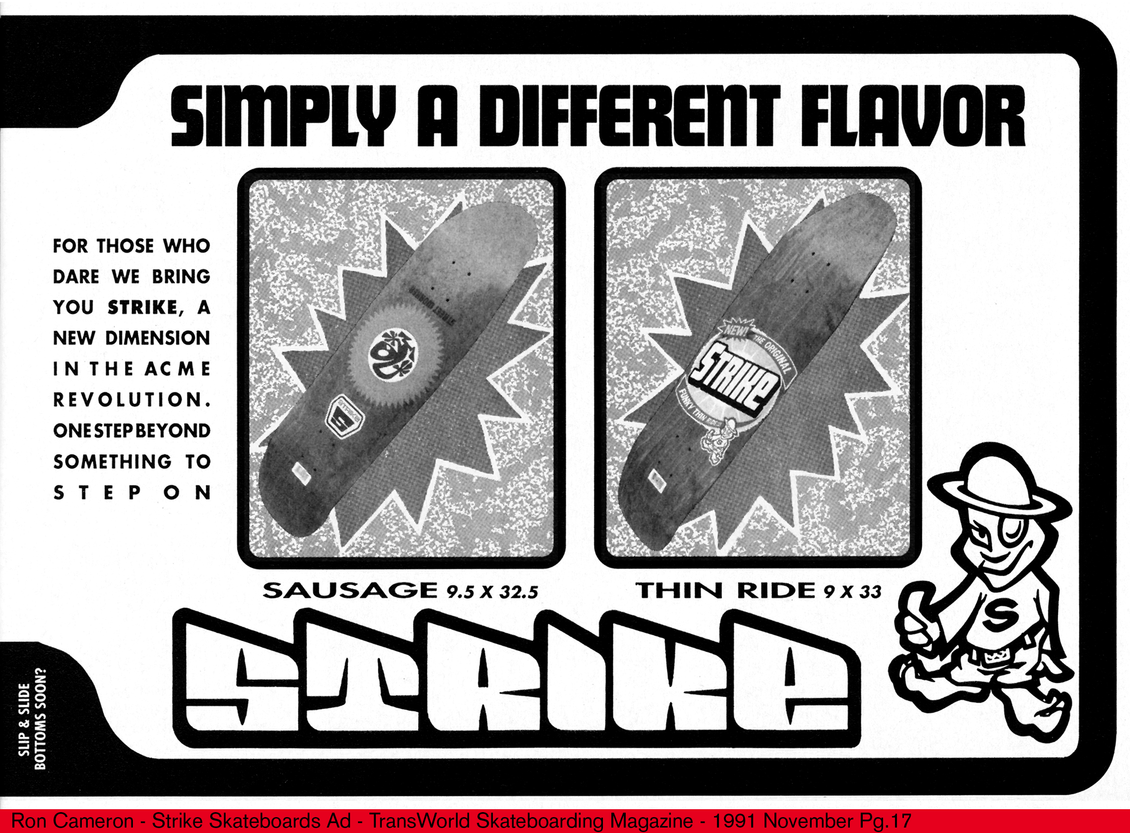
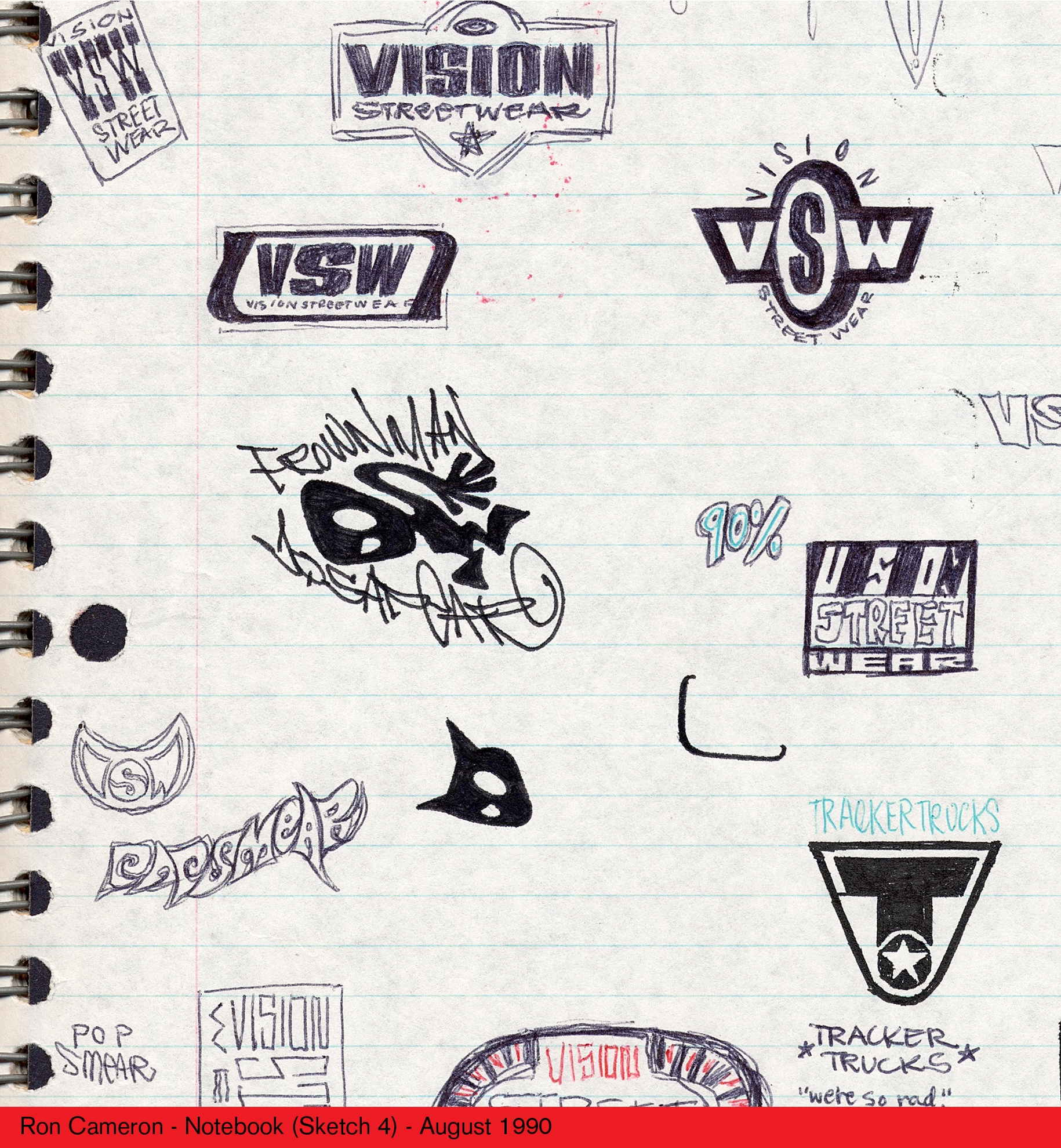
While working on designs for Sector 3, Cameron unearthed a sketchbook of drawings that he would revisit for another project. When Sector 3’s funding fell through in 1991, he joined forces with fellow Blockhead alumni Jim Gray to form Acme Skateboards. Disagreements over Acme’s art direction paved the way for Cameron to form a spin-off company, Strike, and for his first street board design, dubbed ‘Street Worker’, he found himself revisiting the character once more.
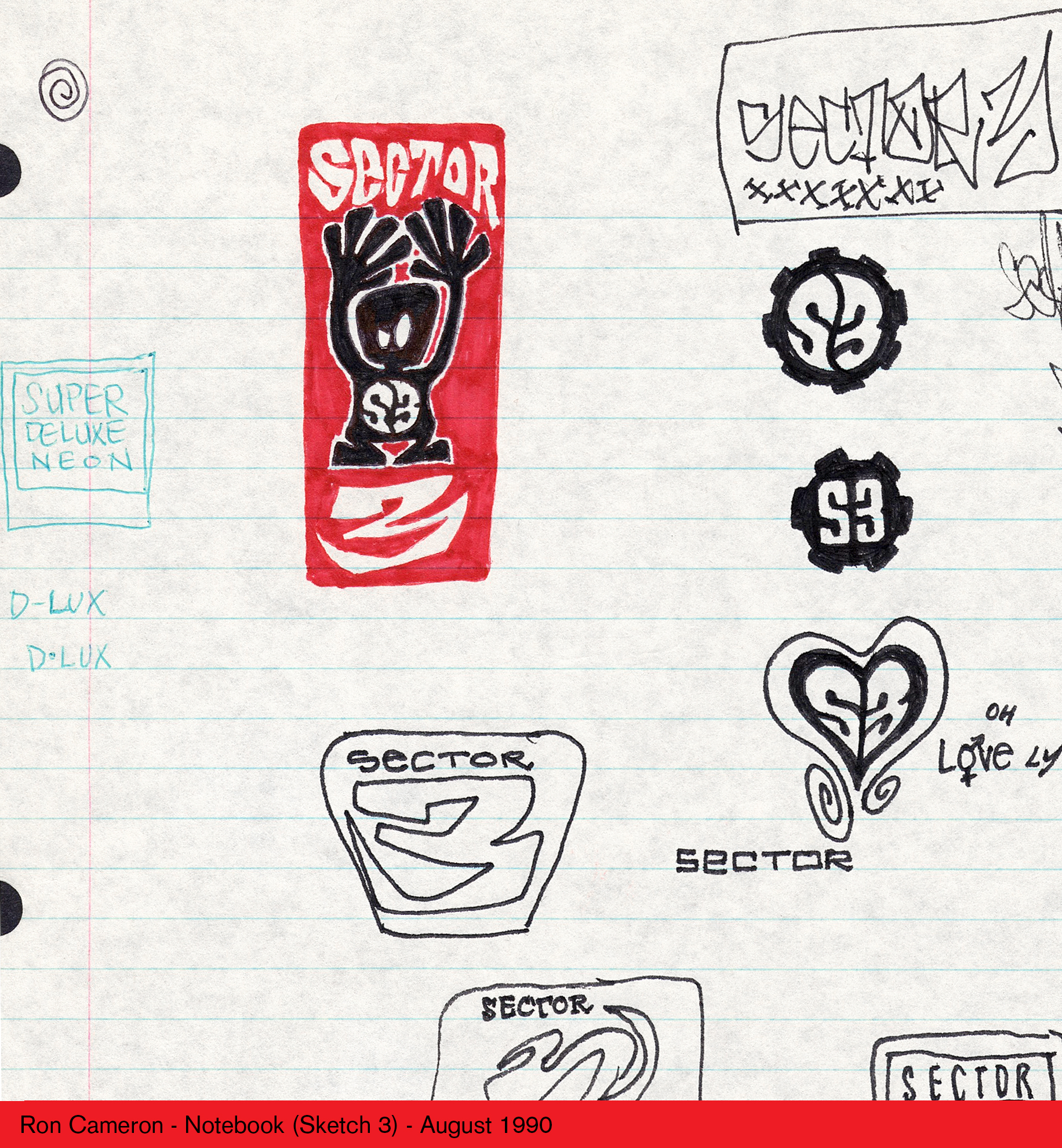
'I went back through my sketchbook and saw that character that I did a couple times in rough forms,' he recalls. 'I redrew it and put a little spike circle around it from a Safeway grocery stores logo from the 1970s or 1960s. It was a street board that was one of the first that was all rounded off. I was planning on doing it for Sector 3, so instead of Sector and a big “3”, it became Strike and a big “S”.'
While ‘Street Worker’ and Cameron’s other designs were hugely popular among the skating community, Cameron can only surmise that the image was taken from one of two sources: the 3x3 graphic on the board itself, or a low-quality print ad scan. Having granted Hawtin the rights to use the image officially, he also offered a hi-res version. The problem was that the low-quality version of Plastikman was now the norm.
'That’s the funniest part about it,' Cameron laughs. 'He was like, “As bad as you think it is, this is what's become known, so we can't suddenly clean it up.” So there's the difference. There's the Plastikman version, and the Strike Skateboards version is the cleaner one.'
In its rougher, bootleg iteration, the Plastikman logo could frequently be spotted around Detroit in the early 1990s, signalling to those in the know that plans for another of Hawtin’s legendary underground parties were afoot.
'The logo became the branding for a tribe,' Hawtin muses. 'To most people, it didn't mean anything, but the people who knew were like, “You're one of us.” Across the world, but especially in the Midwest, the ravers who were coming to our events and experiencing these kinds of communal experiences quite often marked themselves with a Plastikman logo, and it was almost a rite of passage.'
As electronic music continues its cyclical relationship within mainstream and underground aesthetics, the Plastikman logo remains an enduring visual touchstone. The emblem has since found its way into the world of fashion, following a collaboration with Frenckenberger in 2022, which divided opinion amongst fans.
'Some people hated it, because it became a high-end fashion piece,' Hawtin concedes. 'For us, we did that because it was a collaboration with friends who were very committed to a certain quality, working with independent artisans creating their fabrics. So in that way, for me, it had a connection to the lineage of this DIY culture, even though it was in a very different context.'
Last year marked the 30th anniversary of sophomore album Musik, on which the character featured prominently. Subsequent albums have seen Hawtin integrate it more subtly, shifting forms to reflect the sonic evolution of Plastikman’s musical output. More recently, the character has been revived as a central component in Hawtin’s ever-evolving live show.
'It’s now at the forefront, but it also gets ripped apart,' Hawtin explains. 'Plastikman is very much malleable and in a constant flux. It's something that you kind of want to pull apart and rebuild every time. It's like one of the tracks on the first album: it's like plasticine… When I'm in the studio working on new ideas, it's like I still have that Play-Doh as a kid. I'm pushing it back together and destroying everything I've created before and then building something out of it again, creating something else in a slightly different form.'
For his part, Cameron remains content with the unexpected legacy of his work – one that might otherwise have been consigned to the annals of skating history.
'It became so much bigger than being on the bottom of a skateboard deck that was going to be outmoded within a year,' he recalls. 'The culture was changing so fast that that board had a lifespan of about a year, maybe two, on the market… It would have come and gone, but this way, it took on a life of its own without me even knowing it. Isn't the universe funny?'
Paul Weedon is a UK-based freelance writer and journalist. His work frequently explores the intersection between design, music and popular culture.