Edits by Edit music genre posters

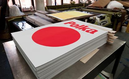
We're grateful for the bounty of eclectic graphic design styles we come across over at W* HQ, but sometimes we're left craving for a bit of pared down minimalism. Therapeutically taking things down to the bare font, Edits by Edit is a series of 13 screen-printed limited edition numbered posters, each one representing a musical genre. In the spirit of graphic detox, designers were given a strict brief that they could only use one element and one typeface.
src="/images/thums/98_EditbyEdits_hm_06012011_it.jpg" alt="Edit by Edits">
See more posters from Edits by Edit
The series is the launch project of Edit. a studio set up by New York- and London-based designer Nitzan Hermon, and is the moniker under which he does all of his creative work.
src="/images/thums/98_EditbyEdits_hm_06012011_it2.jpg" alt="Edit by Edits studio">
Go behind the scenes of Edits by Edit in production
Inspired by the series of modernist TV prints created by Albert Exergian for Blanka, Hermon decided the concept would work well if applied to music genres, a subject close to his heart. Apart from immersing himself in print and digital design, typography and the occasional conceptual code work, music is in Hermon's background - a big preoccupation at that as he also runs his own record label, Fine Art Recordings.
Enlisting the help of designers who had the right styles to execute the poster concept, Hermon pulled the project together in just under a year. The resulting work is simple but effective, and the tongue-in-cheek science diagram style graphics tick all our boxes.
Wallpaper* Newsletter
Receive our daily digest of inspiration, escapism and design stories from around the world direct to your inbox
-
 Get to know Issey Miyake’s innovative A-POC ABLE line as it arrives in the UK
As A-POC ABLE Issey Miyake launches in London this week, designer Yoshiyuki Miyamae gives Wallpaper* the lowdown on the experimental Issey Miyake offshoot
By Jack Moss Published
-
 Eurovision unveils its 2024 stage, designed by Beyoncé's Renaissance Tour creatives
This year's stage design aims to bring the audience into the performance more than ever before.
By Charlotte Gunn Published
-
 Ikea meets Japan in this new pattern-filled collection
New Ikea Sötrönn collection by Japanese artist Hiroko Takahashi brings Japan and Scandinavia together in a pattern-filled, joyful range for the home
By Rosa Bertoli Published