Rado partners with Les Couleurs Le Corbusier

Receive our daily digest of inspiration, escapism and design stories from around the world direct to your inbox.
You are now subscribed
Your newsletter sign-up was successful
Want to add more newsletters?
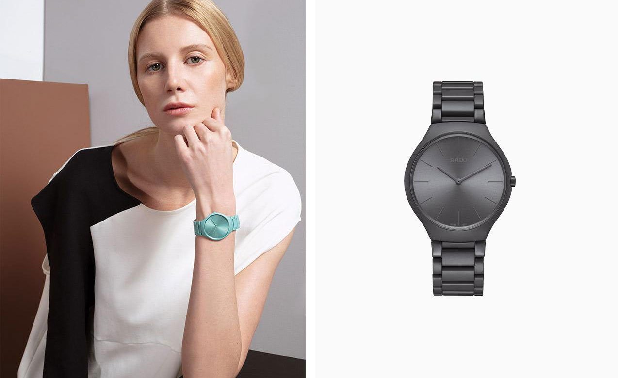
Left, True Thinline Les Couleurs Le Corbusier Slightly Greyed English Green – 32041, from the 1931 edition of Le Corbusier’s Architectural Polychromy palette, is infused with a hint of blue. Right, True Thinline Les Couleurs Le Corbusier Iron Grey – 32010 is the darkest shade of Le Corbusier’s first Architectural Polychromy palette, published in 1931.
Rado’s collaborations with Jasper Morrison and Konstantin Grcic resulted in two of the Swiss watch brand’s most notable contemporary watch designs. Now, it is taking its design-partnership credentials one step further – albeit with a backwards glance.
Rado’s just-announced association with Les Couleurs Suisse, protecting body of Le Corbusier’s Architectural Polychromy, promises to be a harmonious one. That the architect-designer hails from the world’s horological heartland is a tidy link. That Rado has immersed itself in the exploration of colour theory since it started experimenting with high-tech ceramic in the 1990s adds up to a genuinely creative one.
Back then, the process of creating wearable products in a material commonly used by the aerospace industry for its toughness and heat resistance was a high-risk business requiring huge investment in special machinery. Attempts at introducing colour beyond achieved black and white tones proved almost impossible, due to the inconsistency of pigment in the extremely high-temperature ceramic production process.
Over the past 30 years, Rado has become a master alchemist, relentlessly experimenting until tonal ceramic shades, such as grey and brown, became possible.
The launch of the True Thinline Les Couleurs Le Corbusier – a monochromatic ceramic watch collection created in nine of the Architectural Polychromy shades – marks a milestone in horological achievement. The results, though hard to convey in an image – particularly the subtlety of the achieved tones – are seriously impressive.
As with the ceramic technology, working with Les Couleurs Suisse added a further layer of process. ‘We had been experimenting with prototype colours for 10 years before going to see them,’ says Matthias Breschan, Rado CEO. ‘They took one look and said, “No”.’
At that point the prototypes were shiny – ‘the light was all over the place,’ recalls Breschan. ‘So we tried it on matt ceramic, which absorbed the light, and went back to see them. That was the starting point.’ The next two years involved much back and forth and trial-and-error. But, as Breschan points out. ‘It was Les Couleurs Suisse who were always in charge of the colours.'

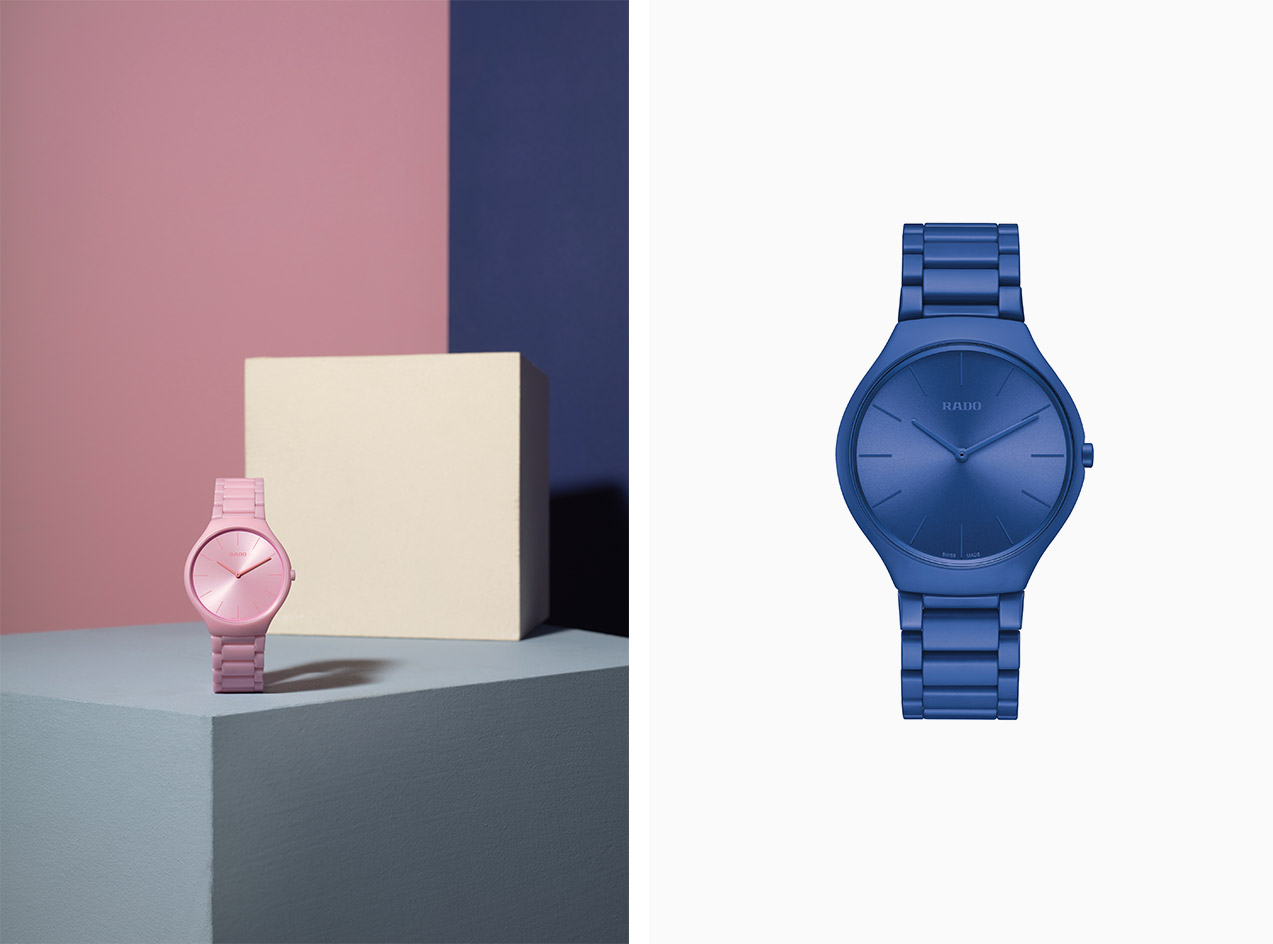
Left, True Thinline Les Couleurs Le Corbusier Luminous Pink 4320C, from the 1959 series is the ultimate pop colour. Right, True Thinline Les Couleurs Le Corbusier Spectacular Ultramarine – 4320K is one of the dynamic shades of the 1959 series of Le Corbusier’s Architectural Polychromy palette.

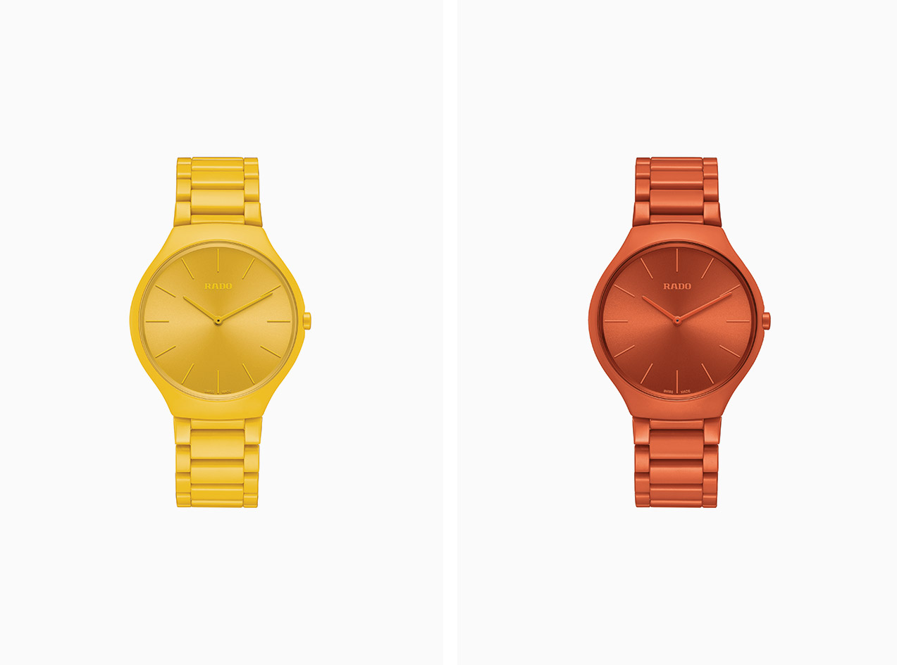
Left, True Thinline Les Couleurs Le Corbusier Sunshine Yellow – 4320W, from the 1959 dynamic colour series, is the only yellow shade in the Polychromy. Right, True Thinline Les Couleurs Le Corbusier Powerful Orange 4320S, from the 1959 series, is a basic, optimistic shade suited to larger surfaces.
INFORMATION
For more information, visit the Rado website and the Les Couleurs Le Corbusier website
Receive our daily digest of inspiration, escapism and design stories from around the world direct to your inbox.
Caragh McKay is a contributing editor at Wallpaper* and was watches & jewellery director at the magazine between 2011 and 2019. Caragh’s current remit is cross-cultural and her recent stories include the curious tale of how Muhammad Ali met his poetic match in Robert Burns and how a Martin Scorsese Martin film revived a forgotten Osage art.