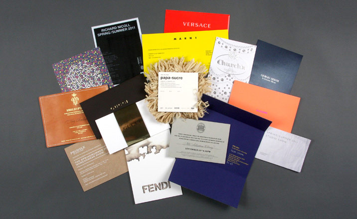
A kaleidescopic collection of all our favourite invitations from the S/S 2011 Womenswear Collections
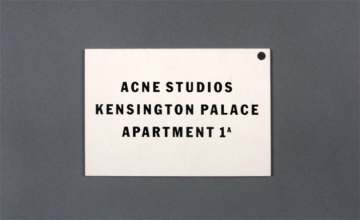
Acne (front) sent out a thick black-foiled invitation card.
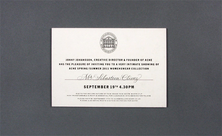
On the reverse of the Acne inviation card, our fashion director’s hand-written name was underlined with purple foil.
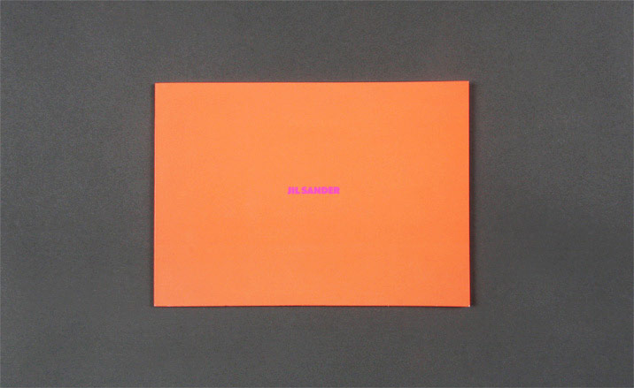
Jil Sander’s fluorescent invitation reflected the sizzling-coloured collection.
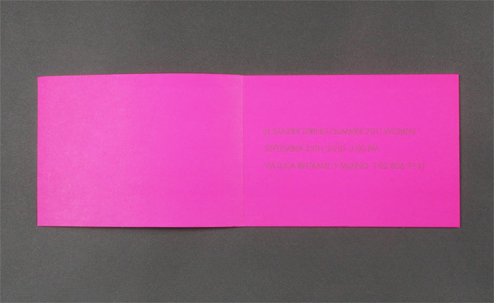
Jil Sander’s invitation opened to reveal a shocking-pink interior.
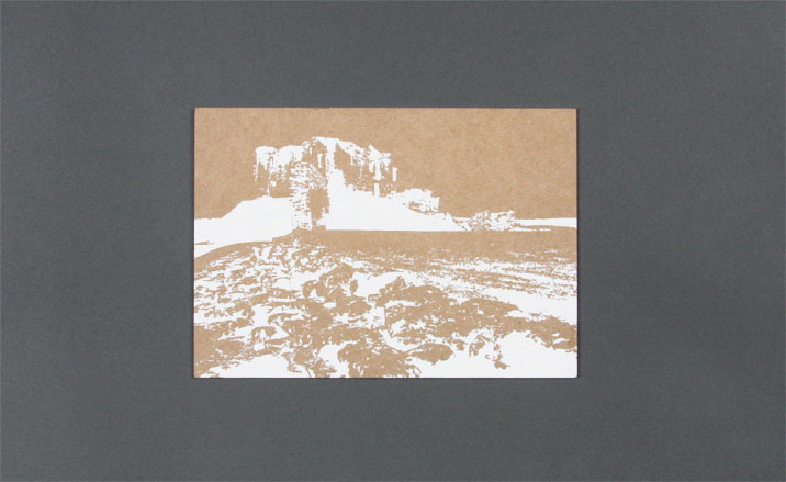
Pringle of Scotland’s white-foiled card featured a stylised negative image of a scene from the label’s latest advertising campaign, shot near Nairn.
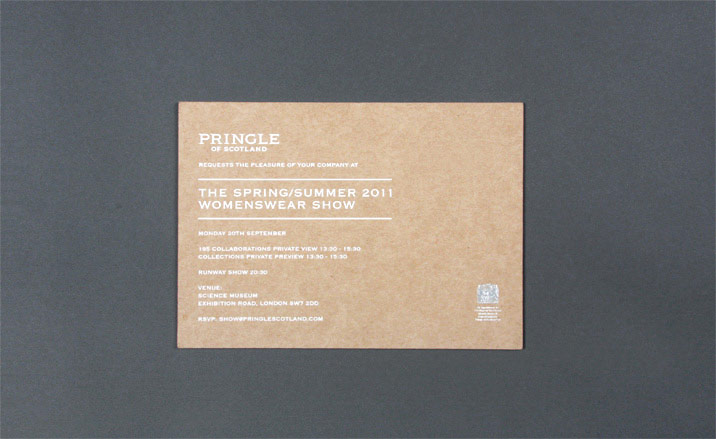
Pringle of Scotland (reverse).
Receive our daily digest of inspiration, escapism and design stories from around the world direct to your inbox.
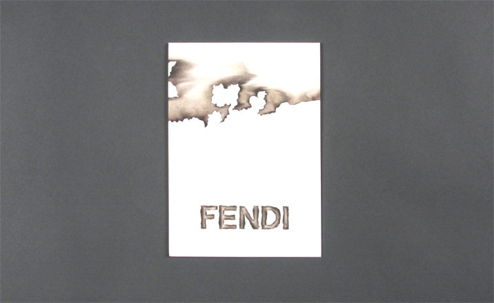
Fendi’s invitation appeared scorched – as did the collection - thanks to dyed, laser-cut organza.
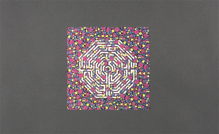
Versus’s floral offering echoed both the micro-prints and the abundance of geometric shapes in the collection.
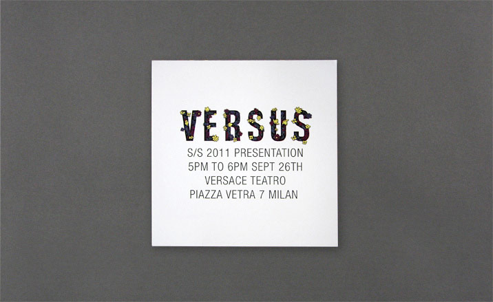
Versus’s invitation (reverse).
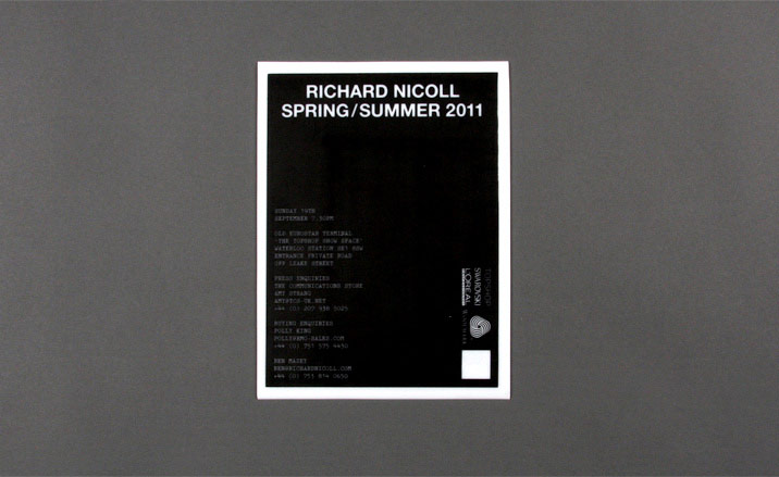
Richard Nicoll’s invitation was screen-printed on vinyl with the print appearing in retro typewriter typography.
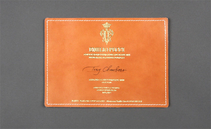
From Emilio Pucci came a piece of tan stiched leather with gold embossed lettering.
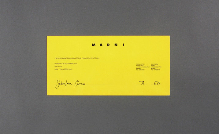
Marni sent out a simple, glossy and sunny card.
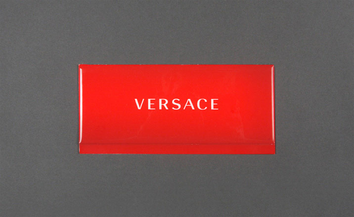
Versace
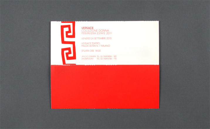
Versace
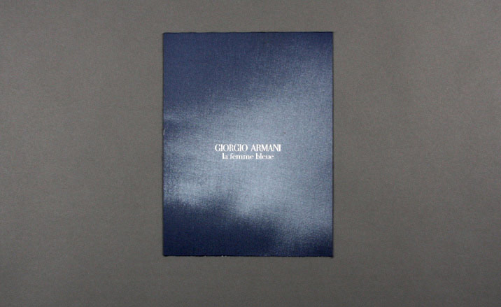
Giorgio Armani’s blue, fabric-covered invitation set the tone for a marine-coloured show that was big on texture.
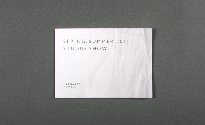
Margaret Howell sent a fold-out poster that opened out to reveal the crinkled surface of a shirt.
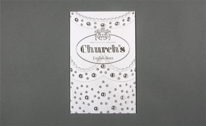
Church’s stiff-board invitation was decorated with the pattern of a brogue shoe embossed with silver-foiled bubbles.
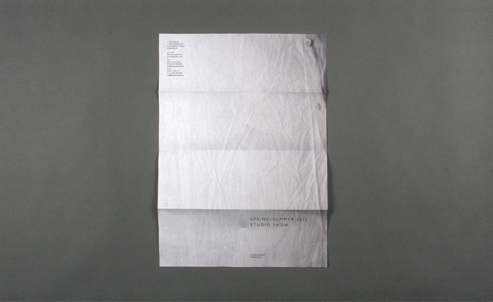
The inside of Margaret Howell’s folded invitation was patterned with a shirt’s crinkles.
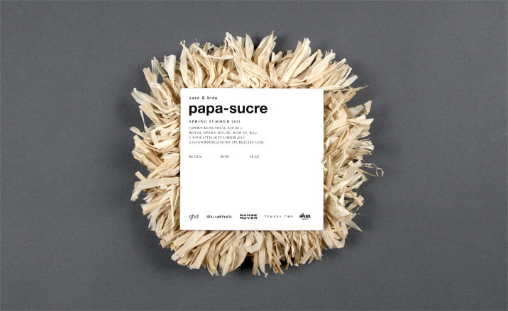
The stiff-board invitation to Sass & Bide’s ’Papa Sucre’ collection was capped by a tangle of crinkley raffia straw.
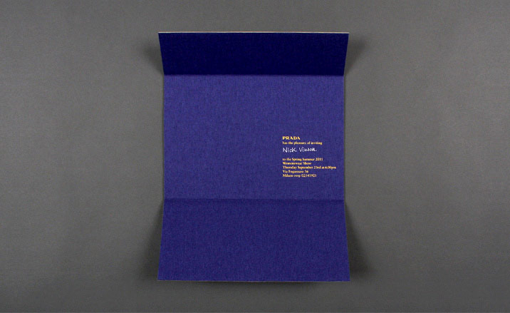
A nondescript cardboard exterior folded open to reveal Prada’s deep blue invitation.
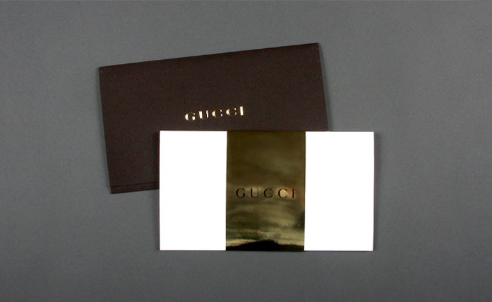
Gucci’s rigourously duo chromatic invitation.
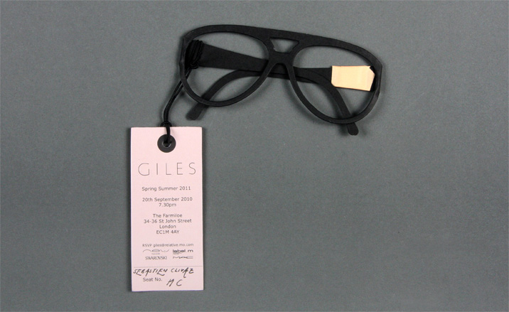
Giles Deacon’s invitation came on a label attached to a paper version of his trademark sunglasses
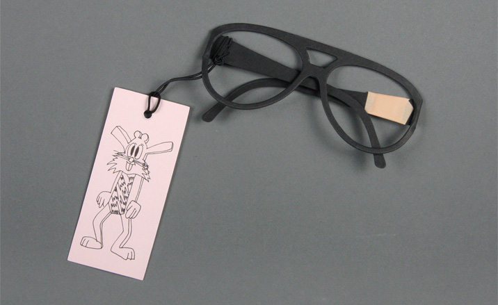
The reverse of the label featured a cheeky cartoon character
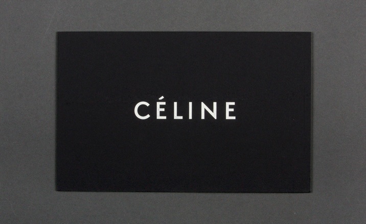
Céline’s double-paper stock invitation was reinforced by thick card
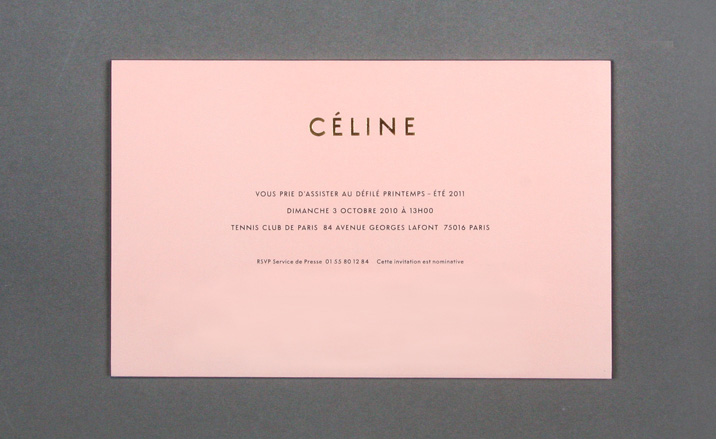
Céline
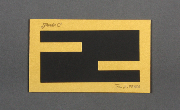
Fendi’s black and gold offering
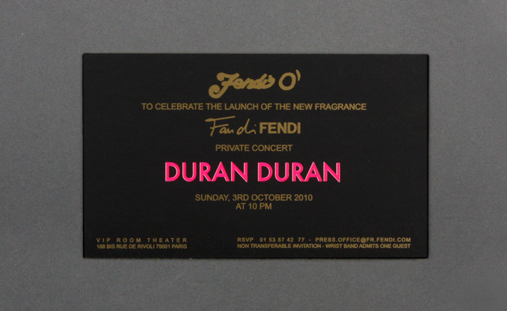
On the reverse, guest performers Duran Duran’s name came emblazoned in a thick, fluorescent glossy print
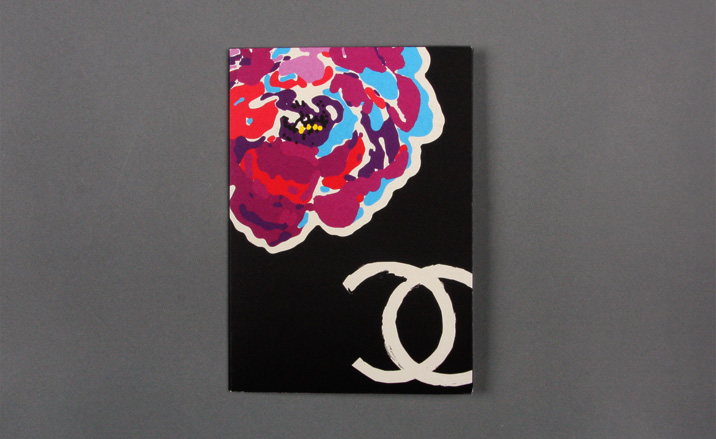
Chanel’s floral offering
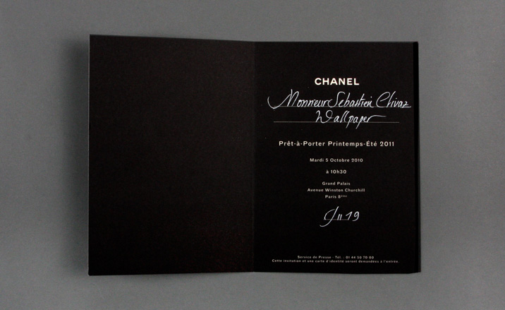
Chanel
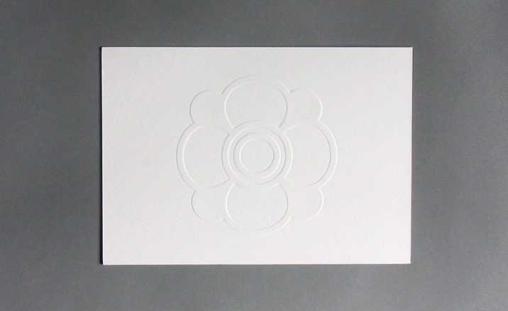
Emanuel Ungaro’s embossed logo adorned triplexed board with a subtle pink rim
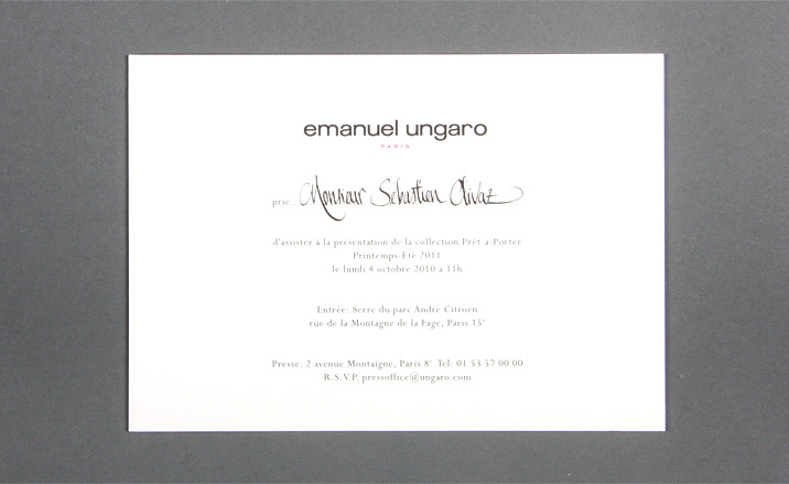
Emanuel Ungaro
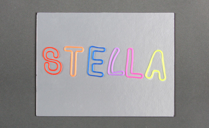
The designer’s firstname was spelt out in fluorescent elastic bands on a thick silver card, with purple edging, on the Stella McCartney invitation
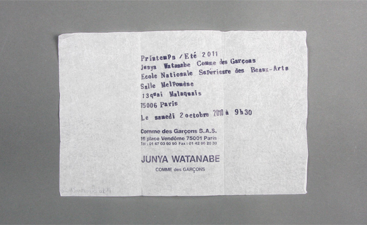
Junya Watanabe’s delicate tissue paper offering
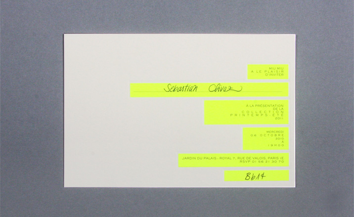
The Miu Miu invitation featured bold, embossed blocks of fluorescent yellow...
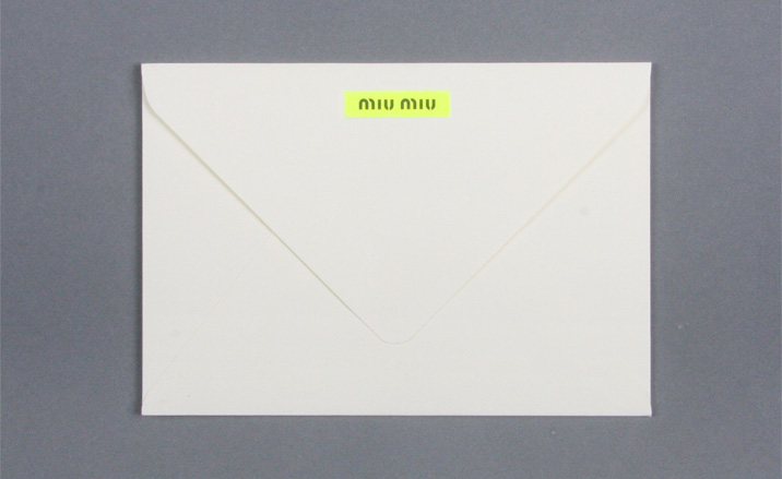
...as did the envelope
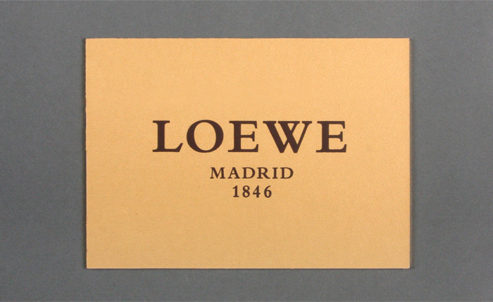
One side of Loewe’s extra thick, gilt-edged card had a leather-like texture...
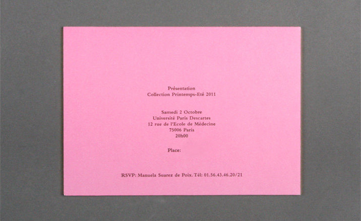
...while the other featured simple, printed pink paper
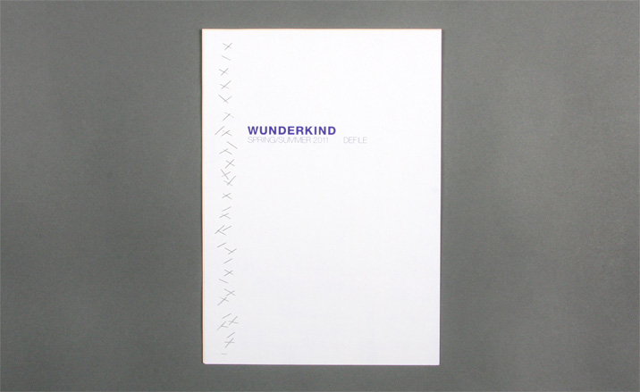
Wunderkind’s multi-paper stock invitation came erratically stapled together
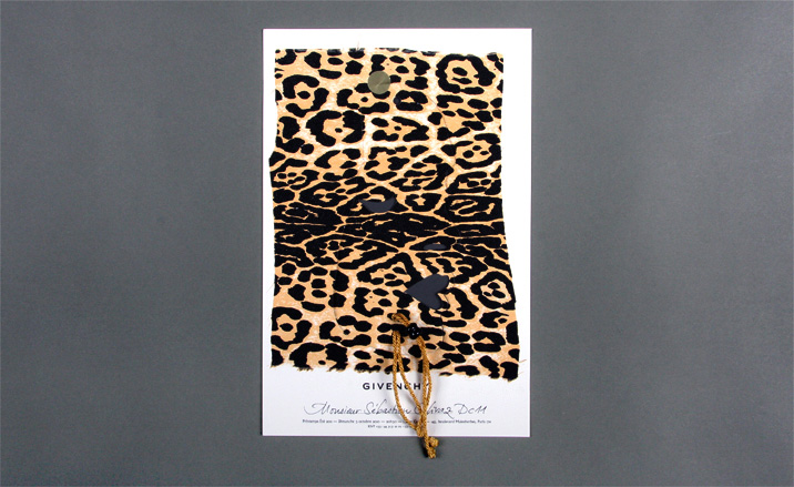
Givenchy by Riccardo Tisci’s offering incorporated a dye-cut, detachable woman’s face in leopard print...
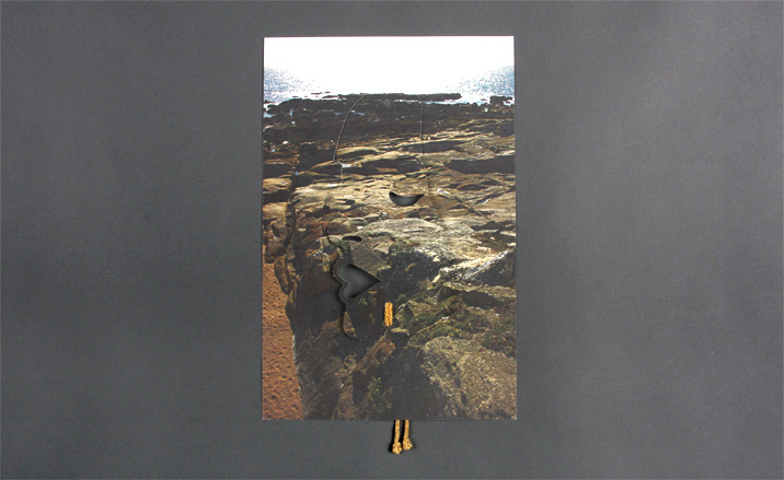
...while the reverse featured a rocky beach scene
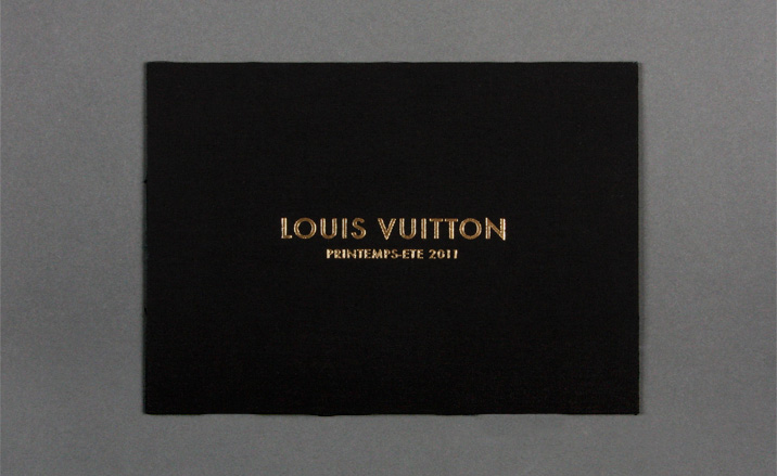
Louis Vuitton’s gold-foiled fabric card invitation
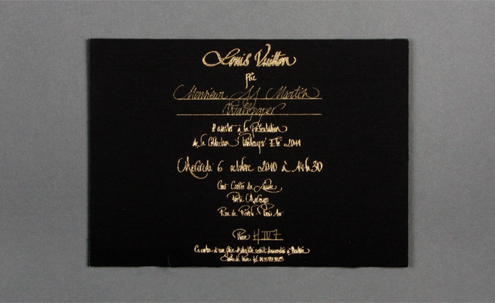
Louis Vuitton
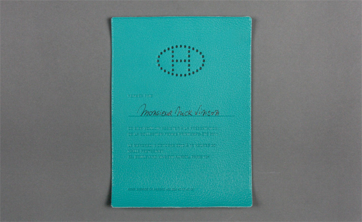
Hermès sent out a leather invitation with a hole-punched logo and debossed lettering
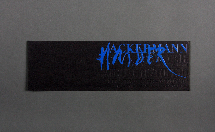
Ackermann’s invitation came emblazoned with a super-glossy, blue paint logo, with black debossed show details
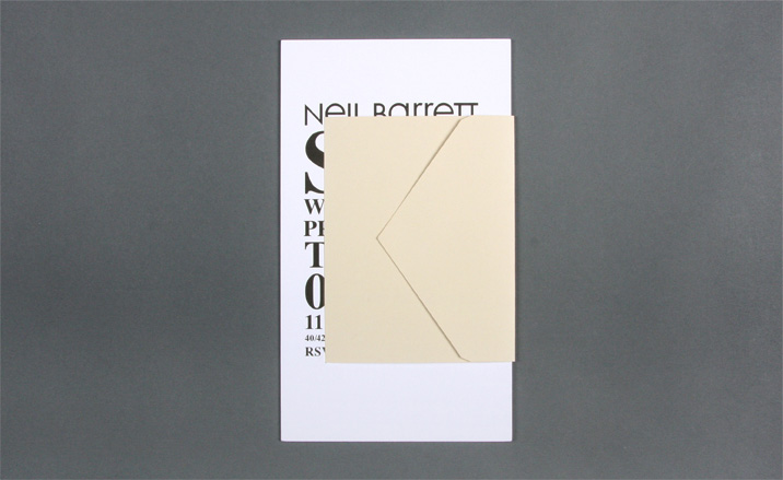
Once again, Neil Barrett made the envelope a feature by outsizing the card
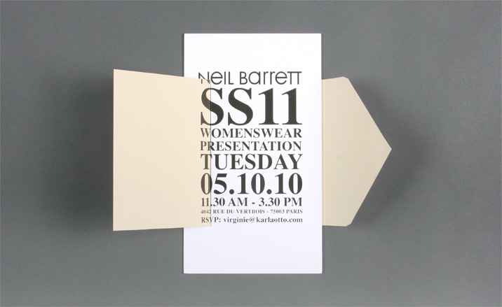
Neil Barrett
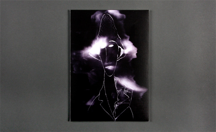
John Galliano’s canvas invitation featured a moody sketch of woman’s face
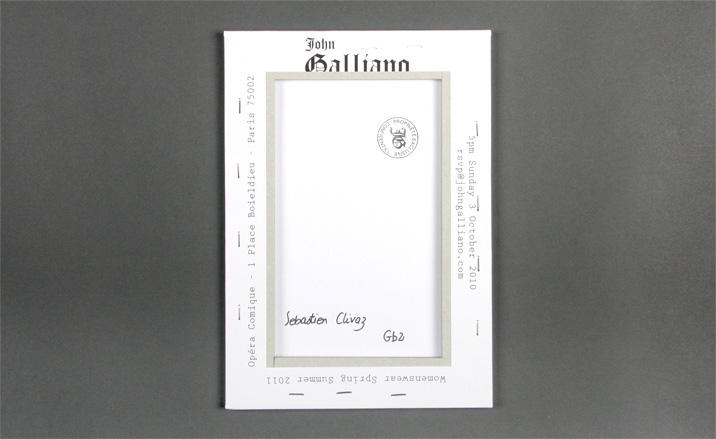
The show details came printed on the back
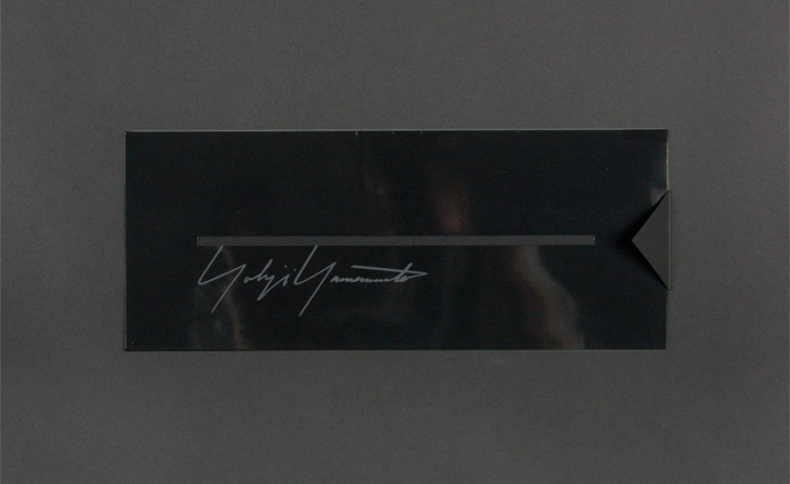
At first glance, the Yohji Yamamoto invitation looked like a simple, glossy back card with a mysterious dye-cut strip...
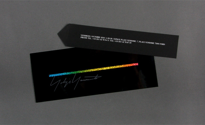
...but, when you pulled on the subtly protruding back strip, it revealed a glittery blaze of colour
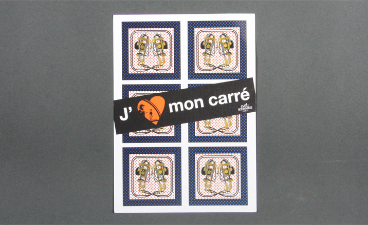
The Hermès and Colette collaboration invitation incorporated images of their limited edition scarves
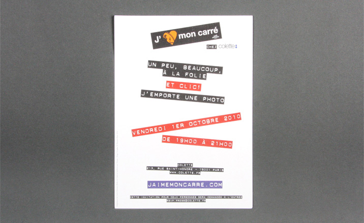
The reverse came printed in the style of an old-school label maker
Jack Moss is the Fashion & Beauty Features Director at Wallpaper*, having joined the team in 2022 as Fashion Features Editor. Previously the digital features editor at AnOther and digital editor at 10 Magazine, he has also contributed to numerous international publications and featured in ‘Dazed: 32 Years Confused: The Covers’, published by Rizzoli. He is particularly interested in the moments when fashion intersects with other creative disciplines – notably art and design – as well as championing a new generation of international talent and reporting from international fashion weeks. Across his career, he has interviewed the fashion industry’s leading figures, including Rick Owens, Pieter Mulier, Jonathan Anderson, Grace Wales Bonner, Christian Lacroix, Kate Moss and Manolo Blahnik.