As avid Wallpaper* readers will know, we never let a good fashion show invitation pass by unnoticed. In the battle of brand one-upmanship, these oversized calling cards get more ambitious with every season. Alongside everything from logos to lookbooks, they are the fruits of an extraordinary creative relationship - illuminated in new tome, Graphic Design For Fashion - in which the cross-fertilisation of ideas breeds playful, surprising and often outlandish results.
'Fashion gives you a certain freedom of creation - you can experiment, play, have fun,' say graphic designers Antoine + Manuel of their work for Christian Lacroix in the book. Their layered textures, geometric forms and detailed illustrative gestures not only adorn the label's printed material but often add an explosive element to the Lacroix catwalk. 'Fashion constantly changes, so you can dare - you don't always have to be "right",' they add.
By listening in on the dialogue between designer and client, Graphic Design For Fashion, by Jay Hess and Simone Pasztorek of studio byBOTH, is much more than just a survey of strong work. Split into four neatly navigable chapters - branding, invitations, lookbooks and packaging - it swings from the making of Mevis & Van Deursens' wax-seal logo for Viktor & Rolf (which, in black, has 'a posh, absurd, fetish-like quality', they say) to Mind Design's alternating cardboard and vacuum-packed foil creations for Lacoste by Tom Dixon.
The invitations chapter is - of course - a highlight. Across its pages, you'll find everything from Studio Small's whole-punched invitations for Margaret Howell, to Paul Boudens' designs for Haider Ackermann and Yohji Yamamoto.
Of the latter, Boudens says. 'For me working for Yohji Yamamoto was a marriage made in heaven. Especially in the beginning, I was able to fully use my range of skills: the painting, the hand-made feeling, classic typography, gorgeous paper choices and perfectionist finishing.' Boudens takes pains to imprint his work with the mark of a human, rather than a computerised 'robot', as his Yamamoto invitations - stitched together or splashed with red paint - are testament. 'I do not want to become a computer nerd, the life would go out of my work,' he says - a good one to remember, should a bout of technophobia ever strike.

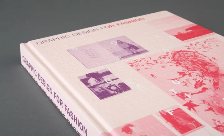
The hardback cover features debossed type

Spread from the book: pages from the A/W 2003 Eley Kishimoto 'views-paper' by HarrimanSteel

Close-up: Christian Lacroix Pret-a-Porter A/W 2006 invitation by Antoine + Manuel.

Spread from the book: A comic strip-style lookbook for A/W 2003 for Bernhard Willhelm by Freudenthal Verhage

Close-up: For S/S 2006, the Bernhard Willhelm lookbook by Freudenthal Verhagen was produced as two A1 posters. 'This was the superwoman collection. Before the shoot we had the idea to show Berhard and Jutta as giants being attacked by their own creations, mean little fashion elves,' explains Verhagen.

Close-up: A selection of Haider Ackermann invitations by Paul Boudens.

Close-up: A/W 2010 lookbook by Designbolaget for Won Hundred.

Close-up: A/W 2009 lookbook by Designbolaget for Won Hundred.

Close-up: With central perforations, these A5 invitations by Paul Boudens for Yohji Yamamoto, were delivered in translucent metallic envelopes.

Close-up: Viktor & Rolf A/W 2008 invitation by Mevis & van Deursen, stamped with the wax seal-style logo.

Close-up: Homework's minimalist packaging for organic label Fleur Tang featured a subtly embossed logo.

Close-up: A small snippet of a vast array of branding collateral material by Acne Art Department for Acne Studios, including Jeans labels, denim buttons, a compliments slip and receipt envelope.

Spread from the book: Bags and tissue paper (customised each season) by Acne Art Department for Acne Studios

Spread from the book: Acne Paper subscription cards even get special treatment, with alternating paper colours for each issue

the Journal Standard Luxe lookbook

Close-up: Inside the lookbook, loose sheets of apparently aged paper create the impression of a personal collection of photos and clipping.

Close-up: Joff lookbook by Julia Born.

Spread from the book: Bless lookbook by Manuel Raeder

Close-up: Bless lookbook by Manuel Raeder.

The back cover of Graphic Design For Fashion