Is the Calibri typeface 'woke'? We asked its designer
'It's more a compliment than something bad for me,’ says the Dutch type designer Lucas de Groot


Receive our daily digest of inspiration, escapism and design stories from around the world direct to your inbox.
You are now subscribed
Your newsletter sign-up was successful
Want to add more newsletters?
The Donald Trump administration has long taken issue with modern design, from the architecture of federal buildings to the decor of the Oval Office itself. Now, modern typefaces are under fire – specifically the san serif font family Calibri.
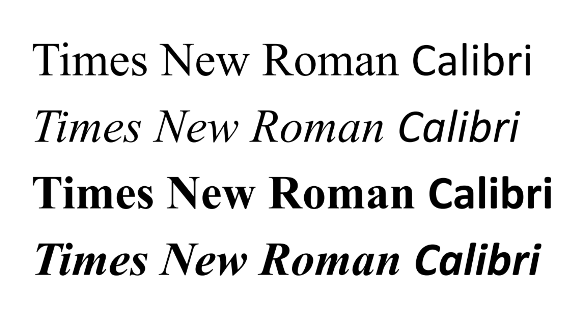
According to a report in The New York Times today, Secretary of State Marco Rubio is terminating the use of Calibri in official State Department correspondence. Going forward, Times New Roman will be used in an effort to ‘restore decorum and professionalism to the department’s written work,’ according to an internal memo reviewed by the Times.

Calibri was adopted in lieu of Times New Roman as the official typeface of the State Department two years ago, under the Joseph Biden administration, in an effort to make written communication more accessible to people with learning disabilities and visual impairments.
In the memo, with the subject line ‘Return to Tradition: Times New Roman 14-Point Font Required for All Department Paper,’ Rubio criticised the Biden-era redesign deeming it ‘wasteful’ and redolent of the previous administration's ‘radical’ diversity, equity and inclusion efforts. (At the time of publication, the State Department's website was making use of the open source typeface EB Garamond)
Furthermore, Rubio said that Calibri was ‘informal’ and noted that ‘switching to Calibri achieved nothing except the degradation of the department’s official correspondence.’
Lucas de Groot, the Dutch type designer who created Calibri in the mid-2000s, disagrees.
‘There’s nothing woke in it, maybe just a friendliness,’ he tells Wallpaper* from Berlin where he leads the studio LucasFonts. ‘Like most of my typefaces, I try to design with a little bit of a humanistic touch, because I think the subtle voice a typeface transmits is really important in conveying messages.’
Receive our daily digest of inspiration, escapism and design stories from around the world direct to your inbox.

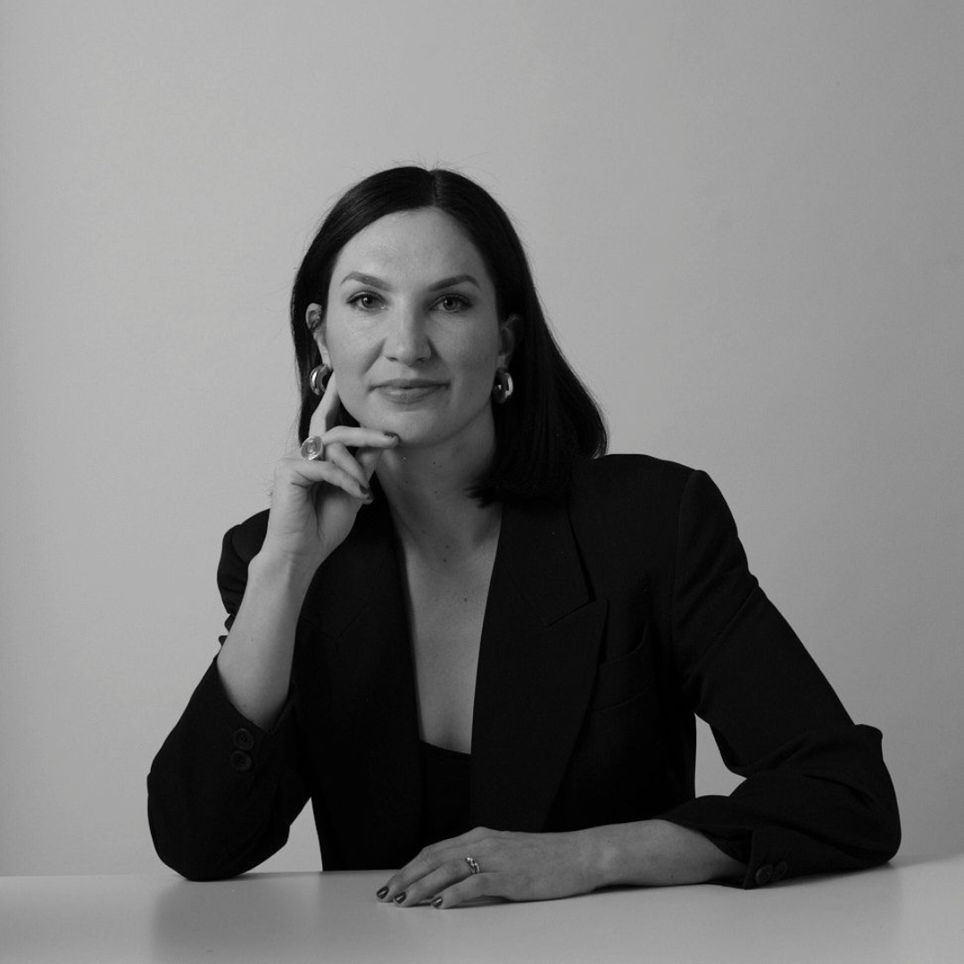
Type designer Lucas de Groot. He invented Calibri in the mid-2000s with the aim of creating text that would be more legible on digital screens of the era
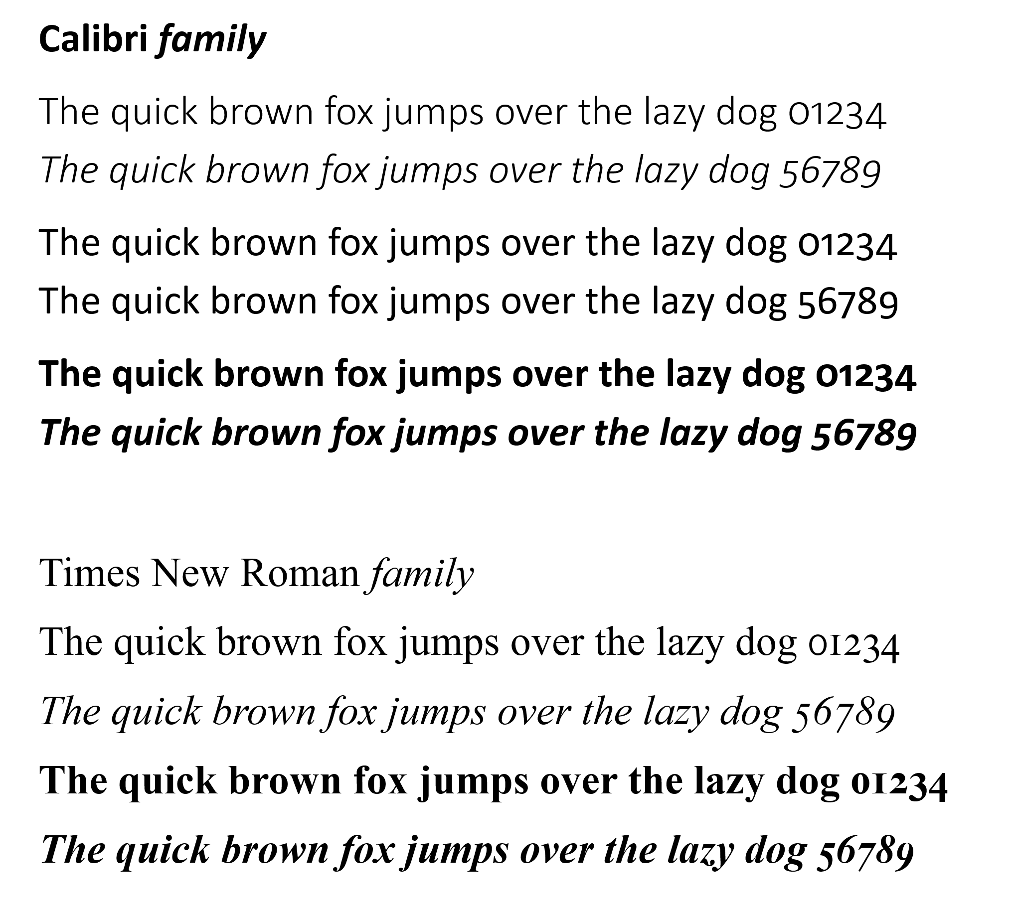
De Groot designed Calibri in the mid-2000s as part of a brief to design a san serif that would be easily-read on digital screens of the time. His proposed font family featured pleasingly soft tops and bottoms. Calibri would become the default typeface for Microsoft Office in 2007 and one of the world’s most ubiquitous san serifs. ‘It was really intended to facilitate reading on screen,’ he says.
Times New Roman, by contrast, was developed for the British newspaper The Times in the early 1930s. While ideal for mechanical typesetting, de Groot points out that it is not as legible in digital formats.
‘If you compare a line of text in Times New Roman with a line of text in Calibri on a high-resolution screen, you will immediately see that the Times New Roman is too spindly,’ he says. ‘Times New Roman, as implemented in the Windows operating system, is a low-quality font.’

While some graphic designers aren't particularly thrilled by Calibri — 'It's fine, it does its job,' says Giorgia Lupi, a partner at Pentagram — they suspect the issue goes deeper than a mere font choice. 'This whole situation tells us way more about symbolism and who gets to decide what "looks right" than it does about typography,' Lupi says.
'You could set the most human policy in Comic Sans and it would still be more dignified than cruel policy set in the most "professional" font,' she adds.
De Groot has nothing against serif fonts – he has designed many of them – but thinks there are better alternatives for digital communication. ‘To me, it's just a funny story. And [Rubio] calling Calibri woke is probably more a compliment than something bad for me,’ de Groot says.
If the State Department is looking for an alternative serif typeface, de Groot suggests one designed for Adobe Systems by Robert Slimbach: Minion.

Anna Fixsen is a Brooklyn-based editor and journalist with 13 years of experience reporting on architecture, design, and the way we live. Before joining the Wallpaper* team as the US Editor, she was the Deputy Digital Editor of ELLE DECOR, where she oversaw all aspects of the magazine’s digital footprint.