Bally rewrites the alphabet with illustrated series
The Swiss brand unites a roster of global artists in new illustrated endeavour

Receive our daily digest of inspiration, escapism and design stories from around the world direct to your inbox.
You are now subscribed
Your newsletter sign-up was successful
Want to add more newsletters?
The storied Swiss brand Bally may be best known for upholding the classical traditions of shoemaking, but its latest endeavor, the creation of a whimsical illustrated alphabet that makes nod to both its past and present values, proves that it’s not resistant to having a bit of fun either.
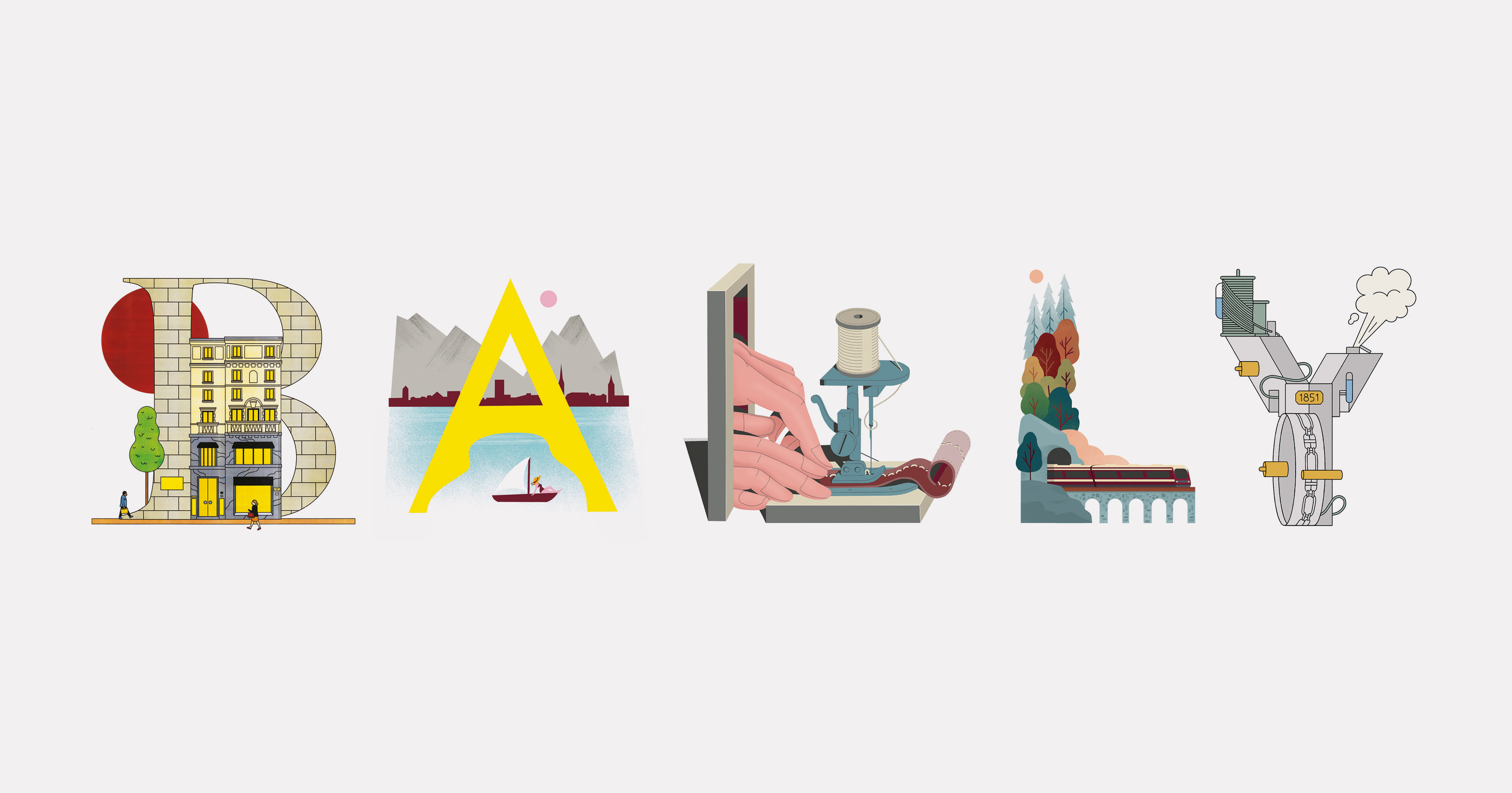
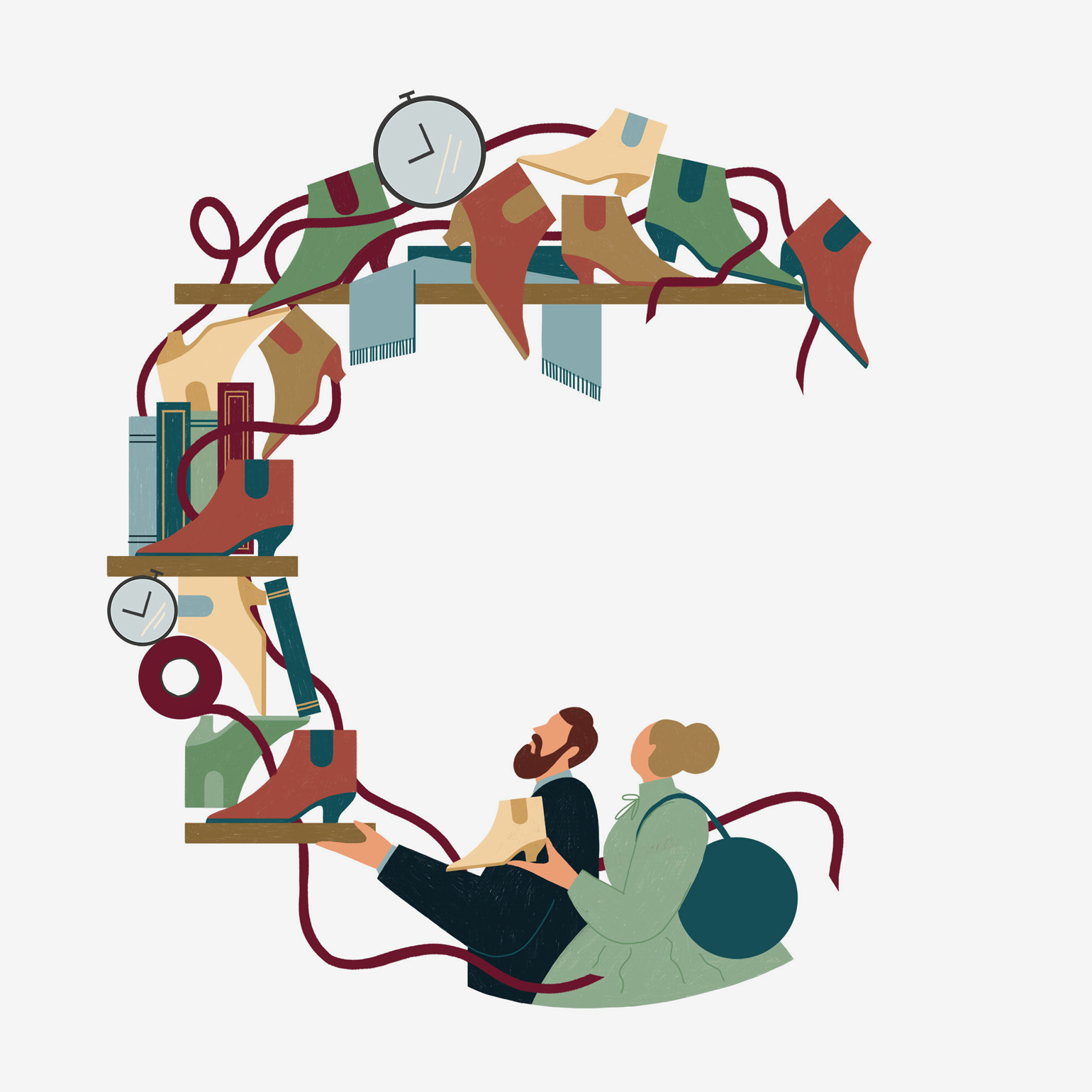
Bally A-Z, a set of compositional letters created by five illustrators and artists from around the world, delightfully draws from the brand’s rich history and trove of unexpected anecdotes in each design. Starting with ‘A’, which expresses the brand’s philosophy of ‘The Art of Living Well’ with a picture of a sailboat floating leisurely along the Limmat River in Zurich, and ranging to ‘C’ that tells the tale of ‘Carl Franz & Cecyle’, Bally’s founding father and his wife, and how they ventured into the shoemaking business, the letters eloquently depict both stories and brand values in a simple and charming gesture.

The creatives involved – the Brooklyn-based illustrator Abbey Lossing, the Swiss pair Nina Wehrle and Evelyne Laube of It’s Raining Elephants, illustrator George Wylesol from Baltimore, the Dutch cartoonist Lennard Kok and visual artist Bryce Wymer – have each interpreted each letter’s origin story through their personal visual lens.
Wylesol, who created the letter B to represent the brand’s flagship store, ‘Bally Haus’, designed by arichitects Casper Mueller Kneer on Via Montenapoleone and Via Manzoni in Milan, shares, ‘I really liked the clean design of the store, accented by the natural textures of wood and stone. I also [explored] the neighbourhood on Google Street View and looked at classical architecture and crowds of people to help fill up the composition.’
‘As far back as I can remember, Bally was always where beautiful design meets function,’ says Wymer, who illustrated letters D, L, M, R and S. ‘Of the letters that I was assigned, R was my favourite [as] it was meant to highlight Jakob Hlasek’s tennis win in 1991. I knew I wanted to catch his figurative energy and his footwear of course.’
Put together in advance of the label celebrating its 170th year in 2021, the letters, which are also occasionally animated, are being unveiled on Bally’s Instagram channel each week.


Top, C – Carl Franz & Cecyle. Bottom, A – Art of Living Well
INFORMATION
Receive our daily digest of inspiration, escapism and design stories from around the world direct to your inbox.
Pei-Ru Keh is a former US Editor at Wallpaper*. Born and raised in Singapore, she has been a New Yorker since 2013. Pei-Ru held various titles at Wallpaper* between 2007 and 2023. She reports on design, tech, art, architecture, fashion, beauty and lifestyle happenings in the United States, both in print and digitally. Pei-Ru took a key role in championing diversity and representation within Wallpaper's content pillars, actively seeking out stories that reflect a wide range of perspectives. She lives in Brooklyn with her husband and two children, and is currently learning how to drive.