Liberty Fabrics launches new graphic collection by Karel Martens
New Liberty Fabrics collection in collaboration with Karel Martens brings the Dutch graphic designer's experimental work to textiles

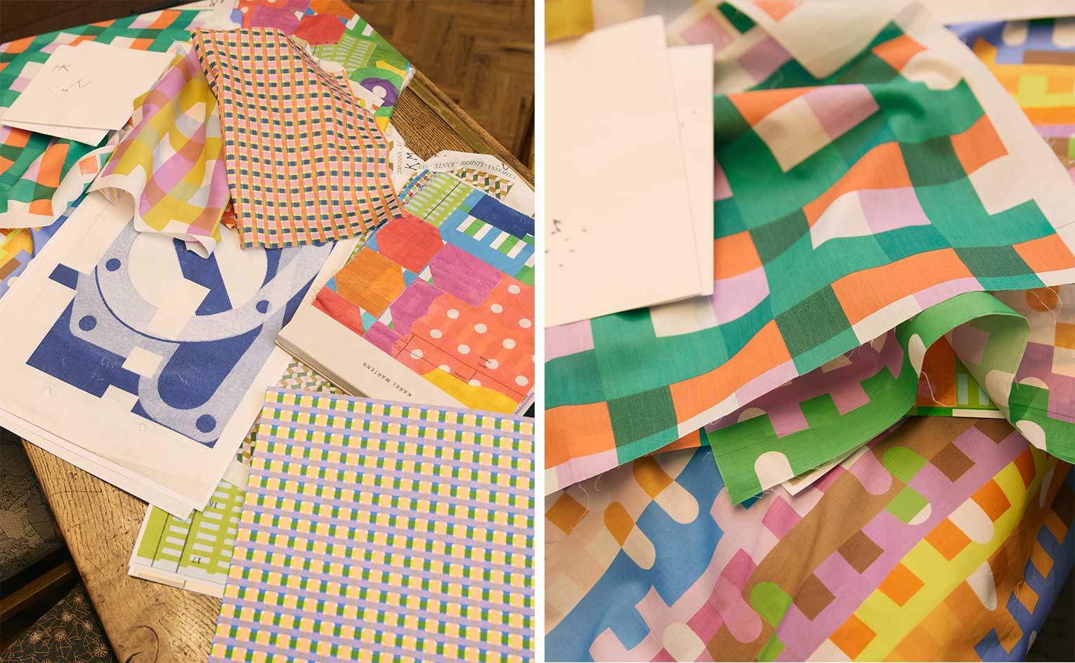
Liberty Fabrics unveils a new collaboration, created in collaboration with experimental Karel Martens. Featuring the Dutch graphic designer's distinctive layering of colour and shapes, the collection was developed in close collaboration with the Liberty Fabrics design team to create wearable textiles.
Liberty Fabrics by Karel Martens

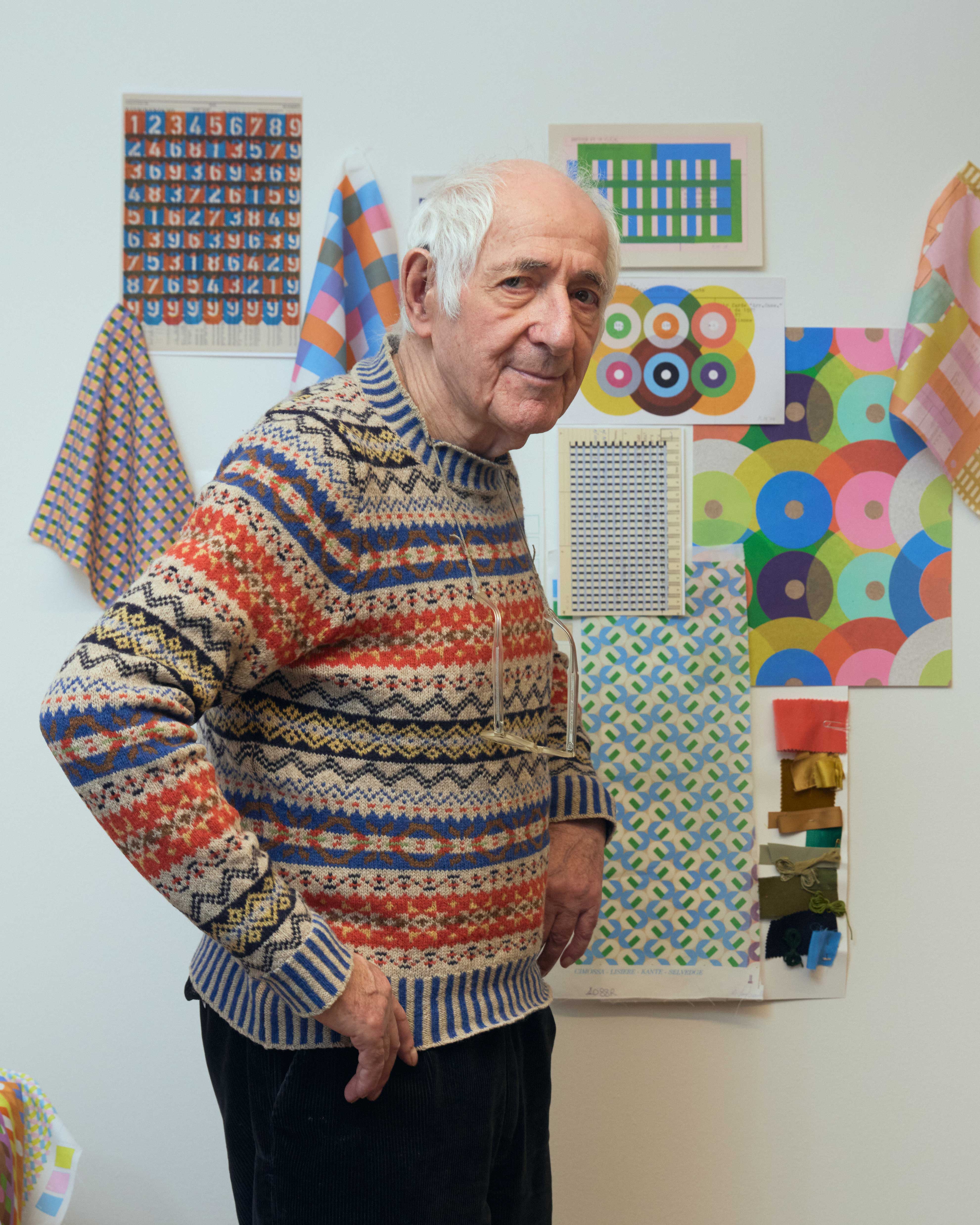
Karel Martens photographed at the Liberty Design Studio
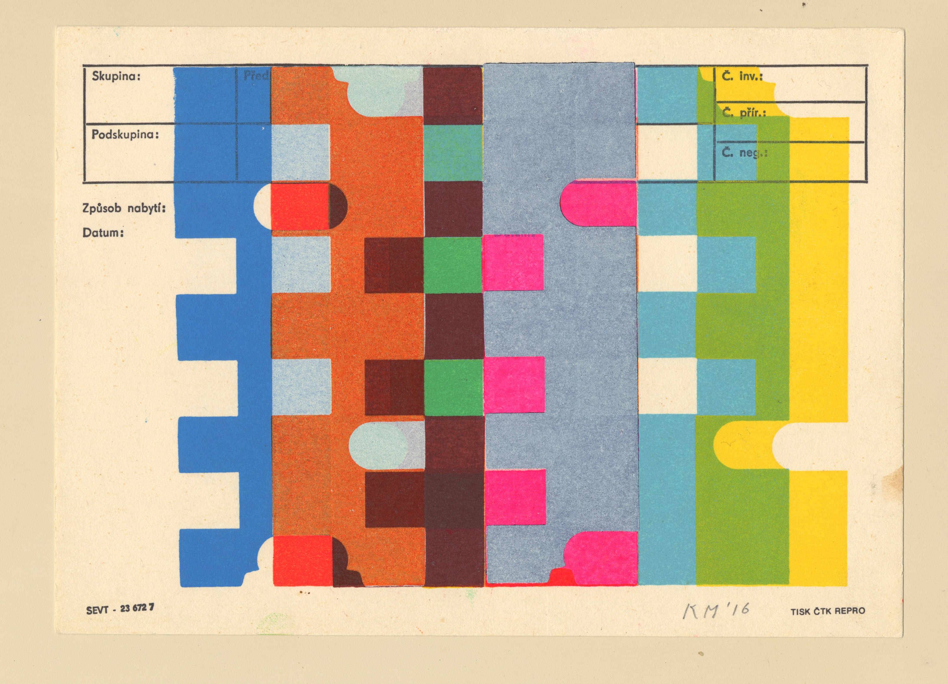
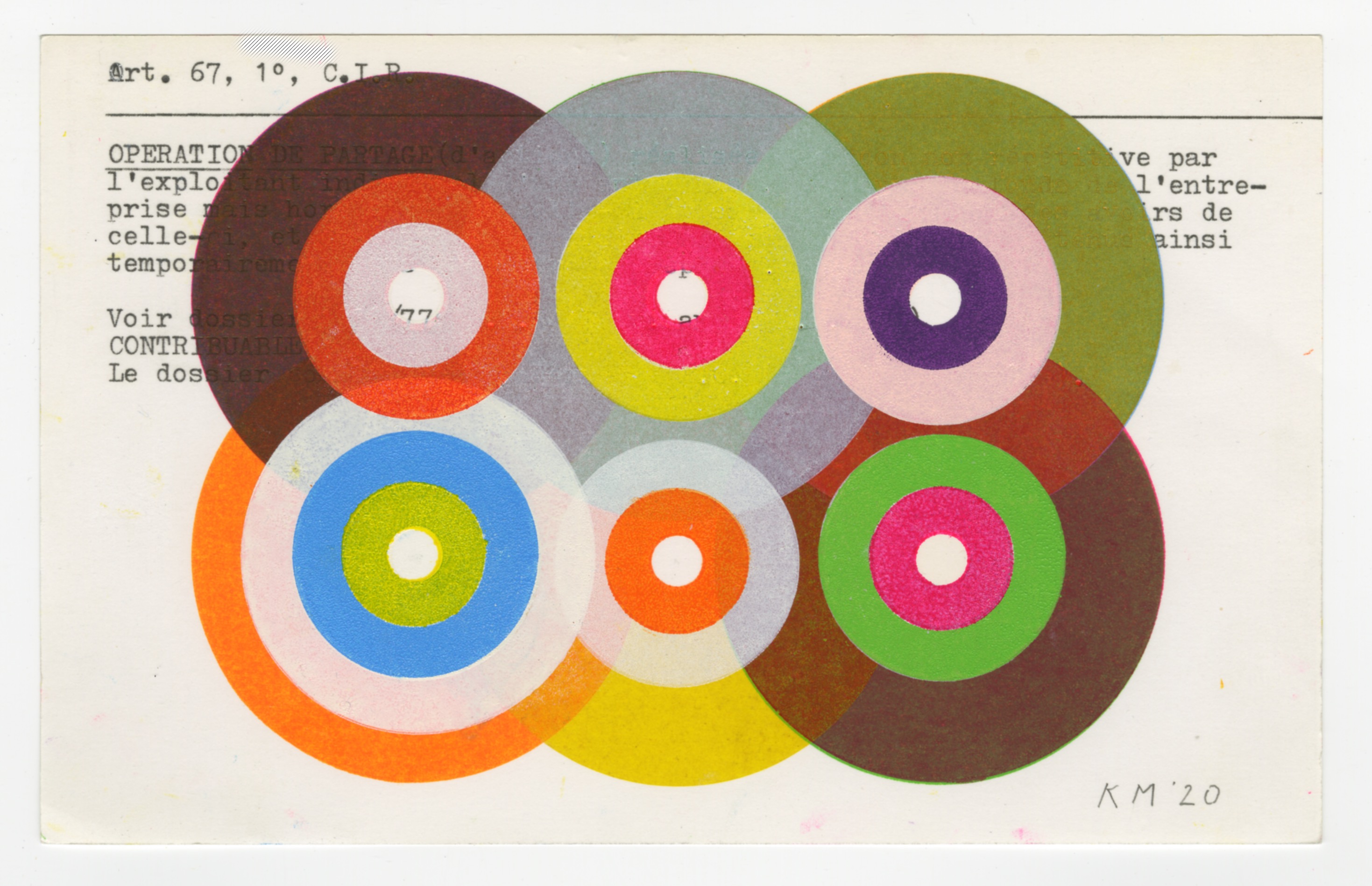
Martens started setting the basis for his hand printed monoprints in the 1960s, as a student at the Arnhem School of Art. Studying sculpture and painting expanded Martens' understanding of shape and colour, and contributed to his career as a graphic designer and typographer.
'[When I was studying], graphic design didn't exist, so I had a very broad education,' explains Martens. 'I started making prints, and my prints became the basis for the collection.' His work has always been strongly independent, with many self-initiated projects but also important public commissions that have included murals for London's Guy’s and St Thomas’ Hospital Cancer Centre.
Honouring both Martens and Liberty Fabrics' legacy, the collection is a celebration of colour and form, painstakingly recreating the designer's layering of shades onto textiles. The resulting collection is modernist in spirit and offers a new approach to textile design for the British company.
Printed at the Liberty Fabrics mill located near the banks of Lake Como, using both cutting-edge technology and traditional techniques, the series mixes hand drawn motifs with digital collages to achieve a vibrancy of colour that is faithful to Martens' originals.
'To make a good design you need a good designer, but you also need good content, and a good commissioner. And then the executer: you need to be working with good printers, and this was the case with Liberty, I was impressed with the different possibilities in fabric.'

'There is something archetypal in colour that opens your eyes, with three primary colours, you can make all the colours in the world,' says the designer. 'In printing, when you layer colours you get a surprise, you can never tell what is going to happen.'
Receive our daily digest of inspiration, escapism and design stories from around the world direct to your inbox.

Rosa Bertoli was born in Udine, Italy, and now lives in London. Since 2014, she has been the Design Editor of Wallpaper*, where she oversees design content for the print and online editions, as well as special editorial projects. Through her role at Wallpaper*, she has written extensively about all areas of design. Rosa has been speaker and moderator for various design talks and conferences including London Craft Week, Maison & Objet, The Italian Cultural Institute (London), Clippings, Zaha Hadid Design, Kartell and Frieze Art Fair. Rosa has been on judging panels for the Chart Architecture Award, the Dutch Design Awards and the DesignGuild Marks. She has written for numerous English and Italian language publications, and worked as a content and communication consultant for fashion and design brands.