In 2025, the artwork gracing many of the year’s most interesting albums was as diverse and multifaceted as the music contained within. Many artists looked to the past and to classical references and traditional techniques; others fully embraced technology, while some danced between both modes – cherry-picking ideas from across the history of visual art and imbuing them with new meanings. Here, we look at ten of the most creative album covers from the last 12 months.
Lily Allen, ‘West End Girl’

In the short number of weeks since West End Girl entered the cultural conversation, dominating headlines (and, inevitably, end-of-year lists) with its frank and fearless dissection of the end of the author’s marriage, the album’s artwork has become equally as ubiquitous. Painted by Spanish portrait artist Nieves González, the image of Allen in a pale blue puffer jacket – rendered in oils and exhibiting the smart balance of contemporary aesthetic and classical gaze that González’s work has made a trademark – acted as the perfect visual anchor for a very modern story, but a tale as old as time. 'The balance came from recognising that we are working with similar tensions, in different mediums. We were telling the same story; the complexity of being a woman in the present, navigating inherited codes while building your own,' González told Wallpaper*.
David Byrne, ‘Who Is The Sky?’

Inspired by a moodboard featuring traditional costumes and ceremonial outfits from around the globe, the technicolour artwork for Talking Heads icon David Byrne’s latest solo album, Talking in the Sky, was as full of life and positivity as its now-73-year-old author. Helmed by New York-based graphic designer Shira Inbar and shot by photographer Ahmed Klink, the image shows a kaleidoscope of Byrne dancing in his own take on these costumes – made using zips and ropes and elevated by fashion designer Tom Van der Borght. 'I love these suits because through them, simple objects become special and everyday materials become ceremonial, ritualistic, and imaginary,' said Inbar of the concept. 'Like the music in this fantastic record, we worked collaboratively to form something big, vibrant, and kind of whimsical.'
Japanese Breakfast, ‘For Melancholy Brunettes (& Sad Women)’

Shot by Korean fashion photographer Pak Bae, the cover of Michelle Zauner’s fourth album as Japanese Breakfast positioned the musician as the weary central protagonist in her own tableau of memento mori. Heavily referencing the tradition of 17th-century Dutch vanitas still life, Zauner’s version found her face down with her head in her hands, surrounded by both indulgence and death. 'I knew for a really long time that I wanted the album cover to be an image of me passed out on a table, sort of looking like… I’ve over-consumed my fill… fatigued with melancholy,' she said of the image. 'The cover feels like I have everything I want, which was sort of how I was feeling while writing this record.'
Lorde, ‘Virgin’

When New Zealand pop behemoth Lorde announced her fourth LP Virgin, she did so with a statement of intent: 'The colour of the album is clear,' she wrote. 'Like bathwater, windows, ice, spit. Full transparency.' In keeping with this ethos, Virgin’s cover image –an X-ray of a pelvis, showing a belt buckle, zip and IUD – was as transparent as they come. Shot by South Korean artist Heji Shin, whose previous work includes Baby, a series of babies’ heads emerging from the birth canal, and shoots with other musicians, such as Robyn and Kanye West, the aim for the cover, said Lorde, was to create something 'techy but mystical'.
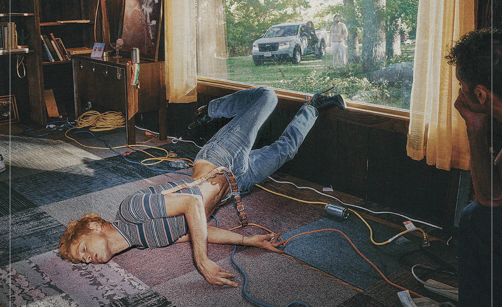
Perfume Genius, ‘Glory’

Over the years, Mike Hadreas has exploded out the world of Perfume Genius – growing from nervous beginnings to an artist with a rich and exploratory sonic and visual universe. The photograph that adorns the cover of sixth album Glory shows the idiosyncratic nature of his outlook. It’s taken by long-term collaborator Cody Critcheloe (otherwise known as SSION) – a multi-hyphenate creative working across music, photography, directing and visual art – and in it Hadreas lies contorted and disjointed on the ground, watched through a window by an unknown man. 'I like how it looks: it could be a dance, or it could be that I’m sick, and there’s something wrong with me,' Hadreas told Wallpaper* of the image. 'It feels like the music, in that it’s earnest and personal, but with absurdity and dramatics, and performance.'
Wet Leg, ‘Moisturizer’

Having recently worked with musicians including PinkPantheress and Confidence Man, director and photographer Iris Luz has described her work as ‘mundane absurdity’ – an idea that fits the strange, Aphex Twin-like image that adorns Wet Leg’s second album Moisturizer well. With the record’s visuals directed alongside the band’s frequent creative director Lava La Rue, the photo is both incredibly normal – the band’s two central musicians, Rhian Teasdale and Hester Chambers, positioned in a plain, beige carpeted room – but also uncanny, with Teasdale’s sinister grin and Chambers’ long, pointed talons pulling focus. As Teasdale explained to Variety: 'I think the whole energy of the creative is kind of subversive – like, if there’s any moments on there that are a bit sexy, it’s also a bit disgusting.'
Blood Orange, ‘Essex Honey’

An evocative image taken from acclaimed Sheffield photographer Johny Pitts’ 2022 photobook Home is Not a Place, it’s the inspired pairing of Pitts’ photograph with Devonté Hynes’ most meditative, reflective work as Blood Orange that transports the viewer immediately into the world of Essex Honey. It’s one filled with grief and nostalgia, that sings of his childhood growing up in Ilford, now seen through the lens of his mother’s recent passing. Though the child on the cover is not Hynes, he acts as a window to the author’s own upbringing. 'A lot of my photographs hold in a mellow/ melancholy ambience borne from what turned out to be a lost yet very formative part of my life,' said Pitts of the photo. 'As soon as Dev sent the masters of Essex Honey, I understood completely how the two works matched.'
Pulp, ‘More’

Coming back with their first studio album in 24 years, the artwork for Pulp’s More arrived as a perfectly pitched fit for this band of beloved returning heroes. Designed by graphic designer Julian House, whose work includes albums by Oasis (Dig Out Your Soul) and The Prodigy (Always Outnumbered, Never Outgunned), the the album features a striking main image taken by frontman Jarvis Cocker whilst on a trip to the volcanic terrain of Kerlingarfjöll in Iceland in July 2024 – its high-contrast colours a bright marker of the energy of the record. Yet just in the distance, at the top of the mountain, sit the same cardboard cutout figures of the band from the cover of their 1995 opus Different Class – a knowing wink from a group who’ve always been knowing-wink masters.
Mac Miller, ‘Balloonerism’

The story of Balloonerism’s surrealist, Picasso-inspired cover art, painted by previously unknown Delaware artist Alim Smith, is a true testament to the power of the internet. Originally commissioned after Mac Miller discovered a self-portrait by Smith – who goes by the alias Yesterday Nite – the image found its way online and became a fan favourite; when posthumous album Balloonerism was released after Miller’s passing, Smith’s work was chosen to front it. Of the original image, Smith explained to Delaware Online: 'I needed to capture how awkward that phase is in life, like when you're not a teenager yet, but you're not a kid no more. You have two big teeth, and your body just looks wrong, proportion-wise.'
Saya Gray, ‘Saya’

Created alongside long-term collaborator Jennifer Cheng, the artwork for Saya Gray’s mononymously titled second LP was inspired by her Japanese great-grandmother. 'She was a performer in Japan and played [traditional three-string instrument] shamisen. The cover felt like an ode to her,' Gray tells Wallpaper*. Inspired by ukiyo-e portraits – renderings of artists and beauties dating back to 17th-century Japan – and the colour-tinted photographs of the 1900s, Gray and Cheng 'wanted to explore performers as both artistic beings and industrialised products through creating and collecting remnants – things that animals use as protection and leave behind, and bits of mechanical materials – as well as touching upon ancestral trauma and vulnerability.' The resulting image is poignant and beautiful, Gray’s face drawing on these rich traditions, but adding the harshness of metal and modernity.