It's not everyday that a heritage brand signs up for a new identity, yet that was the covetable creative challenge extended to Wallpaper* collaborators Tom Hingston Studio on behalf of British jeweller and silversmith Mappin & Webb.
Appointed by the house's new creative director Elizabeth Galton, the London-based design agency was charged with the task of bringing the 235-year-old brand - including its logo, packaging and imagery - expressly into the 21st century.
Already an icon of British craftsmanship as the holder of two Royal Warrants to HM The Queen and HRH The Prince of Wales, Galton's brief centered around revitalising the luxury stalwart for the world stage. 'Mappin & Webb's ambition was to generate a renewed energy and excitement around the brand, focusing on jewellery,' says Tom Hingston. 'Our task was to develop a tone of voice and creative approach that would support its new product direction.' Founded in 1997, Hingston's creative agency specialises in art direction and design identity, having previously worked with luxury houses from Dior to Solange Azagury-Partridge. Hingston also designed a cover for our August 2012 Handmade issue (see W* 161).
But for this project, Hingston began his search in Mappin & Webb's extensive archives. 'Typographically we stumbled across some real gems,' he explains. 'There was a point in the brand's history when it had stores all over the world, from Bombay to Johannesburg, Paris, and Rio de Janeiro. Each store carried a different handwriting and in turn each era brought about even more variations on their logo, so there was a lot for us to reference.'
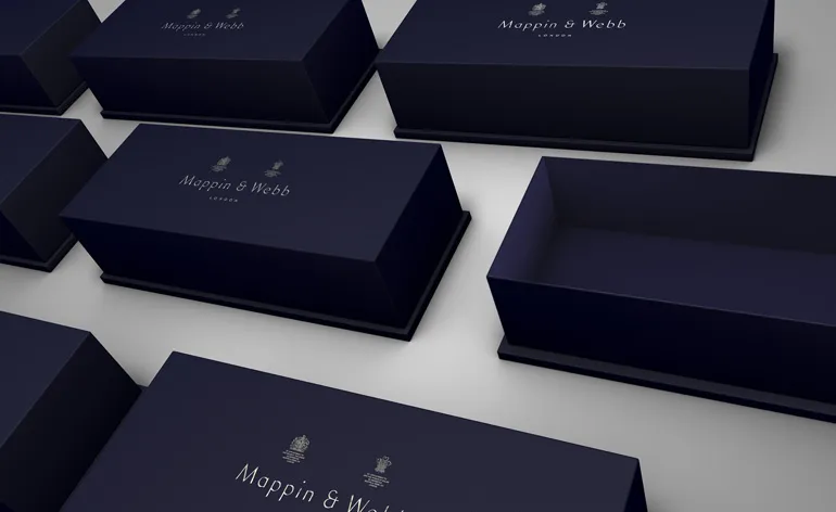
One particular logo, hailing from the 1930s, caught his attention and called for a hand drawn calligraphic approach. Keen to instill a strong sense of craftsmanship in the letter forms, early versions of the new typeface were drawn by hand and then later scanned for digital refinement. Another key consideration for the new brand DNA was maintaining the house's historic 'Britishness', chiefly achieved by reinventing the regal blue livery. 'We drew on the original house colours and branding from the early 1900's,' says Elizabeth Galton of the new packaging, 'which we reinvented with a modern, elegant and quintessentially British twist.'
The same approach was extended to the brand's sophisticated new fine jewellery portfolio and accompanying campaign - shot by the acclaimed British photographer Miles Aldridge. 'Miles' perfectly crafted work and "filmmaker-like" approach, captures glamorous women in luscious technicolour,' continues Galton. Speaking from New York, Aldridge explained his cinematic approach: 'It's a contemporary twist on the rarefied ambience of London's 1960s nightclub scene where seductive, arty, glamorous people rubbed shoulders with the underworld as they drank martinis, gave good pose and danced the night away.' The campaign unifies a transformative celebration of Mappin & Webb's story to date, with the past informing a bright future.

A key consideration for the new brand DNA was maintaining the house's historic 'Britishness', achieved by reinventing the regal blue livery. 'We drew on the original house colours and branding from the early 1900's,' explains Elizabeth Galton, 'which we reinvented with a modern, elegant and quintessentially British twist

Keen to instill a strong sense of craftsmanship in the letter forms, Tom Hingston Studio's early versions of the new Mappin & Webb typeface were drawn by hand and then later scanned for digital refinement. On the right is the brand's clean and modern new monogram

Tom Hingston began his inspiration search in Mappin & Webb's extensive archives

One particular logo, hailing from the 1930s, caught Hingston's attention and called for a hand drawn, calligraphic approach to the new typography

Already an icon of British craftsmanship as the holder of two Royal Warrants to HM The Queen and HRH The Prince of Wales, Galton's brief centered around revitalising the luxury stalwart for the world stage. 'Mappin & Webb's ambition was to generate a renewed energy and excitement around the brand, focusing on jewellery,' says Tom Hingston

'Typographically we stumbled across some real gems,' explains Hingston. 'There was a point in the brand's history when it had stores all over the world, from Bombay to Johannesburg, Paris and Rio de Janeiro. Each store carried a different handwriting and in turn each era brought about even more variations on their logo, so there was a lot for us to reference'

From the left: Archive imagery of Mappin & Webb's London store celebrating the 1936 coronation of King George V; Mappin & Webb's Regent street store in 1977 during Queen Elizabeth's Jubilee

Pieces in the brand's latest fine jewellery collection include, from the left: Mappin & Webb 'Fortune' rose gold diamond ring; 'Empress' white and yellow gold diamond ring
-
 A Venice sneak peek into the new Fondation Cartier pour l’art contemporain by Jean Nouvel
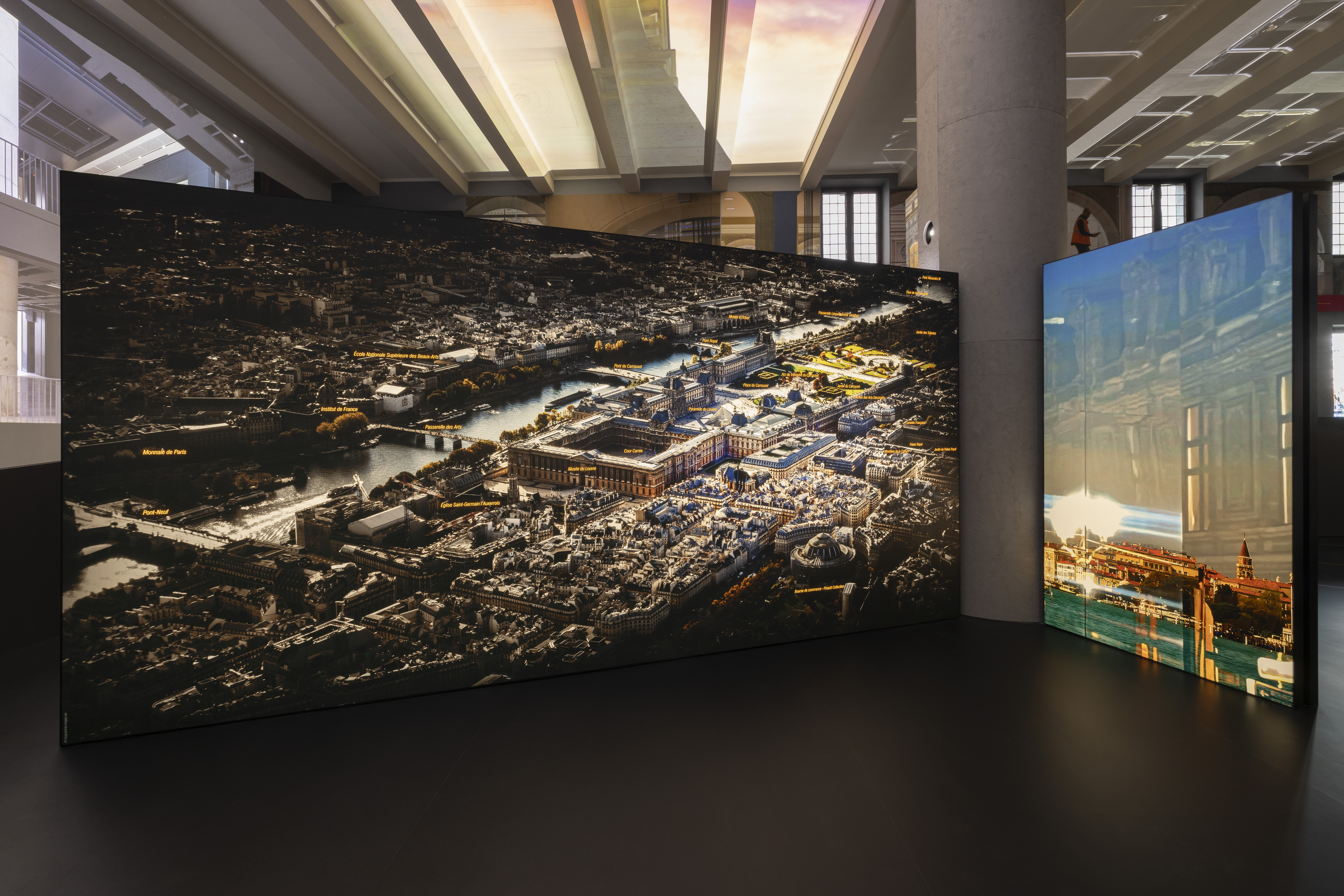
A new home for Fondation Cartier pour l’art contemporain by Jean Nouvel will open later this year in Paris; in the meantime, the Venice Architecture Biennale 2025 offered the perfect platform for a sneak preview of what's to come
-
 Let's go outside: ten outdoor furniture ranges we love
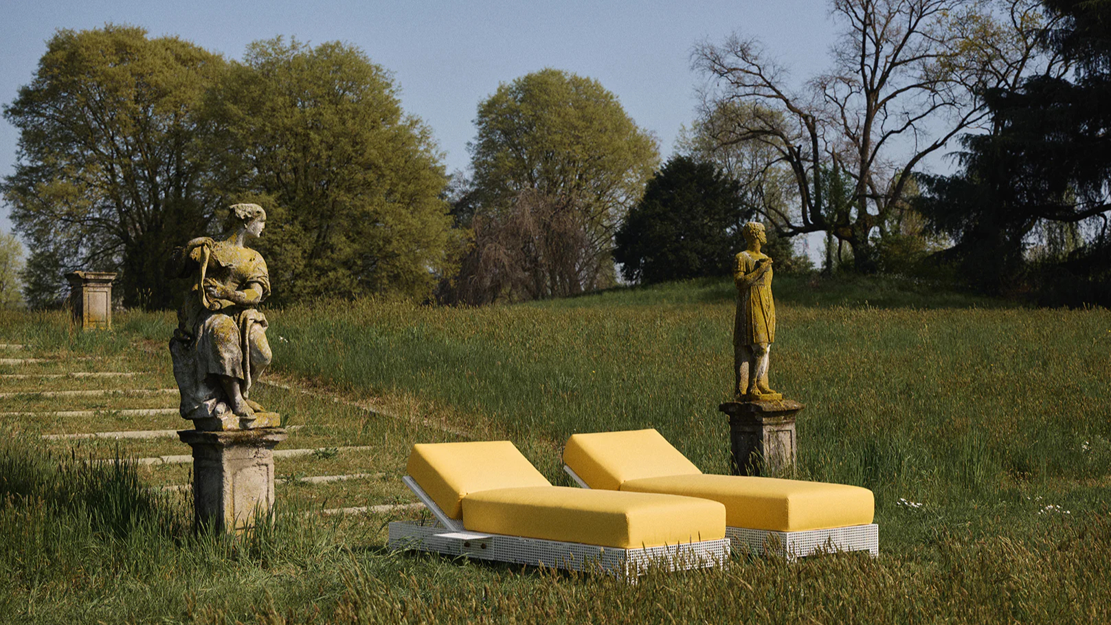
Our round-up of outdoor furniture brings together work by leading designers and studios, blending contemporary forms with enduring materials designed to elevate open-air living
-
 Viva Las Vegas: the story behind the Wallpaper* June 2025 cover shoot
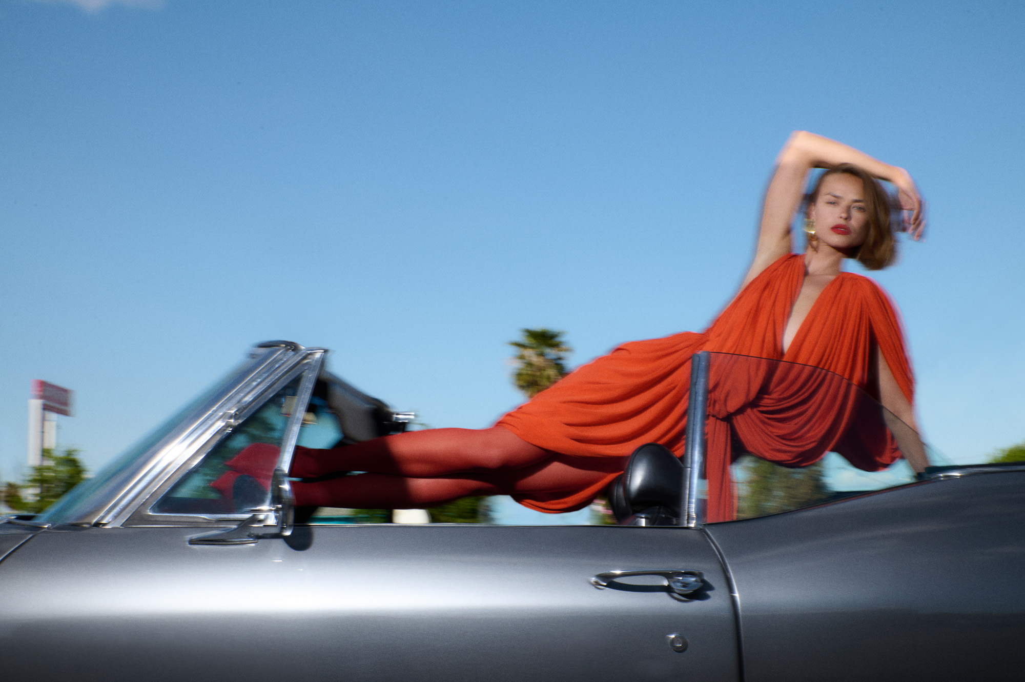
Photographer Theresa Marx and Wallpaper* fashion and creative director Jason Hughes recount a whirlwind day in Las Vegas – from cruising down the strip to controlling the Bellagio fountains


-
 Studio Frith and Bocci collaborate on a contemporary new brand identity
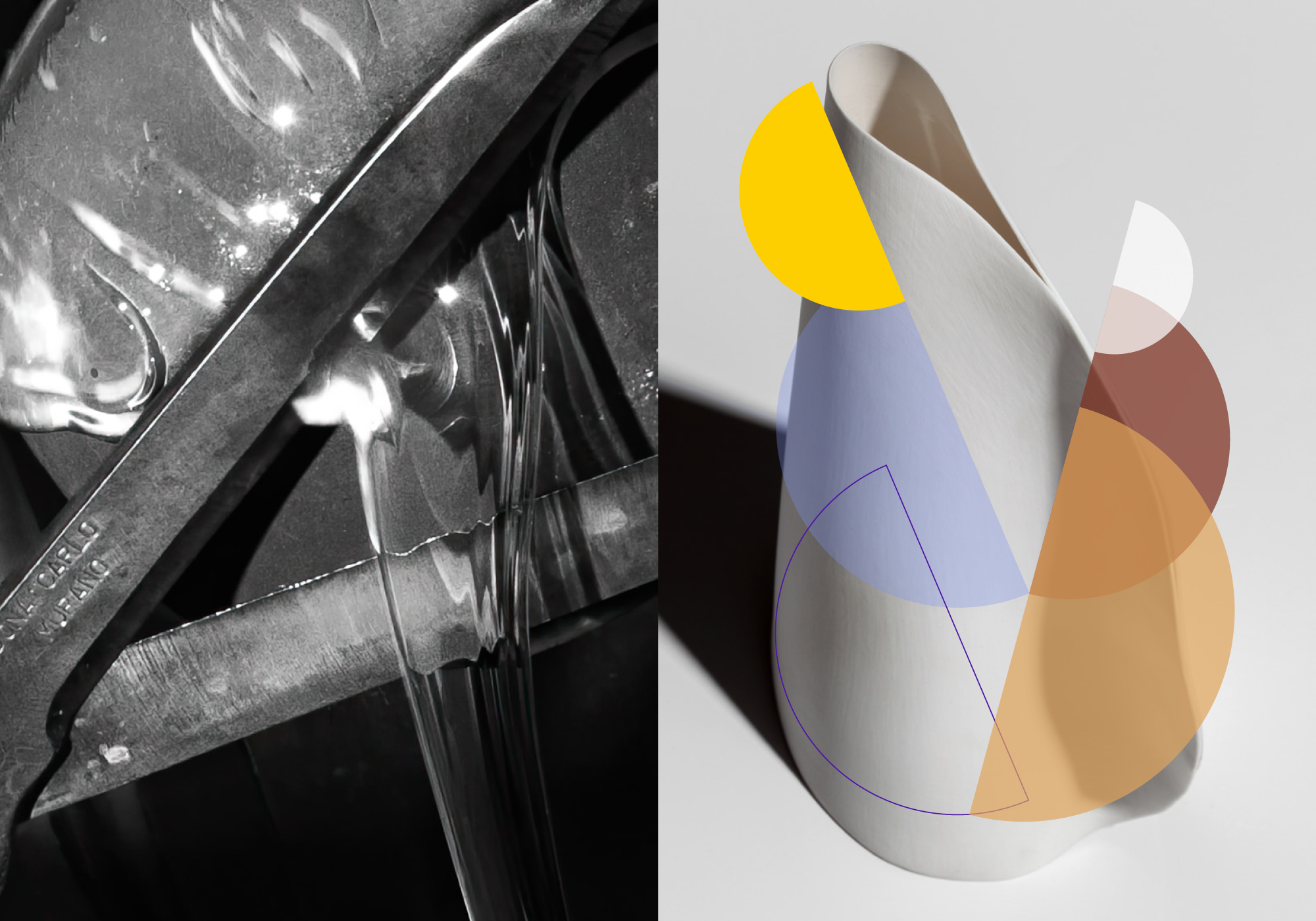
Bocci presents its new brand identity, created by Studio Frith to reflect the Canadian blown-glass and lighting company’s contemporary, experimental approach
-
 Anatomy of a rebrand: we dissect Loewe’s new identity, designed by M/M (Paris)

