
We’d like you to meet Wallpaper* blue, the new colour developed by creative director Sarah Douglas during a fruitful year-long collaboration with one of the UK’s oldest paper companies, James Cropper.
The new hue – an unusual dark petrol blue – first made its appearance in a slightly different form when Douglas specified a palette of 12 new colours as part of Wallpaper’s 2013 redesign. ‘I wanted to develop it further,’ she explains, ‘and the opportunity to work with James Cropper came at just the right time.’
The family-owned company, founded in 1845 and based in the Lake District village of Burneside, is one of the world’s leading producers of coloured and specialist papers, and works with many of the biggest brands in fashion and design – but this is the first time it has developed a bespoke paper for a magazine. ‘It’s been a really fruitful collaboration,’ Douglas says, ‘and I’ve loved meeting people who are so passionate about what they do.’
The making of Wallpaper* Blue: watch the film
Working closely with current chairman Mark Cropper and his colour specialists, Douglas explored the possibilities of the existing blue, and ended up taking it in a subtly new direction. As she says, ‘The new Wallpaper* paper colour may look at first glance like a dark, almost navy blue, but it also contains a surprising amount of yellow, which gives it added richness and warmth. It feels modern and has a certain austerity, but it’s also a strong colour that to me feels very Wallpaper* and really reflects the strength of the brand.’
The new paper colour is already being used for all Wallpaper* stationery, but there are also plans afoot to launch a range of Wallpaper* notebooks in the same hue: watch this space.

This is the first time the family-owned company has developed a bespoke paper for a magazine.

The bespoke tone – an unusual dark petrol blue – made its first appearance in a slightly different form during the 2013 redesign of Wallpaper*.

The new paper colour is already being used for all Wallpaper* stationery.

There are plans afoot for a range of Wallpaper* notebooks in the same hue.
-
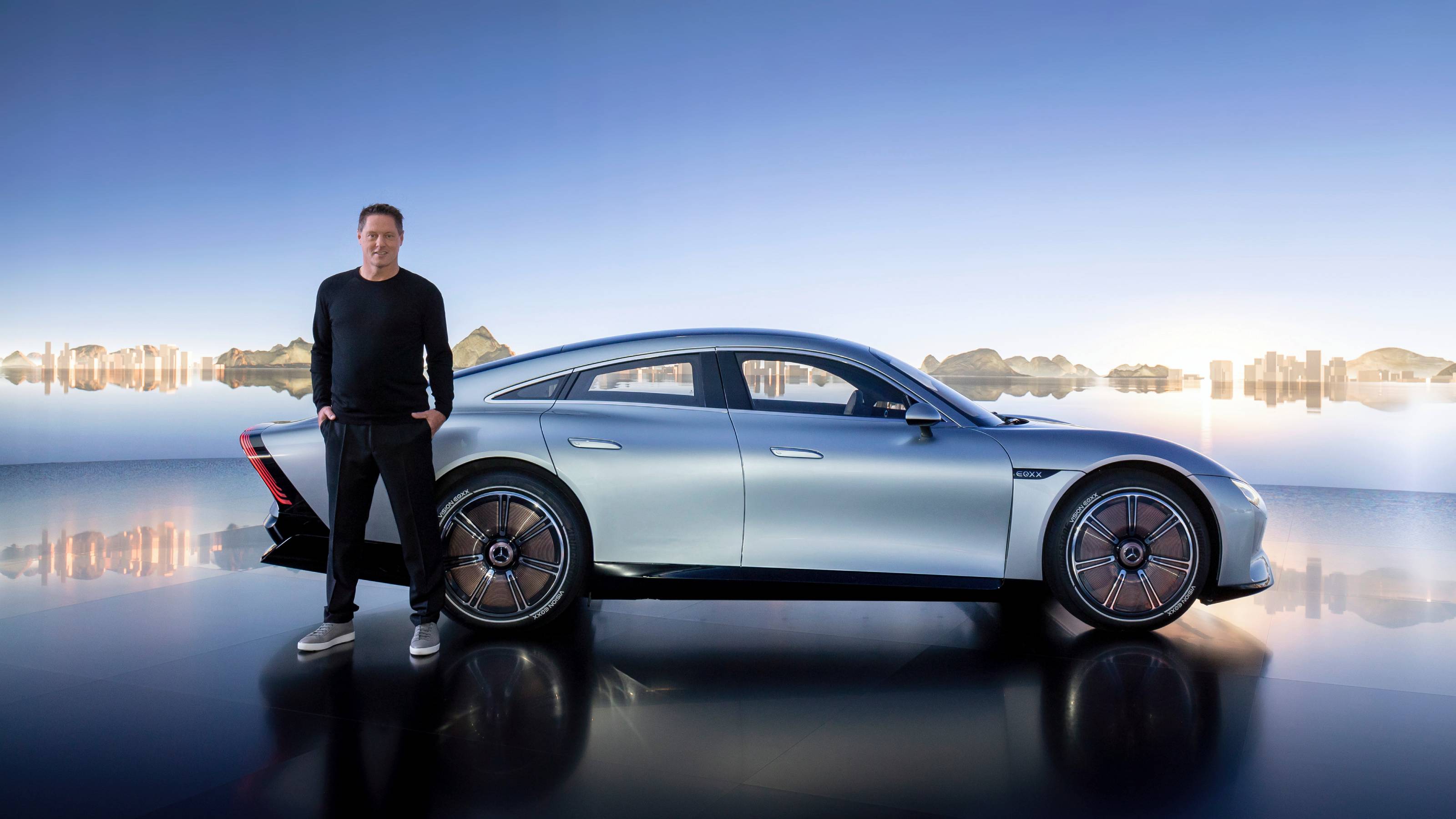 Gorden Wagener leaves the helm of Mercedes-Benz design after 28 years with the company
The German designer is stepping down from the role of chief design officer at Mercedes-Benz. We look back at his influence and impact on the world of automotive and luxury design
-
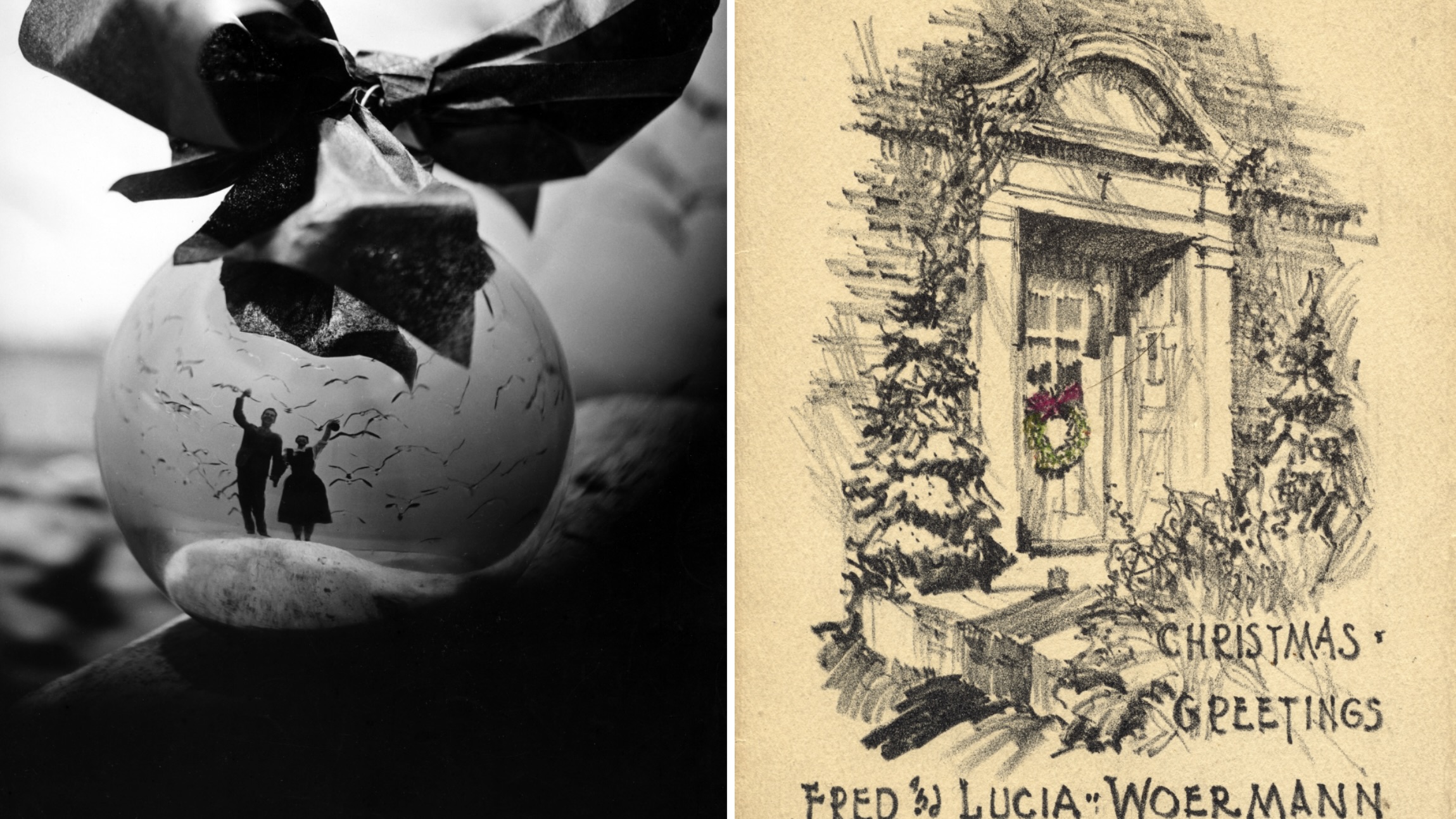 These Christmas cards sent by 20th-century architects tell their own stories
Handcrafted holiday greetings reveal the personal side of architecture and design legends such as Charles and Ray Eames, Frank Lloyd Wright and Ludwig Mies van der Rohe
-
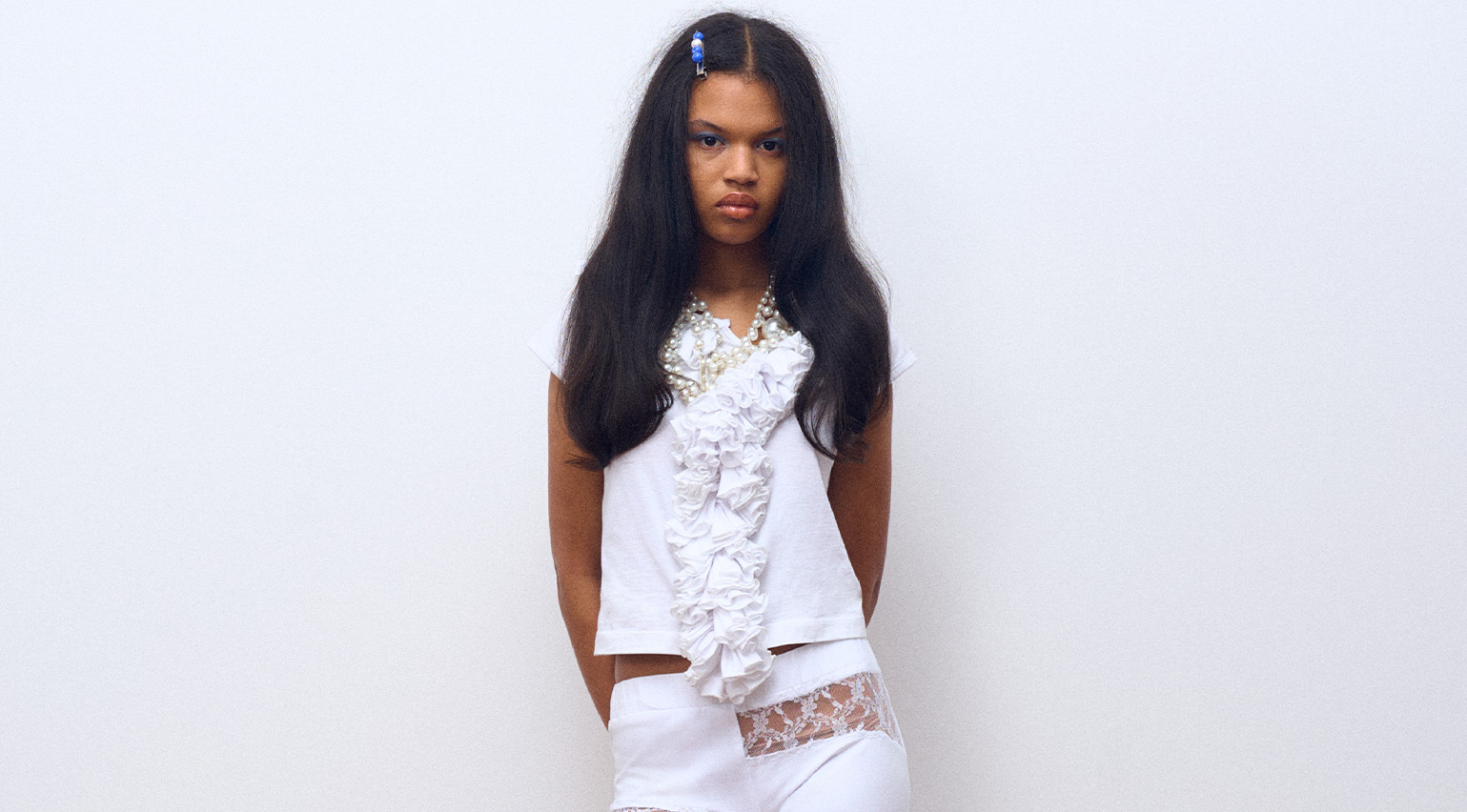 Lucila Safdie’s ‘feminine and surreal’ womenswear is inspired by teenage bedrooms and internet lore
The latest in our Uprising series, the Central Saint Martins graduate is honing a pastel-shaded vision rooted in depictions of girlhood in film and literature


