You must be brave to dare to tinker with an established brand's logo. To alter the actual name, not just the logo, requires steely courage. And in the fashion world, you don't get a more established name or brand than Yves Saint Laurent.
So when it was announced in June 2012 that newly appointed creative director Hedi Slimane was to alter not only the graphic language, but also the actual nomenclature of the house, the tremors of disapproval were felt all the way from Madison Avenue to Avenue Montaigne. When the new logo made its first appearance a month later, the shrieks of disapprobation went up a notch. To drop 'Yves' was disrespectful enough, but to replace painter Cassandre's mythical 1961 YSL logotype altogether was utter lunacy, surely?
But we beg to differ. Why? Primarily because most of these knee-jerk, social media-fuelled reactions were misinformed and ignorant. So we'd like to set the record straight.
By calling the new line Saint Laurent, Slimane has, in fact, shown intelligence and great respect to Mr Yves Saint Laurent. The new logo design gives a reverent nod to the very beginnings of his game-changing, ready-to-wear collection in 1966, adopting a similar appellation to the original 'Saint Laurent Rive Gauche', as well as utilising the Helvetica font styles chosen during that revolutionary era.
This smart trick of 'retro-branding' returns the ready-to-wear to the spirit of the origins of the line, but marks a new era.
'It made sense today to transpose these principles and recover the original name and typeface,' Slimane explained in a rare interview. 'The name Rive Gauche disappeared in the past then resurfaced several times. It seems intrinsic to the universe of Yves Saint Laurent, without it being useful to refer to it literally today. We thus went to the essential, a name
that is written as it is spoken every day: Saint Laurent, unequivocally.'
This sensitivity and respect for the Parisian house is not at all surprising as Slimane's early career highlight was at YSL as ready-to-wear director of men's collections under the stewardship of Mr Laurent himself. Famously, he then went on to revolutionise the male silhouette at Dior Homme before taking a five-year hiatus from fashion design, moving to Los Angeles (where he continues to live and work) to hone his photographic skills and develop as an artist.
It was at the beginning of this fashion sabbatical that Wallpaper* got to know and like Hedi - and why we must disclose a certain positive bias. As one of our first trio of Guest Editors in 2007 (W*103), we experienced and got to understand his philosophies, working methods and to-the-millimetre approach first-hand.
Meetings in New York, London and Paris were always pleasant, productive and illuminating. Slimane came across as a highly intelligent, deeply curious man who knew that in the turbulent world of fashion, total creative control and strong financial support was essential. But Slimane's interests beyond the narrow confines of fashion were clear, abundant and very refreshing. Music is, of course, a huge influence, but his awareness and passion for typography, architecture and intelligent industrial design (Dieter Rams, in particular) was more of a surprise.
But it was no surprise to us that Slimane's attention during those first months in the new job would be paid to the often neglected areas of visual communication: 'Concentrating on the base before approaching the form. The fundamentals, the signs, the language, before the fashion,' he will tell you.
Old-school graphic design fans will be relieved to hear that the classic YSL has not, of course, been entirely deleted. The new stripped-back and minimal Helvetica will sit perfectly (as it originally did) with the rhythmic charm of Cassandre's monogram. Yves may be absent, but we feel certain he would approve.

The new logo design gives a reverent nod to the very beginnings of Mr Yves Saint Laurent game-changing, ready-to-wear collection in 1966, adopting a similar appellation to the original 'Saint Laurent Rive Gauche', as well as utilising the Helvetica font styles chosen during that revolutionary era

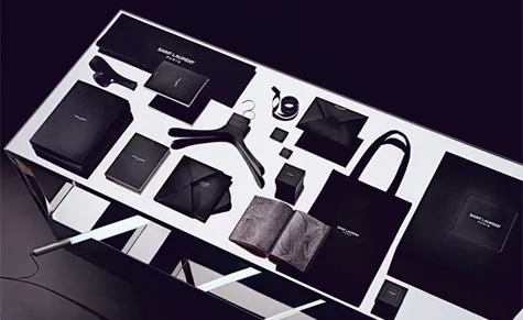
For the S/S 2013 womenswear show, the brand's first offering under the new Saint Laurent name, it sent out a discreet black notebook as an invitation...

,,, which opened up to reveal photographs of its Babycat print

The original Cassandre logo

Yves Saint Laurent and a model in front of his first Parisian boutique

Slimane has also introduced a new Saint Laurent Paris store concept. First unveiled in the opening of the French Maison's Shanghai boutique in October 2012, it references the French Art Deco and Union des Artistes Modernes movements

The brand recently launched its first UK concept space within London's Dover Street Market

Saint Laurent's new black-and-white shop fittings include art deco-inspired mirrored shelves and cabinets, with marble, gold brass and silver details