RIBA marks a new chapter with a redesigned brand identity that looks to the future
The new brand identity by Johnson Banks kickstarts RIBA's preparations for its bicentenary in 2034
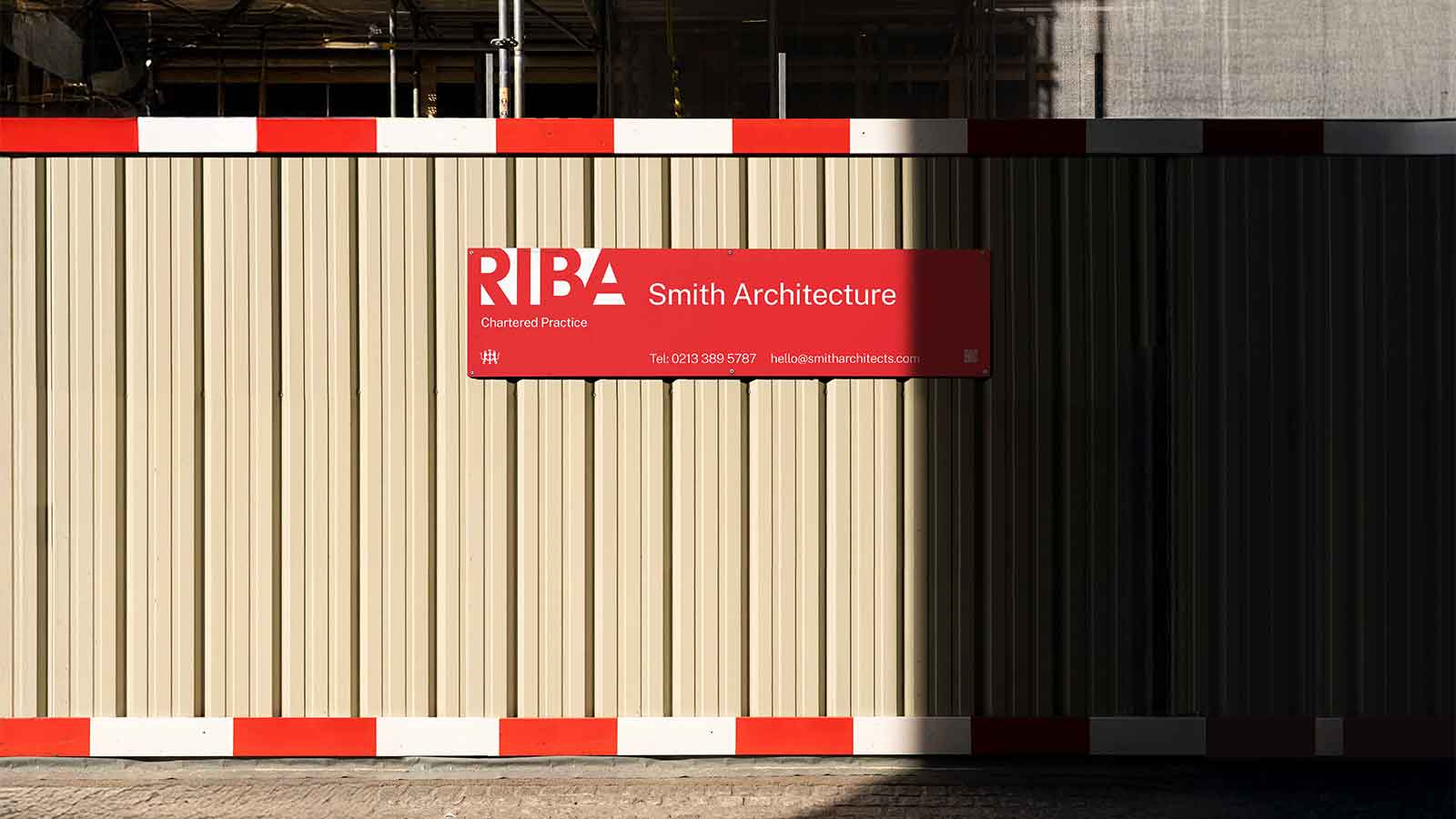
RIBA, the Royal Institute of British Architects, unveils today a new brand identity, created in collaboration with branding design studio Johnson Banks.
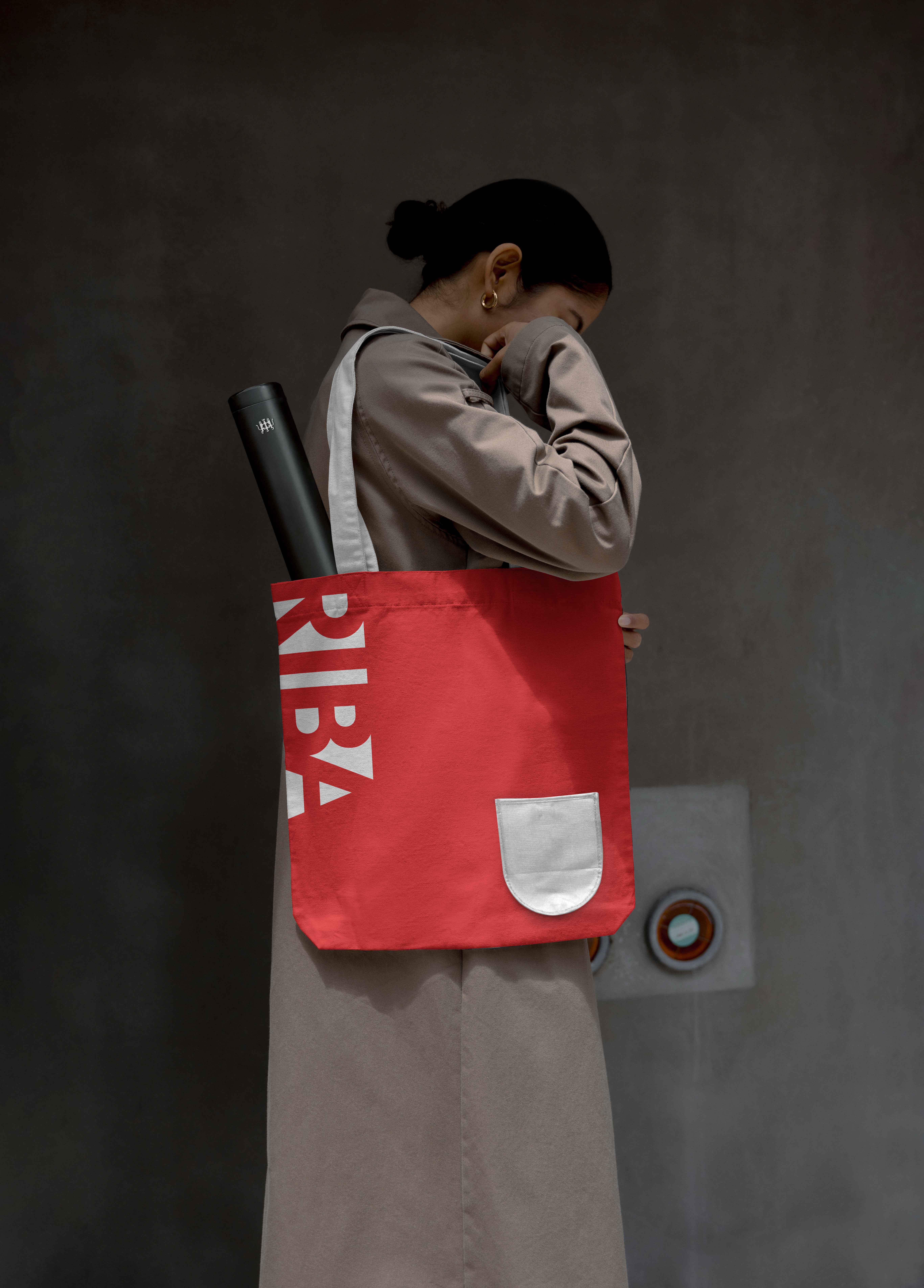
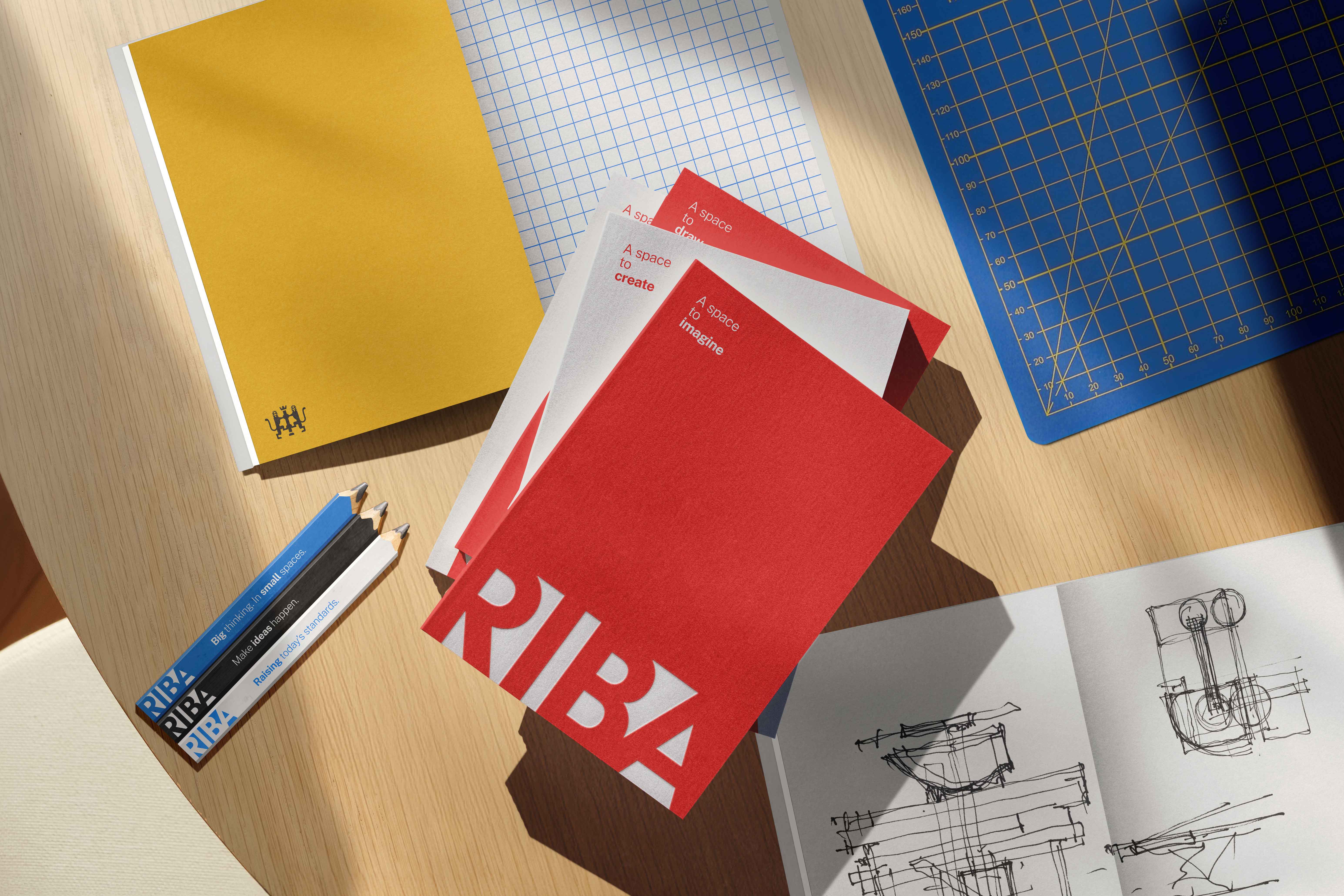
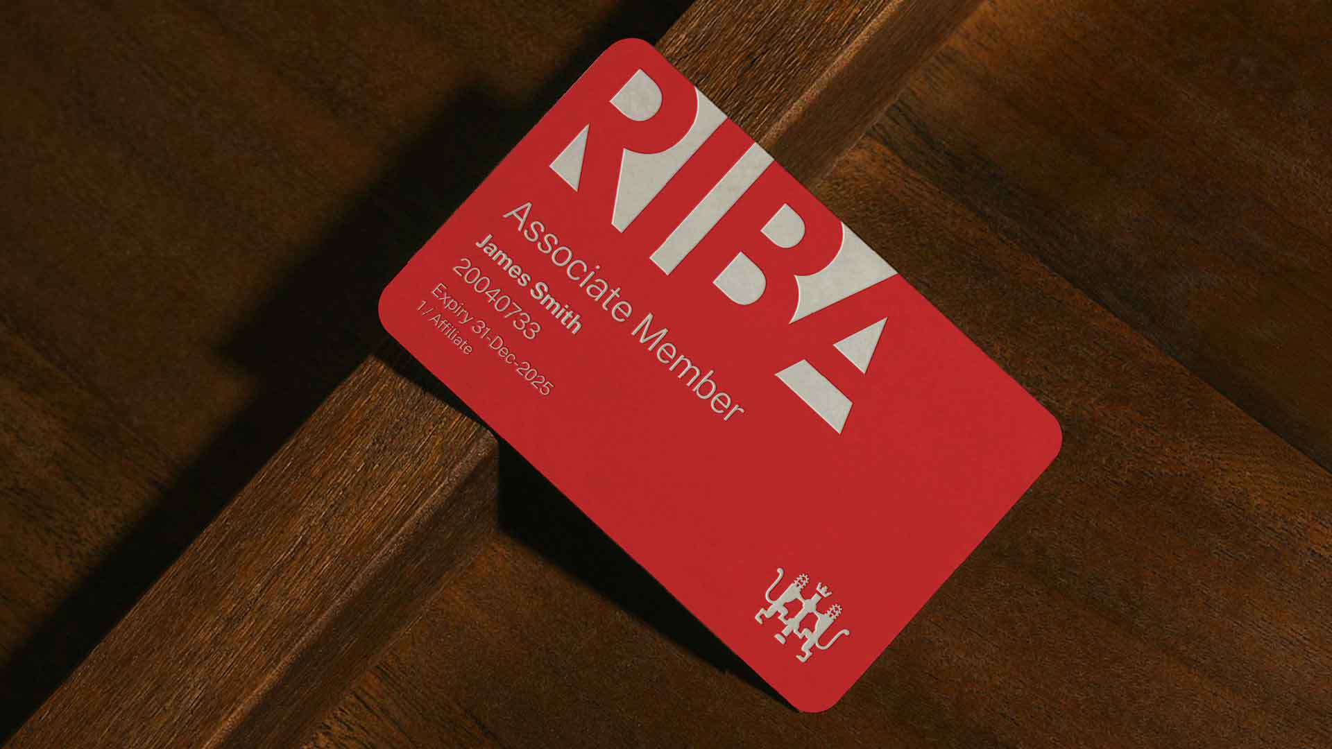
The new identity speaks of the institute's push for modernity, as it prepares to celebrate its bicentenary in 2034. It includes a bold new sans-serif font replacing the slim, serif typography of the old logo, and a novel colour scheme based on a brighter shade of red.
'Rebranding an esteemed organisation such as RIBA has to be done with great care – ensuring it remains relevant and resonant in a changing world, while also acknowledging and respecting its history,' says Michael Johnson, creative director and founder of Johnson Banks. 'That’s why we’ve brought key assets – like its famous red – to the forefront and retained the historic crest. But it needed a more modern brand, and clearer voice – and that’s expressed in its new narrative and a bold new logotype that puts the RIBA name front and centre.'
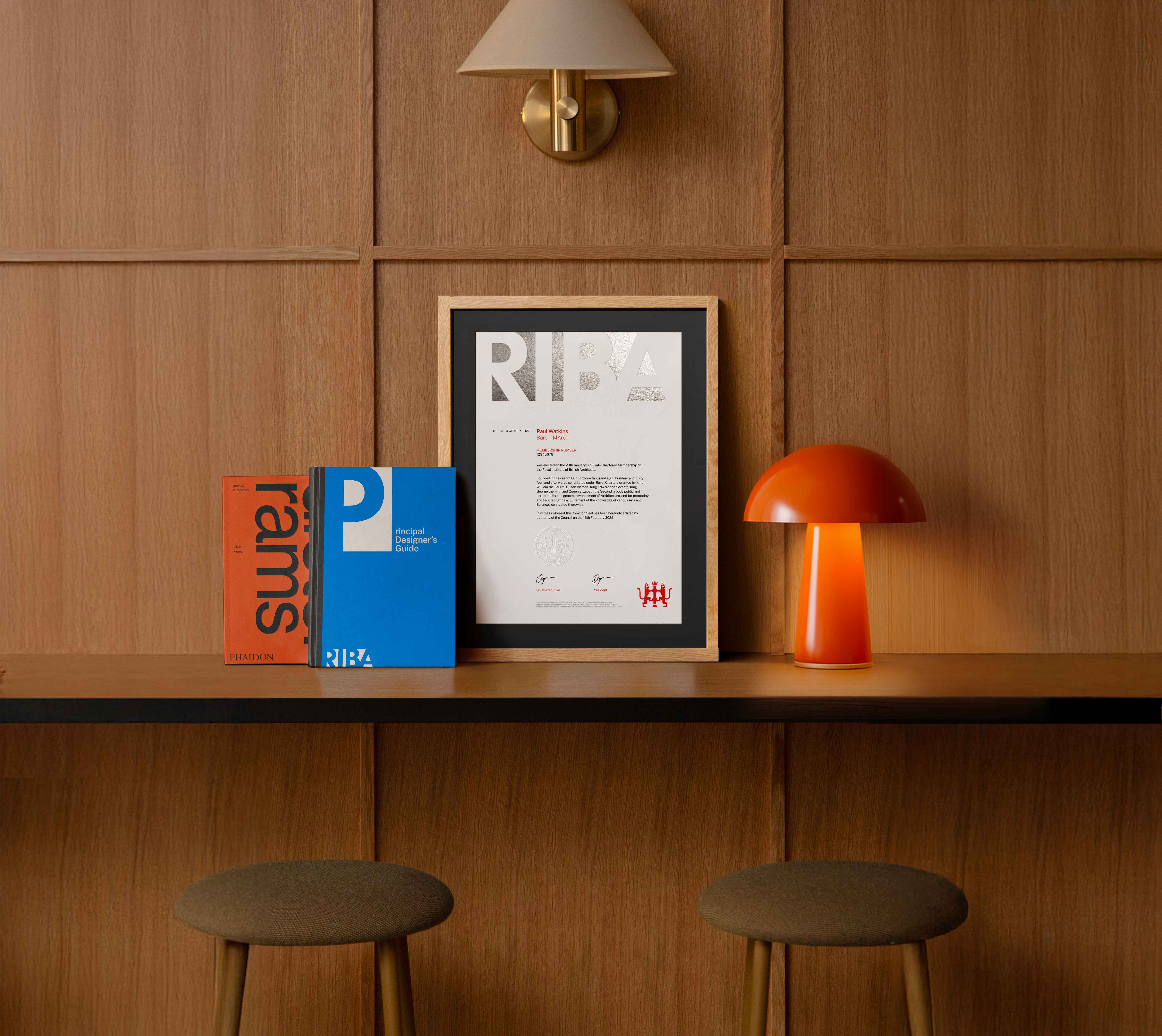
The logo design is inspired by 'the spaces and connections between walls and structures', and the RIBA crest, depicting two lions and a chevron-adorned column, has been updated as a discreet silhouette. Over the next few months, the new logo will be shared across all RIBA assets and merchandise.

'The rebrand will be more than just a new look; it will be a powerful statement of our intent as an outward-looking, purposeful cultural institute,' says RIBA president Chris Williamson. 'RIBA must remain relevant and essential to architects and practices across the globe, grow its membership among those early in their careers, and advocate on behalf of its members.'
The rebrand is part of the Institute's House of Architecture initiative, which includes an unprecedented plan to upgrade its digital infrastructure, improve access to its collection and carry out a refurbishment of its historic headquarters. Located at 66 Portland Place, the Grade II*-listed building was opened in 1934 and houses a gallery and bookshop; currently closed for refurbishment, the renovated building will be defined by improved access to its spaces in a quest to make architecture more accessible to all.
'It’s been over a quarter of a century since RIBA last considered its brand – with its 200th birthday approaching in 2034, it’s the perfect time to position our brand for the future,' adds Jack Pringle, chair of RIBA board. 'The upcoming rebrand is bold, creative and in-step with the digital world.'
Receive our daily digest of inspiration, escapism and design stories from around the world direct to your inbox.
Rosa Bertoli was born in Udine, Italy, and now lives in London. Since 2014, she has been the Design Editor of Wallpaper*, where she oversees design content for the print and online editions, as well as special editorial projects. Through her role at Wallpaper*, she has written extensively about all areas of design. Rosa has been speaker and moderator for various design talks and conferences including London Craft Week, Maison & Objet, The Italian Cultural Institute (London), Clippings, Zaha Hadid Design, Kartell and Frieze Art Fair. Rosa has been on judging panels for the Chart Architecture Award, the Dutch Design Awards and the DesignGuild Marks. She has written for numerous English and Italian language publications, and worked as a content and communication consultant for fashion and design brands.