
For a 47-year-old boutique, Browns has undergone fairly few changes to its aesthetic, whether it concerns the brick-and-mortar New Bond Street store’s exterior, or the outstanding edit inside on its rails and shelves.
Of course, subtle yet meaningful modifications have been carried through on to shop windows (legendary for their originality) and brand selection (known for launching fledgling designers’ careers), but one thing remains firmly true. ‘Browns has an incredible heritage and DNA,’ says Holli Rogers, the boutique’s CEO. ‘One of my key priorities has been ensuring that remains second to none.’

The 'perfectly traditional, but disruptive' redesign of the Browns logo was spearheaded by creative studio Spring
Nevertheless, Rogers had her eye on an aesthetic change that would reflect Browns’ ‘heritage of championing and supporting talent.’ She called on Robin Derrick, founder and creative director of Spring, to lend his dynamic vision to the Browns logotype, which had been left untouched since the 1970s – until now.
‘There was an inherent juxtaposition between the desire to demonstrate continuity, but at the same time, clear change,’ explains Derrick. ‘We felt the existing logo was still very relevant and so we played around with it, refined the typography and then applied the cut.’ Derrick essentially slashed the underside of the Browns logo. ‘The bluntly cut serif logo was perfectly traditional, but disruptive’, he comments.
The new logo will be rolled out across all mediums and channels, from price tags to carrier bags, from the website to store signage. ‘Those who know Browns will still recognise the distinctive personality of the brand, but it will be clear something exciting is going on’, Derrick says. ‘There’s a self-confidence to it. Half of the logo is removed, but you still read it as Browns – its heritage fills in the gaps.’

The redesign reflects Browns’ ‘heritage of championing and supporting talent’, says Browns CEO Holli Rogers

The new logo will be rolled out across all mediums and channels, from price tags to carrier bags

The typography was refined and the underside essentially slashed
INFORMATION
For more information, visit the Browns website and the Spring website
-
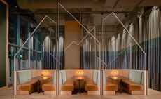 Bar Spero, in Washington DC, nods to the playful nature of Spanish cuisine
Bar Spero is a Spanish seafood bar and grill designed by Streetsense and led by chef Johnny Spero
-
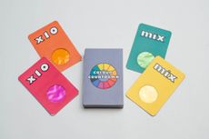 Colourful card game wins Design Museum’s Design Ventura competition
Annual design competition Design Ventura was won by students from The Piggott School, who created a fun I Spy-inspired card game
-
 Tour a Chilean pavilion perched on the coast: a sanctuary for sleep and star-gazing
Algarrobo-based architecture studio Whale! has designed a Chilean pavilion for rest and relaxation, overlooking a nature reserve on the Pacific coast


