
This summer, Bordeaux’s Musée des Arts décoratifs et du Design is staging an exhibition on colour. Titled ‘Oh couleurs! Design through the lens of colour’, the show has been curated by museum director Constance Rubini and designed by Pierre Charpin.
The exhibition, set in an old prison adjacent to the museum’s Hôtel de Lalande, doesn’t aim to be an encyclopaedic view on colour. On the contrary, Rubini’s goal is to offer varied points of view on pigments and their uses, from architecture to car design, make-up and colour theory, and even geography – visitors are in fact greeted by a series of maps identifying five cities named after a colour (Bordeaux fittingly being one of them).
The exhibition’s theme was inspired by the museum’s building: a historic palace filled with colourful furniture, ceramics and objects that range from the early 18th century to the Memphis period. Rubini condensed these colourful inspirations and channeled them in a sophisticated curation inside the nearby prison, offering a fascinating social and historical panorama of colour.

A display of black and neon curated by Pierre Charpin, including Philippe Starck’s chaise ‘Miss Wirt’ from 1982. © Madd Bordeaux. Photography: M Delanne
Small alcoves dotted throughout the building feature topical displays of distinctive colour stories, such as a panoramic view of Tupperware divided by decade, or a display of Japanese boro, and a series of international flags all using the colour red. Irma Boom designed a linear wallpaper representing the ‘colour DNA’ of the city of Bordeaux, which is forms the backdrop to furniture and ceramics from the Hôtel de Lalande.
As well as designing the exhibition, Charpin had free rein to explore colour’s social meaning in an area of the show; his selection included colour classics such as Alessandro Mendini’s ‘Proust’ armchair and an Ettore Sottsass cabinet, but it also put an aesthetic spin on more mundane items, such as safety helmets and a neon pharmacy sign.
The exhibition space is dotted with treasures, such as the story of Parisian textile designer Paule Marrot, who served as Renault’s colour consultant, or a collection of wallpapers designed by Le Corbusier for Swiss company Salubra (an ‘extra-muros’ visit includes the architect’s estate in nearby Pessac, a colourful cluster of housing created for local factory workers). Rubini also includes different points of view on design history’s most relevant colourists, such as Josef Albers, Verner Panton and Hella Jongerius – although her claim is not for a comprehensive exhibition, the MADD show certainly offers an eclectic perspective, allowing visitors to develop a kaleidoscopic view on colour.

Within the old prison where the exhibition is set, each cell features a mini-exhibition in itself, looking at a different aspect of design. Pictured, a collection of typically yellow objects representing the warmth of the south. © Madd Bordeaux. Photography: JC Garcia

Left, Irma Boom-designed wallpaper serves as a backdrop to furniture and ceramics from the Hôtel de Lalande. Right, a display of colour and minimalism including Donald Judd’s ‘Corner’ chair from 1984. © Madd Bordeaux. Photography: JC Garcia

The show includes a room dedicated to Verner Panton, recreating a stand he designed in 1971 for Mira-X at Heimtextil and exploring the physiological effects of colour. © Madd Bordeaux. Photography: JC Garcia

One section, curated by Pierre Charpin, included iconic objects as well as more mundane pieces, such as the bright green neon pharmacy (left) and wall piece ‘Ocelle’ (right), both by artist Vincent Beaurin. © Madd Bordeaux. Photography: JC Garcia

An exploration of traditional Japanese Boro textile was also part of the show. © Madd Bordeaux. Photography: JC Garcia

More examples of Paule Marrot’s work for Renault, left, and a display of Josef Albers work, right. © Madd Bordeaux. Photography: JC Garcia
INFORMATION
‘Oh couleurs! Design through the lens of colour’ is on view until 5 November. For more information, visit the Musée des Arts décoratifs et du Design website
ADDRESS
Musée des Arts décoratifs et du Design
39 rue Bouffard
33000 Bordeaux
-
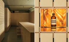 Aesop’s Salone del Mobile 2024 installations in Milan are multisensory experiences
Aesop has partnered with Salone del Mobile to launch a series of installations across Milan, tapping into sight, touch, taste, and scent
-
 Dial into the Boring Phone and more smartphone alternatives
From the deliberately dull new Boring Phone to Honor’s latest hook-up with Porsche, a host of new devices that do the phone thing slightly differently
-
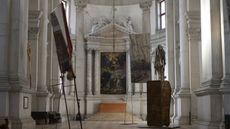 Berlinde De Bruyckere’s angels without faces touch down in Venice church
Belgian artist Berlinde De Bruyckere’s recent archangel sculptures occupy the 16th-century white marble Abbazia di San Giorgio Maggiore for the Venice Biennale 2024


