
The legacy of British designer and sculptor Eric Gill is more than marked by the shocking posthumous revelations in his private life. Despite this – and the subsequent calls to have his work removed from public view – the fact remains that Gill was an artist of great talent, whose work in typeface creation was hugely influential to the discipline, ubiquitously employed across publishing and design industries to this day.
Given this, Monotype is staging a week-long celebration of Gill and his most legendary works. Gill started working on Gill Sans in 1927 and produced Joanna a few years later, in 1930; both fonts have been since adopted by Monotype, which has continuously been adapting them to contemporary typographic needs, from different alphabets to new currency symbols, as well as for use on digital platforms.
With a background as a sculptor, carver and calligrapher, Gill had a particular sensibility for light and shadow, apparent in his typographic work. He and Monotype developed a long relationship, and the American company acquired several of his fonts, which he often created and updated in collaboration with the commercial team there. ‘Gill Sans is evidence of the company’s strong relationship with Eric Gill,’ says Dan Rhatigan, a consultant on the Gill Series project and former type director at Monotype.
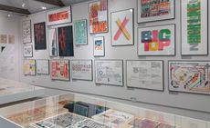
On display in the exhibition – curated by James Fooks-Bale, Monotype's creative director – is an array of materials that inspired the development of Gill’s typefaces, as well as documents that explore his fonts' histories and eventful development.
The show also serves as the announcement of a series of new fonts that continue Gill’s legacy. Over 75 new fonts have been introduced in the Monotype library, the most comprehensive update to the Gill Sans and Joanna families yet. Gill Sans Nova, Joanna Nova and Joanna Sans Nova will be available immediately from Monotype. Four designers collaborated over the course of over two years to develop contemporary styles that are true to the typographer’s original intentions. Adjustments of the fonts include an increased palette of weights, making them better suited to digital use, and a Sans version of Joanna, which didn’t exist before. ‘The [Joanna] font has such a vast library and heritage,’ says Terrance Weinzierl, one of the designers tasked with the new project. ‘What we asked ourselves was: how do we contribute to that in a meaningful way?’ The resulting design balances simplicity, beauty and usability, but also maintains Gill’s initial aesthetic character.
‘Gill’s mastery of light and dark spaces is what made his typefaces so good,’ said Steve Matteson, the company’s creative type director. ‘Our work with the [Eric Gill] series spotlights the role Monotype continuously plays with respect [to] the past, present and future of type, where we have the unique ability to revive legacy designs with new weights, characters and languages.'
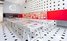
The exhibition, and the subsequent commercial release of the three typefaces, is an important step in a conversation that brings type history to life.

In this 2012 proof, we see how Joanna Sans Nova – an updated version of the seminal typeface – plays on formal cues from both Gill Sans and Joanna to become something entirely new

This original 10-inch production drawing shows how many different styles could be made from the outlines drawn on a single, simple sheet

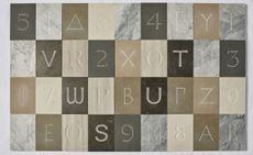
Details of Gills Sans, which Gill started working on in 1927, displaying his particular sensibility towards light and shadow

Pictured: Monotype Newsletter No. 56, 1958, which presented the Joanna typeface to the public for the first time

The exhibition includes intimate sketches, drafts and ideas from Gill, spotlighting the continuing role his creations have played in the development of contemporary type

Seventy-five new fonts have been anounced by Monotype in conjunction with the exhibition, including Gill Sans Nova, Joanna Nova and Joanna Sans Nova

The ’Gill Series’ exhibition not only serves to celebrate the man’s work, but also brings the history of the discipline to life
INFORMATION
’Monotype: the Eric Gill Series’ is on view until 10 November. For more information, visit Monotype’s website
ADDRESS
The Old Truman Brewery
Brick Lane
London, E1 6QL
-
 Ikea introduces its first gaming furniture collection
Brännboll is the first Ikea gaming furniture collection, unveiled during Milan Design Week 2024 and designed to swiftly transform a domestic space into a gamer’s paradise
-
 Morgan take their classic roadster and give it subtle but significant tweaks for 2024
New details and features give the compulsive Morgan Plus Four an even more pared back silhouette and driving ability
-
 Wallpaper* Class of '24 exhibition now open at Triennale Milano
Wallpaper* Class of '24 exhibition at Triennale spotlights international emerging talent in furniture and product design, with the support of AHEC and SNOW (until 21 April 2024)


-
 Set in stone: Sekford and Salvatori carve out a timeline of typography
 -
 Playful typography: MAD looks back on the 1960s and 70s
 -
 True to type: master of print Alan Kitching displays 'A Life in Letterpress'
 -
 The drawn word: SFMoMA tracks the modern evolution of typography
 -
 The AIGA National Design Center in New York looks back on 100 years of typography
 -
 Pencil to Pixel typography exhibition, New York


