
Alice Tye filters 'big M' Modernism with painterly approach to add another layer of texture and memory. As well as creating a 4m concertina book of paintings from a virtual stroll down La Jolla Road in Palm Springs, Tye has turned her eye to the cinematic depiction of Californian modernism. 'I want to communicate the sunny skies, swimming pools and palm trees,' she says, 'and also something darker hidden beneath the façade, the "dark underbelly of suburbia".' www.alicetye.com
Today's graphics graduates are faced with the daunting task of making their mark in a field that has expanded beyond the tactility of two-dimensional media into a digital realm of virtual space and interactivity
Writer: Jonathan Bell


Charlie Bakker's playful imagery combines photography, design and an architectural approach to space. 'I want to see how our perception of an object is influenced by its surroundings,' she explains. 'I'm playing with the fact that when we perceive our surroundings, object and space become inseparable.' Bakker's exploration has resulted in a series of exploded-imagery, skew-whiff perspectives that draw in the viewer. 'I believe it's important to question the daily and banal to create a greater understanding of who we are.' www.charliebakker.com


Russian designer Dmitry Bukreev draws a direct line between his portfolio work and Soviet Constructivist art and design of the 1920s. 'I used the model of Constructivism and updated it through a fashion catalogue of an imaginary designer named Varst,' he says, describing how his alter ego exists in a world of strict lines and geometric shapes. 'It's a work of art direction, styling and visual experiments,' he says. dbukreev.tumblr.com


Herman has developed a calm yet authoritative aesthetic for his short films and graphics. The 'observational collage' shown here illustrates his obsessive deconstruction of stock suburban imagery, enhanced through the serene but menacing grey palette and subtle animation. It was created as part of 'Meeting Place', a short animation exploring the realm of the social network via the work of influential technologist Sherry Turkle. 'Homes are collected in a huddle, yet the inhabitants are hopelessly distant from one another, restricted by walls and hypnotised by their screens,' he says. www.harveyherman.co.uk


Berlin Between is the identity for a documentary film charting the city's early post-reunification years. 'The inspirations were the urban forms and DIY visuals of the Berlin subculture at the time,' says Seiffert, who created a handmade letterset for the project. Seiffert has always taken a socially conscious approach; her Twitter Compendium is a 600 page volume that attempts to contextualise the flurry of one-liner political debate about the new digital future. www.isabelseiffert.net


Deconstruction, image and intention all play a part in the work of Kieran Startup, who creates architectural imagery blended through the unholy lens of Photoshop filters, which degrade, corrupt and otherwise interfere with the clean lines of Mies van der Rohe. He pairs his Deconstructed Architecture series with Deconstructed Hockney, shown here, in an 'experimental attempt to remove the splash from the image in a systematic and incremental way.' www.kieranstartup.co.uk


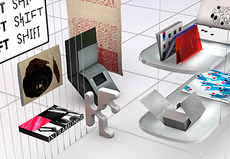
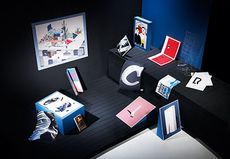
Students on ÉCAL's newly minted 'art direction' degree, Michal Florence Schorro and Prune Simon-Vermot work together to shape experimental compositions forming from strange constellations of everyday objects. 'Our main interest lies in taking 3D objects and translating them into abstract compositions of texture, colour, and light,' says Schorro. The course enables the collaborative duo to shape an emerging aesthetic that is fresh, unconventional and truly unique. www.prune-michal.ch


In creating the identity for Stockholm's Museum of Dance, Moa Wilking drew a new language of physical movement, partly inspired by the collections at the museum and at Les Archives International de la Danse. For the Mercedes-Benz Fashion Week print shown here, she interpreted work by Beckmans fashion students in photography, exploring how each particular piece came about. Wiking ultimately hopes to head for a more multidisciplinary future. www.moawiking.com


Ryan Neil's geometric imagery is based on the simple architectural structure of his college degree show, which used minimal materials in order to maximise display space. 'The idea was to provide a neutral space for student work while letting us build a richer spatial environment for visitors,' says Neil, who presented his organisation diagram as a strong graphic identity. Now Tokyo-based, Neil is looking to strike out with his own set of cross-pollinating studios, keeping the collaborative process alive. www.ryan-neil.com


Another designer with an architectural approach, Thorsteinsson builds 3D models of vanished structures and laboriously constructed posters for a college lecture series. Taking as a starting point the typographic inscription on the cenotaph in front of Yale's Beinecke Library, Thorsteinsson has delved into typeface design for the posters, creating an evolutionary model that develops over the year, 'appropriate to the content of the lecture.' His future work will expand this fusion of graphics with built environments. www.stefanthorsteinsson.dk


Benjamin Muzzin's 'Full Turn' video makes use of a unique way of displaying image - a spinning flat screen that gives the impression of a solid 3D object. 'I wanted to explore the notion of the third dimension,' says Muzzin, 'to try to get out of the usual frame of a flat screen.' Sticking two screens back to back and spinning them at high speeds builds a picture of a dancing 'kinetic light sculpture'. www.benjaminmuzzin.ch

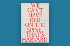
Bold text and bold statements give Maryam Fanni's unmissable visuals instant recognition factor. Creator of several works examining the effects of ongoing privatisation, state-sponsored nostalgia and the politics of identity, Fanni is overtly political in her work. 'My practice requires never-ending collective and collaborative research and organisation to form resistance against neoliberal and fascist tendencies,' she says. Her idealist aesthetic is sharply formed to support progressive causes. www.maryamfanni.se

'As a graphic design student, the very basic thing you learn is typography and typefaces,' says Calvin Kwok, lamenting that there are few contemporary guides to using Chinese characters. 'I intend to develop a style guide containing basic Chinese typography knowledge, which will be distributed in print and available online.' His research has taken him deep into orthographic territory as he 'searches for new possibilities in Chinese typography from the root of Chinese characters and calligraphy.' cargocollective.com/cliko

Jessica Svendsen's series of lecture posters makes subtle allusions to the work of visiting artists. For example, the laser-cut stencil used to make the poster for photographer Philip-Lorca diCorcia evokes a 1978 photograph taken while diCorcia was at Yale himself. 'The lecture poster for photographer Todd Hido uses a projected grid of light photographs to reference the light sources in his colour prints,' she explains. While in her poster for Leo Rubinfien she uses 'undulating letterforms and colours' reminiscent of the photographs in his series A Map of the East. www.jessicasvendsen.com


'3D is such an amazing tool with endless possibilities. Only your imagination is the limit,' says Dominic Plaza. Taking inspiration from futuristic technologies and abstract art, Plaza builds slick, intricate films that create order from chaos. 'All my projects are small learning steps in the process of creating, and also a bridge to bigger, more challenging projects.' He hopes for a future in the VFX industry or his own motion design studio. behance.com/dominicplaza

Hugh Cowling describes his cover for the eighth edition of Falmouth's portfolio publication, Illustrated Quotes and Sayings, as 'bold and fairly impartial.' 'I didn't want it to be biased towards one particular area,' he says. He draws inspiration from Reid Miles's Blue Note record covers and Milton Glaser, and his portfolio includes a suite of illustrations for the poems of Gillian Clarke, including this image of a beetroot, rendered in watercolour and pencil. Cowling is already working on book covers for Bloomsbury. www.hughcowling.co.uk


Jyotish Sonowal's diploma project resulted in the creation of a Bengali typeface, developed in collaboration with the Indian Type Foundry. 'I was unhappy at the lack of weights in current Bengali fonts, which forced newspaper designers to use several typography malpractices [stretching, force bold, forced italics],' he explains. Using traditional calligraphy as a starting point, he came up with five different weights, designed for many applications. Sonowal continues to work on Indic typefaces. behance.net/jyotish13

Min Ji Lee has created an interactive typeface called 'Transtype'. 'It changes its form from abstract shapes to black letters in response to sound,' she says, explaining how the letterforms derive from technical construction processes. Her other project explores the concept of neutrality in typeface design, creating Caslon5 Grotesk through the addition of 'unfamiliar elements' to a face inspired by William Caslon. www.minjilee.com


'Nordic by Noma' was a collaboration between Morten Rosendal, Emil Bjerregaard Juul and Hans Pelle Jart. Together they designed a series of events for the restaurant Noma. 'The seven events will take place in nature and get you close to the ingredients that have been used in the dinner,' says Rosendal. 'It's an attempt to improve our understanding of food.' Their site is refreshingly clean, typographically driven and rich with natural imagery. studentshow.com/gallery/Nordic-by-noma/7951157

Nikolas Brückmann and Yuriy Matveev collaborate under the banner of Sure.Is on graphics and motion imagery, making them the perfect choice to create an identity for the B3 Moving Image Biennial at Hochschule für Gestaltung. By adapting old fractal generating software, they created a rich blast of psychedelic imagery. 'We were aiming for a visually strong analogy that goes beyond the visual and also plays with the viewer's perception,' they explain. 'We generated a huge variety of fractals and went with three final key visuals. It was great fun to look at those hypnotising images for days.' sure.is

Illustrator Tamsin Nagel undertakes detailed studies of what she calls 'natural forms and mundane objects,' closely observing texture, colour and line. 'I'm inspired by stories, films, nature and anything that's a bit "off'",' she says, ' things that seem ordinarily beautiful on the surface but are actually dark or unsettling the closer you look.' She captures this sense of unease in her work. 'I love a good pencil,' she says. 'The plan is to continue drawing and being inspired by my strange, sometimes mundane surroundings.' tamsin-nagel.tumblr.com


The Fox is a publication without barriers, designed by Mathew Whittington as an exploration of printing as a new form of public space. 'I'm interested in the way users who experience these systems renegotiate the objects and spaces in ways that deviate from the primary directives of the designer,' says Whittington. www.mathewwhittington.com
-
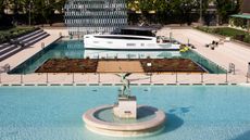 All aboard: Azimut moor a yacht in the heart of Milan
With Azimut's Mooring by the Moon, Michele De Lucchi and AMDL Circle provide insight into the philsophy of the Seadeck Series with an immersive installation at Bagni Misteriosi
-
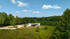 A low-energy farmhouse provides a rural escape in North Carolina
This low-energy farmhouse is a net zero architectural re-set for a Californian client, an East Coast relocation for a more engaged and low-key lifestyle
-
 Objects Are By unite creatives with artisans to create a new world of product design
Milan-based brand Studio Objects Are By is introducing a novel idea to the design process. They're asking: What if you let an artist, an actor or a chef moonlight as a product designer?


-
 Visual Communication
From typographic talents to virtual-reality virtuosos, the font of all knowledge is here
-
 Visual Communication
From pixels to paint brushes, this visual vanguard has a promising future
-
 Visual Communication
The designers, illustrators and typographers communicating in bold new ways
-
 Visual Communication
From print to pixels, these visual designers, illustrators and typographers have each emerged with a strong and clear voice


