The return of the POP Swatch watch
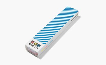
Swatch first launched POP in 1986. Designed to be worn with a degree of customisation, whether popped onto an optional strap, dangled from a necklace or clipped to a T-shirt, the POP Swatch was an irreverent quirk perfectly in tune with the times. And, according to Carlo Giordanetti, Swatch creative director, now is the right time to bring one of its best-loved inventions back. ‘POP Swatch has been popping in and out of our minds for quite some time,’ he admits of the decision to revive it. ‘Dressing and accessorising with freedom and personal creativity is a fundamental criteria for the new fashion generation.’ Hence, Giordanetti and his team were keen to stay faithful to the carefree vibe that characterised the pieces from the start. Pictured: the POP Swatch watch in its matching pop packaging
Writer: Hannah Silver
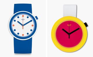
Here he talks us through his pick of the current POP crop... Pictured left: The clean dial and simple colour tones of the Swatch POPiness is broken up only by cylindrical hour-markers, or ‘confetti’. Suitably tongue-in-cheek, this is POP at its most understated. Right: Pop Art meets neon in the Swatch POPtastic, where ‘the idea is to have a straightforward, almost paradigmatic watch face in fluoro or full colour,’ explains Giordanetti
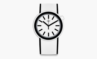
The graphical simplicity of the monochrome POPmoving leaves an an impression. The minimalist design makes it Giordanetti's favourite piece: ‘I am in love with the fun yet totally clean ones, such as the bold black and white of the POPmoving. I also wear it as a pocket watch’
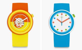
Pictured left: By revealing the workings within, the POPover laces simple functionality with a bold neon glow. ‘The inspiration comes from the street, the energy of youth, the challenge to satisfy the transversal appeal of Swatch in a fun and simple way’. Right: Dedicated block colour defines the design of the POPpingpop. Subtle accent color detailing on the hour markers and crown are all the detail required
Wallpaper* Newsletter
Receive our daily digest of inspiration, escapism and design stories from around the world direct to your inbox
Hannah Silver is the Art, Culture, Watches & Jewellery Editor of Wallpaper*. Since joining in 2019, she has overseen offbeat design trends and in-depth profiles, and written extensively across the worlds of culture and luxury. She enjoys meeting artists and designers, viewing exhibitions and conducting interviews on her frequent travels.
-
 Enjoy ocean and jungle bliss at Bespoke Tulum’s residences in Mexico
Bespoke Tulum is an exclusive hospitality complex designed by Muro Rojo Arquitectura on Mexico’s Caribbean coastline
By Sofia de la Cruz Published
-
 In Van Cleef & Arpels’ high jewellery, the archival meets the au courant
Van Cleef & Arpels pays tribute to its rich heritage with a captivating high jewellery collection
By Hannah Silver Published
-
 New Nothing Ear and Ear (a) earbuds: audio innovation with a retro nod
Nothing’s new Ear and Ear (a) earbuds, drawing inspiration from vintage portable hi-fi and packed with updates, help the company maintain its status as an audio innovator
By Jonathan Bell Published
-
 Samuel Ross unveils his Hublot Big Bang watch design
Samuel Ross brings a polished titanium case and orange rubber strap to the Hublot Big Bang watch
By Pei-Ru Keh Published
-
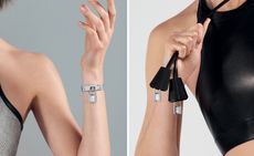 Playful design meets chic heritage in the Hermès Kelly watch
The new Kelly watch from Hermès rethinks the original 1975 timepiece
By Hannah Silver Last updated
-
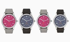 Discover the tonal new hues of the classic Nomos Club Campus watch
The Nomos classic wristwatch Club Campus now comes in two new collegiate colours. The perfect graduation gift from the Glashütte manufacture
By Hannah Silver Last updated
-
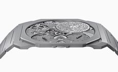 Bulgari unveils the thinnest mechanical watch in the world
The new Bulgari Octo Finissimo Ultra watch is a record-breaking feat of engineering
By Hannah Silver Last updated
-
 Breitling and Triumph unite on a racy new watch and motorcycle
1960s design codes are infused with a contemporary edge in the collaboration between Breitling and Triumph
By Hannah Silver Last updated
-
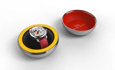 Gerald Genta’s mischievous Mickey Mouse watch design is rethought for a new era
The Gerald Genta Retrograde with Smiling Disney Mickey Mouse watch pays tribute to Genta’s humorous design codes
By Hannah Silver Last updated
-
 Shinola honours Georgia O’Keeffe with a new watch
Shinola Birdy watch stays faithful to the minimalist codes of Georgia O’Keeffe’s painting, My Last Door
By Hannah Silver Last updated
-
 Bulgari’s new book celebrates women and high jewellery
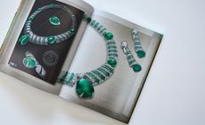
Bulgari Magnifica: The Power Women Hold, published by Rizzoli New York, takes a closer look at the female muses who inspired the spectacular Magnifica high jewellery collection
By Hannah Silver Last updated