
-
 John Gosling on crafting the otherworldly soundtracks for Lee Alexander McQueen: ‘We wanted to shock people’
As ‘Unnatural Harmony: Sounds of Lee Alexander McQueen’ arrives at London’s Southbank Centre, the provocative designer’s longtime music director, John Gosling, recalls their decades-long collaboration
-
 Treasures from the worlds of fashion and art collide at an extraordinary new exhibition in Lisbon
One of a series of new and upcoming exhibitions on the subject, ‘Art & Fashion’ at Lisbon’s Calouste Gulbenkian Museum dissolves the boundaries between the mediums in an arresting, era-spanning display
-
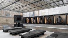 Stone Island’s immersive Milan Design Week installation with NM3 is all about ‘touch and feel’
Featuring a singular jacket in different technical iterations – an ode to founder Massimo Osti’s ‘No Seasons’ concept – the installation doubles as a space for ‘community and music’
-
 Marni is taking over an iconic Milanese café for Design Week – and it’s open to everyone
Beginning at Milan Design Week in April, Marni x Cucchi will see the Italian fashion house take up residency at Pasticceria Cucchi for a three-month tenure, featuring ephemera and objects shaped by their respective design codes
-
 ‘Schiaparelli lived to shock’: V&A’s new show is an homage to the pioneering surrealist couturier
Wallpaper* takes a tour of ‘Schiaparelli: Fashion Becomes Art’, a blockbuster new fashion exhibition on Italian designer Elsa Schiaparelli, which opens at London’s V&A Museum on 28 March
-
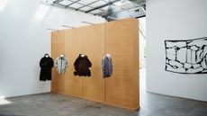
 Inside Helmut Lang’s fashion archive in Vienna, which still defines how we dress today
New exhibition ‘Séance de Travail 1986-2005’ at MAK in Vienna puts Helmut Lang’s extraordinary fashion archive on view for the first time, capturing the Austrian designer-turned-artist’s enduring legacy
-
 ‘Architect of glamour’ Antony Price makes a high-voltage return to the runway with 16Arlington
Featuring a runway debut from Lily Allen, the show saw legendary designer Antony Price – best known for outfitting Roxy Music in the 1980s – unite with 16Arlington’s Marco Capaldo on the sensual after-dark collection
-
 Frieze London 2025: all the fashion moments to look out for
The best fashion happenings to add to your Frieze London 2025 schedule, from Dunhill’s curation of talks at Frieze Masters to an exhibition of furniture by Rick Owens
-
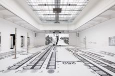
 Inside the Paris exhibition cataloguing Virgil Abloh’s extraordinary archive
The visionary American designer’s archive goes on display this week at Paris’ Grand Palais in a new exhibition, ‘Virgil Abloh: The Codes’, giving an insight into his polymathic approach
-
 ‘Dirty Looks’ at the Barbican explores how fashion designers have found beauty in dirt and decay
From garments buried in River Thames mud to those torn, creased and stained, ‘Dirty Looks’ is a testament to how ‘creativity and new artistic practices can come out of decay’, its curators tell Dal Chodha
-
 Tyler Mitchell’s London show explores the figure of the Black Dandy, ‘imagining what else masculinity could look like’
Originally part of a visual essay to accompany the Met’s ‘Superfine’ 2025 Costume Institute exhibition, ‘Portrait of the Modern Dandy’ goes on display at Gagosian Burlington Arcade in London this week
-
 The standout shows of New York Fashion Week S/S 2026 – as they happened
Heralding the start of fashion month, the latest edition of NYFW took place in the city this week. Here, in our rolling round-up, Wallpaper* picks the highlights
-
 In Copenhagen, cult Icelandic outerwear brand 66°North celebrates a century in business
At Copenhagen Fashion Week, Wallpaper* sits down with 66°North CEO Helgi Óskarsson as the brand – which has garnered a devoted following both inside and outside its native Iceland – looks forward to the future
-
 Haute Couture Week A/W 2025: what to expect
Five moments to look out for at Haute Couture Week A/W 2025 in Paris (starting Monday 7 July), from Glenn Martens’ debut for Maison Margiela to Demna’s Balenciaga swansong. Plus, ‘new beginnings’ from JW Anderson
-
 With an ode to Italy, Homme Plissé Issey Miyake brings its brand of fashion magic to Florence’s Pitti Uomo
Marking the start of a new nomadic way of showing for the Japanese label, Homme Plissé Issey Miyake held its S/S 2026 show at Florence’s Villa Medicea della Petraia as part of Pitti Uomo last night (18 June) with a collection inspired by the colours and textures of Italy
-
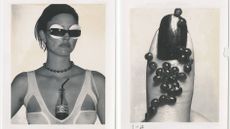 Donna Trope celebrates the power of the Polaroid in Paris
‘Polaroids used to be my rejects, and now they are my holy grail,’ says the beauty photographer, as she shows rarely seen images in a Paris exhibition
-
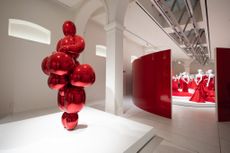 Inside the new Fondazione Valentino Garavani and Giancarlo Giammetti in Rome, which opens with an ode to ‘Valentino Red’
Wallpaper* gets a private tour of the new Roman institution, PM23, which opens with an exhibition of ‘dialogues’ between Valentino Garavani’s designs and a catalogue of red-hued contemporary art
-
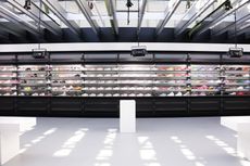
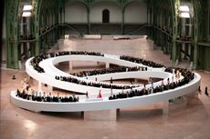
 Milan exhibition celebrates 20 years of Armani Privé: ‘Haute couture is fashion when it becomes art’
Hosted at the Tadao Ando-designed Armani/Silos, ‘Giorgio Armani Privé 2005-2025, Twenty Years of Haute Couture’ displays an expansive collection of the Italian designer’s showstopping haute couture creations
-
 Martine Rose’s first gallery show celebrates the radical queer energy of Bronski Beat
Taking place at Sadie Coles HQ over London Fashion Week, ‘Everything Must Change’ centres on a 2016 short film by menswear designer Martine Rose and image-maker Sharna Osborne starring Bronski Beat frontman Jimmy Somerville
-
 Inside Louis Vuitton’s Murakami London pop-up, a colourful cartoon wonderland with one-of-a-kind café
Wallpaper* takes a tour of the Louis Vuitton x Murakami pop-up in London’s Soho, which celebrates the launch of a new ‘re-edition’ accessories collection spanning the greatest hits from the Japanese artist’s long-running collaboration with the house
-
 Japanese outerwear label Tatras’ expansive new Tokyo store finds ‘beauty in contrast’
Step inside the new Ginza outpost of Tatras, an Italy-meets-Japan outerwear label which has recently collaborated with Italian artist and Michèle Lamy protégé Giovanni Leonardo Bassan
-
 Get to know Issey Miyake’s innovative A-POC ABLE line as it arrives in the UK
As A-POC ABLE Issey Miyake launches in London this week, designer Yoshiyuki Miyamae gives Wallpaper* the lowdown on the experimental Issey Miyake offshoot
-
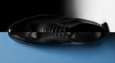 These limited-edition John Lobb brogues pay ode to the patron saint of shoemaking
Storied British shoemaker John Lobb presents its latest ‘Saint Crépin’ edition, a yearly 500-run release of a shoe which shows off the heights of its Northampton workshops
-
 First look at Our Legacy’s cat-adorned Emporio Armani collaboration
Feline forms appear throughout a new collection from Emporio Armani and Swedish brand Our Legacy (out 17 November 2023), combining the brands’ unique aesthetics
-
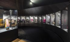
 ‘Shoemaker to the stars’ Salvatore Ferragamo’s colourful life and work celebrated in new exhibition
‘Salvatore Ferragamo 1898-1960’ at the house’s Florence museum explores the Italian shoe designer’s wide-ranging career, which began in the golden age of Hollywood
-
 Celine Saint Honoré is dedicated to Hedi Slimane’s feats of savoir-faire and craft
The Celine store on Rue Saint-Honoré is designed to capture the spirit of Paris, showcasing the house’s most precious offering. Here, Wallpaper* captures Celine’s couture, Haute Maroquinerie and Haute Parfumerie collections in the luxurious space
-
 Exhibition to explore the Bloomsbury Group through fashion
Supported by Dior, Charleston’s ‘Bring No Clothes’ explores the Bloomsbury Group’s use of – and influence on – fashion, featuring works by Dior, Fendi, Comme des Garçons and more, alongside original clothing and ephemera


