
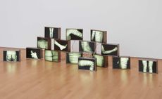
French graphic designer Malika Farve's new work at London's Kemistry Gallery asks you to quite literally read between the lines. Her posters and short film, collectively titled 'Hide and Seek', are imbued with the same teasing nature that made her a natural collaborator for Wallpaper's 2009 Sex Special - her specially commissioned 'pin-up' alphabet featured a sapphic couple in stockings performing a sort of Kama Sutra A-Z. Though somewhat more demure, her latest creations are equally playful and intriguing.
‘Hide and Seek’ draws the viewer into the world of an enigmatic woman whose contours merge and clash with her monochromatic environment. The narrative, like the design, is minimalist – this woman’s background, and her fate, are up to you. Once again they reveal the London-based artist’s lust for bold, architectural patterns and optical experimentation.
Farve spoke with us from her studio, where she was working on the display for Hide and Seek.
Had you established a narrative in your mind before setting out to design Hide and Seek?
Yes. Because my work is very pared down and minimalist, the narrative is never complicated, but it always has to be there. My idea was to hide a girl inside very intricate, abstract, almost architectural modular patterns. I liked the idea of having a human presence there, which informs the way you look at the picture. I thought I’d try to develop a series of prints, each with a maximum of three colours, and always black and white, hiding that girl. In your imagination she would move from one pattern to the next. That’s how the idea for the video began – it wasn’t planned originally but it made sense with this idea of movement.
Tell us about the main character.
Actually I don’t know much about her except that she’s very sophisticated and glamorous. Nobody knows where she’s going, but she’s on a journey, hiding inside things, then revealing herself and being quite bold.
You’ve said you’re particularly inspired by modern architecture. Any place in particular?
No, though I’m amazed every time I go to the Barbican, because it has kind of a futuristic yet very dated feel about it. Over the years I’ve taken in things, taken pictures. Most likely I’ve created here a composite space that’s not even necessarily London specific – it could be in Paris. But it’s that idea of repetition that I like, that idea of picking out one balcony from a block of buildings.
I’ve always thought that the zebra crossing was beautiful – something simple that informs where you’re going to walk. But people are so jaded, they almost don’t see it any more.
A lot of your work features strong, sharply defined women. Are they an extension of yourself?
I don’t think so – I’m much more messy, I don’t have that sharp haircut. This theme started at Wallpaper*, actually, with the pin-up project (W*124). The women had this kind of robotic thing about them. They’re so sharp, almost clones of each other. For me, that’s the perfect aesthetic: the symmetrical face, the red lipstick, the curves and insanely long legs – it’s the essence of a woman and what I find beautiful. In a way it’s every woman but no woman at all – at least not in reality. She’s untouchable.
Why, apart from your obvious point of view, do female characters tend to dominate your work?
Since I was a kid I’ve been drawing every day, and always women, exclusively. There’s something in the curves I love to play with – they’re so sexy and glamorous, there’s so much to play with. Men are a bit more angular, though I’m starting to draw more men now. They’re interesting in a geometrical sense.
Are your bold primary colour palettes informed by fashion?
No. I’ve just always been colour obsessed. I love combining colours that clash in a nice way. That’s why I use a lot of red and blue – those simple combinations of hot and cold that play tricks on your eyes. I dress in those colours, too. I have days when everything is green, or everything is blue. And red is probably the sexiest colour anyway.
You seem to have brought a bit of your French background into your scenes. And also a bit of film noir. Are we seeing things?
Film noir is definitely an inspiration – the mood of it. And the Frenchness, it’s funny, so many people have assumed my girls are French – in my commercial work as well. It’s the sophistication. Growing up in Paris you always have this idea of the French actress, the Catherine Deneuve, the Carole Bouquet, as so classy. And I’ve always loved that, along with Hollywood films from the 1950s, with female characters who were very glamorous, feminine and strong. But I still think it’s completely subconscious. Maybe after a few years here they’ll be more British.
Is your work solely computer-led? Or do you begin on paper?
I still draw on paper, but just to sketch. And even the sketches I do on the computer, because I start with the colour. I go very quickly into colouring things to get the overall weight of the shapes and composition.
Negative space is very much alive in your work. What can we conclude from that?
Actually, my trick is that I create the negative space. My process is to draw everything, then take away bit by bit. And I love it that way; it’s very soothing. I take away until I can’t take away any more, until that last necessary line.
I think this [subtraction] began completely organically, when I was working on the first pin-up girls. I wanted to do something erotic, then I realised that if you draw everything, there’s no scope for guessing. And the sexiest thing is to guess. It’s so much more erotic. Drawing the pin-ups’ clothing but not their bodies – there was something interesting about that how people would fill in those spaces themselves. It’s about playing tricks – like the work of Bridget Riley, abstracting the content.
What has changed in graphic design over the past years to allow you to achieve success as an artist?
For me it’s something very specific to London. People are more open-minded and more interested in personal work from graphic artists and illustrators. As long as you have a voice, people are quite excited to see that, and that gives you credibility. There are fewer boundaries between contemporary art and graphic design now in London. But I would never be able to do what I do in Paris. It’s just never really happened there.
When I set out to do applied arts, I was sure I would never become an artist, because I didn’t feel I had anything to say. Then I realised I had things to say personally that I couldn’t [in commercial work]. The Wallpaper* alphabet was one of my first real artistic accomplishments. That’s when it dawned on me I owed it to myself to go with it. Now I couldn’t do my job without continuing to do personal work.

Buildings' by Malika Favre

Curtains' by Malika Favre

Peeking' by Malika Favre

Peeking' by Malika Favre

Steps' by Malika Favre, shown in full (left) and close-up

Zebra' by Malika Favre

An animation accompanying the exhibition cleverly unites the works
ADDRESS
Kemistry Gallery
43 Charlotte Road
London EC2A 3PD
-
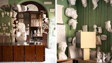 Interni Venosta is a new furniture brand by the Dimorestudio founders
Launched at Milan Design Week 2024, Interni Venosta is Dimorestudio Britt Moran and Emiliano Salci's new brand, crafted by Tuscan manufacturer Fabbri Services and paying homage to 1970s Italian design
-
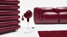 Gucci’s ‘Design Ancora’ reimagines furniture classics in rich red
Gucci launches new editions of Italian design icons in an alluring deep red, showcased during Milan Design Week 2024
-
 Loewe’s Jonathan Anderson drafts artists to create 24 extraordinary lamps at Milan Design Week 2024
Loewe creative director Jonathan Anderson commissioned international artists and artisans to explore ‘illumination within the house’ with a series of lamps and lighting installations, shown at a group exhibition at Milan Design Week 2024


-
 Supergraphics pioneer Barbara Stauffacher Solomon: ‘Sure, make things big – anything is possible'
94-year-old graphic designer Barbara Stauffacher Solomon talks radical typography, motherhood, and her cool welcome for St Moritz
-
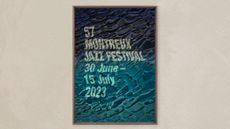 Montreux Jazz Festival posters: a visual history
As artist Guillaume Grando (SupaKitch) unveils his poster for the 57th Montreux Jazz Festival (30 June - 15 July 2023), we reflect on the most memorable designs since 1967, including from David Bowie to Andy Warhol and Camille Walala
-
 AA Bronson on the radical, enduring legacy of General Idea
General Idea, an art group that pioneered a queer aesthetic, is celebrated in a retrospective at the National Gallery of Canada (opened during Pride Month and running until 20 November 2022). Surviving member AA Bronson speaks about their origins, and impact on art and social justice
-
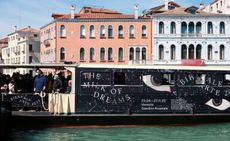 A Practice for Everyday Life gives 59th Venice Biennale a richly surreal graphic identity
London-based graphic design studio A Practice for Everyday Life (APFEL) gives an otherworldly identity to the surrealism-infused 59th Venice Biennale theme ‘The Milk of Dreams’
-
 Inside Na Kim's vibrant playground for all ages
South Korean graphic designer Na Kim's ‘Bottomless Bag’, installed at Buk-Seoul Museum of Art, is a vivid, geometrical exploration of memory and everyday objects. We offer a virtual tour and find out how the concept came to be
-
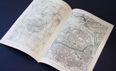 Philipp Doringer’s cartographic design: from Bob Dylan to Vienna’s Second District
Our Next Generation 2022 showcase shines a light on 22 outstanding graduates from around the globe, in seven creative fields. Here, we present Austrian Philipp Doringer, a graduate of Design Academy Eindhoven
-
 Chiachi Chao’s typography blends Western and Eastern writing styles
Our Next Generation 2022 showcase shines a light on 22 outstanding graduates from around the globe, in seven creative fields. We profile Taiwanese type and graphic designer Chiachi Chao, a graduate of ECAL, Lausanne
-
Tom Hingston on designing for Serpentine Galleries, the V&A, and Wallpaper*
London-based art director and graphic designer Tom Hingston discusses his visual identities for Serpentine Galleries


