In line with the much anticipated Herzog & de Meuron extension (itself celebrated with the graphic representation by Peter Saville with Paul Hetherington and Morph,) Tate has given its logo, online branding and merchandising a rejuvenating lick of paint.
Tate Design Studio enlisted the help of London-based branding specialists North to reconfigure the museum's typographic expression. North decided early on that starting from scratch simply wasn't necessary. Jeremy Coysten, North partner explains, 'For us to propose getting rid of the identity system entirely would be irresponsible and a selfish act as designers. Instead, we built on the existing brand equity, refreshed and strengthened what was working well.'
Tate's highly recognisable logo was one of those branding aspects that 'just worked.' After looking into implementing an alternative, North decided to retain the logo's custom typeface, 'Tate Pro', but to control its usage more carefully.
Previously, Tate employed multiple versions of the logo, including both lower-case and capital letter options, along with versions with multiple font weights, aiming to visually promote the museum's 'Look again, Think again' philosophy. However, the new, streamlined system makes use of just one, consolidated logo, that succeeds across print, digital media and merchandising. This new concept also hopes to unify all four Tate locations (Tate Britain, Liverpool, St Ives, as well as Tate Modern).
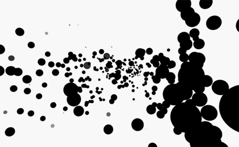
We've already seen this new, colourful branding in full swing in Switch House's UXUS-designed Tate Modern shop. The vibrant, largely primary palette was chosen from the Tate Members commission by artist Martin Creed. These colourways will be refreshed every few years in collaboration with a new artist. So, just like the adaptable, modular retail experience, the updated visual identity has the capacity to evolve with the museum.
At such an exciting, busy time for the organisation, Tate's CMO Rob Baker took time to add, 'What North have created has allowed us to realise the potential of the current identity, ensuring it can exist seamlessly across all platforms in a confident and expressive way.' Confident is right. The new look is bravely simple, subtly achieved and quietly effective – it sees in the monumental Switch House opening with characteristic Tate class.

The much anticipated Herzog & de Meuron extension opens to the public tomorrow. Pictured: the central, concrete staircase at the base of Switch House

North decided early on that redesigning the visual identity from scratch simply wasn't necessary

Jeremy Coysten, North partner explains, 'For us to propose getting rid of the identity system entirely would be irresponsible and a selfish act as designers. Instead, we built on the existing brand equity, refreshed and strengthened what was working well'
Jeremy Coysten, North partner explains, 'For us to propose getting rid of the identity system entirely would be irresponsible and a selfish act as designers. Instead, we built on the existing brand equity, refreshed and strengthened what was working well'

After looking into implementing an alternative, North decided to retain the existing logo's custom typeface, 'Tate Pro', but to control its usage more carefully

The new, streamlined branding system has opted for just one, consolidated version of the logo, that succeeds across print, digital media and merchandising

This new system hopes to unify all four Tate locations (including Tate Britain, pictured) across all possible channels

The vibrant, largely primary palette was chosen from the Tate Members commission by artist Martin Creed. These colourways will be refreshed every few years in collaboration with a new artist

Tate's CMO Rob Baker adds, 'What North have created has allowed us to realise the potential of the current identity, ensuring it can exist seamlessly across all platforms in a confident and expressive way'
INFORMATION
For more information, visit Tate’s website
Photography: North
-
 The visual feast of the Sony World Photography Awards 2024 is revealed
The Sony World Photography Awards 2024 winners have been revealed – we celebrate the Architecture & Design category’s visual artists
-
 Don’t Move, Improve 2024: London’s bold, bright and boutique home renovations
Don’t Move, Improve 2024 reveals its shortlist, with 16 home designs competing for the top spot, to be announced in May
-
 Perfumer H has bottled the scent of dandelions blowing in the wind
Perfumer H has debuted a new fragrance for spring, called Dandelion. Lyn Harris tells Wallpaper* about the process of its creation


-
 The Shining: new book sheds alternative light on Kubrick’s infamous film
We speak to designer Craig Oldham, editor of the new book The Shining: a Visual and Cultural Haunting about this cross-cultural reframing of Stanley Kubrick’s epic film
-
 Hem’s new brand identity plays with architectural geometry and colour
The newly launched identity was created for Hem by London-based practice Made Thought with a specially developed typeface by Letters from Sweden
-
 Rimowa celebrates its 120th anniversary with a new visual identity
Wallpaper* takes an exclusive look with CEO Alexandre Arnault and chief brand officer Hector Muelas
-
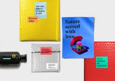 Spoonful of sugar: Studio AH-HA gives Biocol a new graphic identity
 -
Brick by brick: Why Not Associates build deSingel a new visual identity
-
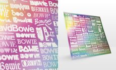 Designers contribute typography to the ‘The changing faces of Bowie’ poster
 -
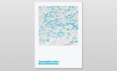 Topographic London posters by Melissa Price


