
The unexpected and previously unexplored parallels between the work of Edvard Munch and Robert Mapplethorpe are the subject matter of a new exhibition – ’Mapplethorpe + Munch’ – at Oslo’s Munch Museum, designed by international architecture and brand design firm Snøhetta.
The fourth in an ambitious series of six ’+ Munch’ exhibitions at the Norwegian museum, this latest installments marks perhaps the most surprising – if not most ‘contemporary’ – pairing yet (previous ’+ Munch’ dialogues have featured the work of Munch-era artists like Van Gogh and Vigeland). But despite their many differences, similarities arise between the Norwegian expressionist painter and the American photographer, due in great part to the medium in which they are presented.
Both the exhibition and the catalogue follow the flow of curator Jon-Ove Steihaug’s essay, which compares and contrasts the two artists. To begin the exhibition, Snøhetta have created a cleansing threshold of large-scale, shredded banners. Emblazoned with the exhibition’s title, the banner’s graphic, bold black and white lettering plays with perspective as you pass through, making the once clear title an abstract and near indistinguishable start. ‘The transition from ordinary life into the fictitious world of art thus becomes both a sensory and mind-cleansing experience,’ explains the design firm.
Colour plays an active role throughout the exhibition itself; not in the traditional sense of the art (most all of the 141 photographs of Mapplethorpe’s on show are in black and white, with only a sparing few of Munch’s 95 pieces employing colour) but in the walls on which it hangs. A deep blueish-grey tint serves as the main canvas, contrasted sharply by the fleshy pink hue of the first room and exit. Partition walls running parallel with the longest walls of the museum are painted white, in sharp juxtaposition with the sombre black walls that accommodate the most controversial images on show.
Also responsible for the design of an accompanying catalogue, Snøhetta have devised a concept that mirrors the exhibition’s bold colour choices, most readily on the cover. The same pink tint of the entrance features here, balanced with the shredded banner’s graphic font in debased black foil and double portrait. The inner layout features images gravitating towards the bottom of the pages, with generous space above allowing the contrasts in both artists’ work to stand clear. Technical information at the back of the book gains a new, textural dimension with the use of matte paper.

Both the exhibition and the catalogue follow the flow of an essay by curator Jon-Ove Steihaug, which compares and contrasts the two artists.

To begin the exhibition, Snøhetta have created a cleansing threshold of large-scale, shredded banners. ‘The transition from ordinary life into the fictitious world of art thus becomes both a sensory and mind-cleansing experience,’ they explain.

Colour plays an active role throughout; not in the traditional sense of the art, but in the walls on which it hangs. A deep blueish-grey walls serve as the main canvas of the exhibition, contrasted sharply by the fleshy pink hue of the first room and exit.

The inner layout of the accompanying catalogue features images gravitating towards the bottom of the pages, with technical information at the back of the book gaining a new, textural dimension with the use of matte paper.

This is the first time the work of Munch and Mapplethorpe have been displayed in this way.

Also responsible for the design of an accompanying catalogue, Snøhetta have devised a concept that mirrors the exhibition’s bold colour choices.

Partition walls running parallel with the longest walls of the museum are painted white.

These sit in sharp juxtaposition with the sombre black walls that accommodate the most controversial images.
INFORMATION
’Mapplethorpe + Munch’ is on view until 29 May. For more information, visit the Munch Museum’s website
ADDRESS
Munch Museum
Tøyengata 53
0578 Oslo
-
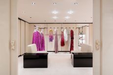 Inside Valentino’s glamorous new Sloane Street store, inspired by the art of haute couture
The latest in Valentino’s ‘The New Maison’ store concept opens on London’s Sloane Street this week, offering an enveloping marble and carpet-clad space of ‘intimacy and uniqueness’
-
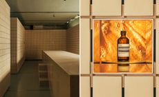 Aesop’s Salone del Mobile 2024 installations in Milan are multisensory experiences
Aesop has partnered with Salone del Mobile to launch a series of installations across Milan, tapping into sight, touch, taste, and scent
-
 Dial into the Boring Phone and more smartphone alternatives
From the deliberately dull new Boring Phone to Honor’s latest hook-up with Porsche, a host of new devices that do the phone thing slightly differently


-
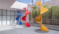
 Supergraphics pioneer Barbara Stauffacher Solomon: ‘Sure, make things big – anything is possible'
94-year-old graphic designer Barbara Stauffacher Solomon talks radical typography, motherhood, and her cool welcome for St Moritz
-
 Royal College of Physicians Museum presents its archives in a glowing new light
London photography exhibition ‘Unfamiliar’, at the Royal College of Physicians Museum (23 January – 28 July 2023), presents clinical tools as you’ve never seen them before
-
 Museum of Sex to open Miami outpost in spring 2023
The Museum of Sex will expand with a new Miami outpost in spring 2023, housed in a former warehouse reimagined by Snøhetta and inaugurated with an exhibition by Hajime Sorayama
-
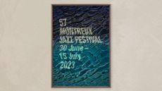 Montreux Jazz Festival posters: a visual history
As artist Guillaume Grando (SupaKitch) unveils his poster for the 57th Montreux Jazz Festival (30 June - 15 July 2023), we reflect on the most memorable designs since 1967, including from David Bowie to Andy Warhol and Camille Walala
-
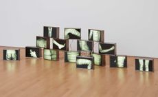 AA Bronson on the radical, enduring legacy of General Idea
General Idea, an art group that pioneered a queer aesthetic, is celebrated in a retrospective at the National Gallery of Canada (opened during Pride Month and running until 20 November 2022). Surviving member AA Bronson speaks about their origins, and impact on art and social justice
-
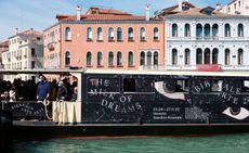 A Practice for Everyday Life gives 59th Venice Biennale a richly surreal graphic identity
London-based graphic design studio A Practice for Everyday Life (APFEL) gives an otherworldly identity to the surrealism-infused 59th Venice Biennale theme ‘The Milk of Dreams’
-
 Inside Na Kim's vibrant playground for all ages
South Korean graphic designer Na Kim's ‘Bottomless Bag’, installed at Buk-Seoul Museum of Art, is a vivid, geometrical exploration of memory and everyday objects. We offer a virtual tour and find out how the concept came to be
-
 Jenny Holzer curates Louise Bourgeois: ‘She was infinite’
The inimitable work of Louise Bourgeois is seen through the eyes of Jenny Holzer in this potent meeting of minds at Kunstmuseum Basel


