
The Spanish Art Directors & Graphic Designers Association (ADG) has kicked off a star-studded campaign to promote its annual honour roll, the Laus Awards.
Titled 'Laus &', the campaign has called upon a dazzling roster of international designers and creative directors to each devise a poster that interprets the word 'Connections'.
There are 46 contributors in total, in numeric harmony with the 46th anniversary of the awards. Among them are legends from an older generation (including Milton Glaser, Ivan Chermayeff), of-the-moment design outfits (Bibliothèque, APFEL) and celebrated editorial talents (Simon Esterson and our own Editor-in-Chief, Tony Chambers).
'Some are personal friends and acquaintances, others were contacted "out of the blue",' explains curator Astrid Stavro. 'The responses have been heartfelt and enthusiastic throughout.'
They have also been incredibly varied, comprising typographic treatments, symbolic designs involving light switches and the international on/off symbol, cartographic references, allusions to reproduction, and satirical, occasionally explicit takes on the banality of internet communication.
Stavro explains that the aim of the campaign is to encourage and challenge Spanish designers to aspire to the talent of these contributors. At the same time, she also welcomes the attention at the campaign has garnered around the world – especially as this iteration of the Laus Awards is the first to be open to international entry.
The full collection of one-off posters will be exhibited during the Laus Awards ceremony in Barcelona's Design Museum, and remain part of the museum's permanent collection thereafter.

Pictured left: Spin creative director Tony Brook expressed ’connections’ through interlinked ’C’-shaped forms in gradating colours. Right: Wallpaper* Editor-in-Chief, Tony Chambers played on Massimo Vignelli’s iconic 1972 map of the New York Subway, zooming in on Chambers Street station and allowing for the intersecting lines to form a lowercase ’t’

Pictured left: London agency Bibliotheque’s poster uses red blood cells as an allegory for how everyone is connected. Right: among the oldest contributors to the Laus & campaign was the celebrated designer Bob Gill, who contributed a hand-drawn illustration of three acrobats joined in mid-air

Pictured left: Dean Poole, creative director of the NZ-based Alt Group depicted a child throwing up a rainbow of colours, in reference to a popular internet reaction for seeing something cute. Right: font designer Henrik Kubel set the name of his studio, A2, in the illusion-inducing typeface ’Eyes Lies’, created by his business partner Scott Williams in 2004

Pictured left: Dutch creative communications outfit KesselsKramer presented a collection of explicit photographs from the internet, showing erect phalluses side-by-side with remote controls. Right: Matt Wiley, art director of the New York Times magazine submitted a tricolour design using disconnected lettering
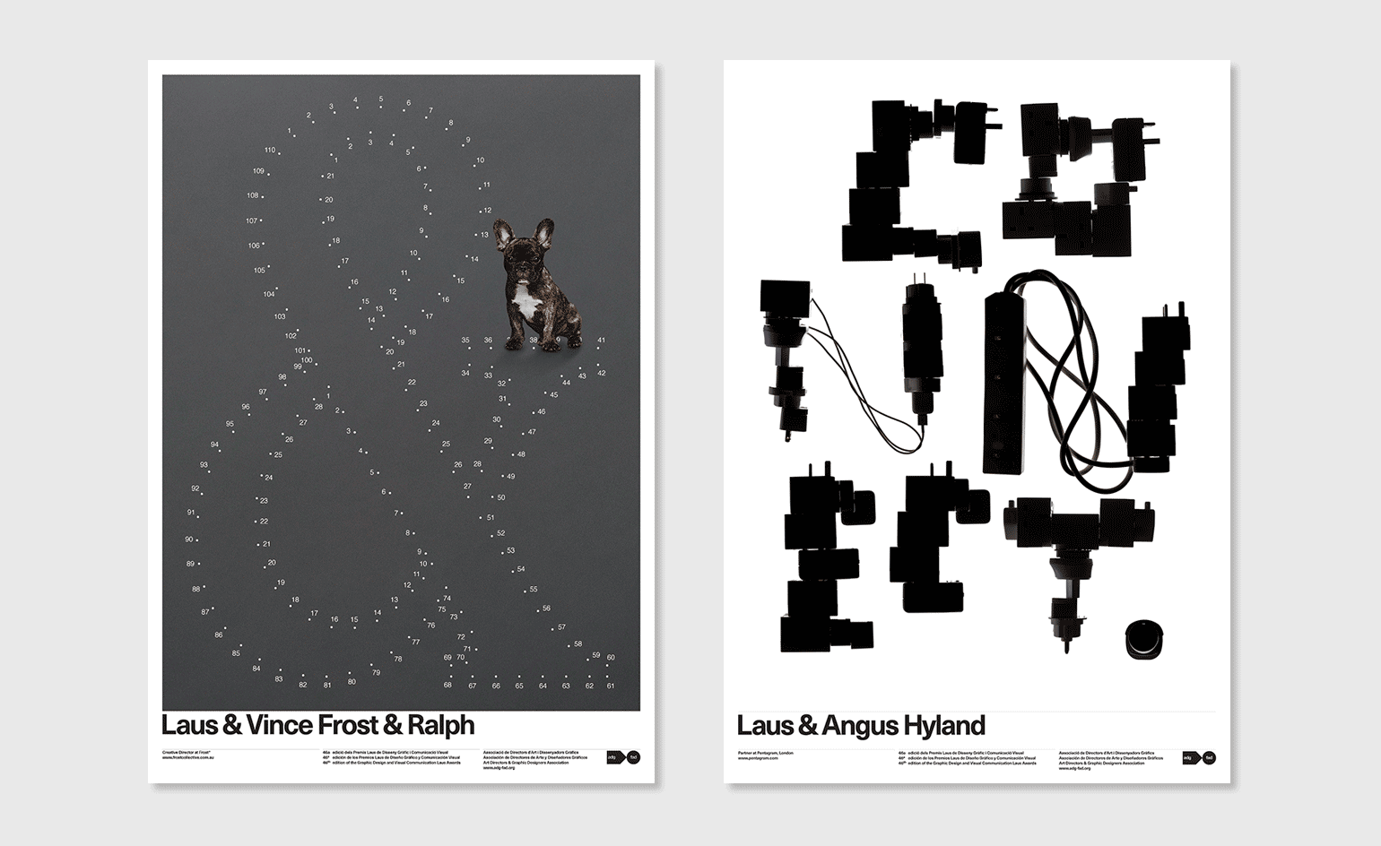
Pictured left: Frost* Collective CEO Vince Frost’s bulldog, Ralph, makes a cameo and gets a byline in his connect-the-dots inspired poster. Right: Pentagram partner Angus Hyland created an abstract iteration of the word ’connect’, fittingly constructed from a range of power adapters

Pictured left: London-based branding studio NB gave a black-and-white, graphic representation of a sperm fusing with an egg. Right: book design maven Peter Mendelsund cited a terse, but actual and complete conversation he had with his friend, fellow designer Oliver Munday
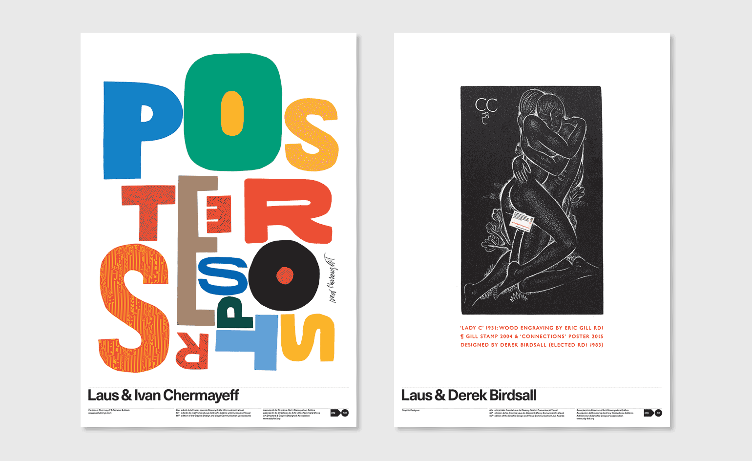
Pictured left: now 82, logo designer extraordinaire Ivan Chermayeff remains dextrous as ever, as witnessed by his assemblage of letters from the word ’Posters’, cut by free hand without prior measurement. Right: the similarly illustrious Derek Birdsall appropriated a 1931 wood engraving by Eric Gill, showing a copulating couple. Their private parts are now concealed by Birdsall’s own Gill Stamp, created for the Royal Academy of Arts in 2004
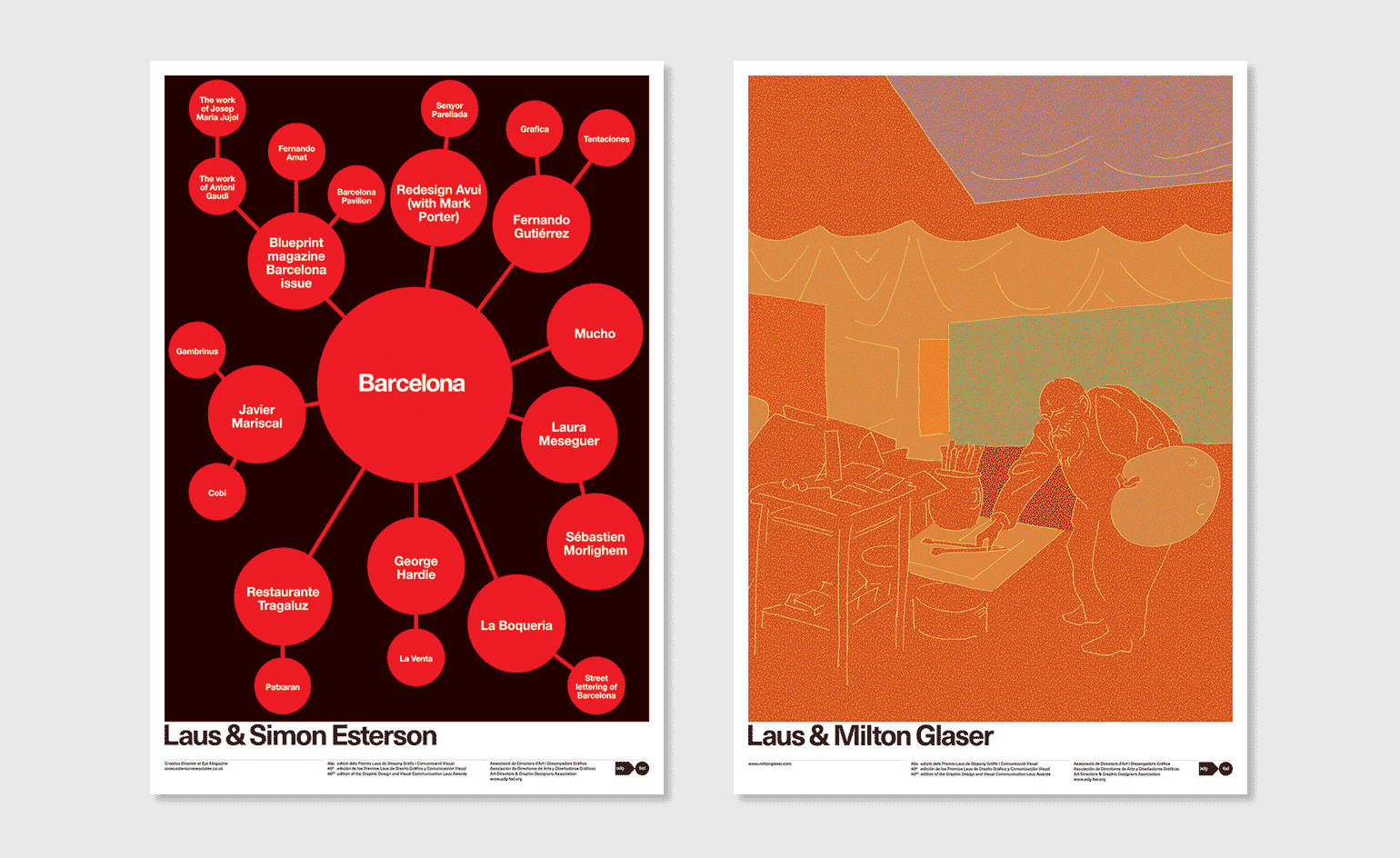
Left: influential editorial designer Simon Esterson’s response was a mind map of design icons and visual inspirations associated with Barcelona, home of the Laus Awards. Right: in possible reference to his continued creative output, graphic design legend Milton Glaser contributed a drawing of an elderly painter at work in his studio, rendered in a cheerful orange
INFORMATION
The Laus Awards are now open for entries. For more information visit the Laus Awards website
-
 Dial into the Boring Phone and more smartphone alternatives
From the deliberately dull new Boring Phone to Honor’s latest hook-up with Porsche, a host of new devices that do the phone thing slightly differently
-
 Berlinde De Bruyckere’s angels without faces touch down in Venice church
Belgian artist Berlinde De Bruyckere’s recent archangel sculptures occupy the 16th-century white marble Abbazia di San Giorgio Maggiore for the Venice Biennale 2024
-
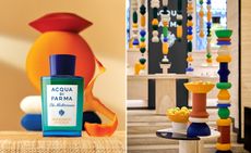 Discover Acqua di Parma’s new Mandarino di Sicilia fragrance at Milan Design Week 2024
Acqua di Parma and Fornice Objects bring the splendour of Sicilian mandarin fields to Milan to celebrate new fragrance Mandarino di Sicilia


-
 SlowMo eases digital mental health therapy into daily life
SlowMo is a new mental health support app developed by design studio Special Projects and King’s College London that uses visual prompts to combat unhelpful thoughts
-
 Mark Dalton on helping people navigate a pandemic through design
Design Emergency began as an Instagram Live series during the Covid-19 pandemic and is now becoming a wake-up call to the world, and compelling evidence of the power of design to effect radical and far-reaching change. Co-founders Paola Antonelli and Alice Rawsthorn took over the October 2020 issue of Wallpaper* – available to download free here – to present stories of design’s new purpose and promise. Here, Alice Rawsthorn talks to creative director Mark Dalton
-
 In memoriam: Wim Crouwel (1928-2019)
 -
 V&A Museum’s new map navigates seven miles of gallery space
Anyone who has ever found themselves waylaid in the V&A will welcome the addition of a new map, and nearly 400 signs, comprising 60 totems, 130 hanging signs as well as an entirely new signage at gallery thresholds
-
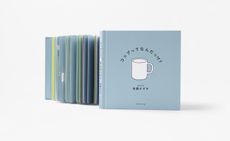 Nendo’s first graphic picture book depicts how design ideas are born
 -
 Tony Chambers on why ‘less but better’ is the future for retail and design
 -
 Heavenly staircases, chocolate faucets and more in our Design Awards 2018 issue
 -
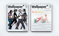 Disruptive thinking and dynamic design in our Next Generation issue


