
What is colour? The artists of the mid-twentieth century had a few attempts at defining what it could be.
Take David Annesley — one of the artists included in ‘Colour is’, a group exhibition opened this week at Waddington Custot on Cork Street, London. Interested in the possibilities of colour to insinuate movement, his glorious bright yellow steel sculpture, Orinoco (1965) is something of a show-stealer in the galleries. Yellow is know as the strongest colour psychologically — it can plunge you into the pits of despair if it’s the wrong hue — but this yellow is definitely on the optimistic side, confident, joyful and warm.

'Acute', by Kenneth Noland, 1977; ‘Karnack’, by William Tucker, 1966; and ‘Il 49 (On Color / Multi #2)’, by Joseph Kosuth, 1991
Sculptors such as Sir Anthony Caro, Paul Feeley and William Tucker also saw colour as way to express energy and direction. Feeley’s delightful Dubbe, (1965) red, blue and cream painted on waves of wood, feels as if it might start dancing. For painters, meanwhile, colour invariably became a cerebral pursuit, a way to understand how painting itself works on the eyes and the mind, but the results are often visceral, rather than puzzles of theory.
The publication of Josef Albers’ influential tome on colour in 1963 – The Interaction of Colour, still doing the rounds today – had a lot to do with the exuberant investigations into colour in the latter half of the 20th century. In Albers’ book, he presents, for example, how the same hue could be perceived entirely differently, depending on which colour is next to it – and considers how the optical effects of ’simultaneous contrast’ could apply in paintings.

‘Blue Cell’, by Peter Halley, 1999
His interests in contrast and perception are manifest in an early oil painting, on view at Waddington Custot, Study for Homage to the Square: “Persistent”, dated 1954-60. ’As basic rules of a language must be practised continually, and therefore are never fixed,’ Albers wrote, ‘so exercises toward distinct colour effects never are done or over. New and different cases will be discovered time and again.’
The exhibition looks at some of those new cases for understanding the language of colour, in works made as recently as 2017: a colour field painting by 92 year-old painter and poet, Etel Adnan. There is also a pair of rice paper watercolours – Parade I and Parade IX – by Sam Gilliam that prove that colour still has so much to tell us.

‘Floor Piece Hè’, by Anthony Caro, 1972; ‘Study for Homage to the Square: “Persistent”’, by Josef Albers, 1954–60; and ‘Untitled (DJ 77-18) (meter box)’, by Donald Judd, 1977
As the first signs of spring begin to appear in a London weary of winter, ‘Colour is’ solicits anticipation for a fresh season and its kaleidoscope of shades.

Blue Cell, by Peter Halley, 1999; Dubhe, by Paul Feeley, 1965; and Colour Chart 58, by David Batchelor, 2012

29.8.73, by John Hoyland, 1973; Floor Piece Hè, by Anthony Caro, 1972; and Study for Homage to the Square: “Persistent”, by Josef Albers, 1954–60

Study for Homage to the Square: “Persistent”, by Josef Albers, 1954–60; Study for Homage to the Square: “Cool Illumination”, by Josef Albers, 1964; and V6 Spatial Relief, Red, by Hélio Oiticica, 1959–1991

Study for Homage to the Square: “Cool Illumination”, by Josef Albers, 1964

Il 49 (On Color / Multi #2), by Joseph Kosuth, 1991

Le poids du monde 29, by Etel Adnan, 2017
INFORMATION
‘Colour is’ is on view until 22 April. For more information, visit the Waddington Custot website
ADDRESS
Waddington Custot
11 Cork Street
London W1S 3LT
-
 Step inside Juno Omakase, London’s smallest counter dining experience
Juno Omakase, inside Los Mochis Notting Hill, offers a one-of-a-kind tasting menu in which Tokyo meets Tulum
-
 ‘Help me go faster’: How Nike Air is priming its athletes for Olympic success
Ahead of the Paris 2024 Olympics, Nike’s chief design officer Mike Lotti opens up to Wallpaper* about its latest high-performance sneakers, developed alongside world-leading athletes and honed using AI technology
-
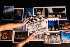 A new book offers a cinematic view on Molteni & C
‘Molteni Mondo. An Italian Design Story’ published by Rizzoli celebrates 90 years of the Italian furniture company Molteni & C


-
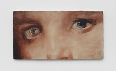
 Guglielmo Castelli considers fragility and violence with painting series in Venice
Guglielmo Castelli’s exhibition ‘Improving Songs for Anxious Children’ at Palazzetto Tito, Venice, explores childhood as the genesis of discovery
-
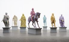 Yinka Shonibare considers the tangled relationship between Africa and Europe at Serpentine South
Yinka Shonibare‘s ‘Suspended States’ at Serpentine South, London, considers history, refuge and humanitarian support (until 1 September 2024)
-
 Gavin Turk subverts still-life painting and says: ‘We are what we throw away’
Gavin Turk considers wasteful consumer culture in ‘The Conspiracy of Blindness’ at Ben Brown Fine Arts, London
-
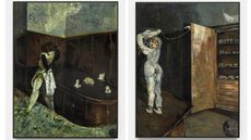
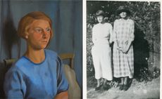 Dorothy Hepworth and Patricia Preece: Bloomsbury’s untold story
‘Dorothy Hepworth and Patricia Preece: An Untold Story’ is a new exhibition at Charleston in Lewes, UK, that charts the duo's creative legacy
-
 Don’t miss: Thea Djordjadze’s site-specific sculptures in London
Thea Djordjadze’s ‘framing yours making mine’ at Sprüth Magers, London, is an exercise in restraint
-
 ‘Accordion Fields’ at Lisson Gallery unites painters inspired by London
‘Accordian Fields’ at Lisson Gallery is a group show looking at painting linked to London
-
 Fetishism, violence and desire: Alexis Hunter in London
‘Alexis Hunter: 10 Seconds’ at London's Richard Saltoun Gallery focuses on the artist’s work from the 1970s, disrupting sexual stereotypes
-
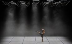 Wayne McGregor’s new work merges genetic code, AI and choreography
Company Wayne McGregor has collaborated with Google Arts & Culture Lab on a series of works, ‘Autobiography (v95 and v96)’, at Sadler’s Wells (12 – 13 March 2024)


